Although my engagement with this week’s praxis assignment has not yet resulted in any especially useful or meaningful results (chalk it up to the monotony of data entry), the process has nevertheless helped me to think about the kind of historic mapping project I might like to propose for our term project, and the challenges of visually representing historic data involved: something I might name City of Churches: Mapping Religious and Social Change in Brooklyn.
I believe that the lives, deaths and continuities of churches, synagogues, mosques and other religious buildings, considered as part of the same data set and viewed over time, have the potential to provide a valuable lens through which to view social and demographic change, and to discern patterns of urban development in the City of New York. Buildings of worship–frequently architecturally significant, although not always legally protected as landmarks–are not only material witnesses to the histories of different ethnic, immigrant and faith-communities past and present: they comprise, alongside other historic structures, the unique texture of the urban built environment. This is as true for Brooklyn as for the other boroughs, which in the nineteenth century was known as the “City of Churches” due to the rapid pace of its construction of ecclesiastical edifices, belonging to different denominations and spanning a number of different architectural styles. In addition to providing a sense of community and place, charitable services based out of religious building complexes also provide crucial social and material support to struggling families and individuals.
Taking into consideration issues related to historic preservation and cultural heritage, as well as the demography of urban religion, the goal of my mapping project would be to:
Track the construction, conversion and/or demolition of religious edifices and related properties in the borough of Brooklyn over time, from at least the early nineteenth century to the present.
Ideally, this information would be best conveyed on an animated time lapse map that would convey the appearance, conversion and disappearance of nodes over time. Such a map could also be paused and viewed statically.
Each node on the map representing a standing, converted or demolished religious edifice, could be selected to interactively display:
Historical information, including facts, articles photographs, etc.; as well as
Current demographic information about each respective node’s congregation/parish (if available), including information about social services (food pantries, larger aid networks, etc.) accessible at each node
Questions I intend to ask myself while working on this map include:
What does a community lose when it loses a church building, in terms of cultural heritage, social support or otherwise?
If a former religious property is converted to private use (say, market-rate condos) or demolished (to build, say, yet more market-rate condos or Vornado office towers), who ultimately benefits from doing so?
Are historical and recent trends and patterns in religious and sociodemographic change (including gentrification, for example) more easily discerned by presenting this information cartographically?
Could displaying this information cartographically have an impact on public attitudes regarding the preservation of these structures?
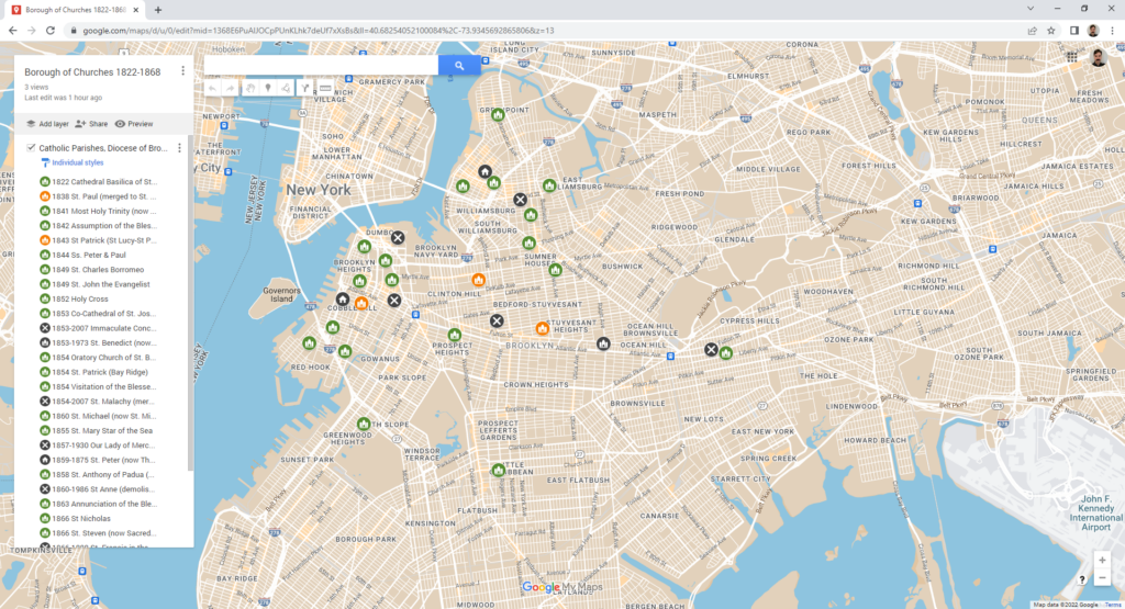
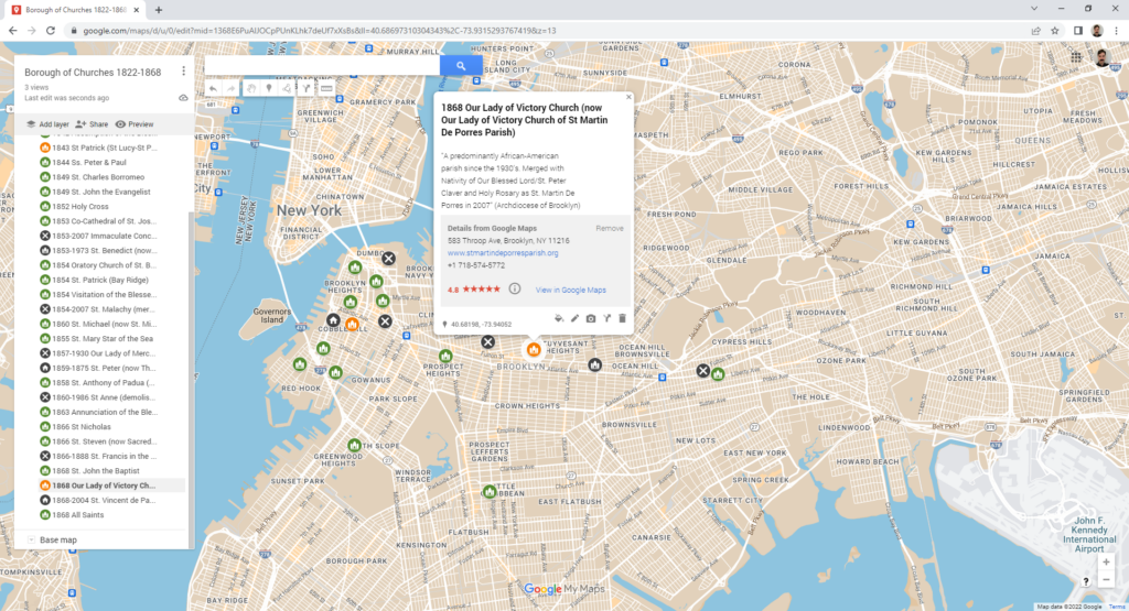
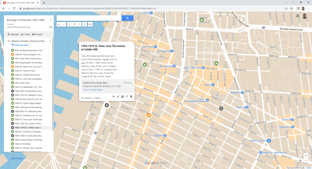
For the sake of completing this praxis assignment, I attempted to create a static map from information of just one religious organization that was readily available: current and former parishes of the Roman Catholic Diocese of Brooklyn, available on the website of the diocesan archives (ideally this project would include multiple denominations and religions–this is just a place to start). I began to manually enter data into Google Maps (I was hoping to export this layer as a .CSV file, and then import this file into my Student Developer account of CartoDB, but I encountered an obstacle involving linking to data storage).
The version of my very rough work in progress (linked here) only displays the sites of current and former parish churches of Brooklyn founded in the nineteenth century from the years 1822 to 1868 (representing only 30 nodes out of a total 144 Brooklyn Catholic parishes to be plotted, at least 28 of which represent churches that no longer exist, whether demolished or converted to other uses). Since I am using a static rather than an animated map, I am constrained to symbol and color to convey historical change. The symbols currently in use on my map are as follows:
Sites of properties currently associated with the Catholic Diocese of Brooklyn:
Church (green): The extant church building on site is still in use as the home address of its own parish
Church (orange): The extant church building is still in use by the diocese/community, but its original parish has been merged to another address or is defunct.
Sites of properties no longer associated with the Catholic Diocese of Brooklyn:
Church (grey): building owned and used for worship by another denomination or religion (in a map displaying the properties of multiple religions, this would be displayed by another color or symbol)
House (grey): exterior physical structure of church building still intact, converted to residential use (I would need to select a separate icon for commercial or communal use)
‘X’ (grey): building demolished.
As a functional historical lens on the changing religious life of Brooklyn over time to the present, this project would only be as effective as the breadth and depth of the data included. That being said, such a project would be biased in favor of well-established dioceses and independent organizations that have historically maintained strong archival and recordkeeping operations. Although the mainstream organizations by and large serve immigrant and low-income communities, there is always a risk that many small, independent places of worship (perhaps based out of physical spaces not generally considered to be of historical importance) that serve these same populations might go unaccounted for–whether due to the fleeting existence of a defunct organization’s address in the historical record or lack a discoverable online presence.
Whether you are a tourist or a resident of NYC we can all relate to one thing- we all have to use the restrooms eventually. I wanted to choose to map something helpful and that everyone can use no matter the level of technological variance. In which I chose to map unknown and or really nice restrooms, for the sake of accessibility, I have limited it to only Manhattan and 23 restrooms. All of these restrooms are chosen from Got2GoNYC which is created by Teddy Siegel.
The Process:
For the actual mapping component, I chose the program Tableau as I am familiar with this program and I wanted to ensure a “Tooltip” is visible. The information that is visible in the “Tooltip” is the restroom name (font size 15), the location, ADA accessibility, details (lock code, amenities, etc), and Gender(s) listed after (font size 10). The background is to be visible via streets and public transportation because if I used a modernistic approach many would use it as a list instead of a map. The markers (scaled larger) originally were blue but I decided to make it an opaque black for visibility and for it not to be confused with public transportation.
In the future, I hope to map more restrooms for different boroughs but would encounter difficulties with overlapping markers, restoration of data, etc. It would also be interesting on how many restrooms are still available from 1980-2022.
Each of us processes the stimuli of our experience differently. Our senses pull in raw data that is translated by our brains into some sense of order, providing us with the ability to navigate the onslaught of external input. Our brains want order, they want to find a path through. The trick is that we all experience and translate these stimuli a little differently. Whether it is in how our brain perceives it or how we emotionally or intellectually process and react. This week’s readings, so focused on the inherent shortcomings of curating, standardizing and relaying information, all point to an overall takeaway that there is no such thing as objective truth because the complexity of the many interwoven phenomena that comprise both our experience and understanding of it is not fixed.
With that understanding, it is easier to understand maps as limited tools that allow us to capture a specific thesis relevant to a specific world view held at a specific point in time. When we map histories, for example, not only is the map relying on a specific depiction of a physical location that in itself makes assumptions, it is overlaying data that is relevant to a specific moment(s) in time as marked by the map’s creator. Time as a necessary data point in relationship to a map makes them multidimensional, yet maps are almost one dimensional as a concept in that they are instruments to convey a premise developed by its creator. The map’s creator is documenting their correlations and understanding of what is important at the expense or in relief of all other possible observations. Because of this, it becomes imperative to ask—what was left out? What values are on display and what is the motivation driving this depiction?
Considering these limitations, it would seem that maps incorporating multiple expressions of collaboration would be the most relevant and successful to Digital Humanities. There should be collaboration and discussion on the authoring side—rich input to help decide, in particular, the appropriate final form and content of the project. As the field moves more into active public discourse, often attempting to bridge the academic and public worlds, targeting a large audience AND engaging them in the functionality, content, and development of the end product would invite the most robust outcomes.
Richly layered maps, a benefit of digital expression, with filters that provide various lenses, although still curated, offer more potential for user interpretation, inspiration, and interaction. The excellent Evictions Lab map shared in class last week, rich with data, includes an easy to engage with interface that gives users multiple ways to view statistical data to arrive at their own understanding of the story that emerges from the map. The creator(s), having chosen what data to include in the map, remain the curator, but the user becomes a collaborator invited to engage and therefore challenge, expand, and synthesize the data for emerging concepts and perspectives. We are inviting the public to “read” the findings not just witness, where reading implies deep engagement and processing of what is taken in.
A visualization that could benefit from more interaction is the one featured in Bonilla and Hantel’s In Visualizing Sovereignty: Cartographic Queries for the Digital Age. Revealing an understanding of the world that is not accounted for in traditional tools is an extraordinary challenge. Admirably, the author’s were able to step away from step away from the traditional depictions of land mass in a geospatial context— for a more linear understanding of time as well as collaborate with colleagues outside of their immediate circle (animator). However, the end result leaves out a core aspect of the authors’ perspective. Rather than depict nations in relationship to their colonizer and traditional achievements of “sovereignty,” it might have served the creators to consider the notion of sovereignty itself within their depiction as deeply as they do in their writing. Variations of sovereignty as the underlying framework over which the nations are placed would help center one of their primary ideas. In the current depiction, we are told that the dates of achieving “sovereignty” are important, but all other nuance is stripped away— the violence and continued paternalistic relationships inspired by political gain the authors mention in writing are absent. The Renewing Inequalityvisualizations may have applicable learnings to offer. By providing multiple views (map, cartogram, chart) the project not only accommodates multiple users’ preferences and needs, but creates the potential for the relationships between the data points to reveal varied insights. I have to wonder if the chart view in this project might not inform a possible solution for the issues arising with the Visualizing Sovereignty project. Updated to a quadrant based chart, it might allow the mapping of Caribbean nations in relationship to various concepts of sovereignty over time. Interaction in the form of a sliding bar could dynamically visualize the shifting of each nation over time, emphasizing the dynamic nature of these shifts in a more palpable way. This treatment may also more readily reveal the lack of complete political and social sovereignty in nations that were previously considered “sovereign” in the traditional Western sense as discussed by the authors, thereby engaging users in discussion of the very concept of sovereignty. Overlays could be toggled to provide additional context, including colorization to account for colonial relationships, demographics, cultural traditions and more.
As the readings make clear, it’s critical that we question every tool we are offered—ensuring that we understand its origin and implications when conveying our perspectives and findings through them. In addition, I believe it’s important that we consider the tool of our own mind in the same way. Through collaboration we gain outside perspective on what our own minds may have presented to us as truth. Not only does collaboration help illuminate our own biases and assumptions, it also creates the opportunity for dramatically new configurations and perspectives.
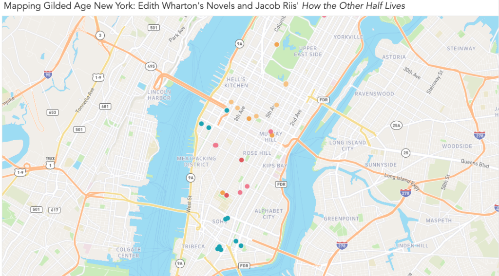
This week, I attempted to map the works of two chroniclers of Gilded Age New York: Edith Wharton and Jacob Riis. Both offered clear-eyed critiques of the city and its people, and together they represent the duality inherent to the idea of a Gilded Age. Wharton’s novels describe the thin ornamental gilding that conceals the truth about a society; Riis’ journalism and photography deal with with what’s rotten underneath. Wharton’s critique is cultural and relatively narrow: the shallowness of the rich and the rigidity and provincialism of their customs and mores. By contrast, Riis’ critique is material, and his focus on the indigent is an indictment of the wider social and economic structures of late 19th century New York.
To create my map, I chose to use Tableau. You can see a draft of it here, on Tableau Public, as well as in the screenshots below.
View of the entire map. Locations from Riis’ How the Other Half Lives are in teal, while Wharton’s novels are represented by various warm shades.Each marker expands into a note that contains information about the author, source, and location, as well as an excerpt from the relevant text and interpretive notes. In the notes, I attempted to give context about the source material and explain my methodology for determining the location.
Goals and Inspiration
I chose to map Wharton and Riis after a visit to the Tenement Museum last month. I’ve read three novels by Wharton in the past year, and while I’ve always been moved by the photography of Jacob Riis, I hadn’t consciously connected their work until paging through a copy of How the Other Half Lives while waiting for my tour.
The title alone is pointed, and I couldn’t help but think of Riis directing it toward New Yorkers who resemble Wharton’s characters. They possess such precise, detailed knowledge about the rules of their own limited world, yet show so little curiosity about what exists just out of sight. By mapping sites from Wharton’s novels and Riis’ journalism, I hoped to see just how closely these worlds were situated.
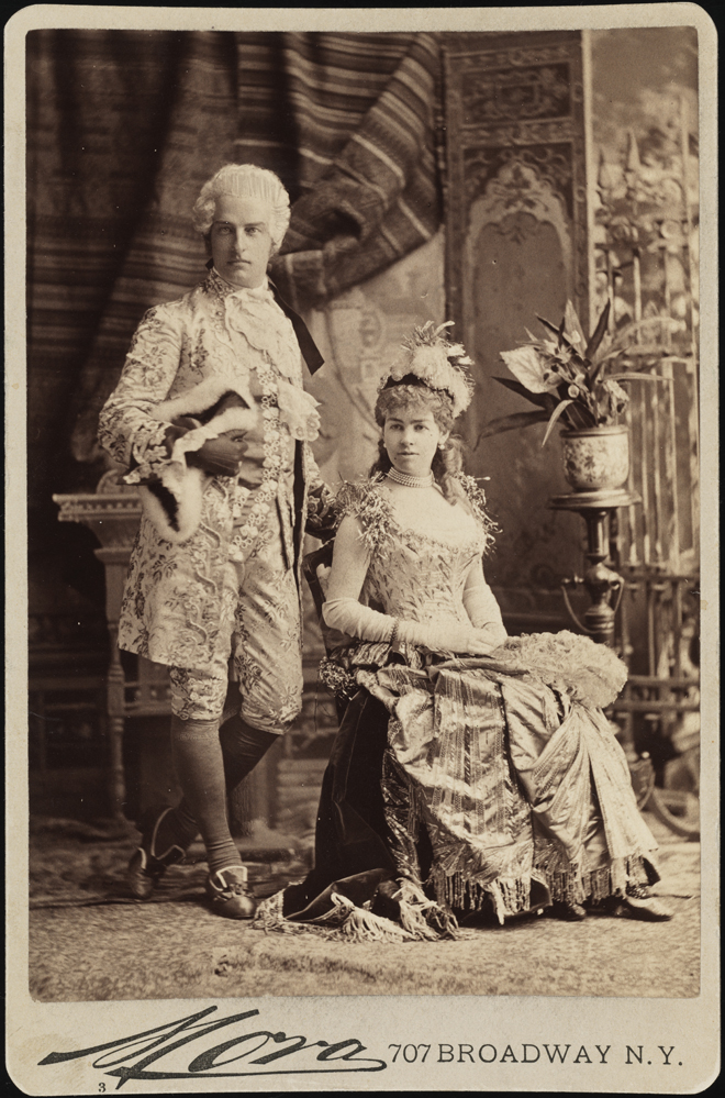
Mora (b. 1849). Mr. and Mrs. Cornelius Vanderbilt II (neé Alice Claypoole Gwynne). 1883. Museum of the City of New York. F2012.58.1341. https://www.mcny.org/story/vanderbilt-ball
I was particularly interested in spatially distinguishing the “genteel” poverty experienced by some of Wharton’s characters from the desperate circumstances Riis documented. For example, Wharton’s The House of Mirth tells the story of Lily Bart’s gradual fall from “high society” to poverty and obscurity. When Lily, finally broke, moves to a boarding house and works in a small workshop making hats, just how far is she — economically, socially, and literally — from the immigrant garment makers in the tenements of the Lower East Side?
My initial plan was to overlay locations from Riis and Wharton with demographic information from the time, such as population density, income, family size, etc. I set out to see what had been already done — and quickly realized how ambitious my original goal was. A number of researchers have done great work with data from this era, including researchers at the time. (You can see my rough research notes, including links to sources, here.)
Through Village Preservation’s blog, I learned about the demographic maps created by the Tenement-House Committee in 1894. I’m including a small image below, but I encourage you to click through to the Library of Congress listing to see a full-sized image — these maps are incredible.
Pierce, F. E. The Tenement-House Committee maps. S.l.: Harper & Brothers, 1894 Map. https://www.loc.gov/item/2006629793/.
What strikes me is that these map-makers were doing something we were challenged to do this week — map something that isn’t normally considered mappable. While demographics maps are common today, the crazy-quilt appearance of the lower map (showing various immigrant populations in New York) shows how ambitious a task this was at the time. The map is difficult to read at first glance, at least to my eye — our mapping conventions have evolved over time, to the point where I have built-in expectations about how a map like this “should” look. The idiom of the upper map is more familiar to me; even before studying the key, I was able to make assumptions about what it shows.
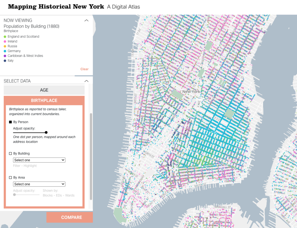
A more recent — and equally visionary — look at the same data is Columbia University’s “digital atlas,” Mapping Historical New York. The team behind this project used census records to map out demographic data at the individual and building level. So far, their data set includes records from 1850, 1880, and 1910. For each of these, you can view information related to nationality, gender, race, occupation, and age, as well as basic population density information. You can zoom out to view larger patterns, but since the map points represent individual records, you can zoom in on a block and see what types of jobs the people living there had, where they were born, and more.
Gergely Baics, Wright Kennedy, Rebecca Kobrin, Laura Kurgan, Leah Meisterlin, Dan Miller, Mae Ngai. Mapping Historical New York: A Digital Atlas. New York, NY: Columbia University. 2021.
The project includes case studies that use specific locations on the map to present a story — something I would eventually love to do with my data. However, given the complex work that’s already been done with demographics, I chose to limit my focus for this first draft to plotting locations from Wharton’s novels and Riis’ How the Other Half Lives.
Gathering Data: Challenges and Methodology
I started by reading everything I could find about locations in Wharton’s novels. Given her enduring popularity, as well as the prominence of real estate in her work, I thought that finding rough locations for many of her characters’ homes would take a Google search or two. I was wrong, of course. While you can book an Edith Wharton walking tour, these tours are mainly focused on the events of Wharton’s life and general Gilded Age sites, rather than locations in her novels. It was easy to find writing that touched on the significance of place in her work, from the hotel where Undine Spragg stays in an attempt to get “in” with high society, to Ellen Olenska’s idiosyncratic flat in a neighborhood her critics consider beneath them . But finding more detail about possible locations than is offered in the books themselves? Not easy. (Except in a few cases, which are noted in my map.)
This is where I felt my own limitations as a humanist. While I took a handful of courses in both, my undergraduate degree wasn’t in history or literature — they’re subjects I’ve continued to study in the decade and a half since I graduated, but not with academic rigor or backing. I didn’t find what I was looking for in academic databases, but I can’t say for certain that the information wasn’t there. With both the literary and historical aspects of this research, I couldn’t be certain I was asking the right questions, so I had to use a simple method of finding the answers I wanted: I went through each of my source books.
I worked with three of Wharton’s novels, each of which I’ve read within the past year:
I started by making a list of the specific locations I was hoping to find in each, as well as search terms within the novels that I thought might lead to other discoveries (e.g., “avenue,” “street,” “corner,” “house,” “home”). Since all three novels are in the public domain and available on Project Gutenberg, I was able to use ctrl+F to highlight the terms and scroll through the results. (This is a task I would like to explore again once I know more about text mining.) I started collecting my data in a spreadsheet, including:
A brief description of the locations I found
Textual evidence of the actual location. This ranged from:
Vague evidence, like “far west of Sixth Avenue” (Lily Bart’s boarding house in The House of Mirth), to
Highly specific details, like the ones that place Lawrence Selden’s bachelor apartment in the same book at 50th Between Fifth and Madison.
A relevant excerpt from the book
I did the same for Jacob Riis’s words and photos, using two sources:
Once I had my basic data, I started working to pinpoint precise locations for each place. This was fairly straightforward for Riis’ work, as he was a journalist by trade. For most of his photos and descriptions, I was able to use details in the text to easily estimate the location within a block or two.
Wharton presented a number of challenges. Most obviously, her work is fiction — so I didn’t expect an exact concurrence between her work and the New York City map. However, a few of her idiosyncrasies made my job harder:
Wharton only rarely used real places (the Academy of Music, the Metropolitan Museum of Art), but she often used buildings that are meant to be stand-ins for other, well-known buildings. For example, Undine Spragg’s hotel in The Custom of the Country is called the Stentorian. Since Wharton provides the cross streets, I know that it’s a stand-in for a real hotel called the Majestic — and her readers probably would have known that too, and understood that she was using that detail to further color Undine’s character. I have the strong suspicion that many of her other locations — especially the most ostentatious mansions — are nods at specific buildings, as well. Contemporary readers would be able to pick up these cues (and so might experts on the history of New York architecture), but it wasn’t something I could figure out in the ten hours or so I spent collecting this data.
While each of these novels is set in New York City, Wharton mainly wrote them while living in Lenox, Massachusetts. Even when she provides an exact address, it’s not clear that one should really expect that address to be accurate. For example, in The House of Mirth, Wharton provides us the exact cross streets for Lawrence Selden’s apartment building, “The Benedick.” (Another fictional but very likely-sounding location!) When Lily Bart visits, she notices every detail about her potential beau’s block — except for the fact that it contains St. Patrick’s Cathedral, if it is where Wharton says it is.
Wharton’s impressionistic mapping extended to relative locations, as well. For a while, I thought I could be clever and map the posh Fifth Avenue homes in The House of Mirth based on the movements of the characters who visit these homes. For example, characters are often described walking north or south from one house to another. I began to plot these home on a straight line — but eventually figured out Wharton had not done the same. My plan was foiled when I realized that a particular house was listed as both north and south of its neighbor.
When I reached the limits of what the text could offer, my next step was to consult other sources. The one I used the most was Mapping Historical New York. When Wharton’s text offered me a general area, I used the demographics maps, as well as other historical sources, to come up with a likely location.
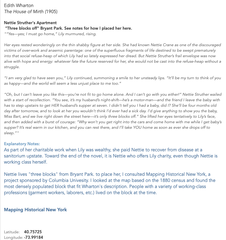
For example, one of the places I was most interested in locating was Lily Bart’s boarding housein The House of Mirth. This is a significant location because of what it represents: Lily’s fall into poverty after she accrues an overwhelming amount of debt and makes “bad” social choices. The boarding house is where Lily goes to live when she decides to stop accepting acquaintances’ charity; it’s also where she dies from an ambiguous overdose. When the other characters see Lily’s living situation, they are shocked and even disgusted. Here’s one reaction:
As she led the way westward past a long line of areas which, through the distortion of their paintless rails, revealed with increasing candour the disjecta membra of bygone dinners, Lily felt that Rosedale was taking contemptuous note of the neighbourhood; and before the doorstep at which she finally paused he looked up with an air of incredulous disgust.
“This isn’t the place? Some one told me you were living with Miss Farish.”
“No: I am boarding here. I have lived too long on my friends.” He continued to scan the blistered brown stone front, the windows draped with discoloured lace, and the Pompeian decoration of the muddy vestibule; then he looked back at her face and said with a visible effort: “You’ll let me come and see you some day?””
The House of Mirth, Chapter 10
Given the intensity of Rosedale’s reaction, I was extremely curious about where Lily might have lived — and how it would have compared to the living conditions of immigrants in the tenements. Fortunately, this same section of the novel offered key clues to the location. To put everything together, I consulted Mapping Historical New York, as well as information about the elevated rail line that existed at the time. I describe the process in a note on my map:
I was able to make an educated guess about the location of Lily’s apartment (as well as her chemist — see other note) based on the face that she walks there with Rosedale after meeting him as he descends from the 6th Avenue train. Based on other context, the only el stops that fit are 23rd St., 33rd St., 42nd St., or 50th St. (Others opened after the novel was written.)
Knowing that Wharton was born on 23rd and chooses to make far West 23rd the home of Madame Olenska’s artistic neighborhood in “The Age of Innocence,” I believe we can eliminate the possibility of Lily living on or near 23rd.
Demographics maps show that 50th was less densely populated further to the west, which makes it an unlikely location for a shabby boarding house. 42nd and 33rd were both dense — but given the landmarks near 42nd, and the fact that it’s closer to Bryant Park, which has been mentioned before as a place where Lily stops at this point in her life, I believe that 42nd is the most likely spot for her to run into Rosedale.
According to “Mapping Historical New York,” this block [W. 42nd between 9th and 10th] is the first one on 42nd west of 6th that has a significant number of garment workers living there in 1880; it and the blocks directly south are very densely populated, compared to the blocks to the east. 42nd St. has a large population of immigrants at that time, but from various backgrounds, whereas the streets to the south are predominantly German — something I think would have been noted if Wharton had intended it to be the case about Lily’s street.
(Interestingly, this location for Lily’s boarding house puts her only a few blocks north of one of the Jacob Riis locations in Hell’s Kitchen — but based on demographics at the time, that was a meaningful distance. The location suggests that while Lily was poor, she was still in not nearly as dire straits as the New Yorkers who lived in the tenements to the south.)
My process wasn’t quite as intense in each case, but I did try to reach this level of certainty for all my data. For this draft of the map, I eliminated locations that I couldn’t pin down within a few blocks. Once I had identified the locations that would make the final cut, I revisited the whole list on Google Maps to determine the latitude and longitude for each. You can view a copy of my dataset (as of 9/20/22) here.
Building the Map
Once I had my data, I chose to build my map in Tableau. As others have stated in their posts, it’s free for students and offers a robust toolset. I found it easy to learn, but I hit a few stumbling blocks that kept me from the vision I would ultimately like to execute.
Custom Map Image
I had originally planned to plot my coordinates on this 1879 map of New York, which I used to narrow down a few of my locations:
However, from a practical point of view, this map has a few problems. First, the perspective is skewed. The map doesn’t show a true bird’s-eye view, like we would expect from a modern map. When I attempted to overlay this image with Google Maps, I could get the contours of the Battery to match up, but Central Park wasn’t even close.
My second issue was that I didn’t trust the accuracy of the map beyond Manhattan, which would have been essential for providing the bounding latitude and longitude to map on Tableau.
I think both these issues can be resolved — but not in a couple of evenings.
Tooltip Images
I’d originally planned to include Riis’ images as part of the tooltips for my labels; each of the points I mapped has an image associated with it.
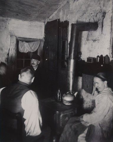
“Children’s Playground in Poverty Gap.” 1892. Located on W. 28th between 11th and 12th.
Tableau doesn’t currently offer a built-in way to do this. Many users employ an elaborate workaround — which I will attempt in my next draft — but this seems like a real gap, as well as a barrier for Digital Humanists, students, and others, especially if the workaround solution is not scalable or easy to keep updated with new data sources.
Reflections and Next Steps
My first attempt at this project was somewhat successful — I can see the limits of my own skills, both in the humanities and in the tools I used, but I also was able to answer some of the questions I started with.
My map, with nearly all points visible. The warm colors represent locations drawn from Wharton’s novels and life, while the teal markers represent locations documented by Riis. The locations in Wharton’s work that come closest to intersecting with “the other half” are Lily Bart’s shabby boarding house (westernmost yellow marker in Hell’s Kitchen) and Ellen Olenska’s apartment in a neighborhood that we could now refer to as “gentrifying.” (One of two pink markers nestled closely together north of the Meatpacking District.) Also note how spread out the world of Wharton’s characters is compared to the densely packed New York of Riis’ tenement dwellers.
Plotting out the locations in Wharton’s and Riis’ work did give me a better sense about how the worlds they described coexisted, with Riis’ workers providing so much of the labor that Wharton’s characters would choose not to see. I was especially interested in seeing the clear lines drawn between Wharton’s “genteel poor” and the real-life tenement dwellers; even when they approach each other on the map, they don’t quite overlap.
However, the most valuable aspect of the project was the chance it gave me to reflect on larger questions, including ones we’ve touched on in class.
Namely:
How might DH tools like mapping unintentionally obfuscate the uncertainty within some works of scholarship? I know that I’ll probably end up revising some of my locations as I learn more about Gilded Age New York, and I did my best to “show my work” and be honest about how tenuous some of my conclusions are. But if this lives publicly on the web, will my caveats get lost as other people find and use my work? For example, how many walking tours would have to include my educated guess about Lily Bart’s boarding house for the location to become an established fact? Our readings this week addressed the idea of maps seeming to create truth — when Digital Humanities projects use these tools, do we run the risk of being more convincing than we intend to?
Who and what am I leaving out by focusing on Riis and Wharton, and how does this reinforce existing narratives and gaps? The whiteness of the people (fictional and real) I highlighted in this project doesn’t reflect New York today — it doesn’t even reflect Gilded Age New York. I became especially conscious of how limited my data set is when I asked my husband, who’s a historian of the Great Migration and Black urban politics, to give me a gut check on some of my methodology as I checked for information on Mapping Historical New York. Instead of answering my question, he got caught up on looking at the demographics of an area just southeast of Columbus Circle and launched into a story about how Booker T. Washington nearly got beaten up there — and how of course that made sense, given the historical context of the area. That’s a story my map wouldn’t capture, along with many others. As I expand this project, I need to add additional sources, lest I give viewers the impression that the stories I’ve chosen are representative of that era of New York as a whole.
How do our tools limit what we choose to do as humanists? When I chose to leave certain elements, like Riis’ photos, out of this draft because it was too complicated to attempt in the moment, I compromised the integrity of my original goal. I have no doubt the project would be richer with the photos included. I believe I’ll be able to include them in my next draft, but this makes me reflect on some of the debate about defining Digital Humanities and Digital Humanists — namely the perceived distance between “thinkers” and “makers.” I have more sympathy for the argument that Digital Humanists must be makers than I did before this project, though I’m not fully convinced. If those who don’t have the skills to make projects choose to rely on out-of-the-box tools that impose limits on their projects, are they just restricting their own work? Or can we aggregate all of the DH work that doesn’t get made (or executed to the fullest extent) for want of a good tool and see it as detrimental to the field as a whole?
How might these tools limit the information available to the public? If data gets left out because it’s not easily displayed, can we expect people who engage with our work to know that data exists? What assumptions might be made based on a lack of data?
I’m curious to hear others’ thoughts and critiques as I continue working on this, especially as I continue grappling with these questions.
[Updated 9/21/22 ~ 10:00 AM to add additional sources, including my dataset, and make some edits for clarity and style.]
Below is a response to Myaukh Sen’s Dividing Lines. My intention was the synthesize the readings into a more “inclusive” piece that touched on each but time did what time does and suddenly its approaching midnight on Tuesday. Anyways, I’m not necessarily married to anything stated in this post so I look forward to hearing your thoughts, disagreements, etc. (Also, I’m writing this under the assumption that our required responses to weekly readings listed on the course syllabus can be done at any point during the semester and can be approached however we like?)
In July of this year, Google Maps announced the launch of Street View in India after an eleven-year regulatory struggle, partnering with local mapping solutions company, Genesys International, and multinational information technology services company, Tech Mahindra, to potentially mend the problems associated with the barely intelligible images of Indian villages lamented by Mayukh Sen (Garg, 2022). Throughout their piece Dividing Lines, Sen rightfully critiques the “hierarchies of dominance of the West” that reproduce such cartographic invisibilities and erasures, labeling Google a “de facto neocolonial force” that reifies and recreates “inequities created by colonial-era decisions, ultimately calling for a “humane approach to mapping” that doesn’t work to revitalize uneven developments in the globalized economy through increasingly ubiquitous digital systems (Sen, 2017). For the most part, Sen’s point, despite it being predicated almost entirely without mentioning India’s resistance to participating in such mapping projects (Sen waits until the second-to-last paragraph to mention this as an element of the issue), is a necessary one that deserves further recognition and understanding by those of us existing primarily in a framework built from Western cartographic perspectives and traditions. However, I feel that components of Sen’s conclusion miss the point entirely.
While advocating for a precise approach to mapping that doesn’t allow “glib sentimentality” to influence the crucial necessity of attention to “political divisions and geographical inequalities,” Sen seems to intermittently fall into such sentimentality throughout this piece, anticipating “the promise” of Google Earth offering some medicinal program for homesickness or displacement as something the company (or, a similar program) might eventually learn to strive for, that the “essentialist white, Western perspective” is, at this point in the development of unfettered digital capitalism, driven by anything but a perspective of profit (Sen, 2017). Google’s profit-driven desire to exist in and extract data from the physical spaces of countries such as India has long existed, prohibited only due to a terror attack in Mumbai that Google Earth was subsequently deemed liable for, rather than some underlying logic in the company’s structure that values the nostalgia incited through the crystal clear image of a New Jersey home more than that of villages in Balrampur. The drive of corporate interests to globally colonize public space, best exemplified by Google’s cartographic projects, certainly meets the criteria of Sen’s labeling of them as “de facto neocolonial forces,” but seemingly not for the reason that he intends. Sen seems focused on Google’s approach to an economy of exploitation and dispossession, grounding his understanding of this approach in the outmoded model of colonialism and critiquing this “neocolonialism” for its disregard for the homes and identities of those not represented through its ostensibly “global” reach, rather than advancing contestations against the very existence and expanding scope of such programs.
As I noted above, the recent acceptance of Google Street View’s project and its intention to map 50 Indian cities by 2022 might provide some sense of recognition as the landmarks of hometowns become discernible and the Western haze is lifted from the street signs that might lead one to interactive images of one’s childhood homes. There is undeniable value in such an experience and this critique of Sen’s work is not meant to discredit this. However, to quote Shoshana Zuboff’s remarks on the work of historian of cartography John B. Harley, “‘Maps created empire.’ They are essential for the effective ‘pacification, civilization, and exploitation’ of territories imagined or claimed but not yet seized in practice. Places must be known in order to be controlled” (2019, p. 154). Though Sen hints at an understanding of this throughout his piece, even going so far as to say that “concerns about surveillance and data harvesting” shouldn’t be invalidated while doing nothing to validate them, I feel as if Sen’s emphasis on digital colonialism’s exclusion of the Global South negates the severity of the grip with which Google’s novel empire is indexing the physical world in a growing number of nations and societies that are growing wholly dependent on the consumer technologies such companies provide, ultimately leading to an erosion of possibilities of existence outside of the market everywhere. Zuboff goes on to note that it is Google’s prerogative to “empty every place of the subjective meanings that unite the human beings who gather there,” mirroring Adam Greenfield’s warnings in Radical Technologies: The Design of Everyday Life that the tailoring of environmental depictions via the smartphone to each individual user creates a different atomized map that “subtly erodes an experience of the world in common” (Zuboff, 2019, p. 141; Greenfield, 2017, p. 24). Despite Sen’s hesitant hope that Google can someday amount to “its promise of offering something like home,” the company, by design, will never provide anything outside of its “commercially oriented representation of the world,” to borrow the phrasing of Anne Marie Gardenier, and to expect, ask for, or demand humanity, recognition, or dignity from a structure rooted purely in exploitation demonstrates an unfortunate lack of consideration for that which we are truly up against (Gardenier, 2020, p. 3).
To India’s credit, their 11-year resistance to Google Maps’ invasive engagement with their public spaces is noteworthy and their recent entrance, only permissible due to its collaboration with two Indian corporations, seemingly counters the passive consumption of strictly Western corporate content that Olivia Colon once described as a foundational component to digital colonialism (2017). Lastly, I recognize that such a critique of Sen’s argument from the exact Western perspective this piece is advocating an escape from might come across as banal or as devaluing his work and well-warranted motivations in creating it. My intention was merely to highlight a component of Google’s universal project of exploitation as the next unprecedented phase of the cycle of dispossession (i.e., digital dispossession and the proletarianization of the mind), rather than purely an exacerbation of inequities and injustices of the previous era (though this is obviously an element of such a process). Cartography is, and always has been, an instrument of power, and when a map of the world exists in the pocket of the multitude as a catered augmentation attuned to the desires and drives of one’s behavioral surplus, providing harvested data to an algorithm that responsively works to automatically feed these desires and drives with curated stimuli and sedatives, our sovereignty is overthrown and we are left with few tools existing outside of the market to redefine what it is to be autonomous, self-determining, and unconstrained by the technologies that increasingly normalize themselves not as mere augmentations but as a prerequisite to properly exist and be recognized in the world.
Essentially, Bonilla and Hantel’s advocacy for a revisualization of sovereignty seems to bear a great deal more emancipatory and revolutionary potential than working towards spatial recognition from a program of global corporate colonization with an infinite appetite for the exploitation of the same human experience that allows us to cherish and recognize our selves in the hum of a song, in the Proustian smell of a dessert on a stove in the next room, and in the now-foggy objects that furnished our childhood struggling for shape in our memories. How’s that for glib sentimentality?
Resources
Colon, O. (2017, July 27). ‘it’s Digital Colonialism’: How Facebook’s Free Internet Service has failed its users. The Guardian. Retrieved September 20, 2022, from https://www.theguardian.com/technology/2017/jul/27/facebook-free-basics-developing-markets?utm_source=ifttt
Gardenier, A. M. (2020). Analyzing Google Maps from a critical cartography perspective: (dissertation). Online Culture / Department of Culture Studies / School of Humanities and Digital Sciences, Tilburg.
Garg, A. (2022, July 27). Google maps in India finally gets Street View, coming to these cities first. India Today. Retrieved September 20, 2022, from https://www.indiatoday.in/technology/news/story/google-maps-in-india-finally-gets-street-view-available-in-10-cities-1980506-2022-07-27
Greenfield, A. (2017). Radical Technologies: The Design of Everyday Life. Verso.
Sen, M. (2017, March 27). Dividing Lines. Real Life. Retrieved September 20, 2022, from https://reallifemag.com/dividing-lines/
Zuboff, S. (2019). The Age of Surveillance Capitalism: The Fight for a Human Future at the New Frontier of Power. Public Affairs.
For this assignment I chose Tableau not only because it’s one of the recommended tools for beginners in the syllabus, but also because it’s one I keep hearing about, including at work, for a meaningful visual representation of data to tell a story. I downloaded the student version then discovered the public online version which is limited but more convenient so I created an account and used the latter. Then I headed over the YouTube for a quick tutorial and found Tableau in Two Minutes – Tableau Basics for Beginners which turned out to be 23 minutes long of which I logged around 9 minutes. Then I spent way too much time figuring out what topic I wanted to cover and where to find a manageable dataset. It would have been nice for this to be included in the syllabus.
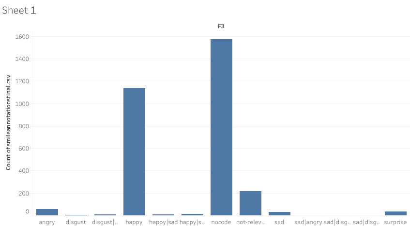
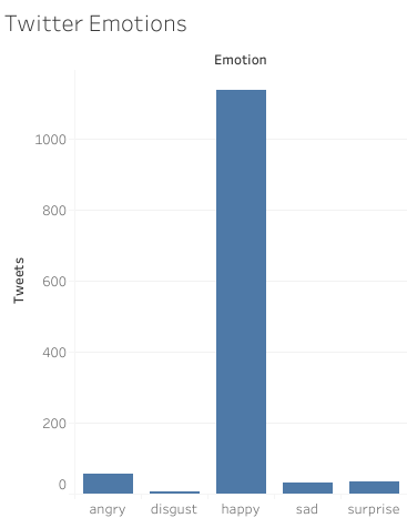
I settled on Twitter and searched for related datasets. I came across the following list: Top 25 Twitter Datasets for Natural Language Processing and Machine Learning, chose SMILE Twitter Emotion – “Ideal for sentiment analysis, this Twitter dataset contains over 3,000 tweets across a range of emotions including happiness, anger, outrage, sadness, and more,” and was taken to figshare to download the dataset. Here we were given more information on the dataset: “tweets mentioning 13 Twitter handles associated with British museums was gathered between May 2013 and June 2015. It was created for the purpose of classifying emotions, expressed on Twitter towards arts and cultural experiences in museums. It contains 3,085 tweets, with 5 emotions namely anger, disgust, happiness, surprise and sadness.” This is not what I imagined the dataset to be about but I’m all in at this point since the goal is to familiarize myself with the tool.
I never download info from unfamiliar sites, but did some research on figshare and they seem legit so I downloaded the csv file and dragged in into a new Tableau workbook and the fields did not populate as indicated in the YouTube tutorial. Again, adding vetted tutorials to the tools in the syllabus would have been helpful.
I played around and moved one item into a row and another into a column field and came up with graph. Not a riveting imagine which means I needed to do some data cleanup, like removing the “nocode” and other irrelevant columns which resulted in the more meaningful graph below where we can clearly see that the emotions expressed were overwhelmingly positive:
The data visualization is available on public Tableau.This assignment has whetted my appetite for exploring Tableau further.
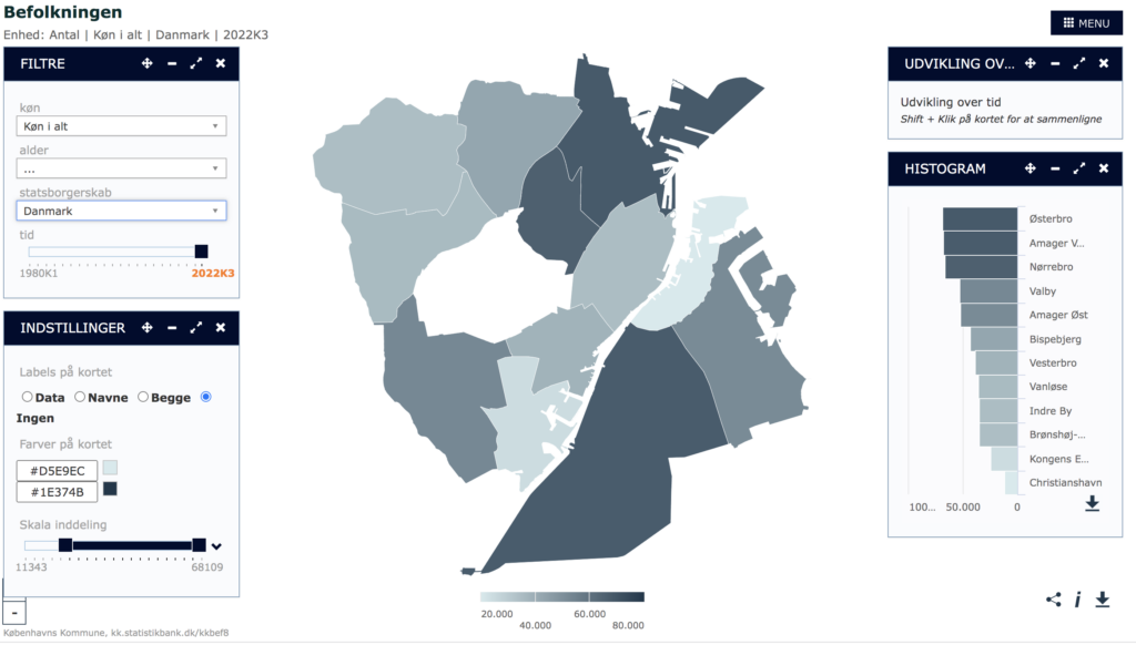
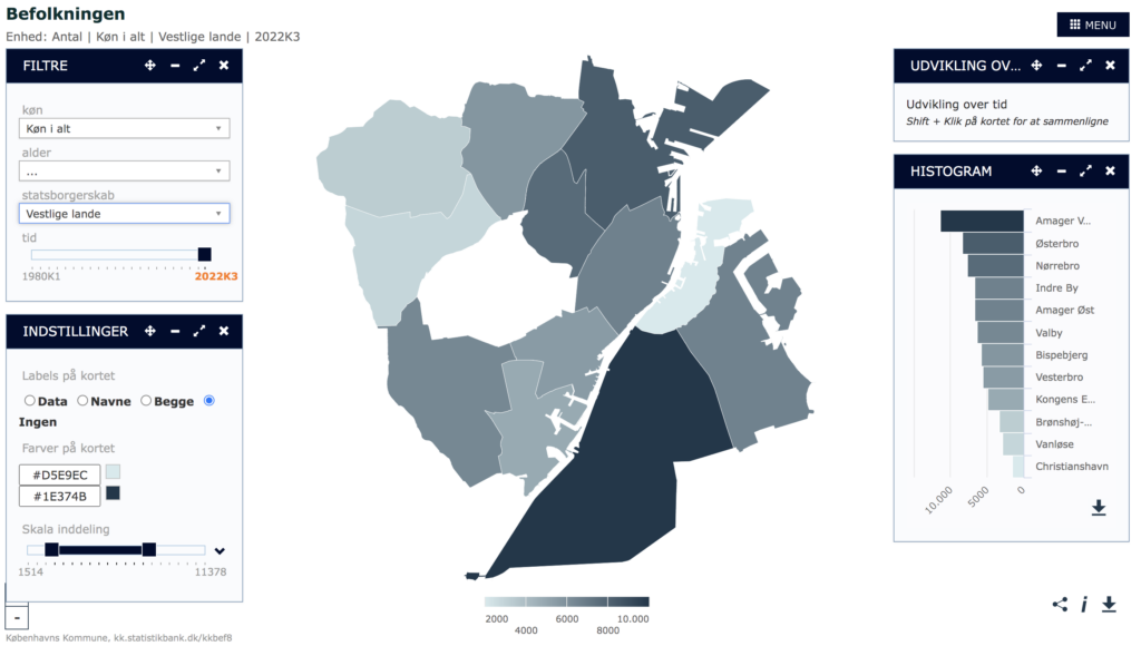
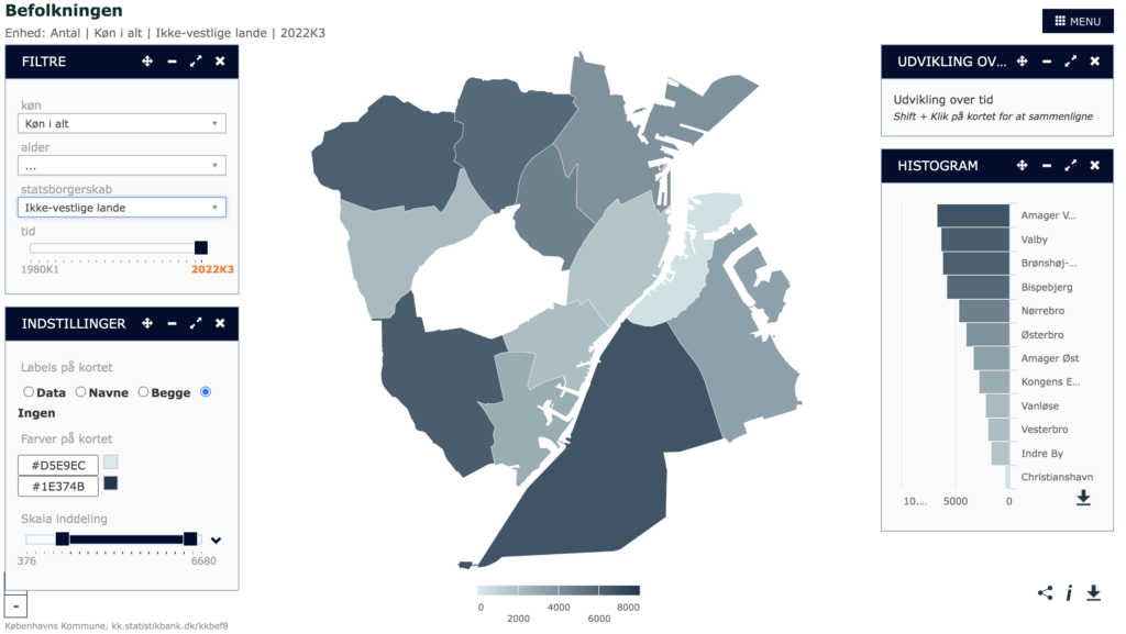
With this praxis assignment I wanted to explore mapping in the context of Denmark, and I thought it was a good opportunity to get more familiar with tableau as a program for mapping. In the following text I will reflect upon the process and some of my reflections.
I started by asking what is traditionally not mapped and found it interesting to explore the themes of borders in this case Denmark. On a map of Denmark borders are thick lines and come across as more permanent than they are both historically and for the people living around them. I became interested in a map showing the movement of people across borders, and tried to open up the understanding of borders as not necessarily only around a nation but a broader understanding. How can a map show both the big consequences and impact borders have on people’s lives and at the same time the fluidity of them? Are borders made by nations not people? Since I set out to work in Tableau I needed to find a dataset large enough to work to map out. With my experience in Tableau the data needs to be readable for the program and fit into how it is built. I started searching for already collected datasets which is something I have not done before since it has not been relevant for my work or studies. My search led me to realize there exists a lot of free datasets online both from New York and from Copenhagen. An exciting discovery as I found data sets about a wide range of topics. From datasets with different kinds of trees, air quality in New York and to how many new bike lanes are made in 2021 in Copenhagen. I actually found the dataset of three interesting and tried to incorporate it in tableau but unfortunately I found out that tableau doesn’t work with European cities in the same way as it does with cities within the USA. I could not just use zip codes and it did not recognize my multi poly location. It reminded me of one of our readings “Dividing Lines. Mapping platforms like Google Earth have the legacies of colonialism programmed into them” by Mayukh Sen. I realized that Tableau is not that easy to use outside Western countries. It made me reflect upon the tools we are using within digital humanities and if they are helpful in decolonization knowledge production or works in opposite ways? Mayukh Sen presents an argument of how Google Earth has the legacies of colonialism programmed into them. He further explains on Google Earth a lot of photos in Indias are blurry and not sharp and creates a link between colonialism and the way Google earth’s hireaky in selected countries. It makes me wonder if DH used tools have a colonialism programmed into them maybe without realizing? It suddenly makes the quote from Audre Lorde very literally: “The master’s tools will never dismantle the master’s house”.
As I search for a solution to my problem with locations in Denmark I come across a larger database from Denmark called “Danmark statistic bank” (the danish bank of statistics). There exist many different kinds of datasets from Copenhagen, some similar to what I have found from New York and others very different. One of the interesting things about both the differences and similarities in themes was the way it was framed. An example is the overall categories. NYC open data focuses on business, city government, education, environment and health while Copenhagen open data focus also on health and environment but also transportation, culture and sports. It does not surprise me that there are cultural differences, but it becomes relevant when these differences are the basis for mapping and data collection.
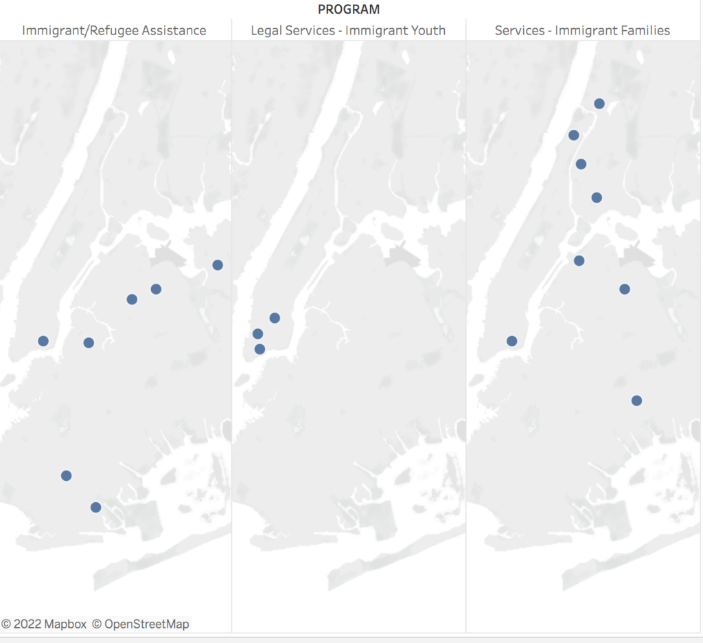
While I could not make the data work from Copenhagen with Tableau I ended up finding out that the Danish open data source has its own mapping program for visualizing the data. I have attached these because I found them interesting. They show what the city has categories people into as data: danish, western immigrants and other immigrants. I could continue talking about this matter and the way they divided people, but I will save that for another post. Luckily I did not find a similar division in the datasets from NYC but instead I found a list of locations if you as an immigrant are searching for assistance. Which I made a little map about. Not my intended idea but I got to work with Tableau and learn more about the program.
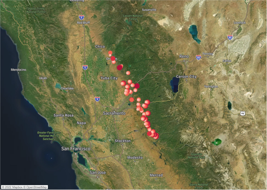
For my PRAXIS Mapping assignment, I have visualized a bird sampling dataset that I’ve found from the government’s open data website, data.gov.
About the data
A little bit about the dataset, published by the California Department of Fish and Wildlife:
“These data are summary statistics of abundances of birds counted within 100-m radius circles with 10-minute point counts at multiple sample points along 36 randomly selected watercourses in the foothills of the Sierra Nevada Mountain Range. Bird surveys were conducted between 25 March 2005 and 30 June 2005 along watercourses from Butte to Calaveras counties. These data represent 2,614 detections of 94 species at 144 different sample points along the 36 watercourses.”
Here are some pictures of Riparian Birds.
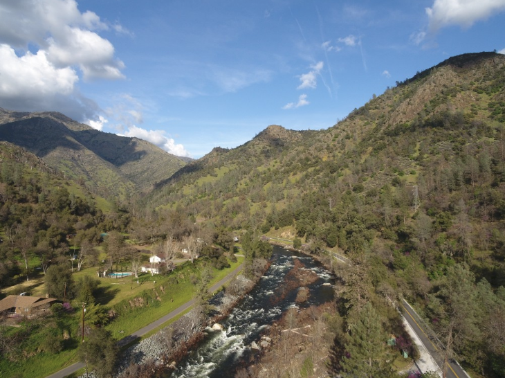
And a picture of Sierra Nevada Foothills:
Mapping exercise
I have selected the Tableau desktop tool considering it’s versatile, free, and available for Mac computers. The dataset is rather short and simple, it provides latitude and longitude coordination along 36 randomly selected watercourses in the foothills of the Sierra Nevada Mountain Range. This limited what I can do with the mapping visualization exercise. I first transformed the lat and long columns from the CSV dataset into Tableau’s geographic role data types. Then, I dragged these values to the X axis (columns) and Y axis (rows) respectively. I then dragged in “the count of sighting of the birds” with the “option” key down to express the sum of this variable. Then I played around with the mapping configuration to determine what map visual to show (satellite images, highways, city mapper, etc.). Lastly, I changed the scale and color of the data point to make them more prominent and legible.
It’s been a difficult week for me as I have been recovering from the worst possible Covid wave one could catch (sigh), however, I am now doing better and managed to spend some time completing the mapping task.
Below you will find a simple website I built as part of this week’s praxis assignment; please note that instead of creating a blog post with my experience here, I have decided to incorporate the narrative part, together with some key aspects of this small project, directly in the website (all very experimental for me I will admit!). I’d love to hear your feedback, so please reach out and let me know what you think!
Email us at [email protected] so we can respond to your questions and requests. Please email from your CUNY email address if possible. Or visit our help site for more information:


