
With this praxis assignment I wanted to explore mapping in the context of Denmark, and I thought it was a good opportunity to get more familiar with tableau as a program for mapping. In the following text I will reflect upon the process and some of my reflections.
I started by asking what is traditionally not mapped and found it interesting to explore the themes of borders in this case Denmark. On a map of Denmark borders are thick lines and come across as more permanent than they are both historically and for the people living around them. I became interested in a map showing the movement of people across borders, and tried to open up the understanding of borders as not necessarily only around a nation but a broader understanding. How can a map show both the big consequences and impact borders have on people’s lives and at the same time the fluidity of them? Are borders made by nations not people? Since I set out to work in Tableau I needed to find a dataset large enough to work to map out. With my experience in Tableau the data needs to be readable for the program and fit into how it is built. I started searching for already collected datasets which is something I have not done before since it has not been relevant for my work or studies. My search led me to realize there exists a lot of free datasets online both from New York and from Copenhagen. An exciting discovery as I found data sets about a wide range of topics. From datasets with different kinds of trees, air quality in New York and to how many new bike lanes are made in 2021 in Copenhagen. I actually found the dataset of three interesting and tried to incorporate it in tableau but unfortunately I found out that tableau doesn’t work with European cities in the same way as it does with cities within the USA. I could not just use zip codes and it did not recognize my multi poly location. It reminded me of one of our readings “Dividing Lines. Mapping platforms like Google Earth have the legacies of colonialism programmed into them” by Mayukh Sen. I realized that Tableau is not that easy to use outside Western countries. It made me reflect upon the tools we are using within digital humanities and if they are helpful in decolonization knowledge production or works in opposite ways? Mayukh Sen presents an argument of how Google Earth has the legacies of colonialism programmed into them. He further explains on Google Earth a lot of photos in Indias are blurry and not sharp and creates a link between colonialism and the way Google earth’s hireaky in selected countries. It makes me wonder if DH used tools have a colonialism programmed into them maybe without realizing? It suddenly makes the quote from Audre Lorde very literally: “The master’s tools will never dismantle the master’s house”.
As I search for a solution to my problem with locations in Denmark I come across a larger database from Denmark called “Danmark statistic bank” (the danish bank of statistics). There exist many different kinds of datasets from Copenhagen, some similar to what I have found from New York and others very different. One of the interesting things about both the differences and similarities in themes was the way it was framed. An example is the overall categories. NYC open data focuses on business, city government, education, environment and health while Copenhagen open data focus also on health and environment but also transportation, culture and sports. It does not surprise me that there are cultural differences, but it becomes relevant when these differences are the basis for mapping and data collection.
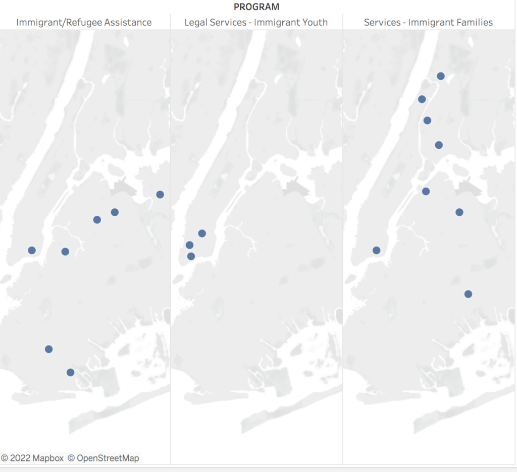
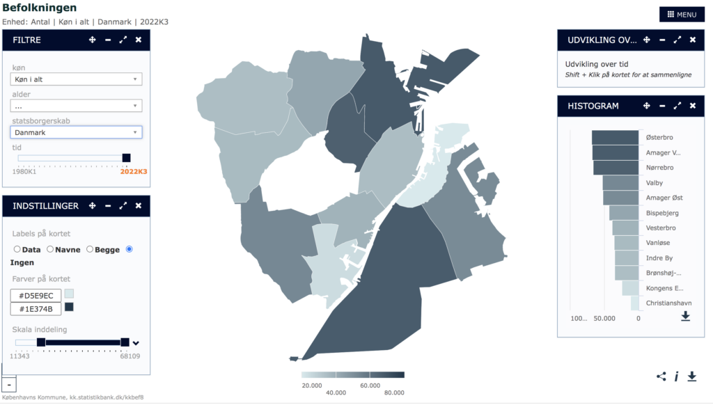
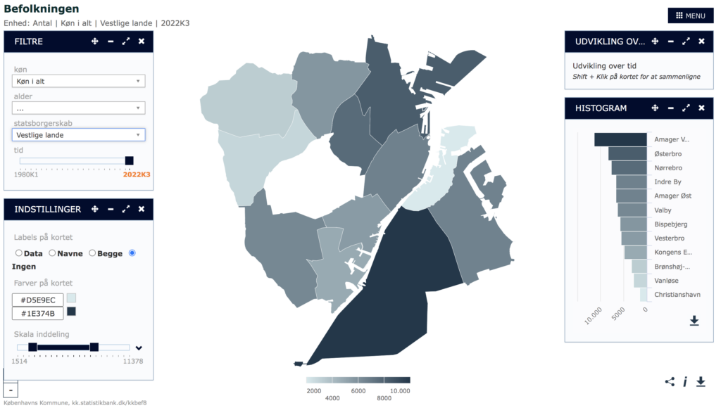
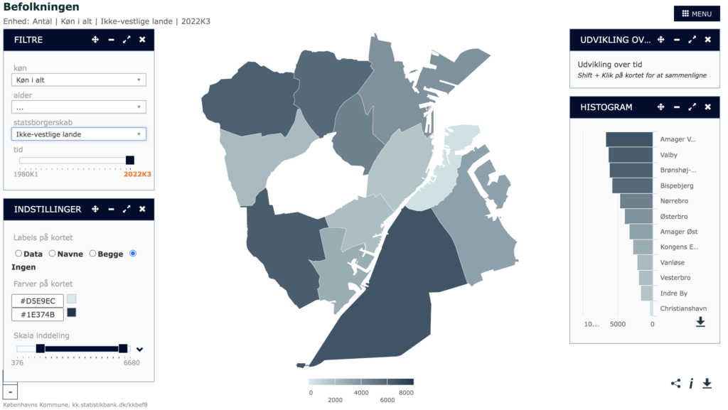
While I could not make the data work from Copenhagen with Tableau I ended up finding out that the Danish open data source has its own mapping program for visualizing the data. I have attached these because I found them interesting. They show what the city has categories people into as data: danish, western immigrants and other immigrants. I could continue talking about this matter and the way they divided people, but I will save that for another post. Luckily I did not find a similar division in the datasets from NYC but instead I found a list of locations if you as an immigrant are searching for assistance. Which I made a little map about. Not my intended idea but I got to work with Tableau and learn more about the program.

This entry is licensed under a Creative Commons Attribution-NonCommercial-ShareAlike 4.0 International license.
Ben,
I like the questions that you bring up in your post regarding whether the tools we use in DH also have a colonializing aspect to them as Google does in India, for example. These are concerns that I thought about as well. I like your Audre Lorde quote too.