
As Alan Lui laid down the gauntlet for cultural criticism, so has Johanna Drucker laid down the gauntlet for information visualization. Equivalent to a guardian watching her charge run into a children’s shop and indiscriminately grab every “toy” within reach, Drucker forcefully puts a time out to the situation insisting on a pause and a reflection of what is the situation is, where we are and what are we doing there. The approach to graphical display that has been taken from the harder sciences is, according to Drucker, “a trojan horse” that will subvert basic tenets of the Digital Humanities enterprise, which is, as the names implies, a humanistic science. She makes a strong argument for changing direction on how we approach our visualization of capta, which is a stronger reminder of the subjective nature of how we in the field acquire ‘data.’ I think this call to action is relevant and bring the field back to stated endeavors of humanistic, cultural insights which require an individual, with their own agenda, to collect. Data has to be interpreted as well as collected and is not ‘out there’; it is subjective. After she discusses the three components that are fundamental to a ‘perspectival position,’ she gives examples. It is here that I started wondering why in all of the example she frequently starts off with the emotion of fear and anxiety. Those are emotions start with I kept thinking. Why those? Another question that arose in my mind was whether she wasn’t doing what she was cautioning about. Graphically visualizing data in the humanities is to bring the issue to liven up some more insights and add a relevant point to the conversation. Yet, in her example, I wondered when can an experiment designed to show temporality be useful by having the experiment measure the people’s conception of time while standing at a bus stop? I wanted an example to help anchor or solidify the concept, but it didn’t come. Are we reducing the idea too much? By zeroing in on the parts to minutia, are we losing the magic. Literature, philosophy, art have something that is more than the sum of the parts. Discussing the parts if, of course, very useful and relevant, but the overall picture is what is the end goal. Dissecting them to individual parts is the area of other sciences, equivalent to a neurosurgeon explaining the human soul. That’s a wrong venue. Do we do an injustice to the work if we go too far, or possibly even run into a danger zone? This is as relevant to a novel as it is to a group as Guiliano and Heitman point out regarding gathering indigenous data. Perhaps there is a limit to how far we can tread. As it is unacceptable to indiscriminately gather items without consideration to the subject, which in an indigenous population means respecting their traditions of what is shareable and what is not, so it is in some other areas like a novel or work of art. Being culturally sensitive, I think, needs to apply here as well. Drucker has laid out a position that is impossible to ignore. Unless we heed her insights as foundational elements for graphical work, DH will have a stomach ache like that child who just gobbled all the candy they saw in the shop before a guardian changed their direction away.
Monthly Archives: September 2022
Hunting the Abuela’s Tools, Unseen Emeralds and My Red Bike that was stolen while I was doing this work:

While I was reading Johana’s Drucker piece “Humanities Approach to Graphical Display” (2011) I kept thinking about what it would entail or how would it look to create an affective display of information –that is, a graphical space where a reader not only encounters a relational and semantic set of information, but a graph that also produces an effect, a bodily response, a graph that has an affective outcome[1]. She discusses this with the example of the display of time vs. anxiety. In one graph, time is its own independent variable, quantified by hours, which is contrasted with “mood”. There’s (as usual) a line that records the ups and downs of what one assumes to be a person response to a particular event.
But, on the other graph, time is not a rigid set of hours but rather is seen as “perceived time”, precisely because anxiety states change or disturb how time is experienced. With this humanistic approach one can appreciate in the graph how the two variables are not constant and predictable entities; actually, they are embedded in a messy relationship constantly affecting one another in a non-linear direction. This is very important since at the root of our realistic ideas of time and space there’s the assumption that phenomena in the world is made up of data ready to be collected by an observer-independent subject. Drucker argues that a humanistic approach to graphical information challenges this assumption and instead promotes the idea that world phenomena appears as capta embedded in complex and chaotic networks which in turn are interpreted by “observer-codependent” subject. Furthermore, this interpretation act is “characterized by ambiguity and uncertainty, as the bases on which a representation is constructed”. Therefore, a graphical space with a humanistic approach should label temporality as a ‘factor of X’ –X = perceived constructed capta that influences a perceived ‘temporality’, just like anxious states affect how time passes by on a given particular ‘moment’ by a particular individual.
To explain the codependency of the observer and capta she mentions Werner Heisenberg and his theory of uncertainty and explains that the relationship between phenomena and observer is not equal in measure but nonetheless its affected by it:
“Phenomena and their observers are co-dependent, not necessarily in equal measure. A viewer gazing on a sublime landscape or recording migrations at a large scale may be more affected by the phenomena than the phenomena is by the observation. Theoretical physicist Werner Heisenberg never suggested that the relation of intervening observer and effect on phenomena were symmetrical, merely that they were codependent, when he introduced the concept of uncertainty in the early 20th century”
Drucker, 2011, pg.5
All of this seems to be extremely relevant and resonates deeply with how, when, and why I did this visualization assignment. Or, rather, tried to do this assignment. I divided my exercise in three objects or capta that I’m currently chasing: my Abuela’s tools from a series of families photographs taken between 1970 and 1996 in Boyacá, Colombia; an emerald (perhaps groups of emeralds) that I’ve never seen but one of which currently lives at the American Museum of Natural History and was extracted from a mine located in the same territory where my Abuela was born and raised, and last but not least my Red Bike that was stolen outside of the Graduate Center Library while I was doing all of this. I think I would like to bring this three capta in place at the same time here, to follow Donna Haraway’s idea of multispecies storytelling and the necessity of a codependent observer looking deeply and interacting with the knottings – all of those entanglements that are produced in these complex webs of relationship building and world-making occurring not just wiht other human beings but rather with all capta that we perceive, affect and are affected by [2]. Perhaps is like Octavia Butler said:
“All that you touch you change. All that you Change changes you”…
I. Abuela’s Tools

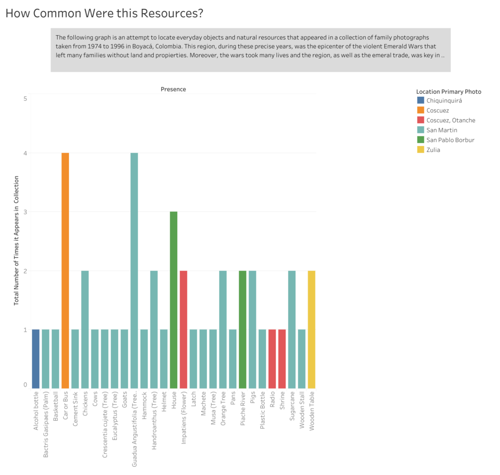
There’s a family collection of 25 photographs taken between 1974 and 1996 around one of the most important sites of emerald extraction in the world, Boyacá, Colombia which happens to be the place were my family is from. I’ve collected the photographs in Omeka and organized them according to ambiguous criteria that came up while doing interviews and asking about the photos. This criteria was selected by the individuals in the photos, as well as the name and the date. I’ve recorded information about location, number of people that appear in the photo, dates, what were the women’s job at the time/temporality of the photo (which I grouped according to certain categories, see below) objects present in the photo and natural resources identified by the individuals present in the photo. Finally, I also grouped what kind of ‘scene’ these photos where depicting, or rather, what kind of landscape, which was also something that came up while doing the interviews. The collection of photos were taken casually sometimes anonymously and without any clear intention other than personal/family documentation. However, within the larger context of Colombia’s history the photos take an important role and are part of an oral memory exercise that could (I hope) visualize the transformations that occurred in the region as the farmers were abandoning the traditional forms of labor, mainly agriculture, in favor of the mine work and the rush of the emerald extraction.
Ambiguos Criteria – Objects, Women’s Labor and Landscapes
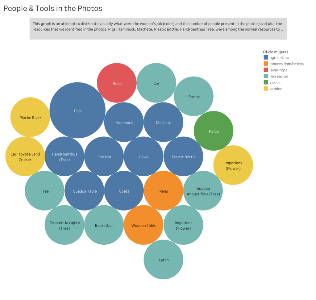

With this “Ambiguos Categories” it could be interesting to explore (if there was more capta/photos available in the collection or even better from other’s people collection) how/when/where the radios were used, in what type of scenes, who used to own this kind of object in the region and with what frequency was seen. Also, very important, dates in which it started to be more frequent.
II. The Unseen Emeralds
The other side of the story of how some objects or natural resources were abandoned within this context in favor of other kind of resources and objects is part of a wider history of emerald extraction in the world. As it is normally the case with many natural resources, the ten most famous and priced emeralds of the world are not in the hands of the people of the region originally taken from. One of this emeralds, comes from the Chivor Mine (Boyacá, Colombia) and currently lives in the American Museum of Natural History in New York. How did it got there? Who “donated” it? And under which circumstances? Are all very interesting and important questions not just for a humanistic approach to capta, but also for a decolonization of museums.
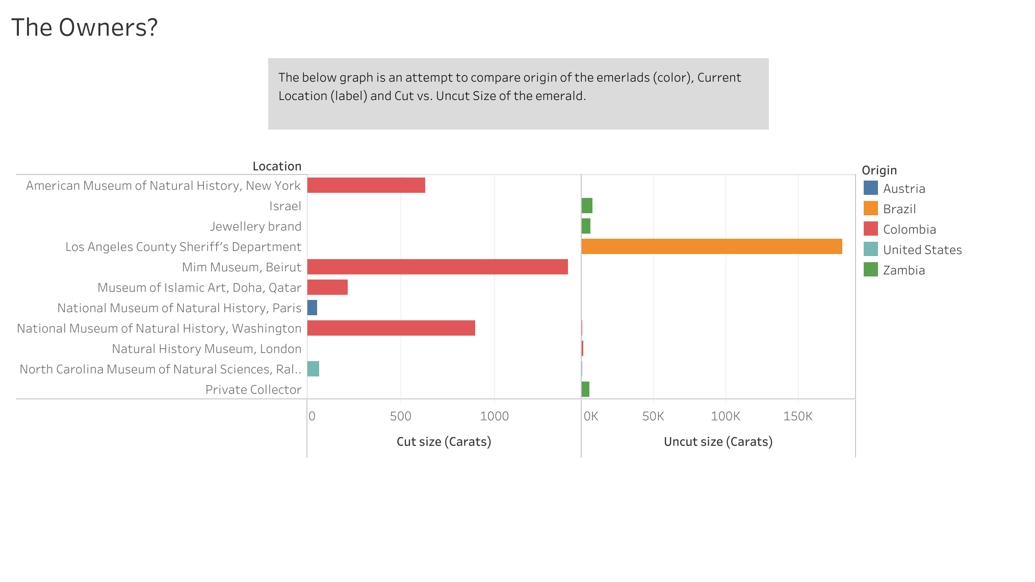
Patricia Emerald

III. NYC Open Data on Bikes…
I had too many problems trying to come up with visualization using this photograph collection. So, given the situation in which this work got interrupted: my bike being stolen, I decided to use NYC Open Data on Bikes.
To be continued…
DATA VISUALIZATION: can graphs and charts be (part of) literature?
POINTS OF DEPARTURE:
This week’s readings highlighted the visualizer’s responsibility in data selection, data vetting, and data contextualization. The authors investigated the uneasy intersection of humanities (&. humanities practices) and the assumption of data (and its presentation) as objective facts.
Especially inspiring for my praxis assignment was Drucker’s text, which critiques this intersection by imagining new forms of visualization that blur the binaries inherent in producing the foundational grids (x and y axis) of common visualization formats. Drucker also proposes replacing “data” with “capta” (to highlight the fact that the information is captured/taken), and this conceptual shift allowed me to explore the fragile distinction between data I can capture and data I might not be able to capture. Or, in other words, it allowed me to ponder what is mappable and what is unmapplable.
Additionally, McMillan Cottom’s critical look at “distant reading” and the problems of literature and media reduced to content that can can be mined for data, made me curious about integrating data visualization into literary forms. Can data vis be literature? Or does it have to be about literature?
Finally, Manovich’s distinction between Information design (as a disciple that works with clearly structured data and wants to make that structure visible) and information visualization (as a maneuver that seeks to “discover the structure” of a data set) made clear to me that the act of probing for connections and patterns in data is replicated in fiction and literature in the sense that we (readers and writers) seek to understand the emotional logic that governs human behavior. (i.e.: What makes a character tick?)
These authors’ thoughts in conjunction with my experience with mapping last week —when I worked with public data that brought up more questions about its generation than anticipated and ultimately helpful— led me to explore visualization with a small, self-generated data set connected to a creative project I am working on.
THE PROJECT CONTEXT:
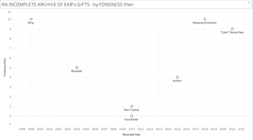
…is a PowerPoint presentation called An Incomplete Archive of EAB’s Gifts. It traces the trajectory of a 20 year relationship through the lens of gifted objects and is presented by the person who received and archived the gifts.
On the level of form and genre, the project explores how fiction and memoir can make use of software tools developed for business to create story and, more so, how this M.O. can introduce new ways of revealing the inner lives of characters and the narrator.
I am using data visualization to add charts and graphs to the existing ppt slides. So, in the remainder of the post, I’ll focus on that aspect. If you’d like to see whole project: An Incomplete Archive of EAB’s Gifts_ DATA VIS.pptx
THE DATA SET:
The person who received the gifts is ostensibly the creator of the ppt and of the data set.
She catalogues the gifts by “item” and “occasion” for the gift. (E.g. star crystal, birthday. Further, she notes the “year” the gift was received, and then, crucially, her “feeling of fondness” for the item at the time she received a gift (“fondness then”) and her feeling of fondness for the item now, at the creation of the ppt, after the end of the relationship (“fondness now”). She choses a scale she’s familiar with: 0-10 (no/low fondness – maximum fondness).
THE DATA VISUALIZED:
Since the data visualization works in tandem with the larger ppt slideshow, text labels for the gifts are sufficient to get across the meaning. They are actually preferable to “direct visualization”, since the project presupposes the reader’s encounter with the corresponding gift-images and context in the ppt.
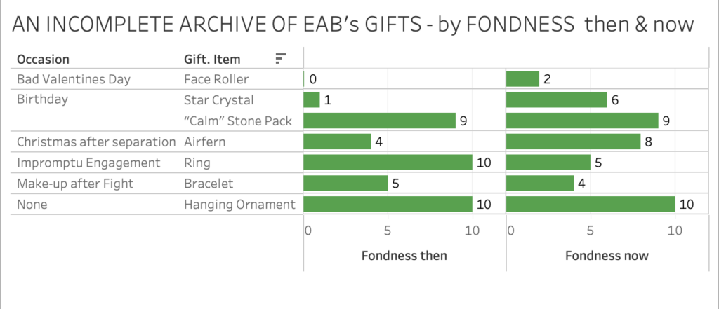
The difference between “fondness now” and “fondness then” lets her and us see how some items have lost emotional power, while others have maintained or increased their power as keepers/locus of memory and affection.
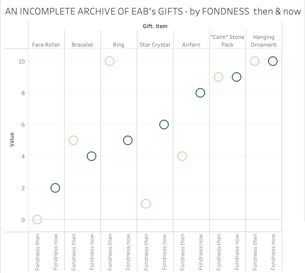
She can ponder what endings and losses do to the emotional charge, and trace how the story of her relationship moved through various states and escapes a single genre. IT wasn’t more drama than comedy. Overall the archive and its context becomes a tribute to her partner as well as their whole shared time. It is their story. (One version of it.)
WHAT I TAKE WITH ME:
As I get familiar with what Tableau can do, I am discovering more ways of correlating data points and interpreting and contextualizing the results in relation to a narrative project I am working on. I would like to continue to experiment with adding additional data, like: how often did the narrator interact with the object in the last year? Dollar value of each gift? etc. and see if subplots emerge from new visualized correlation.
Overall, I am also intrigued by the possibility of counterintuitive and absurd maps to undermine un-investigated trust in visual data presentation. Integrating data vis into fictional narrative could be a way to undermine reflexive trust in data.
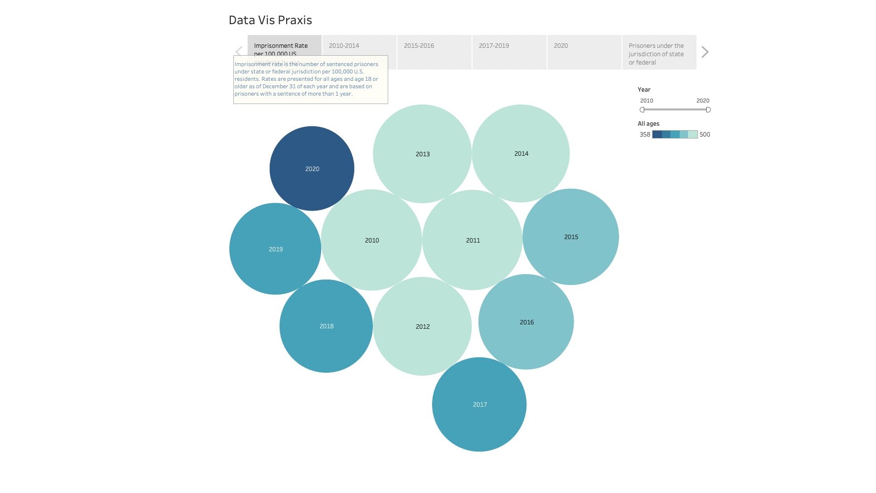
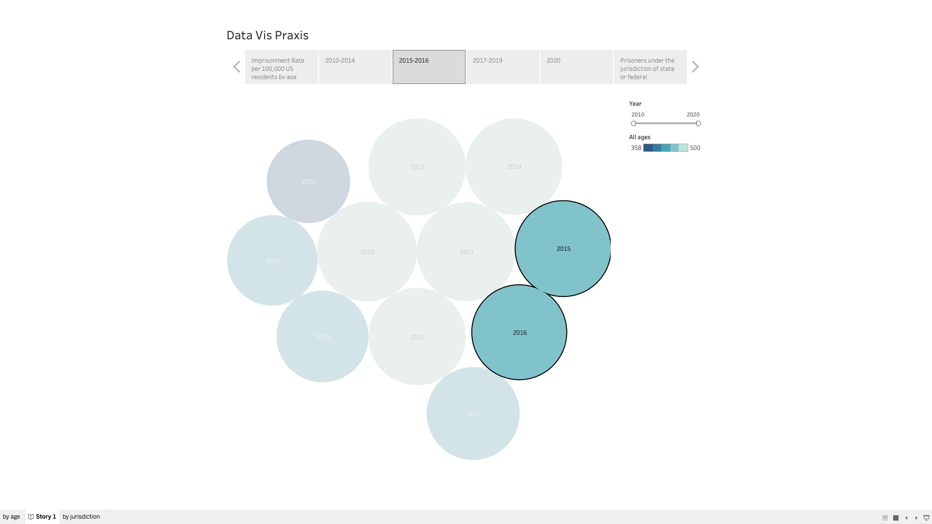
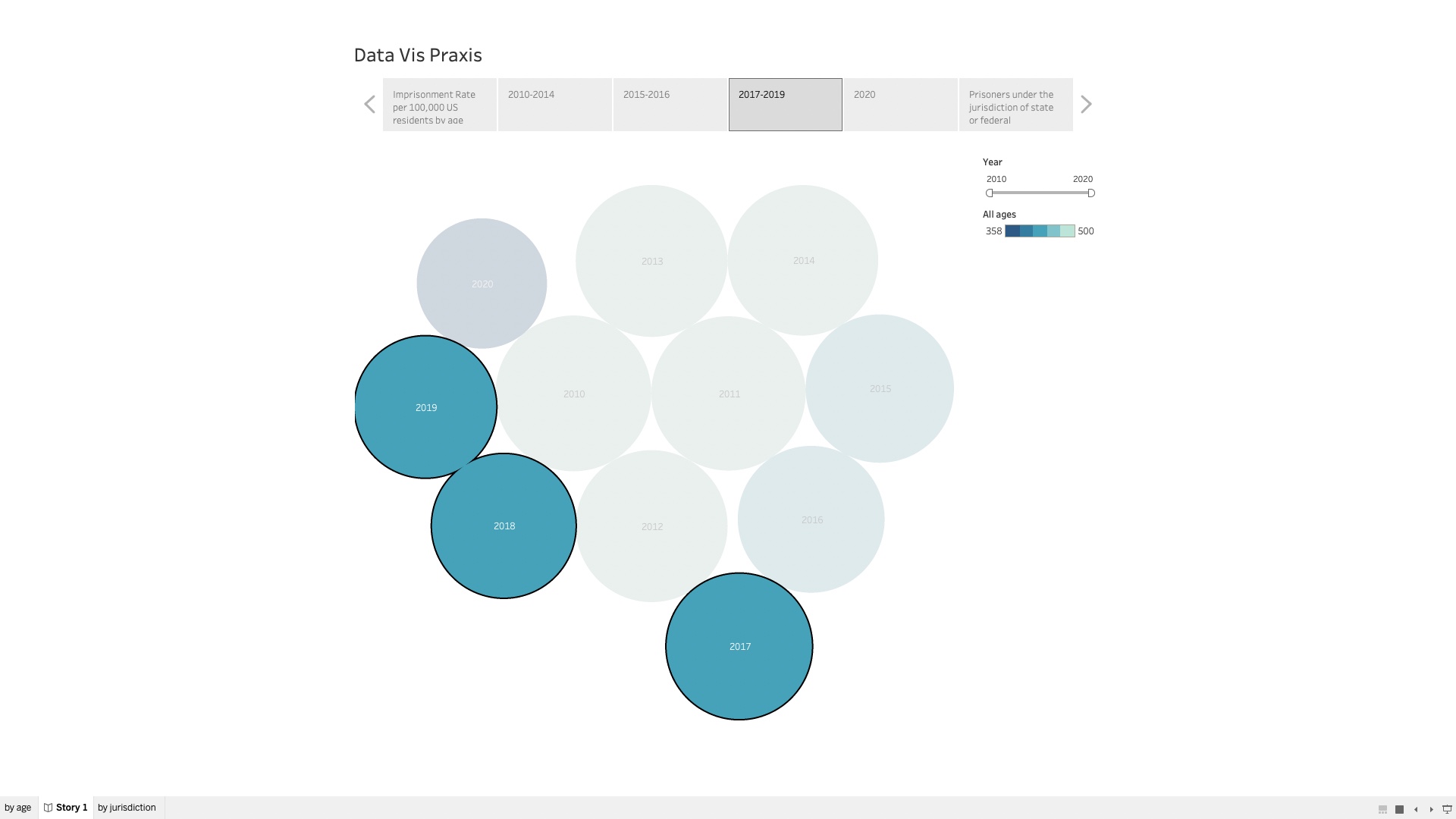
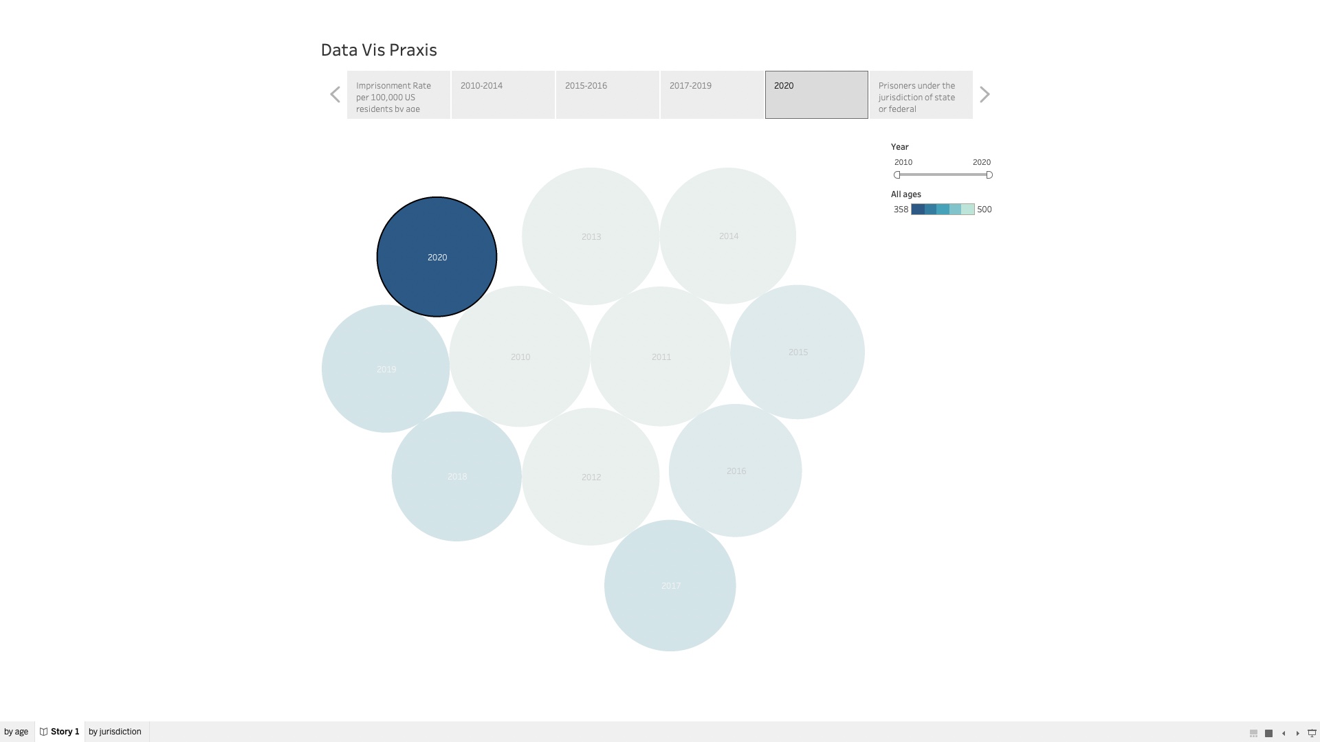
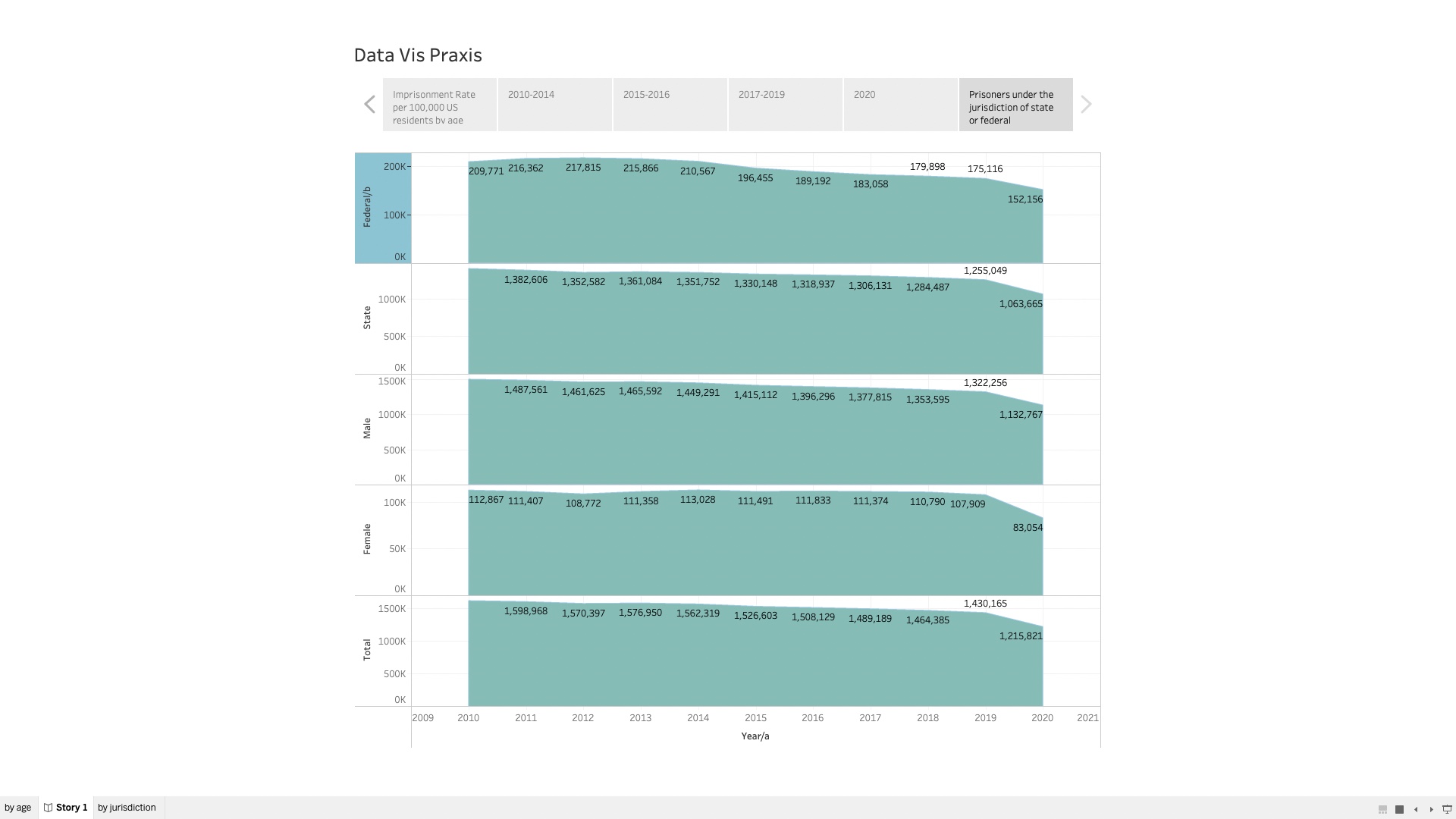
Prison Industry -DataViz Praxis
FYI—-I created a Tableau Public and when I tried to share it was not sharing both sheets so I ended up after many hours saving it to the Tableau Desktop. I included screenshots and if I can figure out how to share via a link or can share on the screen in class, I will. Until then….
To complete this assignment, I pulled some general data sets from the same area of interest- the profits of the prison industry. I have read a lot this past week on the prison industry, spurred by my original curiosity of cost of telephone and video visits in correctional facilities. This is a topic that I am going to continue to research and acquire data about the real criminal of society- corporate and government greed.
This was my first Tableau experience and it took me a bit to get the hang of it (still getting the hang of it) but I really enjoyed using it to have the opportunity to display data in a vibrant way. I did sign up for the student free account but still working through figuring how it works and if it pairs with Tableau Public.
I created a viz using data from the Bureau of Justice Statistics, National Prisoner Statistics, 2010- 2020 for Prisoners under the jurisdiction of state or federal correctional authorities, by jurisdiction and sex, 2010-2020.
The data source for Imprisonment rate per 100,000 U.S. residents, by age, 2010-2020 was also Bureau of Justice Statistics, National Prisoner Statistics, 2010-2020; and U.S. Census Bureau, postcensal resident population estimates for January 1 of the following calendar year.

Praxis Data Visualization WW2 Fallen, and the politics of today.
Preface: I come from part of the world that is steeped in history and that history be it good or bad may drive the politics of today. That world is Soviet Union, or rather was. I was born in Kyrgyzstan one of the republics that constituted the “great” last true colonial empire of the Eurasian steppe. As the old saying goes Demographics is destiny.
When the Soviet Union collapsed into 15 different republics, Russia population stood at 148 million people in 1991 and now in the year of 2022 the population of Russia is about 146 million people and that is despite the immigration into Russia and all the incentives of the Kremlin to boost that number. Population is stagnant and is getting older and the demographic pyramid of Russia looks like a dried Christmas tree rather than a true pyramid. Putin always said that demographics is one of the things that keeps him at night and I am not exaggerating. This types of statements have been said by Putin on numerous times. He always said that there are millions of “Russians” (Russians and Russian speakers) outside of Russia that have been unjustly separated by history and he seeks to correct that mistake. Demographics drives him.
Putin is the leader of Russia that was born right after the WW2, his own father fought in the war. He knows acutely that it was this war that shapes modern Russia. The main holiday 9th of May is a testament to that with all of the pomp and the military parade (not many people know this but military never marched on the 9th of May during the Soviet Union, they marched on October 7 the day of Russian Revolution). He sees the sacrifice of the Soviets and demographic echo that still reverberates in Russia as a great motive to undo the damage of the WW2 that is still being felt. Putin as an amateur of history knows that demographics to him is destiny, and to rule an empire he thus needs more people. 146 million is not enough, and that is why needs Belarus and the crown jewel Ukraine. The events of today and important aspects of politics of Putin can be explained by the below data visualization.
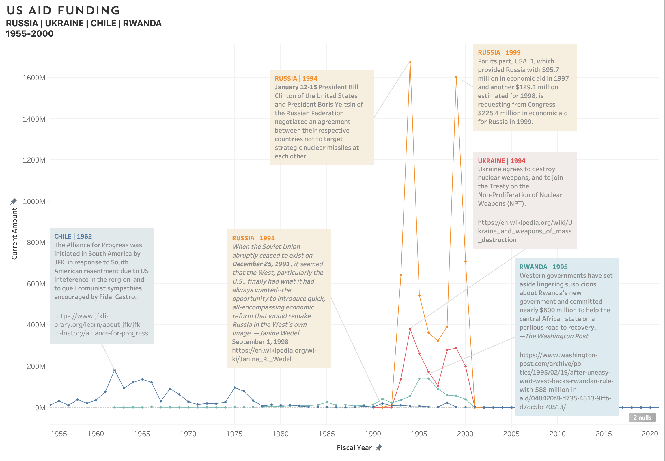
Aiding and Abetting
For my Data Visualization Praxis my primary goal was to gain awareness of the Tableau platform. Below is an outline of my process including the challenges and understandings that emerged.
WHAT TO VISUALIZE
Given that I went in primarily concerned with the technology not the content, it was a bit difficult to narrow down or understand what kind of data would be best to visualize. I found myself ambivalent about most of the data sets I ran across and even tested out a few to see if they might sing to me once loaded in the program. They did not. Without a personal connection or familiarity with the questions the data inherently touched on, I couldn’t formulate a need to visualize it. I am studying race and politics in antebellum US at the Grad Center this semester as well, and my first thought was to visualize key events in the evolution of the various iterations of the anti-slavery movement or the birth and evolution of the Republican Party. In the end, I didn’t feel I had enough data to map the central ideas properly. As a bit of a quirky middle ground, I chose to parse US AID* funding between 1945 and 2021, available on the US Aid website. The data set inherently incorporates US and world history which I find very engaging.
HOW TO VISUALIZE
The data set is quite large (funding from 1945-2020 to almost every nation in the world), and I knew that including all aid over that vast period of time would be overwhelming I knew I wanted to compare and contrast a few nations, but which ones? Ukraine and Russia came to mind because of current news. I included Rwanda, because I assumed there’d be data around the civil war. And Chile. Why Chile? I wanted to hop over to another part of the world, I knew the US had interfered quite heavily in the region, and, well, my husband’s family is from Chile. I chose a color coded line graph, because I wanted to compare and contrast the rise and fall of aid to these. US Aid lists its funding in both current currency values and set as a constant value. I chose to show dollar amounts in current values to make it more relatable, but ideally I would be able to use Tableau well enough to allow for a reveal of the secondary amount for any given data point.
When I noticed that not much money was given to any of these nations until the 50’s, I shorted the displayed timeframe. Unfortunately, the data between 2000-2020 will not load, despite it being included in the data set. This has been particularly frustrating, because the data during that period is sure to reveal heightened activities by the department and reflect global conflicts and major shifts in US foreign policy.
NOW WHAT
After plotting the points it was interesting to the emergence of peak years of funding —making me curious about what events, political environments, and policies impacted the amount of aid. This, for me, is where the fun really started. I researched each nation and was able to determine various events that may have impacted the time and amount of funding. I do recognize the limitations somewhat cursory research, and don’t present it in itself as any form of deep scholarship well rounded theory. In fact, more questions about policy, US and International geopolitical strategies before and after the graphed points, and the impact of the aid quickly arose. The sources I used to look into each point included the JFK presidential memos housed at the presidential Library, government websites, political science think tanks, and even wikipedia—all presenting information in their own formats and from various points of view. From reading the notes taken when JFK spoke with the Rodríguez, then president of Chile, to dry government reports and summaries of aid and newspaper articles adding flavor—they all gave different impressions of the events at hand.
RAISE FROM THE DEAD
Being inside of a Data set is a charged experience. There are many perspectives and stories that are hidden in the points, and I found a strong desire to reanimate the numbers with the information about the events and motivations behind them— to add water to the dehydrated goods. With this in mind, I decided to annotate all of the peaks with a quick note regarding what I had found in my research. I did this knowing that what I chose to include in the annotations would be incomplete—but I viewed this step as an invitation to the audience to question, amend, and correct the theories I posit related to the peak funding years.
——————
*US AID MISSION STATEMENT:
“On behalf of the American people, we promote and demonstrate democratic values abroad, and advance a free, peaceful, and prosperous world. In support of America’s foreign policy, the U.S. Agency for International Development leads the U.S. Government’s international development and disaster assistance through partnerships and investments that save lives, reduce poverty, strengthen democratic governance, and help people emerge from humanitarian crises and progress beyond assistance.”

PRAXIS: School Shootings in America 1970 – Present
From the previous PRAXIS assignment, I wanted to use a data set that is much larger and has a greater impact on the feeling when you visualize it. I chose the data set of school shootings in America (the land of the free), not only did it hit my pinpoints (unfortunately) but it has and forever will be an important topic for centuries. The data set from K-12 School Shooting Database was kind enough to have the data open upon request.
Listed below is my thought process on all visualizations:
- For all visualizations, I wanted the primary color orange which is the universal gun awareness color (orange crossed ribbon). The pie chart was the only outlier and I chose a rainbow color palette purposefully to signify the oxymoron of “Schools being a safe place”.
- One or two median visualizations are required for others to understand the data set if first glancing at it + one/two visualizations that I found interesting and wanted to bring attention to.
- Make sure to include the Null to show that there will always be inconsistencies with data no matter how great it is.
- There was a vast difference in the quarter that the school shootings took place. Following is the total number of incidents per quarter from 1970-2022; Fall (718), Winter (586), Spring (556), Summer (252), and Null (11). The highest amount of incidents took place during the Fall which made me think of the term “Holiday Depression” does that have something to do with the incidents? (I wish there was a column on the mental illnesses that the shooters had if any)
- My closing thoughts: My condolences to those (victims and families) that had to go through any of these situations. Thank you to the K-12 School Shooting Database for inputting all of these incidents for others to represent and bring awareness to these matters; if anyone would like to donate to the Database you can through here. If you have any comments or thoughts please share them.
Header: Criminal aiming gun camera, threatening burglar at victim istock photo
Distant reading of Mary Shelly’s “Frankenstein”
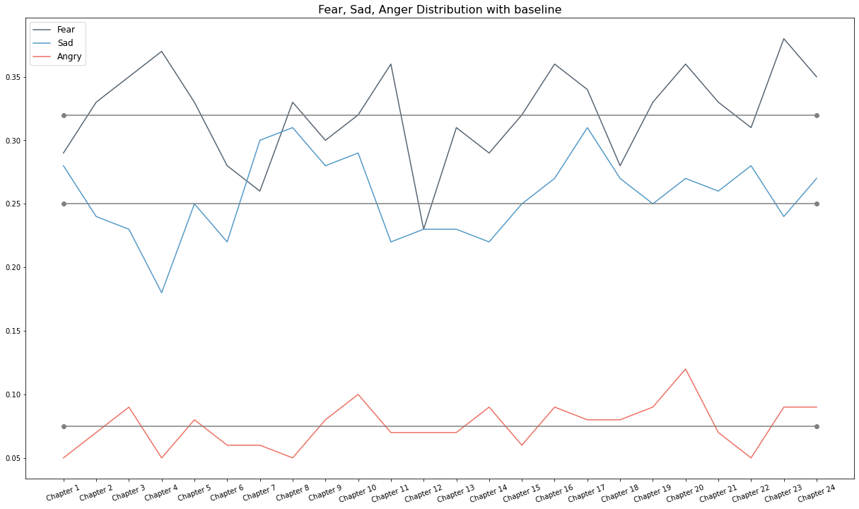
Franco Moretti’s call for abandoning close reading caused a stir in literary scholarship. Moretti’s intention was to leverage big data to find hidden patterns. This is extremely controversial for assessing a complex state like emotions. What is an emotion? Emotions are psychological states that are unique to each person. “Emotions are defined in various ways depending on who you ask.” – Gendron, 2010. Then how to quantify emotion or is it even possible to quantify emotion? In the world of AI, chatbots, and metrics, how do machine understands emotion? Is it even ethical to use machines for quantifying emotions?
Nevertheless, I have chosen “Frankenstein” by Mary Shelly for this visualization to explore distant reading and analyze emotion to show the masterpiece through the lens of computational analysis. A dictionary-based approach has been used for this purpose. A dictionary is equipped with words and their classified emotion. Texts are prepared, preprocessed, and cleaned using python libraries. The Texts are parsed into word tokens and classified based on the dictionary to generate emotion scores.


Praxis Mapping: Native American Nations in New York State
Software Used: Tableau
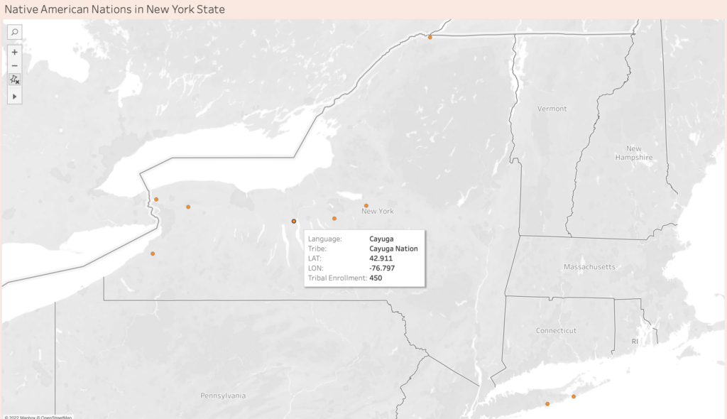
About this Map:
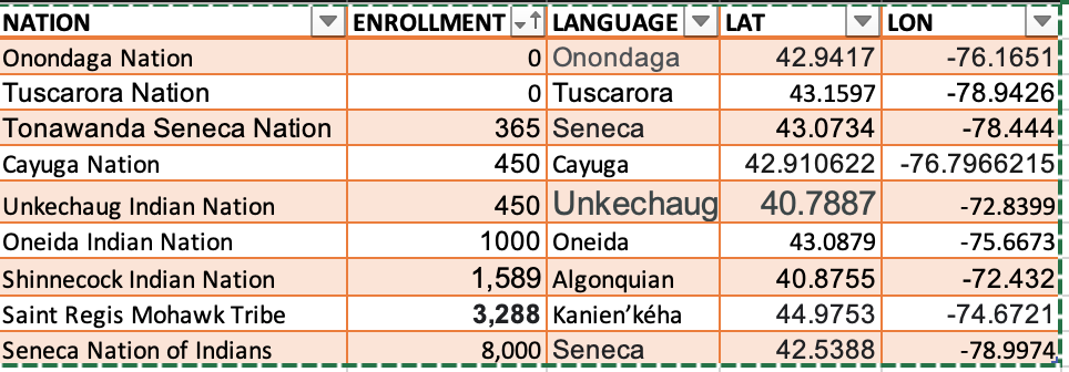
This map represents the nine state and federally recognized Native American Nations in New York State. On this map, I also include the language they speak and the total enrollment number for each tribe. The Tribal Enrollment Number was based on the tribe’s websites.
- Cayuga Nation
- Oneida Indian Nation
- Onondaga Nation
- Saint Regis Mohawk Tribe
- Seneca Nation of Indians
- Shinnecock Indian Nation
- Tonawanda Seneca Nation
- Tuscarora Nation
- Unkechaug Indian Nation
Source: https://www.dec.ny.gov/public/974.html
Process
In recent years, I’ve been interested in learning about my roots and ancestor. When I received my DNA results from Ancestry DNA, I was excited to learn where my bloodline came from. I always knew I had indigenous DNA since I was born in Nezahualcoyotl, Mexico. However, when I read that I had 68% Native American DNA from Central Mexico and 1% Indigenous Americas—Panama & Costa Rica, I felt a new sense of pride and identity. In my family, we never spoke about being indigenous or Native American. However, we embraced our culture and heritage. In the same sense, I felt I had the duty and curiosity to learn more about the Native Americans living in New York State and the Americas.
“Difficult Heritage and the Complexities of Indigenous Data” by Guiliano, Jennifer, and Carolyn Heitman reminded me that we must honor our ancestors and accurately preserve their culture, heritage, and artifacts. The people who handle this data must abide by rules and regulations created by the tribes to keep its authenticity and accuracy. Therefore, I went to the tribe’s website instead of the Census when gathering this data. As I was searching on the internet, I came across the following article: American Indians and Alaska Natives Living on Reservations Have the Highest 2020 Census Undercount.
Challenges:
- I could not get the total enrollment for Onondaga Nation and Tuscarora Nations since it was not on their website.
- I did not know how to read the My Tribal Area website (United States Census Bureau), since the population included people not enrolled in the tribe. Based on the articles above, I don’t know if I can trust this website to represent tribal information.
- Lack of time to learn Tableau
Data
My Questions
Who decides that a Native American Nation is recognized (state and federally)?
Why is there limited information on Tribal Enrollment?
Why are some Nations hesitant to partake in the Census?
What other Nations are in NYS that are not state or federally recognized?
Why are tribes undercounted in the Census?
Resurrecting Barthes’ Dead Authors
I want to write this week about the very interesting piece we were assigned by Tressie McMillan Cottom, “More Scale, More Question: Observations from Sociology.” There’s a lot to digest here and I understand the scope of this article is about sociology’s sway towards quantifiable research and how that parallels what DH is driving in the humanities. However, I found myself writing my largest annotation yet in this class when I encountered the quote about a TV show I’m well aware of but have never seen:
For example, is a character on Grey’s Anatomy “black” because I interpret him as black, or because the show’s writers write the character as black, or because the actor playing the character identifies as black?
Tressie McMillan Cottom, “More Scale, More Questions: Observations from Sociology”
This reminds me of a discussion I had probably 15 years ago during my undergraduate studies as an English student. A professor asked the class for their favorite female characters across the literary canon. After some minutes of discussion, the professor — very ready for what names were brought up — asked us why so many of these characters were written by men and whether that is problematic. Is Caddy Compson of The Sound and the Fury truly a great female character or is she the male ideal of a great female character? As a college kid trying to sound smart for reading a cool book the summer before, I had brought up Oedipa Maas of The Crying of Lot 49 because I thought she was a fantastic heroine — quirky, funny, descriptively beautiful, and driven to get to the bottom of a giant, strange, and highly interesting national mail conspiracy. However, was she really a great female heroine or was she a male author’s idea of what other males might find as a great female character? In some ways, I may have had a crush on this fictional character — as she more closely aligned with what I was seeking in a college girlfriend than what a true heroine in a real society might look like (i.e., she’s no Rosa Parks, Marie Curie, Ada Lovelace, etc). This concept has stuck with me since then, but the quote above really helped put it in new context when thinking about corporate “writer rooms” determining the characterization of a diverse cast of characters.
This concept reminds me of the famous concept of “Death of the Author” as presented by Roland Barthes — which posits the question as to whether the intent of the author matters. In Barthes opinion, as I recall, it does not. A text should be separated from the author’s intent to allow the reader to analyze the cultural phenomena that shaped the text. However, in the Grey’s Anatomy quote above, it is certainly pertinent to look at who the author is when analyzing the makeup of their characters. Can a white author write a great black character? That’s definitely a valid debate; and it’s hard to justify that it’s possible without knowing a lot about what research went into creating the character. And to complement the article in question, that research would hopefully entail a lot qualitative interviews with people similar to the character being shaped. Thus, come anywhere near a conclusion to that answer, I think we need to dig deeper into who the author is and what biases shaped the character in question. This, in some sense, digs up the many authors Barthes killed to see what biases and stereotypes they lived their lives by to see how “great” their characters truly are.