
POINTS OF DEPARTURE:
This week’s readings highlighted the visualizer’s responsibility in data selection, data vetting, and data contextualization. The authors investigated the uneasy intersection of humanities (&. humanities practices) and the assumption of data (and its presentation) as objective facts.
Especially inspiring for my praxis assignment was Drucker’s text, which critiques this intersection by imagining new forms of visualization that blur the binaries inherent in producing the foundational grids (x and y axis) of common visualization formats. Drucker also proposes replacing “data” with “capta” (to highlight the fact that the information is captured/taken), and this conceptual shift allowed me to explore the fragile distinction between data I can capture and data I might not be able to capture. Or, in other words, it allowed me to ponder what is mappable and what is unmapplable.
Additionally, McMillan Cottom’s critical look at “distant reading” and the problems of literature and media reduced to content that can can be mined for data, made me curious about integrating data visualization into literary forms. Can data vis be literature? Or does it have to be about literature?
Finally, Manovich’s distinction between Information design (as a disciple that works with clearly structured data and wants to make that structure visible) and information visualization (as a maneuver that seeks to “discover the structure” of a data set) made clear to me that the act of probing for connections and patterns in data is replicated in fiction and literature in the sense that we (readers and writers) seek to understand the emotional logic that governs human behavior. (i.e.: What makes a character tick?)
These authors’ thoughts in conjunction with my experience with mapping last week —when I worked with public data that brought up more questions about its generation than anticipated and ultimately helpful— led me to explore visualization with a small, self-generated data set connected to a creative project I am working on.
THE PROJECT CONTEXT:
…is a PowerPoint presentation called An Incomplete Archive of EAB’s Gifts. It traces the trajectory of a 20 year relationship through the lens of gifted objects and is presented by the person who received and archived the gifts.
On the level of form and genre, the project explores how fiction and memoir can make use of software tools developed for business to create story and, more so, how this M.O. can introduce new ways of revealing the inner lives of characters and the narrator.
I am using data visualization to add charts and graphs to the existing ppt slides. So, in the remainder of the post, I’ll focus on that aspect. If you’d like to see whole project: An Incomplete Archive of EAB’s Gifts_ DATA VIS.pptx
THE DATA SET:
The person who received the gifts is ostensibly the creator of the ppt and of the data set.
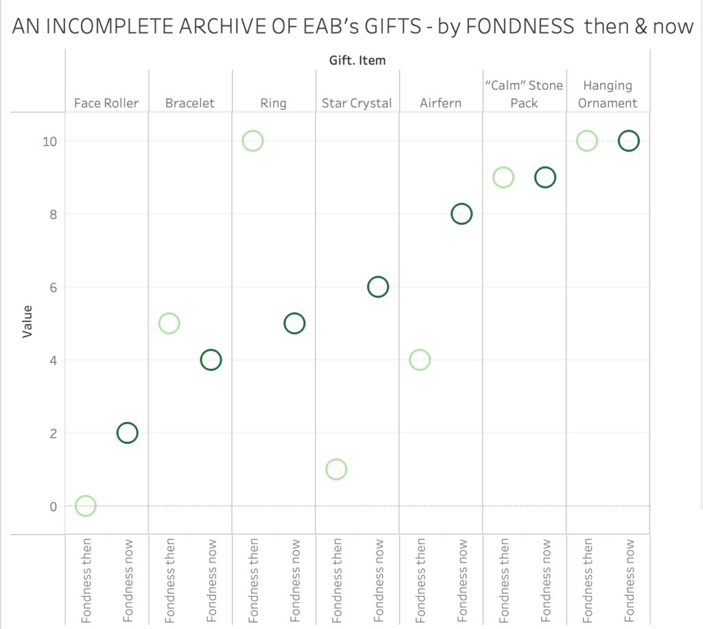
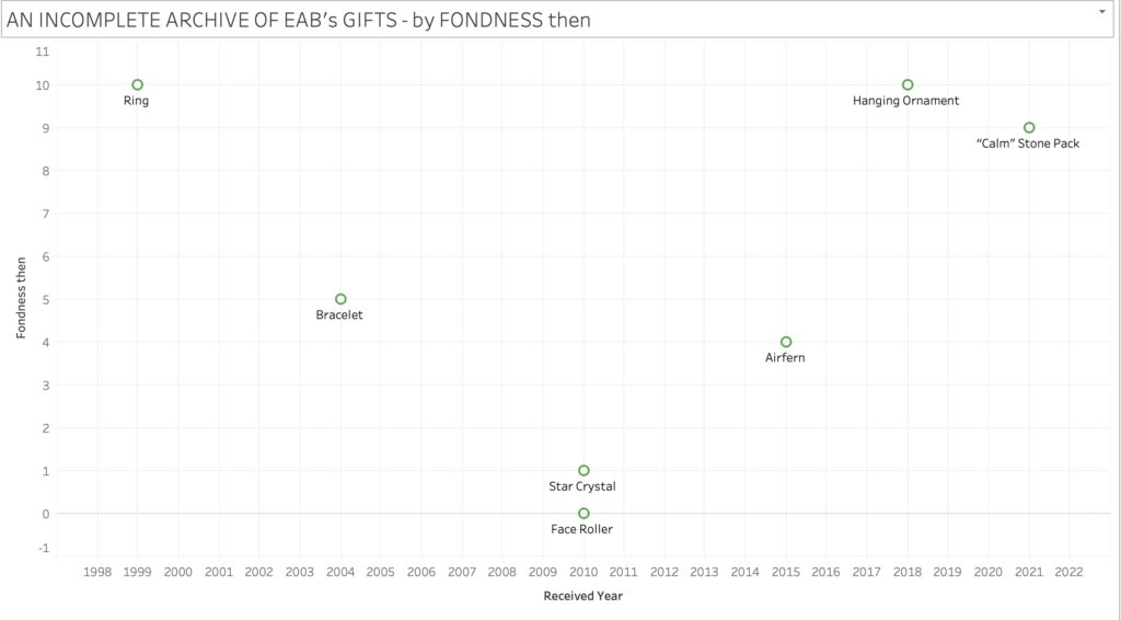
She catalogues the gifts by “item” and “occasion” for the gift. (E.g. star crystal, birthday. Further, she notes the “year” the gift was received, and then, crucially, her “feeling of fondness” for the item at the time she received a gift (“fondness then”) and her feeling of fondness for the item now, at the creation of the ppt, after the end of the relationship (“fondness now”). She choses a scale she’s familiar with: 0-10 (no/low fondness – maximum fondness).
THE DATA VISUALIZED:
Since the data visualization works in tandem with the larger ppt slideshow, text labels for the gifts are sufficient to get across the meaning. They are actually preferable to “direct visualization”, since the project presupposes the reader’s encounter with the corresponding gift-images and context in the ppt.
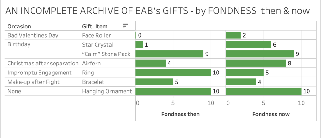
The difference between “fondness now” and “fondness then” lets her and us see how some items have lost emotional power, while others have maintained or increased their power as keepers/locus of memory and affection.
She can ponder what endings and losses do to the emotional charge, and trace how the story of her relationship moved through various states and escapes a single genre. IT wasn’t more drama than comedy. Overall the archive and its context becomes a tribute to her partner as well as their whole shared time. It is their story. (One version of it.)
WHAT I TAKE WITH ME:
As I get familiar with what Tableau can do, I am discovering more ways of correlating data points and interpreting and contextualizing the results in relation to a narrative project I am working on. I would like to continue to experiment with adding additional data, like: how often did the narrator interact with the object in the last year? Dollar value of each gift? etc. and see if subplots emerge from new visualized correlation.
Overall, I am also intrigued by the possibility of counterintuitive and absurd maps to undermine un-investigated trust in visual data presentation. Integrating data vis into fictional narrative could be a way to undermine reflexive trust in data.

This entry is licensed under a Creative Commons Attribution-NonCommercial-ShareAlike 4.0 International license.