Author Archives: Maria F. Buitrago

!Qué viva el Bronx¡ + Late Map Praxis + Into Workshop to QGIS

StoryMaps project: Bronx Untitled (2022)

Candles and Oil at La Familia Markets, Norwood, Bronx, 2022.

Inspired by the maps and reflections the class made and, as I was finally able to go to a map workshop!, I returned and partially completed my own praxis assignment in StoryMaps about the Bronx. I attempted an affective mapping of my working-class, culturally rich and diverse neighborhood, plus a more “larger” curated view of the borough, plus a reflection on borders and shapes. It’s still under construction. I would love to continue the project and work with the community, with the owners of the shops mostly, and ask for their permission to take pictures and include them in the map. Maybe even do maps with them, if they have time, following mainly the methodology of “Talking Maps” as developed by Victor Daniel Bonilla. A Colombian author that constructed many maps with the Nasa community to create visual representations, maps, of their struggle during the 1960s as they continuously had to fight the Colombian government for sovereignty of their land. But their maps mainly tell the story of a Quintín Lame, one of Colombia’s most important indigenous leaders and activist. The class we had on maps also made me remember how much indigenous communities have resisted attempts at mapping, or at leas at maps created to control them, pinpointing their territories and use as a tool to continue our endless history of exploitation and extractivism. But, the work of Victor Daniel Bonilla was done with and for the community. The results are different, the process is different, the intention is different, is about memory, also about who gets to define your narrative.

Mapas Parlantes, Víctor Daniel Bonilla, “Talking Maps” from 45 salón nacional de artistas

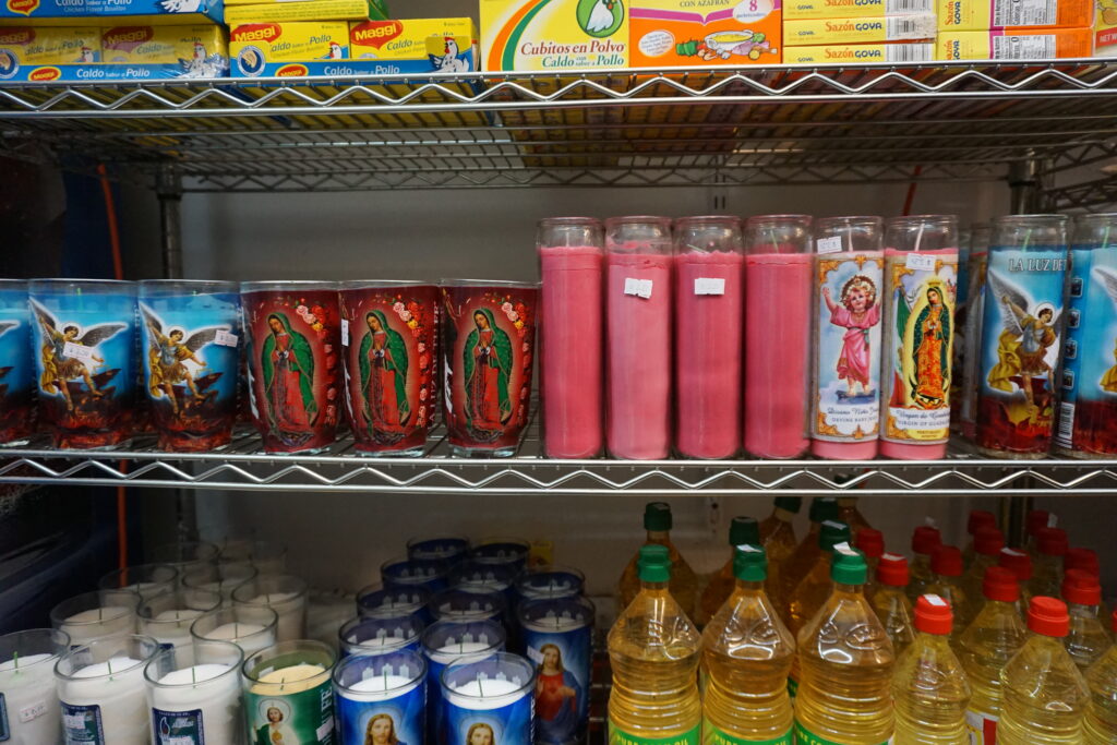
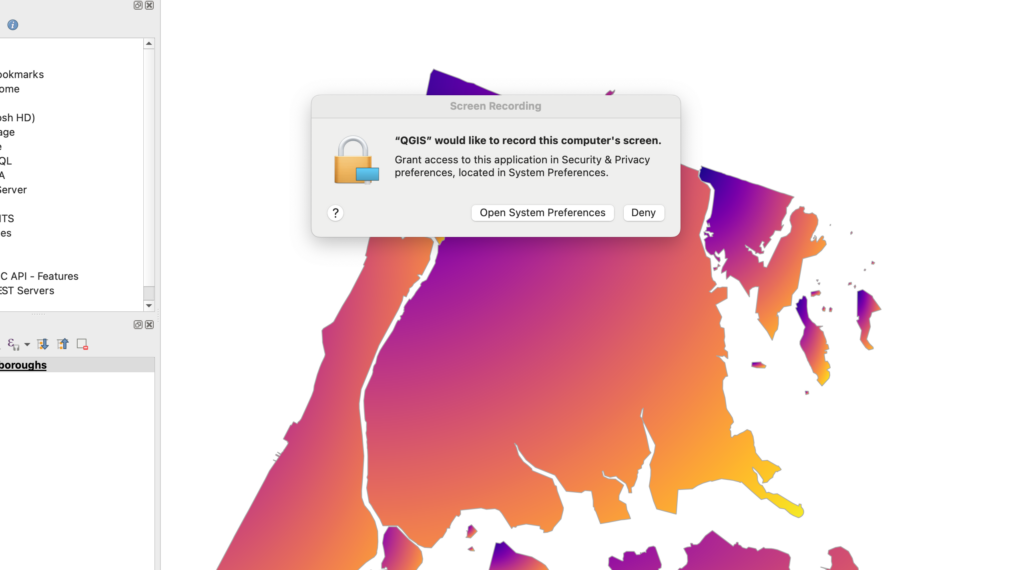
The photos I’ve included in the StoryMap “Bronx Untitled” where mainly taken by me (with verbal consent from the store owners) but some where also from other people’s blogs. I wanted to share a few things/questions that might resonate with those of us/you that want to do more maps. To situate the affective mapping theoretically I started reading “Affective Mapping: Melancholia and the Politics of Modernism” (Flatley, 2008) if anyone has reading recommendations please let me know! I found it useful to think alongside Yarimar Bonilla & Max Hantel (2016) piece on sovereignty. I also think an affective map could be a useful technique against the bad representation or imaginary that there is out there about a borough so huge and diverse like The Bronx. Then, thanks to the workshop in QGIS I was able to step a bit out of my framework and think with those geographical concepts like coordinates (x,y) of latitude and longitude, vectors (collection of those points), features (main information unit), attributes (information about a feature), layers and .sph files. I’ve got much much to learn and most importantly to think differently. But I found the workshop truly useful for a true beginner like me, I recommend it. Weirdly also while using the program at some point it asked me if I would give it permission to record my screen, does anyone know why this happens?

Why do they want to record my screen!?

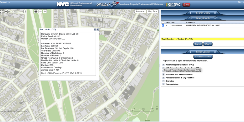
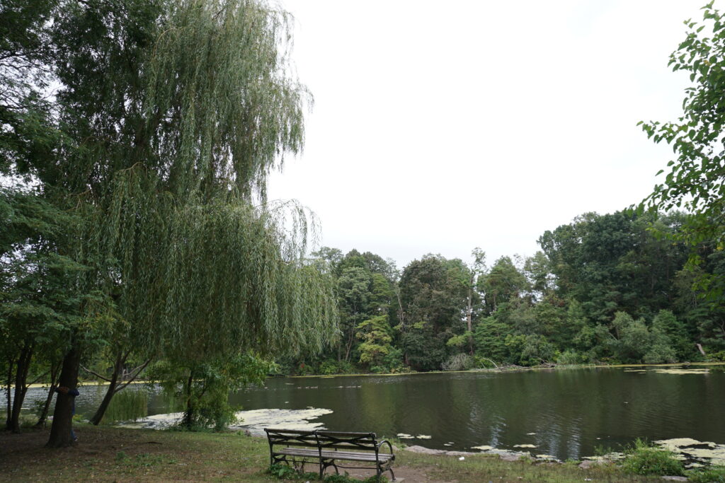
Anyways, in the process of creating the affective map I started to “see” certain things about my neighborhood that were new, like the idea that a lake that once was part of that region, before 1888, truly influenced to this day how we humans are located and developed our activities around space. Also, there are some “vacant” spaces here and there in the neighborhood. I wonder if this is neglected territory or is a strategy for gentrification by increasing prices on already overcrowded apartments?. But also, when thinking about space one should not say that something is “vacant” on those spaces there was so much life, birds, vegetation, raccoons, etc. The fact that a space does not have humans doesn’t mean is empty. In any case I was also “surprised” by the lack of information on this lots.

The lack of information is so political…

Like some of you I also wondered how could I represent something in space that escapes the x,y coordinates. I did a sketch of what/how I sometimes interpreted my neighborhood space, as a collision of unseen cultural borders. The neighborhood has a high rate of hispanics but there are also many people from Bangladesh and it was so interesting for me how my aunts and mom would not really shop on Halal stores even though they basically sold the same exact vegetables as the Mexican store and where literally next to each other! That always makes me wonder how maybe we carry invisible borders within our own existence, borders that mentally accommodate space in a very specific way. It’s not so much that I can’t go to the Halal store but there’s something informing my “hispanic” experience that prevents me from going, from choosing it instead of the more familiar looking store. And yet, there were moments that the neighborhood flourished in unique ways, whenever there was a special religious event, the colors of the street changed, the beautiful dresses inundated the streets with greens, blues, purples, golden colors and the jewelry tingling sounds coming and going alongside laughs. Anyways, how can you express that in a map? And why? I remember someone in class saying that those maps (or perhaps some data visualization) goes to the point of not being useful but just being a pice of art….

Bogota’s border on top of Dhaka’s border on top of Zip code border of Norwood, The Bronx. All borders gravitating towards the center of Williamsbridge park, that once was a lake.
Screenshot of QGIS work (done thanks to the digital fellow’s workshop) Blue for the street roads, purple for the Zip Code borders, and the Zip Code numbers labeled.

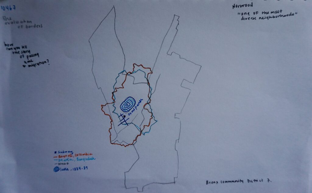
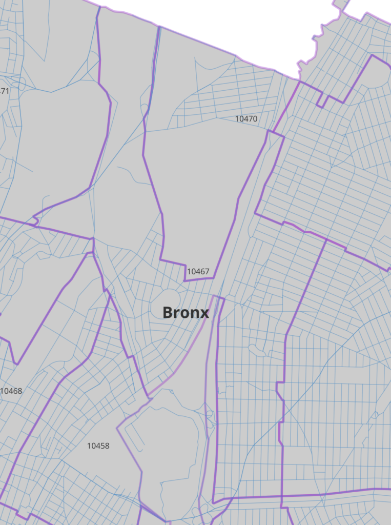
Something interesting that emerges from this two maps is how the neighborhood’s central park (once a lake) might or might be not connected to the larger flora and fauna of Van Cortland that gives Norwood it’s northern limit (according to official standards but in reality it feels more like an extension of the barrio) but it’s part of the 10467 Zip Code. Maybe, while analyzing this space through a more non-human centered view one might be able to connect this two rich and important bodies of life, vegetation and mental health relief. Van Cortland in turn, connects to other parks that eventually lead to the old Croton Aqueduct. Water is so important, maybe one of the most important layers for, yes, geographical thought but also for cultural thought.

Cien años de soledad en el parque – One hundredth years of solitude at Van Cortland park, pandemic times, María F. Buitrago, 2020.

If you want to talk about the Bronx HIT ME UP!

—Happy day & Thanks.

On feeling isolated & The flat moment –annotations

For this week’s assignment on the theme of Digital Pedagogy and annotations I wanted to share with the other students my annotations on two particular topics that I found very engaging and open for further discussion in the introduction of The Four-Dimensional Human: Ways of Being in the Digital World (2015). My annotations would like to prompt the students to contextualize, debate and connect their own personal experiences with the statements presented by the author around isolation; as well as dig deeper into how the ‘four dimension’ of the digital not only affects our present but actually transforms our perception of the past, particularly, when the author explains that nowadays a moment that is not shared on social media is “flat” or “boxed in”.

Isolation

  • In this section the author states that our idea of personhood ( in western philosophy) has been dominated by our feelings of isolation. He then cites examples from Descartes, Don Quixote, Edgar Allan Poe, Charles Dickens and others. Nonetheless, I would like to contextualize this idea with literature from other authors that have prompted us to look at ourselves not as individuals in constant search for ‘independence’ but rather as bodies in basic need of each other. Philosophers like Judith Butler, Toni Morrison or Gloria Anzaldúa have shared another vision of personhood by highlighting the ways in which beings are vulnerable or stand in between frontiers of contested meanings and identities. Could we be “fundamentally isolated” if, as vulnerable bodies, we depend on living with others in shared spaces to satisfy mutual needs? Could we think of ourselves as isolated if we live in complex webs of interdependency. Could the concept of vulnerability add another layer to our current and past ideas of personhood as experienced in this “fourth dimension” world? Do you think isolation and vulnerability opposed each other in our society or in your own life?

A Flat Moment?

Introduction, Four-Dimensional Human, 2015.
  • If we follow the idea that the four-dimension has affected our perception of the past and now the moments or experiences that we had might feel flat, if they were not shared on our networks, how does our evaluation of the past changes? how is this new dimension transforming our perception of time, attention and selfhood? How is this need to constantly share on social media or other networks connected to our ideas of productivity? Finally, here’s a video from artist Jenny Odell, about her book “How to Do Nothing”; how do you think “doing nothing” in our current world relates to this idea of the “flat moment”?

What in the world is a Kernel!?

I attended the workshop “Git It: Intro to Git and GitHub” taught by Nicole Cote. It was super helpful. Below is the process and reflection about it.

Figure 1. Screenshot of the download process of Git. “What in the world is a Kernel?“. The first thing we needed to do to complete the workshop was, of course, to download Git and create a free account on Github. I stumble upon many troubles and questions, specially regarding terminology.

The first steps with Git and Github are, of course, to download the program and create an account on Github. However, to be able to interact with the program and with the local versions of your files you previously need to have installed a coding program like Sublime, Virtual Studio Code or Xcode. Then, you need to select a way to download Git, there are several options, I tried (for reasons unknown to myself) several. In the end I did the homebrew option and ran it through my terminal. Then, the program kind of just goes on its own. It was all very confusing and intimidating at first so I had to watch several videos on how to do it. The most useful one was this one. The guy goes straight to the point (unlike so many others!) and even helps you setting up a ‘Personal Access Token’ without which I just couldn’t do anything on my Mac (again, who knows why).

Once able to download everything you’ll need to connect the local files with the repository you created online, or rather vice versa. Nicole walked us through how to do this step by step, which is sort of easy. You just create a new repository on Github and copy the URL of the ‘README’ file into your terminal. The repository has a specific or, rather, a basic structure so, at least to my understanding, there will always be a “README” file. But you paste the URL of the ‘README’ only once you’ve configured your git name and email on your terminal. Nicole also explained the most important and basic terminology that we absolutely need in order to create the communication path between local files and Github. She explained terms like ‘repository‘ which I understood as another word for where you save all the files of a project or simply a ‘folder‘; also terms like ‘Fork‘, ‘Branch‘, ‘Pull Request‘ and ‘Issue‘.

Figure 2. Screenshot of another issue that reads: “Fatal: Authentication failed for …” which was resolved creating a ‘Personal Access Token’ but I don’t know why.

After reviewing the terms, we started our own test repository and try some Git Commands. I had to repeat this several times on my own until I actually could do it with some ease. And then, I started to make changes to the file on my computer and pushing the changes to Github repeating the following commands like a mantra: “git status/ git add README.md/ git add –all/ git commit -m “new” and so forth and so on, again and again and again. However, I must say that Git tends to tell you all the time and suggest to you if you’ve done wrong something or if the command has any typo, and tells you a possible option or solution, which helps a ton. I also read some of the material available on Git to understand Git, which you can find here. And also used this guide for the basic elements of Markdown files.

Figure 3. Screenshot of the README.md file that I continuously pushed to GitHub, but one can also just edit directly in GitHub.

I decided to copy/past/interact with a poem just because, and ended with this README.md file on the test repo. After trying GitHub I do think is a great tool to track the multiple changes one does to a file/project, and is especially helpful if many people are collaborating at the same time. One thing I found very interesting is that the way the tool is built allows for collaboration that could be more horizontally oriented, so everyone can share their edits/opinions on a given project and all, at least in theory, are deemed equally important. Another feature is that other people can interact with your repo and raise an issue about changes they would like to suggest, furthermore they can clone your repo to start a similar project on their own. Thus, seems like knowledge shared on GitHub can be spread widely to different audiences rather than if you just store your projects or files in other places/websites/digital spaces where no one can comment or alter. I absolutely learned a lot through this process, for example now I have a basic idea of what’s the difference between a ‘Centralized Control System’ vs a ‘Distributed Version Control System’ like GitHub. And, honestly, I’m not sure anymore how I stumble upon the word kernel…maybe is just my plain ignorance but I was never ever introduce to any of this vocabulary. Which is terrible. This tool made me realize (again) how far the people that graduated from the humanities, like me, are to this terms. And that is so unjust and irritating if we consider how key this vocabulary is to understand the mechanisms by which our current world functions. And to realize (again) how compartmentalized our disciplines are is kind of sad; each creates its own set of terms and sophisticated vocabulary that ends up being nothing but a condense and rigid wall through which none but the ‘experts’ can penetrate and have a say.

Figure 4. Screenshot of the different versions of the file in GitHub

Anyways, it was fun to see how in fact you actually can review side by side (figure 4), track, and go back to previous versions of your files. While copying the poem I realized how great it would be for translators and creators to have different version of a same literary work, to be able to branch a file to create multiple word choices and have others comment on it or if there’s a work of fiction to have different passages and compare them side by side, seems so cool, at least in theory.

There’s so much more to learn and so much that I still don’t understand. So many questions.

Hunting the Abuela’s Tools, Unseen Emeralds and My Red Bike that was stolen while I was doing this work:

Figure 1: Still from Bicycle Thieves, 1948, Vittorio De Sica

While I was reading Johana’s Drucker piece “Humanities Approach to Graphical Display” (2011) I kept thinking about what it would entail or how would it look to create an affective display of information –that is, a graphical space where a reader not only encounters a relational and semantic set of information, but a graph that also produces an effect, a bodily response, a graph that has an affective outcome[1]. She discusses this with the example of the display of time vs. anxiety. In one graph, time is its own independent variable, quantified by hours, which is contrasted with “mood”. There’s (as usual) a line that records the ups and downs of what one assumes to be a person response to a particular event.

But, on the other graph, time is not a rigid set of hours but rather is seen as “perceived time”, precisely because anxiety states change or disturb how time is experienced. With this humanistic approach one can appreciate in the graph how the two variables are not constant and predictable entities; actually, they are embedded in a messy relationship constantly affecting one another in a non-linear direction. This is very important since at the root of our realistic ideas of time and space there’s the assumption that phenomena in the world is made up of data ready to be collected by an observer-independent subject. Drucker argues that a humanistic approach to graphical information challenges this assumption and instead promotes the idea that world phenomena appears as capta embedded in complex and chaotic networks which in turn are interpreted by “observer-codependent” subject. Furthermore, this interpretation act is “characterized by ambiguity and uncertainty, as the bases on which a representation is constructed”. Therefore, a graphical space with a humanistic approach should label temporality as a ‘factor of X’ –X = perceived constructed capta that influences a perceived ‘temporality’­, just like anxious states affect how time passes by on a given particular ‘moment’ by a particular individual.

To explain the codependency of the observer and capta she mentions Werner Heisenberg and his theory of uncertainty and explains that the relationship between phenomena and observer is not equal in measure but nonetheless its affected by it:

“Phenomena and their observers are co-dependent, not necessarily in equal measure. A viewer gazing on a sublime landscape or recording migrations at a large scale may be more affected by the phenomena than the phenomena is by the observation. Theoretical physicist Werner Heisenberg never suggested that the relation of intervening observer and effect on phenomena were symmetrical, merely that they were codependent, when he introduced the concept of uncertainty in the early 20th century”

Drucker, 2011, pg.5

All of this seems to be extremely relevant and resonates deeply with how, when, and why I did this visualization assignment. Or, rather, tried to do this assignment. I divided my exercise in three objects or capta that I’m currently chasing: my Abuela’s tools from a series of families photographs taken between 1970 and 1996 in Boyacá, Colombia; an emerald (perhaps groups of emeralds) that I’ve never seen but one of which currently lives at the American Museum of Natural History and was extracted from a mine located in the same territory where my Abuela was born and raised, and last but not least my Red Bike that was stolen outside of the Graduate Center Library while I was doing all of this. I think I would like to bring this three capta in place at the same time here, to follow Donna Haraway’s idea of multispecies storytelling and the necessity of a codependent observer looking deeply and interacting with the knottings – all of those entanglements that are produced in these complex webs of relationship building and world-making occurring not just wiht other human beings but rather with all capta that we perceive, affect and are affected by [2]. Perhaps is like Octavia Butler said:

All that you touch you change. All that you Change changes you”…


I. Abuela’s Tools

Figure 2: Latch in Photo #12, 1982, Boyacá. Courtesy Ana M. Sanchez

There’s a family collection of 25 photographs taken between 1974 and 1996 around one of the most important sites of emerald extraction in the world, Boyacá, Colombia which happens to be the place were my family is from. I’ve collected the photographs in Omeka and organized them according to ambiguous criteria that came up while doing interviews and asking about the photos. This criteria was selected by the individuals in the photos, as well as the name and the date. I’ve recorded information about location, number of people that appear in the photo, dates, what were the women’s job at the time/temporality of the photo (which I grouped according to certain categories, see below) objects present in the photo and natural resources identified by the individuals present in the photo. Finally, I also grouped what kind of ‘scene’ these photos where depicting, or rather, what kind of landscape, which was also something that came up while doing the interviews. The collection of photos were taken casually sometimes anonymously and without any clear intention other than personal/family documentation. However, within the larger context of Colombia’s history the photos take an important role and are part of an oral memory exercise that could (I hope) visualize the transformations that occurred in the region as the farmers were abandoning the traditional forms of labor, mainly agriculture, in favor of the mine work and the rush of the emerald extraction.

Ambiguos Criteria – Objects, Women’s Labor and Landscapes

Figure 3: Attempt to group ambiguos categories such as “Women’s Work at Time of the Photo” (color) as well as “Identified Natural or Artificial Resources” (Label) and “Photo Scene” (Size)
Radio

With this “Ambiguos Categories” it could be interesting to explore (if there was more capta/photos available in the collection or even better from other’s people collection) how/when/where the radios were used, in what type of scenes, who used to own this kind of object in the region and with what frequency was seen. Also, very important, dates in which it started to be more frequent.

Figure 4: In this graph I tried to distribute the objects and natural resources that appeared in the photos based on their frequency and location.

II. The Unseen Emeralds

The other side of the story of how some objects or natural resources were abandoned within this context in favor of other kind of resources and objects is part of a wider history of emerald extraction in the world. As it is normally the case with many natural resources, the ten most famous and priced emeralds of the world are not in the hands of the people of the region originally taken from. One of this emeralds, comes from the Chivor Mine (Boyacá, Colombia) and currently lives in the American Museum of Natural History in New York. How did it got there? Who “donated” it? And under which circumstances? Are all very interesting and important questions not just for a humanistic approach to capta, but also for a decolonization of museums.

Figure 5: Information taken from Wikipedia: “Notable Emeralds” https://en.wikipedia.org/wiki/Emerald

Patricia Emerald

Figure 6: Patricia Emerald at American Museum of Natural History, New York. Original Source: https://www.amnh.org/explore/news-blogs/from-the-collections-posts/exquisite-emerald

III. NYC Open Data on Bikes…

I had too many problems trying to come up with visualization using this photograph collection. So, given the situation in which this work got interrupted: my bike being stolen, I decided to use NYC Open Data on Bikes.

To be continued…

“The Black Boxes of Forced Disappearance” in Colombia –Analysis of DH Tools + Potentials

For this week task I chose to analyze the DH tools used for the investigation: “The Black Boxes of Enforced Disappearance”. This work is not a DH project (apologies). However, it does use many of the tools that DH scholars work and interact with, particularly those involving mapping, 3d modeling, video analysis, archive analysis and data mining. The “Black Boxes” investigation is part of the final report done by Colombia’s Truth Commission. This Commission was established in 2016 as part of the country’s peace agreement process. The purpose of the commission is to “shed light on five decades of atrocities and human rights violations committed during the country’s armed conflict” (United Nations). A Truth Commission is an institution that promotes a transitional justice system and reinforces the importance of truth to resolve conflicts and most importantly as it sees truth as a form of reparation to victims of human rights violations. Truth, however, is not perceived as a matter-of-factness statement but as a complex and heterophonic narrative. The most popular (and perhaps the first?) truth commission in the world was established by Nelson Mandela in South Africa to “help deal what happened under apartheid”. Given the tools used, the complexity of the investigation and the profound impact this work has I think it can constitute a very interesting example of the intersection between digital tools and humanistic inquiry in a broader and real-life scenario.

–The context–

“The Black Boxes of Enforced Disappearance” is an investigation that traces the events that occurred in Bogotá, Colombia between November 6 and 7 of 1985 when the M-19 guerrilla took over the Justice Palace and the operations that the Colombian government launched to “retake” such building. This episode is one of the deadliest and most traumatic events of Colombia’s internal conflict. It was broadcasted by the national TV in real time but left in total impunity. The aftermath of the event left 101 civilians dead and an unknown number of missing persons. The investigation focuses on what happened to those that were murdered and disappeared. One of the most complex results of the investigation is that the Colombian armed forces were the ones that carried out the torture, killing and in some cases, the disappearance of the hostages of the building. As they put it: “Our analysis shows that what was presented as a chaotic hostage release scenario by the armed forces has served for decades to cover up a planned and organized counterinsurgency operation” (Colombian Truth Commission). The complete history of this event is very intricate and difficult, I’ve left some links at the end for those that want to know more about the content of the investigation.

–The Builders–

As we’ve seen with the past readings and discussions pertaining the knowledge production in DH interdisciplinary is also central in this investigation. There were three major builders in this project. The video analysis, mapping, data mining and architecture reconstruction of the places were the killing and people’s disappearance occurred was carried out by the Forensic Architecture agency. This is an agency based in London and mainly composed of architects, filmmakers, software developers and (some) social scientists. The data collection, social work and archival analysis was carried out by a specific appointed truth commissioner and his research team. Interesting fact, the main social researcher in charge, Oscar Pedraza , holds a PhD in Cultural Anthropology from the Graduate Center! And the third set of builders (this is my assumption) are most likely web designers, perhaps UX/UI designers, that render the content available and legible for the digital world and the Colombian population at large.

–The Tools & Outcomes–

Although I’m not actually familiar with how the tools operate or their tech specificities of the programs or platforms employed (this is also very interesting that the digital builders don’t really name their tools, they name their technique, but that’s different), there are many key takeaways from the way they presented the investigation for the public. I’ve separated the ones that I think most important in the following categories:

  • Geographical analysis: 3d modeling and cartographies were used to project the videos recovered from the event but also to trace the routes taken by the hostages and the armed actors.
  • Video analysis: 50 hours of video was synchronized to create a narrative of how the hostages were evacuated from the building and where they were last seen.
  • Audio analysis: 76 testimonies were analyzed and compared with other data
  • Data mining: large volumes of data found in a variety of documents (“sentences, hearings, reports, resolutions, official letters, expert reports, statements, DNA identification, etc) helped place the evidence in space and time and show how many of the evidence throughout the years (videos, photos, reports) has been manipulated or erased. Fascinating conclusion about data (maybe obvios to some of you): data moves in time, is not stable, is very fragile.
  • Documentary, Guides & Exhibition: To help the public walk through all this material the investigation produced a documentary, several special guides (like this one) with visuals that help elucidate and educate how the geographical analysis was done. And last they hosted an exhibition at a museum with a mural title “Negative Evidence

–The Potentials–

After reviewing the project, I think there are many interesting ways of using techniques for humanistic inquiries. I will just focus on one, the video analysis. Given that this events, as I mentioned before, where broadcasted in national television, there was a lot of footage to reconstruct. Nonetheless these sources, this video archive, was manipulated and erased throughout the years, the research point out to the extreme difficulty of organizing and making sense of this data. It seems incredible the work they were able to do with the video available and in a sense, it reminds me of the project of Colored Conventions, of course not for a video archive, but for the visual record that is used to reconstruct a narrative that seems to have been buried in history. This very fragile and manipulated data, that is in both cases very visual is used to narrate a story that must come to light or to public knowledge in a new way and in both cases can have a very reparatory and healing outcome for all the actors involved.

–The shortcomings of my Analysis–

This was a very complex investigation that involves many tools, researchers, infrastructure, resources, etc. With more time it would be nice to explore deeper the tools used. Also, given that this is presented as a finalized investigation; a finalized “product” and not a project in process I don’t have a lot of knowledge about what kind of problems they ran into, besides the difficulty of the task itself! and besides the effects of the pandemic.

Links/Further reading:

About the events & recent | About the Tools | About the Builders & video | Similar Techniques in Journalism (NYT)

Opacity, Spectators and Tools:

As I’m still absorbing and making sense of the ideas of this week and last week’s readings, plus our class discussion, I realize (again and again) how writing is a constant challenge and a tool for thinking. Ramsay and Rockwell (2012) compared coding and writing and asked if those could be considered intellectual pursuits or theorizing enterprises. Writing, according to them, is a technology or methodology that “lies between model and result in humanistic discourse”. However, the mere “act of putting words on a page” cannot be considered a “scholarly act”. But I wonder if those two actions -coding and writing- could in fact be comparable (or, rather, to what extend) and therefore, if “building” in DH could ever become a technique as transparent as writing seems nowadays.

Writing, this old method polished throughout millennia by different societies, helps that “thinking occurs in the first place” (Ramsay & Rockwell); it is both the medium and the tool. It took humanity some time to sort of collectively arrive there, and it meant a parallel process of delegitimization of other kinds of knowledge that resembled the act of writing but do not use an alphabet or a grammatical system for its production (for example sewing symbols and transmitting knowledge and stories through textile fabrication, as some indigenous groups do, i.e: the Kogis). But I would say that after all that effort to make alphabetize the masses there is in fact a certain degree of transparency when we use writing as the method to theorize. One can elucidate implicit and explicit meaning in a text and position the writing in a broader context that might reveal intentions, place of enunciation, interest, etc. One can read the subtext of a text. But I don’t know if that could be achieve in coding or in digital tools and for the general public. The authors themselves point to this problem, which is perhaps imbedded in the way technology was conceived in the first place: “it is the purpose of that tool (and this is particular the case with Digital Tools) to abstract the user away from the mechanisms that would facilitate that process” that is, the process of learning how to use the tool. There’s a constant separation between producer and user, back and front end, because that’s where the “mysticism” of technology lies upon.

And so, opacity in DH seems to be at odds with the critical humanistic tradition. But, it appears again in Kelly Baker Josephs piece for a completely different reason. She writes: “I am learning to incorporate space and time for opacity” in classes. This need is a conclusion she reflects upon from the course Digital Caribbean, she ponders on its content and outcomes but most importantly on the role of her students in the class. Here opacity appears as something necessary, a condition to make a classroom safe and have a safe learning experience. Opacity could be part of an ethic practice when teaching with digital tools but especially when dealing with scholarly production that directly challenges and destabilizes our identities, like the students from minority groups in her class interacting with the Caribbean digital. And so, she concludes that there needs to be a mediation between visibility for scholarly production in our digital era of maximum exposure (“livestreamed conferences, recorded lectures”) and invisibility (privacy?) for safe learning practices. I find her conclusion very valuable and her inquiries extremely interesting. Her reflections make me wonder if in our current digital world and for most of the population both the medium and the tool have exceeded us -the coding and the interface- they seem so beyond our control and our understanding yet so ubiquitous. Even when we have access to internet and digital mediums that does not mean we actually have them as tools, as Josephs puts it, “access does not mean use, and use does not mean full engagement”

So what would full engagement look like for everyone? What would be necessary to have the “opacity” in digital tools be turned to our favor? Would that make “building” more like writing? And why some authors propose the need to move away from discourse when using the tool (Davis Baird)? Why is it that less discourse seems more like a good thing or a “fancy” solution for the linguistic bias in academic theory as for the tech realms; why does this feel like a sort of suppression of the capacity to do deep intense analysis, why does this feel like part of the process of making everything a “ready to use” product that is unquestionable and mystic since it appears to us completely out of context just like the tech products themselves, coming out of the blue.. the “cloud”…when in fact they are not. There’s infrastructure, invisible work and extractivist practices operating all the time in technology creation. I wish DH could make that less opaque.

I also wonder, especially looking at the examples (provided by Todd Presner) of some DH projects that had a very critical and engaging outcome, what is the role of the “consumer”. When he explains the projects by Sharon Daniel and Erik Loyer, I can’t help but feel uncomfortable (which I guess is part of the intention of the project anyways). The lives of two very vulnerable populations, women in prison and a group of heroin addicts, becomes audible to others. Listeners that are most likely in a safe “social, material, and cultural circumstance of listening” and although this probably creates very empathetic feelings and challenges the hegemonic way of viewing this marginalized populations, I don’t think it alters the very vulnerable conditions of their existence. So, maybe to say this is a cliché, but part of me feels like the projects are intended for a society of spectators, those of us who have the comfortable conditions to listen, view or read. On the other side there are the people providing the data that gives life, sense, and structure to the project. And in another those that do the building.

Nonetheless, the possibilities that open up when DH projects engage in the “speculative making” seem fascinating, and perhaps in doing so the tool becomes more accesible to new audiences. I guess this is what Presner suggest at the end: “imagining a new move from within the order of things” and “changing the rules of the game”. Perhaps opacity and transparency could be part of those moves? and what is at risk for doing so?