Author Archives: Maria Baker

PROJECT PROPOSAL: Overbaked & Underproofed

Overbaked and Underproofed: An interactive investigation of the judging language in the Great British Baking Show (GBBS), seeks to create and provide a platform that fosters a critical engagement with an aspect of language as used in a popular reality TV phenomenon. 

By extracting and analyzing the vocabulary and language usage in the judging segments of a season of GBBS, the project seeks to probe the perceived paucity of evaluative language and then look at what the results might reveal about our culture’s easy relationship with quick judgment and our in/ability to translate the sense of taste for a screen-based medium. 

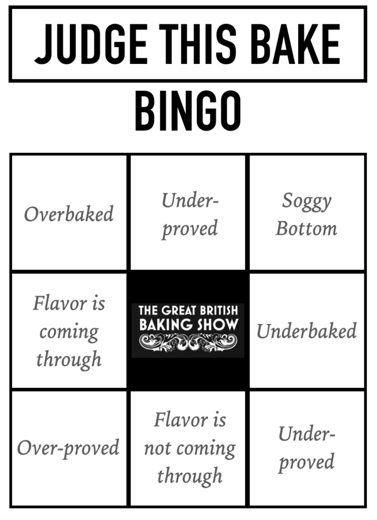
Via a website targeted at the general audience of GBBS and interested linguists, the project features visualizations of the analyzed language, academic discourse around the problems and methods of the topic, as well as an interactive Judge-this-bake Bingo game (populated with the most frequently used judgment expressions) that can be played while re/watching episodes of GBBS. The project aims to induce a shift in popular media consumption by bringing consciousness to the use of evaluative expressions and the framework of judgment, ultimately producing a new and expanded literacy.

PEDAGOGY_Annotation ideas for the Four Dimensional Human

After reading this week’s texts, the need for scaffolding and the importance of weaving assignment goals into overall course goals really stuck with me. (The readings have made me re-evaluate some of the assignments I use in my teaching.)

Consequently, I think that knowing more about the class’s overall context and learning goals would influence what annotations I would prioritize. 

One thing I would strongly consider annotating is the word “selfie” in the last sentence or, alternatively, this sentence on page xvi: “Today, we live with the sense that un-tweeted, un-instagrammed moments might feel somehow cubic, as·in boxed in, just these four walls, unless the walls can be contorted along invisible lines and a message smuggled out.”

This sentence could serve as a point of departure for developing a preparation/framing exercise on our existence in another/new-ish dimension. The following questions could be discussed with students before they re/read the text. 

  • What is your definition of “selfie”? 
  • What do you pay attention to when you take a selfie (if you do)? 
  • Are there rules for taking a good/share-worthy selfie? 
  • When/where do people often take selfies? & What else (other than the self) is often in the picture? 
  • When people share selfies, what kind of verbal context might be typical?” 
  • How does the selfie transform the experience?”

Since the text is about existing/living online, these electronic proofs of 4-dimensional existence are worthy of deconstruction. I hope students would close-read and develop a deeper and more critical understanding of the selfie genre, its deceptions, limits, and possibilities.

***

Another passage on page xvi: “[They] decide to reverse the peepholes in their apartment doors so as ‘to· prevent an ambush’. The idea is that, on returning home, they can check if an assailant is waiting inside to ‘clock them with a sock full of pennies’.” 

In the annotation, I would pose the following questions: 

  • Where in the text do you see other distinctions (or separations) between inside/s and outside/s? 
  • And related: what are separations or “walls” between these inside/s and outside/s? 

These questions would foreground the 4th dimension’s transgression of our assumed understanding of physical space. They would let students track how Scott plays with this transgression by repeatedly creating and dismantling spaces and spatial experiences. The tension between different insides and outsides was the most prevalent tension I noticed. 

***

And, for context, I might share these audio and image files that illustrate the classic dial-up modem related to the passage on page xiv: “The first household modems enforced this separation by acting as though they were grinding up against something hard,. squealing and whirring like a drill hitting rock.” https://www.youtube.com/watch?v=gsNaR6FRuO Either listen to the link and/or look at the pictures below. The first picture needs 20-25 seconds and the next one requires 5-10 seconds of patience, and the last one truly captures the celebratory feeling of landing online. Voila – you’re connected. (Maybe.)

PRAXIS_a dispatch from the mines of my text

Throughout this week’s readings, I noticed the separation between those who analyze and those who provide the “content” that is analyzed, i.e., the separation between the distant readers/researchers and the authors.

Shall these two never meet?

As a person who writes, I began to wonder whether distant reading my own novel draft might yield some productive insight.

While writing, I often find myself in forest-for-the-trees situations, meaning I am deeply in the mud of the moment of my creation (the frog’s perspective) and feel like I am losing my grasp on the story’s overall arc (the bird’s perspective).

To stay connected to the bird’s eye view, authors who work on longer creative projects (and I suppose longer academic projects, too) will often have either a pinboard with index cards or a writing program like Scrivener with features showing the spine of a story digitally.

However, both of these approaches (index card and/or writing software) are still tied to chronology. And one of the intriguing aspects of distant reading is its promise of simultaneity, of translating a time-based piece into a single image. (Or if not entirely ditching chronology, distant reading at least speeds things up.)

How much of a literary work’s overall concept trickles down/is visible in its more fundamental building blocks (words and sentences)? This is a point of curiosity, a question I had not considered before familiarizing myself with distant reading.

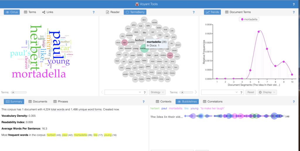
I decided to use Voyant and Word Tree to learn a bit more about my own text-in-progress and see how its micro and macro aspects inform each other.

I uploaded the first chapter of a novel to Voyant I am working on and tried to see whether anything interesting would emerge in the “reveal”. I did not have any specific questions, only many vague curiosities. My belief (based on various experiments conducted for Praxis Assignments throughout the semester) remains that having good initial questions is necessary to find a way for these tools to serve us well. Hopefully, the questions get refined in the process of working with the tools, but an initial curiosity is productive and propulsive.

Here is what I learned about my text:

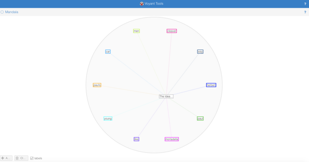
Most insightful was the Mandala feature in Voyant:
It centered the chapter title “The Idea” and showed a list of salient/defining terms within the chapter. The resulting diagram gave me a snapshot of the chapter as a network. It was satisfying to see the story’s main ingredients, almost as if someone had reverse-engineered the text and created the beginnings of a recipe.

Via the Cirrus feature, I learned that I had certainly established my protagonists/main players in the first chapter. Via Trends I saw that the arcs of the main players intersected in ways that confirmed my intentions and intuitions.

So far, I had received mostly confirmations.

More interesting insight came from looking at the “second tier” of usages, the second largest words in the cloud. I noticed that the program treats the possessive of a noun as a distinct entity. I.e., “Paul” and “Paul’s” are different entities as far as Voyant is concerned. Considering both forms together influences (and in this case amplifies) the overall presence of Paul — which aligns with my intentions but was more difficult to see. The strong presence of “Paul’s” also says something about Paul that I hadn’t explicitly considered: He owns more than others. (More characteristics or more goods? Tbd.)
I can see fruitful research questions emerging around the use of the possessive form in my text and the texts of others.

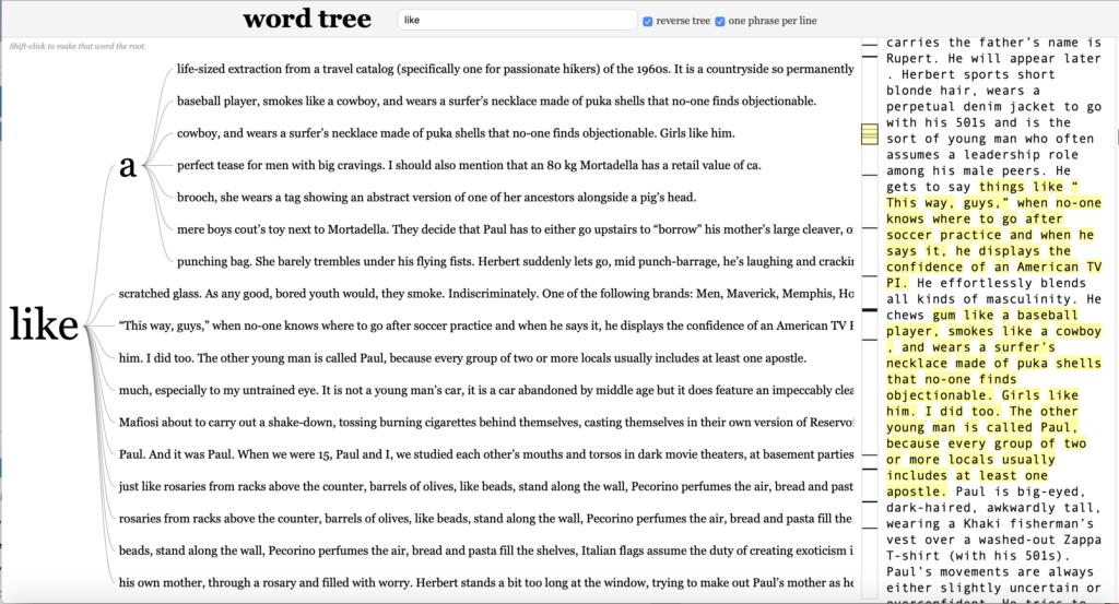
Another aspect that surprised me was the frequent presence of the word “like”. I would not have anticipated this. Here, Word Tree provided an opportunity to look at the context of these “likes” in more detail.

Based on the specific usages, which I could easily surveil via the word tree above, I might consider stylistic changes. Or perhaps I might notice that simile carries outsized responsibility in my text. The frequency of “like” might point to a theme I could make more explicit in revision. (I am thinking about this.)

In summary:

I can see Voyant being especially helpful in the later stages of the revision process for a novel & when evaluating and implementing editorial feedback. Even when using tools like Voyant on your own writing, the insights distant reading affords are most useful paired with close reading. The data visualization can be an impetus for returning to specific sections and close-reading those. (See also the Richard Jean So and Edwin Roland text “Race and Distant Reading” which details a constructive relationship between close and distant reading by looking more closely at Balwin’s Novel “Giovanni’s Room”)

And one sidebar Q:

I am wondering how Voyant’s Cirrus chooses colors. My text is very much about gender, and I noticed that nouns I had designated male kept coming up as blue and green, female coded nouns as pink. Hmmm. Coincidence? This observation made me want to try the software with a text in a very gendered language (like German).

WORKSHOP: CFP _ how to write a conference abstract

A very short preface: My work schedule this semester makes attending the workshops focused on digital skills impossible, so I am especially grateful to all of you for sharing your thorough workshop descriptions! Thank you. Consequently, the workshops I actually CAN attend seem a little further afield. When choosing a session to attend, I am trying to find the sweet spot in the Venn diagram of my availability,  my interests, and DH usefulness.

With that in mind: I took a workshop offered by the Gradcenter’s Writing Center (I work at a writing center at another institution) on responding to CFPs (Calls For Proposals or Papers)/ writing a conference abstract. 

Overall, the workshop took the mystery out of the CFP process and made me think that any one of us with an idea that aligns with a conference’s theme should dare to go for submitting a proposal (in the form of an abstract). 

There are several kinds of conferences: (and you’ve probably seen some asking for proposals in the emails Jason shares with us, most recently HASTAC)

  • sponsored by grad schools
  • regional
  • national (and international)

The two instructors agreed that going to a grad school-sponsored conference might be a great initiating experience.

The bulk of the session was then devoted to looking at dos and don’ts of abstract writing as well as looking at a couple of example abstracts. Below, the essentials.

Your abstract is written in response to a specific conference’s theme. Showing how your idea connects to the theme is vital. The theme is certainly recognizable in the conference’s title, but you might also look for and define the “key terms” the CFP identifies (see second slide) and refer to those terms as you describe your planned contribution. Defining your contribution’s place in the often suggested sub-themes and locating the available formats should also be part of your considerations. Formats might be round tables, panels, seminars, workshops, etc. — they all suggest slightly different approaches to your idea.

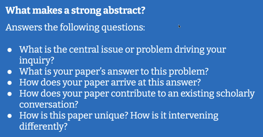
Here a concise summary of what an abstract should do (the two images are screenshots of slides from the workshop):

…and all of this in an allotted word limit of 200, 300, 500 words (there is a spectrum, but short is the defining feature).

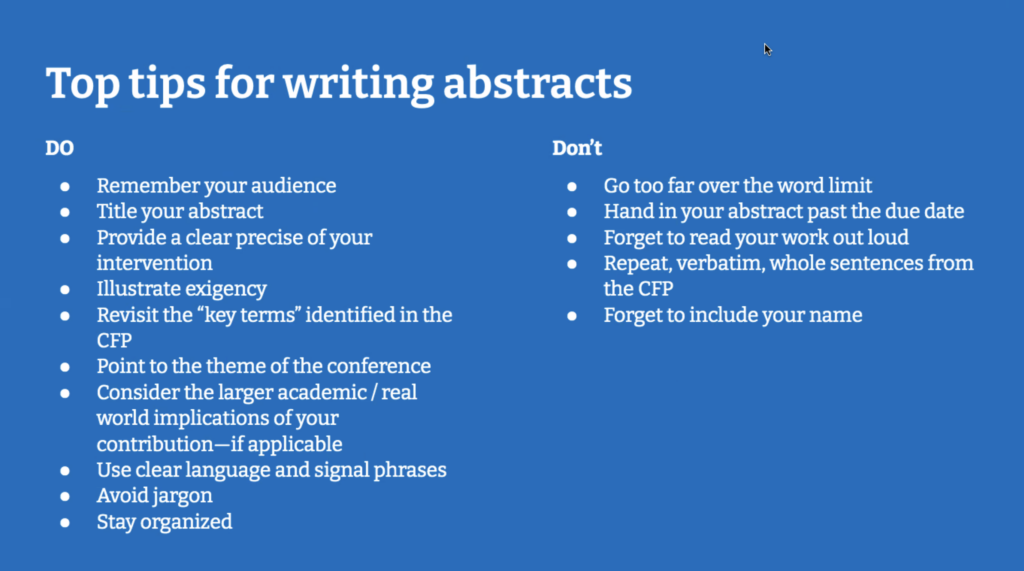
And here the dos and don’ts, which I think are a useful checklist for your abstract-in-progress:

The presenters also made a point of mentioning that even if you write a great abstract, your proposal might still not be chosen, as there are additional  “uncontrollable forces” involved in the selection process.  The selection committee has to consider the overall-make-up of a panel or round table, so sometimes, in order to achieve a balance of perspectives and subspecialties, some great proposals might not make it. 

From my work as a writing consultant, I’ll add the following: 

  • Sounds simple, but still: Close read and return to the CFP a few times as you are consolidating and developing your thoughts.
  • And: take advantage of the Writing Center and bring them your draft in progress to get an outside reader’s input.
  • Also: feel free to contact me with any abstract-related questions anytime.
  • …. and please share info about upcoming conferences.

 DATA VISUALIZATION: can graphs and charts be (part of) literature? 

POINTS OF DEPARTURE:

This week’s readings highlighted the visualizer’s responsibility in data selection, data vetting, and data contextualization. The authors investigated the uneasy intersection of humanities (&. humanities practices) and the assumption of data (and its presentation) as objective facts. 

Especially inspiring for my praxis assignment was Drucker’s text, which critiques this intersection by imagining new forms of visualization that blur the binaries inherent in producing the foundational grids (x and y axis) of common visualization formats. Drucker also proposes replacing “data” with “capta” (to highlight the fact that the information is captured/taken), and this conceptual shift allowed me to explore the fragile distinction between data I can capture and data I might not be able to capture. Or, in other words, it allowed me to ponder what is mappable and what is unmapplable.

Additionally, McMillan Cottom’s critical look at “distant reading” and the problems of literature and media reduced to content that can can be mined for data, made me curious about integrating data visualization into literary forms. Can data vis be literature? Or does it have to be about literature?

Finally, Manovich’s distinction between Information design (as a disciple that works with clearly structured data and wants to make that structure visible) and information visualization  (as a maneuver that seeks to “discover the structure” of a data set) made clear to me that the act of probing for connections and patterns in data is replicated in fiction and literature in the sense that we (readers and writers) seek to understand the emotional logic that governs human behavior. (i.e.: What makes a character tick?)

These authors’ thoughts in conjunction with my experience with mapping last week —when I worked with public data that brought up more questions about its generation than anticipated and ultimately helpful— led me to explore visualization with a small, self-generated data set connected to a creative project I am working on. 

THE PROJECT CONTEXT:

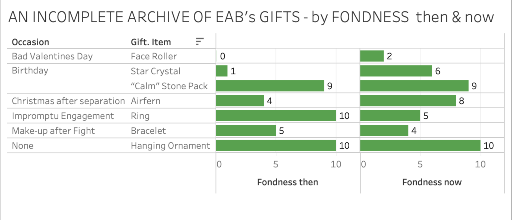
…is a PowerPoint presentation called An Incomplete Archive of EAB’s Gifts. It traces the trajectory of a 20 year relationship through the lens of gifted objects and is presented by the person who received and archived the gifts.

On the level of form and genre, the project explores how fiction and memoir can make use of software tools developed for business to create story and, more so, how this M.O. can introduce new ways of revealing the inner lives of characters and the narrator. 

I am using data visualization to add charts and graphs to the existing ppt slides. So, in the remainder of the post, I’ll focus on that aspect. If you’d like to see whole project: An Incomplete Archive of EAB’s Gifts_ DATA VIS.pptx

THE DATA SET:

The person who received the gifts is ostensibly the creator of the ppt and of the data set. 

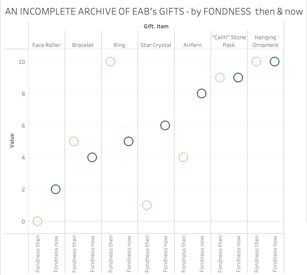
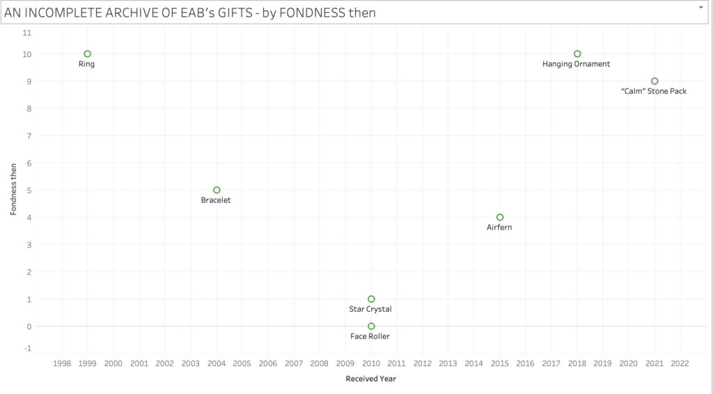
She catalogues the gifts by “item” and “occasion” for the gift. (E.g. star crystal, birthday. Further, she notes the “year” the gift was received, and then, crucially, her “feeling of fondness” for the item at the time she received a gift (“fondness then”) and her feeling of fondness for the item now, at the creation of the ppt, after the end of the relationship (“fondness now”). She choses a scale she’s familiar with: 0-10 (no/low fondness – maximum fondness).  

THE DATA VISUALIZED:

Since the data visualization works in tandem with the larger ppt slideshow, text labels for the gifts are sufficient to get across the meaning. They are actually preferable to “direct visualization”, since the project presupposes the reader’s encounter with the corresponding gift-images and context in the ppt. 

The difference between “fondness now” and “fondness then” lets her and us see how some items have lost emotional power, while others have maintained or increased their power as keepers/locus of memory and affection.

She can ponder what endings and losses do to the emotional charge, and trace how the story of her relationship moved through various states and escapes a single genre. IT wasn’t more drama than comedy. Overall the archive and its context becomes a tribute to her partner as well as their whole shared time. It is their story. (One version of it.)

WHAT I TAKE WITH ME:

As I get familiar with what Tableau can do, I am discovering more ways of correlating data points and interpreting and contextualizing the results in relation to a narrative project I am working on.  I would like to continue to experiment with adding additional data, like: how often did the narrator interact with the object in the last year? Dollar value of each gift? etc. and see if subplots emerge from new visualized correlation.

Overall, I am also intrigued by the possibility of counterintuitive and absurd maps to undermine un-investigated trust in visual data presentation. Integrating data vis into fictional narrative could be a way to undermine reflexive trust in data.

MAPPING: “failing is an option” — a short learning-in-progress report

As I was experimenting with various mapping ideas on Tableau, I was glad to remember the sentence “failing is an option”. 

I got caught in a Tableau-induced trial and error loop for several hours, until I finally understood what lay at the heart of my mapping troubles. And it wasn’t that had difficulty understanding the platform (which I would have anticipated). I produced dozens of very basic and uninteresting maps. 

But: My choice of data was what made my experiment scattered and kept it from coalescing.

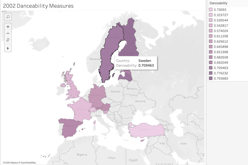
I had chosen a publicly available and rather expansive data set I didn’t fully understand (i.e., a breakdown of Eurovision songs from 1998-2012). Plus, I didn’t have a defined curiosity/question I wanted to pursue. 

What seemed intriguing about the data was the effort to quantify aspects of art — in this case songs that are performed live as part of a highly emotional yearly competition, the Eurovision song contest. A brief explainer: Each country in Europe sends a musical act to compete for points at a grand live show. Juries from each country rate the acts, and the winning country gets to host the coming year’s context. The winning artists may be launched into stardom. 

The collision of an art form (music) with a patriotic competition is fascinating in itself. But then to deconstruct the songs by applying metrics like “happiness” and “danceability” ratings (among others) struck me as particularly poignant. In its expansiveness and its quantitative focus, I felt this data collection might hold a promising cultural critique. (How do you measure a song’s danceability and happiness?)

However, other than having vague notions about the data’s potential for cultural critique, I didn’t have a strong guiding curiosity. So, I moved through various and random mapping assemblages that were visually fascinating (thanks to Tableau’s magic) but still remained random. None of the maps told a story. No obvious pattern emerged. And even if a visual pattern showed itself, I might not have been able to read it or give it meaning without an articulated research goal.

So, my plan is to either spend additional time with the data and try to contextualize it for myself a bit more (no background info was offered) in hopes that I’ll find something I want to make visible. Or, I’ll look for data that respond to a more specific curiosity (which is what I see all of you doing. You are working into an established curiosity you have, which makes so much sense and yields fascinating results.)

Anyway, I thought this particular roadblock was worth sharing, especially because our attention is (deservedly) focused on the mapping and not on the sometimes troubled/troublesome spreadsheet behind it.

MGB

dh project analysis: the quantified drama

THIS WEEK, as I was analyzing a specific DH project, the following aspects of our readings provided a lens of investigation. 

  1. The discussion in Ramsay’s and Rockwell’s text about what constitutes scholarship and whether there is a way to have scholarship without the “discursive elements” – the question of whether a prototype can be theory? Can a thing be scholarship without discourse that illustrates, and articulates the maker’s thinking about the thing? 
  1. And the above text’s intersection with Presner’s call for a more expanded definition of critical discourse. Presner notes the field’s obligation to consider and widen what critical theory encompasses. He especially advocates for critical theory to consider and expand into that “which might or could be”, the utopian.

So, above, we have one argument for questioning the reliance on traditional scholarly discourse as a necessary ingredient of scholarship, and one argument for leaning more into the potential of critical discourse and expanding its place in scholarship.

Adjacent to these seemingly conflicting considerations, I also felt that …

  1. …the distinction between qualitative and quantitative data underlined in D’Ignacio and Klein’s work on Data Feminism plays an important role in considering what is legible (for what reader?) as scholarship, esp. if it is presented without much explanatory or interpretive discourse. Here, their footnote 42:

“People often say that there are two broad kinds of data: quantitative data, consisting of numbers (e.g., how many siblings you have), and qualitative data, consisting of words and categories (e.g., what color is your shirt?). As we will show in chapter 4, any time there is a binary, there is usually also a hierarchy, and in this case it is that quantitative data can be incorrectly perceived as “better” than qualitative data for being more objective, true, generalizable, larger scale, and so on. Feminist researchers have consistently demonstrated the need to collect qualitative data as well, as they can often (but, of course, not always) capture more nuance and detail than numbers.”

The lens these three observations created, made me look at how specific DH projects integrate discursive context and how leaning on qualitative vs. quantitative data might influence the presence or absence of traditionally scholarly context.  I finally chose to take a closer look at a DH project “To See or Not to See“ – an Interactive Tool for the Visualization and Analysis of Shakespeare Plays that seemed to present itself directly to the user/reader without much context. 

[Full disclosure: I also chose this because my academic journey began in theater history, I trained and worked as an actor and a playwright, and I continue to create work for the stage that investigates collisions of stage and screen.]

Here is the link to the project’s page, specifically the page for Hamlet: http://www.thomaswilhelm.eu/shakespeare/output/hamlet.html

Essentially the project turns the plays’ text into quantitative data (counting words and lines) and then colorcodes which character/speaker is associated with the text. It shows one entire play on one “page.” Even at first glance we can already see how much stage time (i.e graph space) each character’s text occupies. We can get a sense of the characters’ movement through the story and easily track their (especially the protagonists’) arcs.

WHAT DATA IT WORKS WITH:

The project works with a stable and finite data set: The Shakespeare Folger Editions text (via the Folger Editions archives). The Folger text of Hamlet, e.g., is very likely complete and will not change. So, questions of accommodating growth don’t have to be central for the creators.

The project focuses exclusively on the quantifiable aspects of Shakespeare’s play, i.e., the countable aspects of language , word- and lines counts. 

Which already brings up the question of what it doesn’t work with. (See the last section of this post.) 

WHAT IT LOOKS LIKE: 

As many other data visualizations I encounter in my daily reading life, the overall structure of this project takes full advantage of our familiarity with interpreting a grid. The x-axis traces the play from beginning to end, leaning on what Kurt Vonnegut illustrated when he proposed that all stories could be turned into graphs. (https://www.youtube.com/watch?v=oP3c1h8v2ZQ )

The y-axis lists the play’s characters, likely in order of total time present, or perhaps in order of relevance in relation to the protagonist. But there is also an implicit – or is it explicit? – arrangement by class (Royals at the top). This organization is a replication of a familiar hierarchy – which contributes to an easy  the “reading” experience and yet perpetuates and fortifies problematic structures.

Giving the characters distinct color coding helps to trace text data ascribed to them. The color schemes don’t telegrapgh a methodology and seem more intent on easily showing contrast.Each character is represented by name and a male or female gender symbol, which says perhaps more about what data the authors anticipate readers will want to parse than it says about the world of the play or theatre at the time of Shakespeare.

Additionally, and especially interesting although easy to skip, is a band at the top, that traces the play’s non-dialogue text – i.e.its stage directions, entrances, and exits. 

Beyond the main screen, there are two pop up windows which let the user delve deeper into the quantifiable elements of the play. The pop-up windows show a) SPEECH: sections of dialogue that are tagged to indicate modes of text (like speech, song, quote etc.) and b) METRICS: graphs that present the network and data specific to the character. For example, I can see all characters Ophelia interacts with, how much she interacts with them, and how her dialog-quantity compares to the play’s overall word-count and a selected act’s word count.

Together, the data show the underlying webbed structure of the play’s world and it’s inhabitants’ relationships.

WHO MADE IT:

Information about the project, adjacent scholarship, and its makers is hidden within the ‘about’ section of a small gray menu button. In other words, it’s not prominent. A link to a scholarly paper is part of the about page. The short paper is a traditionally scholarly text, and the way to discover the names and affiliations of the authors: Thomas Wilhelm, Manuel Burghardt, and Christian Wolff – likely three German men affiliated with a German University. (Sidenote: German theater has a deconstrionist attitude toward Shakespeare’s plays. The plays are often cut and rearranged according to the director, so it strikes me as interesting that a project that so clearly appreciates the full text emerges there.) 

WHAT IT’S LIKE TO READ/USE IT: 

The visual impact of the entirety of Hamlet one one screen equals the satisfaction one can feel when looking at a good map of a city one has lived in. 

It works as a tool (a response to our desire yet inability to grasp more extensive chunks of time and space) that facilitates orientation. There is certainly new knowledge in understanding space and time of Hamlets 2+ hour universe from a bird’s eye view/on one single image. As each play is creating a world of its own, these data collections might function as maps/guides through a Shakespeare imagined universe.

The structure and provided data are easy to navigate and understandable for those who has encountered the play before and have an initial familiarity with Shakespeare’s drama. The authors’ assumption is definitely that their users have a familiarity with Shakespeare and that a quantitative look at a text might yield insight beyond traditional, literary text analysis. 

It’s not intended as an introduction to Shakespeare, I don’t think. So, the assumption of a knowledgable readership obviates the need for a user manual or how-to guidance — at least at first glance. In the related paper, the authors confirm this assumption about audience. They imagine the site to be of use for people working in or creating work about theater.

And it is. 

I made my partner, who’s a professional actor, look at the web-site, and she was instantly enthusiastic about the possibility it might afford her when preparing for a role. As an actor the aspect of a play that stays ambiguous the longest, is a sense of the entire arc one’s character travels. Grasping the arc is necessary in crafting the performance, so having a tool that makes a particular arc so visible, would likely help an actor by illustrating a characters place in the play’s eco-system quickly and succinctly. A theater director who is in the process of shaping the staging of the play, could find this map invaluable as well. The authors also imagine that it could inspire new points of entry for literary analysis, by showing, e.g., word-quantity disparities between genders.  

So what makes this project effective is the author’s understanding of potential users and how little context these users need to grasp the project’s application and implication. It presupposes an informed/partially informed reader with a specific goal and can therefore leave more unarticulated. 

And still, when I read the related paper, I was grateful for the ways in which it helped me to move beyond my initial evaluation of the project’s possibility. In that way, a theoretical discourse does become necessary. The paper did inspire me to think more creatively about the project’s uses and suggested applications beyond my familiar realm. I almost wish that aspects of the paper, in less formal articulation, could preface the project or even interrupt it.

QUESTIONS THAT REMAIN: 

I understand that quantifying an experience (theater) and a literary work (play) is intriguing. Quantification seems to offer a path toward understanding and parsing how and why art works for humans. (And I also understand the reverse. How often it is important to find the story data tells via using a unique narrator’s take on the data.)  

However, theater as an experience still centers the qualitative and subjective. Where do these aspects go in the analysis of world-count?

How to mark up/count a catharsis?  Is there a discomfort with the  ambiguity of qualitative aspects? Does it force a thinking about the variety that performance might bring to these texts? (What about tone, subtext, intention that imbue the words?) What are these aspects so resolutely excluded?

What are the implications and limits of the structure-the reflexive absorption of the grid? What metrics are left out? Considerations of plays shown in repertoire by a company, men playing women’s roles, identity markers other than gender? How would these considerations interfere with the binaries established by the grid?

The creators talk about possible expansions of the project. How do the current discoveries they have made help facilitate new discoveries? Or is it possible the current direction keeps us from entering a radically different but equally productive line of inquiry?

Finally: A bit of a meta question, related to my interest in narrativity. Does it entrench the view of “story” as a hero’s arc and how does this quantification relate to notions of narrativity?
Remixing as an example of DH in action

After reading the introductory DH texts, I admittedly have become obsessed with thinking about the impossibility of (terminally) defining DH. It seems plausible that thinking about the “big tent” and “expansion of the field” and the “alchemical move” of juxtaposition all point to DH as an actively moving, changing, and static-resistant line of inquiry. 

Consequently, the focus of defining DH can shift to exploring and illuminating the relationships between all and various elements of DH (some might be: constituents of the DH community, topics, modes of scholarship, academia/beyond academia, activism & politics). DH becomes about exploring our webbed nature, without ever arriving at a single stable map.  We can train a variety of mobile lenses on a variety of interests and ask questions about mutual influences, dependencies, and the wider consequences of connections. 

I think one salient verb — a defining verb within the ECDA (Early Caribbean Digital Archive)— that addresses the active engagement of the aspects outlined above is REMIXING. As an example of remixing in the context of digital archiving, ECDA shares the “extraction” of slave-narratives embedded in the accounts of colonizers and collecting and arranging them separately to forge a new narrative path, a “re-archive”. 

From the ECDA website, a passage the underlines the centrality of remixing:

“But the digital archive, we believe, offers new possibilities for re-archiving (remixing and reassembling) materials from existing archives as well as archiving new materials. This is not just the promise of recovery—not simply a question of finding materials that have been hidden in the past. Rather, this is a formal possibility—one linked to the new affordances of the digital archive which invite (if not require!) us to disrupt, review, question, and revise the colonial knowledge regime that informs the archives from which we draw most of our materials.”

Remixing leaves room for multiple and layered versions of creating history and developing counter-narratives.  It’s a supremely creative and, I’d say, fundamentally scholarly endeavor (as it consciously builds on existing materials). Remixing proposes and makes use of juxtapositions and honors iterations. So, remixing is one definition of DH in action.

While looking at ECDA and thinking about its use of remixing in digital archiving, I was reminded of Chimamanda Ngozi Adichie’s “The Danger of the Single Story”. The act of remixing to achieve retelling mitigates the single story. I was also thinking of Adam Banks’ Digital  Griots:  African  American  Rhetoric  in  a   Multimedia   Age, which  compares the story-teller to a DJ (see: sampling, remixing) and explores the narrative power of the mixtape in this context. 

[Revision and annotation are also basic maneuvers of remixing (which we engaged in while working on this week’s assignment). Because digital tools allow for easy revision and annotation, there’s also a chance to play with them, go beyond their basic application, and to unearth their creative and political potential. Which is what ECDA is demonstrating. ]