
As I was experimenting with various mapping ideas on Tableau, I was glad to remember the sentence “failing is an option”.
I got caught in a Tableau-induced trial and error loop for several hours, until I finally understood what lay at the heart of my mapping troubles. And it wasn’t that had difficulty understanding the platform (which I would have anticipated). I produced dozens of very basic and uninteresting maps.
But: My choice of data was what made my experiment scattered and kept it from coalescing.
I had chosen a publicly available and rather expansive data set I didn’t fully understand (i.e., a breakdown of Eurovision songs from 1998-2012). Plus, I didn’t have a defined curiosity/question I wanted to pursue.
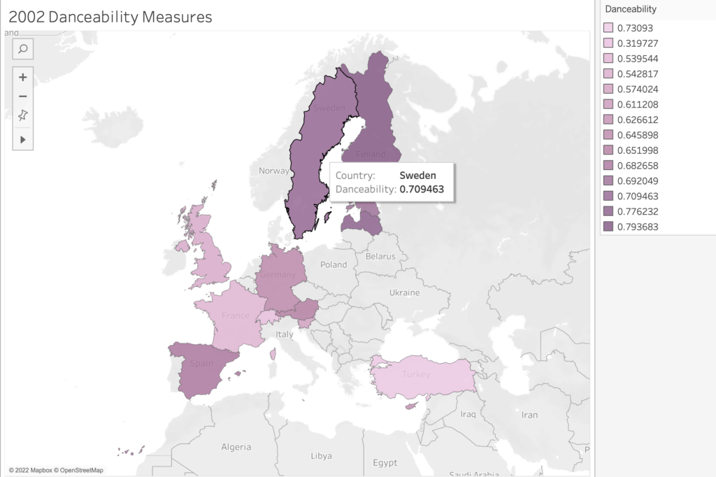
What seemed intriguing about the data was the effort to quantify aspects of art — in this case songs that are performed live as part of a highly emotional yearly competition, the Eurovision song contest. A brief explainer: Each country in Europe sends a musical act to compete for points at a grand live show. Juries from each country rate the acts, and the winning country gets to host the coming year’s context. The winning artists may be launched into stardom.
The collision of an art form (music) with a patriotic competition is fascinating in itself. But then to deconstruct the songs by applying metrics like “happiness” and “danceability” ratings (among others) struck me as particularly poignant. In its expansiveness and its quantitative focus, I felt this data collection might hold a promising cultural critique. (How do you measure a song’s danceability and happiness?)
However, other than having vague notions about the data’s potential for cultural critique, I didn’t have a strong guiding curiosity. So, I moved through various and random mapping assemblages that were visually fascinating (thanks to Tableau’s magic) but still remained random. None of the maps told a story. No obvious pattern emerged. And even if a visual pattern showed itself, I might not have been able to read it or give it meaning without an articulated research goal.
So, my plan is to either spend additional time with the data and try to contextualize it for myself a bit more (no background info was offered) in hopes that I’ll find something I want to make visible. Or, I’ll look for data that respond to a more specific curiosity (which is what I see all of you doing. You are working into an established curiosity you have, which makes so much sense and yields fascinating results.)
Anyway, I thought this particular roadblock was worth sharing, especially because our attention is (deservedly) focused on the mapping and not on the sometimes troubled/troublesome spreadsheet behind it.
MGB

This entry is licensed under a Creative Commons Attribution-NonCommercial-ShareAlike 4.0 International license.