I would like to share with you something personal which I think has some relevance in respect to this week’s readings on the “datalogical” turn, the “digitization of everything” and, eventually, the digitization of us.
My partner was asked to attend an online cryptocurrency course (how original these days!) and, as part of the terms of reference, he had to consent to the use of a software that would analyse his interactions with other participants.
As his first videocall with the course group was on speaker I could hear most of the conversation (I promise I was not being nosy!), which was pretty uneventful as the class members were introducing themselves, cracking some jokes, laughing, and lightly chatting about the newly introduced workload, probably in an effort to neglect the burden of those additional tasks that would stretch everyone’s already-stretched capacity. I ended up not paying too much attention; it seemed to me like a relatively friendly dialogue among people who did not really know each other. How wrong of me!
Shortly after the call, a report was circulated with a detailed analysis of the participants’ interactions. What I read was scary. The report quantified the number of words said by each person, the “energy” and “sentiment” attached to each word (whatever that means), the reactivity to other speakers’ statements and some corrections to improve the “quality” of the conversation (i.e. add some breathing, stop more often between sentences, etc.). And, to push the use of the word outrageous to its full extent, the software would also rate participants. Thus, for example, a shy individual would get a very low mark (you need to speak up!), whilst a witty person would be assessed as “too engaging” (sorry mate, you’re trying too hard!).
What is the moral of this anecdote? Well, in a sense I found this, what I would have implored to be left confined in an experimental dimension, utterly shocking. Who defines whether a word is positive or negative? The dictionary? History? Talk-shows? An arbitrary use can drive almost any word, or sentence, in both directions. Figures of speech also have nuances and their meaning depends on how they are used; irony and sarcasm are frequently an expression of scepticism; an uncertainty in the voice can represent an only partially formed opinion..and I guess the list of examples of ambiguity could be endless.
So, this is the day of reckoning, this is it: the augmented version of text analysis, speech analysis, that everyone was waiting for and, with a great simultaneous feature (it took virtually no time for the software to produce this report)! This is AI at its core.
Why do I care? Simple, this is my very personal room 101: AI’ed conversations that would reveal one’s insecurities in speaking, unveil gesticulation as a form of protection, highlight badly translated jokes and expose those insular cortexes, like mine, that have not yet found their full identity in a language rather than another. This AI application is what I would call forced Darwinism, where the wide adoption of a certain technology, especially in everyday life, might result in a mechanism aimed at standardizing conversations, flows and, ultimately (and sadly), thoughts.
I still have hope though. I hope people will be “equipped” with the freedom of refusing the adoption of a such discriminatory use of speech analysis. And I hope people will be able use this right.
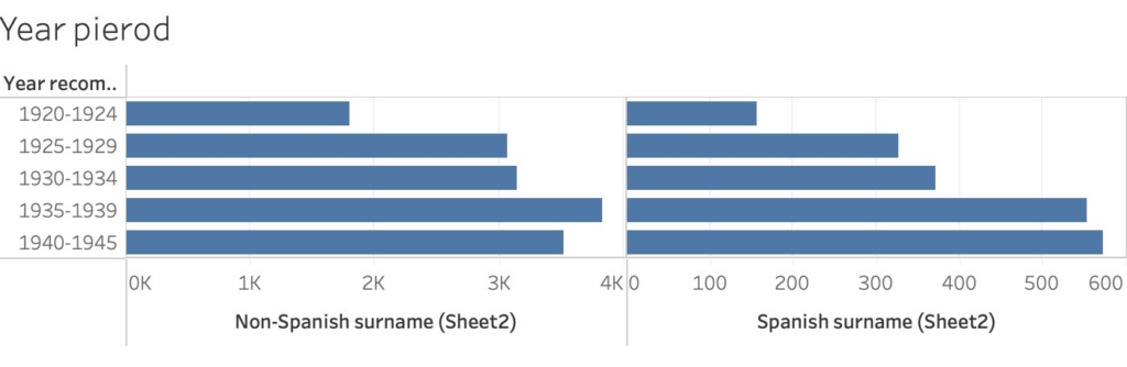
I singled in on the sterilization aspect of Eugenics for data visualization. I found a study done in the American Journal of Public Health (AJPH) with the objective of comparing population-based sterilization rates between Latinas/os and non-Latinas/os sterilized under California’s eugenics law. I purposely did not look at AJPH’s conclusions. Instead, I transferred their data into Excel and then to Tableau to analyze it.
A total of 17,362 individuals were recommended for sterilization from, as they were then known, “Feebleminded Homes” and “Homes for the Mentally ill” from 1920 to 1945 in California. AJPH broke this down under the headings of `Non-Spanish Surnames’ and ‘Spanish Surnames’ and then ‘Year recommended for sterilization’, ‘Gender’, and ‘Age’.
Year recommended for sterilization
This shows sterilization laws were disproportionately applied to Latina/o patients later in the time frame. Yet, the differences are not much, and more data is needed to establish a clear bias. For instance, I think the location of these institutions could play a factor. It could be that they were in predominately non-Latina/o areas or with an increase of immigrants.
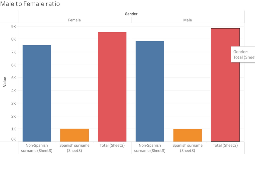
Gender
Like with ‘Year recommended for sterilization,’ the Gender visualization does not show sterilization laws were disproportionately applied to Latina/o. What would be interesting to find out is if the above table correlates to California’s entire population during the time frame. Or other factors like, of the males sterilized, what proportion of Spanish surnamed to non-Spanish surnamed patients were committed because they were convicted of a crime.
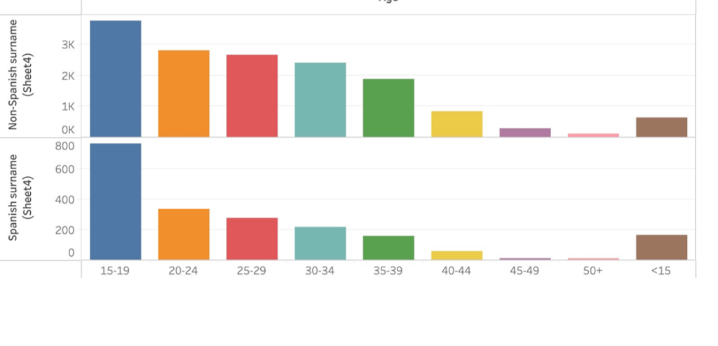
Age
Age is where there is clear evidence that sterilization laws were disproportionately applied to Latina/o patients. The bar chart above shows that California sterilized Spanish surnamed patients younger than Non-Spanish surnamed ones. It would be interesting to know, of the under fifteen-year-olds and fifteen to nineteen-year-olds, how many were male and female. I suspect that there were more Spanish surnamed girls than boys sterilized. Although both sexes were sterilized equally overall, there’s something profoundly sad about it being done to a girl who hadn’t reached adulthood.
Source-Nicole L. Novak, Natalie Lira, Kate E. O’Connor, Siobán D. Harlow, Sharon L. R. Kardia, and Alexandra Minna Stern, 2018: Disproportionate Sterilization of Latinos Under California’s Eugenic Sterilization Program, 1920–1945 American Journal of Public Health 108, 611_613,https://doi.org/10.2105/AJPH.2018.304369
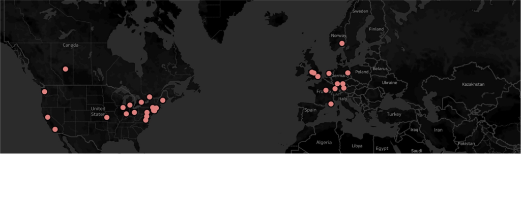
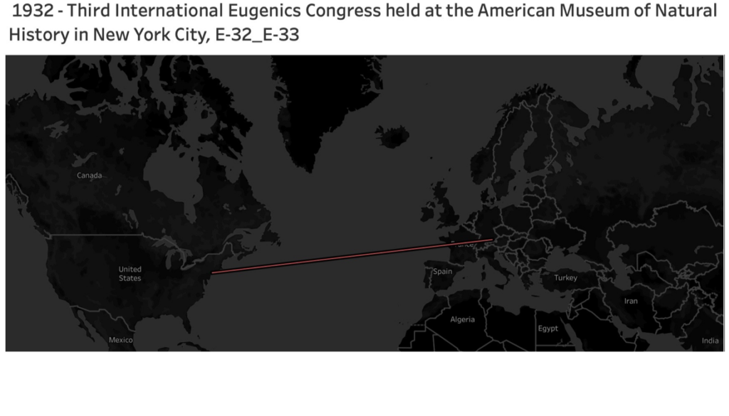
Back in the 1860s, when Sir Francis Galton first conceived Eugenics, it wasn’t rejected as the pseudoscience we know it as today. On the contrary, the idea spread as a form of humanitarian compassion. My mapping idea was to visualize how this ‘noble’ idea spread worldwide and ultimately set the foundation for justifying genocide in Nazi Germany.
I gathered data from https://eugenicsarchive.ca, which is a database of Eugenics-related information about its history and continued significance today. I picked what I considered some of the more significant developments in Eugenics over time for mapping. I gathered the coordinates of where these took place, put them into an Excel spreadsheet, and then imported them to Tableau. My first visualization (History of Eugenics on the Tableau page above) mapped the locations, and if you click on any red dots, you get a description of what happened there.
What this map didn’t show was how eugenics spread over time so I set myself the goal of animating this evolution. I spent way too much time trying to figure this out, but the little victories of accomplishments made it worth while.
If you go to my Tableau public page and view the ‘History of Eugenics Over Time’ visualization and hit the small play button above ‘Show History’ in the top right corner, it should play the animation I made. You can view a video of it below, but it’s better played on Tableau, if it works!
I chose the dark background and laser-like red lines to convey a sense of danger and how these ideas were sooner or later going to reach an inevitable conclusion in a place like Nazi Germany. Overall, I’m happy enough with the results, but I’d prefer it visualized more powerfully.
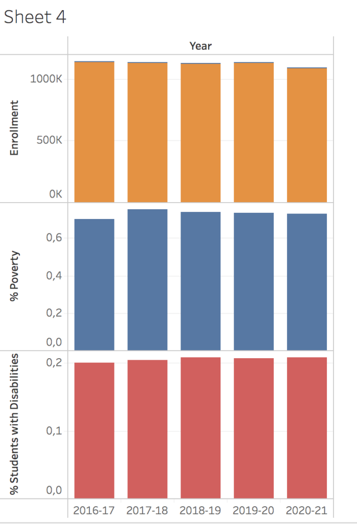
I chose for this assignment to work with visualization to explore the opportunities of the program “Tableau”. I only have little experience from last semester where I worked with a large datasets of information from NYC about community gardens. I wanted to find out more about what data is publicly available, but to push it in another direction than geospatial. Therefore I went into this assignment hoping to learn more about graphs or similar. With that in mind I set out to explore the database “NYC Open Data”. Coming from a background in teaching and a very different school system from Denmark I have an interest in the school system in NYC. I wanted to find out what I could tell about education in New York from a digital humanist point of view by exploring datasets.
At NYC Open Data there exists a lot of dataset, but some of them are hard to understand without context and others are hard to work with. It is for example possible to find information about different initiatives and specific programs at each specific school in New York, but those datasets would be hard to visualize. I ended up looking at general enrollment in schools in New York over the last couple of years. A dataset called “Demographic snapshot citywide” with different information about who enrolls in schools in New York.
Without going too deep into the dataset I still wanted to give a bit of context to situated the dataset more. From the website it tells the user that the data is collected using multiple data sources, including DOE’s Audited Register, biographic data from Automate The Schools (ATS) system and the Location Code Generation and Management System (LCGMS). Data can be used to view citywide demographic and enrollment trends over time. Enrollment counts are based on the October 31 Audited Register for each school year.
I tried different things to create connections between the data for the reader but not everything went as I hoped. I looked at the development over time but had troubles putting the visuals together in a more cohesive graph. I wanted to tell one narrative to make it more clear what I wanted to communicate with this visualization, but also encountered that I need to have a better knowledge of the field and the data to present one narrative. In the end I focused upon the data showing a growth in students enrolled under the category “poverty” over the last couples of years.
As argued by visual theorist and author, Johanna Drucker in “Humanities Approaches to Graphical Display” (2011), data often comes across as mere descriptive and therefore lacks the acknowledgement of the interpretation process behind the final graphical expressions. It is part of a discussion within digital humanities of how to use bigger datasets and still be rooted in the humanistic knowledge production it is based on. Looking at my process and work it is clear to me that a lot of questions are unanswered but they have furthermore evoked my curiosity. Is poverty on the rise in New York? Or has New York become better at collecting data about students today? Or are more low income families kids attending school than earlier? It has raised more questions than these, and some important perspectives to look into in order to understand and interpret the data more fully. Matthew K. Gold and Lauren F. Klein describes in their piece “A DH That Matters” (2019) another relevant perspective to reflect upon: how social and cultural biases pervade technologies, platforms and devices. How is tableau created and what values and ways of thinking does it convey? How does it structure data and what does the program consider data? I don’t have the answers to these questions but I hope they will be explored more during this semester.
Here follows a few screenshots from my process working with tableau.
First screenshot shows the development in three different parts of the dataset “Enrollment”, “% poverty” and “Students with disabilities”.
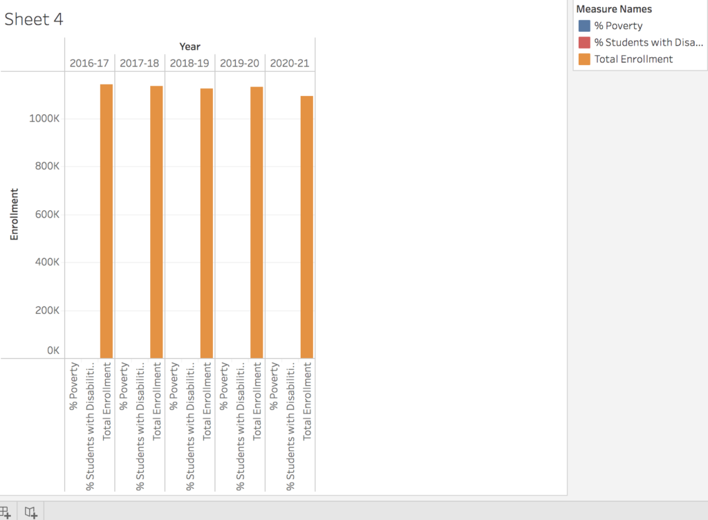
Second shows a tried in combining different datasets
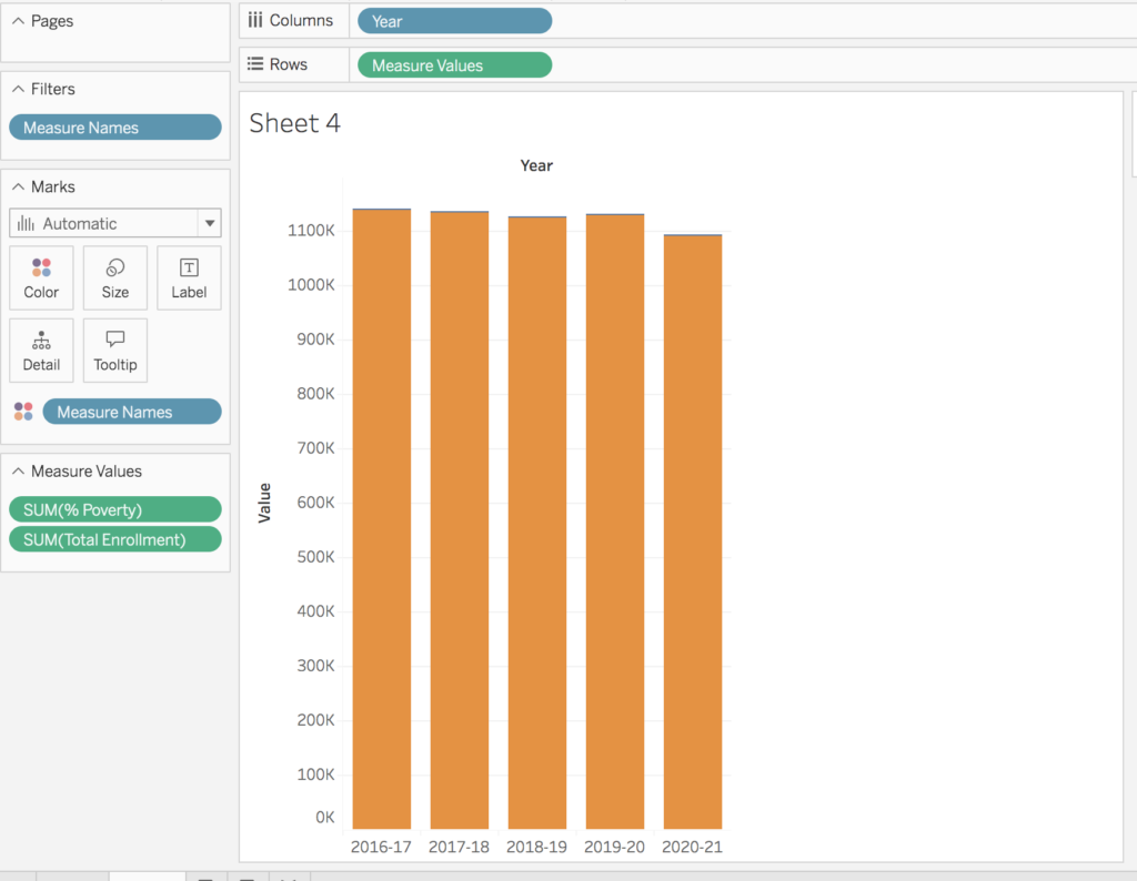
Third shows part of the process in creating the graphs.
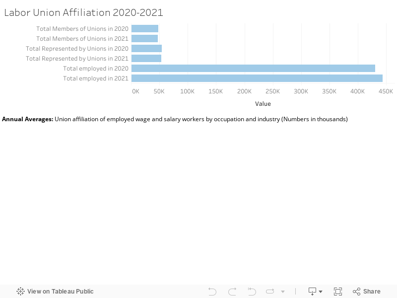
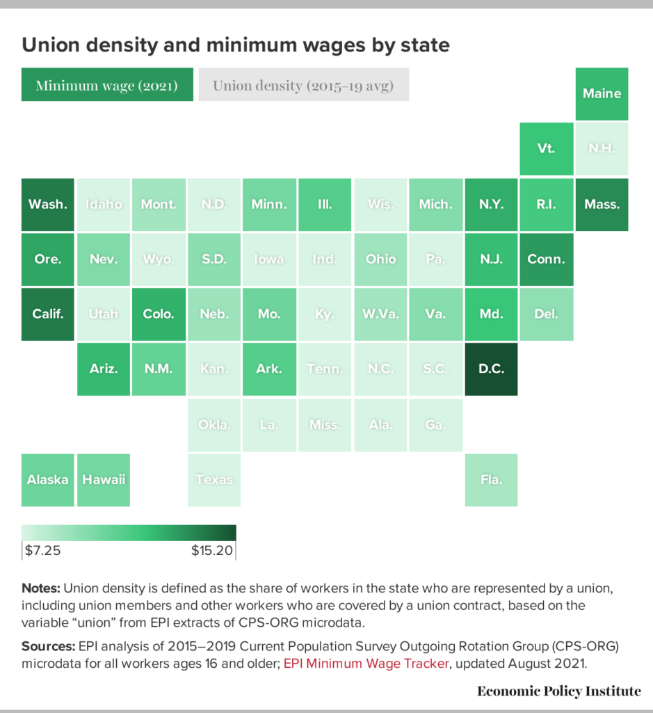
In light of the recent influx of discussion regarding unionization along with efforts being made by Starbucks employees across the country and, more recently, by Trader Joe’s employees in New York City, I thought it might be particularly interesting to look into data regarding how this swelling conversation and viral push for the rights of workers might have manifested in increased national membership with and representation by labor unions. Utilizing the available databases provided by the U.S. Bureau of Labor Statistics, I initially intended on accumulating the four collections of data pertaining to union affiliation into an aggregate visualization to follow Johanna Drucker’s advocacy for a more nuanced approach to graphical expression and to show the ambiguities and complexities undeniably inherent in the labor discussion (Drucker, 2011). However, upon being confronted with the ambiguities and complexities of Tableau Public, I chose to focus on a reduced version of a single dataset. After finding it exceedingly tedious to format the “Union affiliation of employed wage and salary workers by occupation and industry” dataset to be Palladio-friendly, I reduced the data to its core components in order to make it more user-friendly as I clumsily explored the suggested data visualization tools.
Upon finding Tableau Public more accessible, I proceeded to build four simple data visualizations illustrating different elements of the “Union affiliation of employed wage and salary workers…” dataset. The first visualization is a broad overview of the data, detailing the Total Members of Unions, Total Represented by Unions, and Total Employed in the United States in 2020 vs. 2021. From a glance, one can see that this almost embarrassingly straightforward graph counters my initial assumption that union involvement has experienced an uptick in recent years, instead illuminating a 1.79% decline in union representation even as the metric for “Total Employed” increased amidst the nation’s recovery from the COVID-19 pandemic.
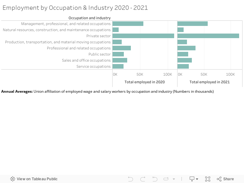
In order to explore the intricacies of this further, the following visualization breaks down Employment by Occupation & Industry in 2020 vs. 2021. While the original dataset includes subsets of each industry, with categories such as “Service Occupations” including a thorough account of the jobs that it encompasses (healthcare support occupations, food preparation related occupations, building and grounds cleaning and maintenance occupations, etc.), I couldn’t conceive of how to go about visually presenting this information in a comprehensible and digestible way. By reducing the data to exist within its broader (and vaguer) categories, users can certainly get a clear sense of the general growth of each sector in 2021 from the user-friendly visualization but are ultimately left without a thorough understanding of the complex occupational ebbs and flows at play within each industry during this period, mirroring Drucker’s warnings regarding the bureaucratic processing of “human activity through statistical means” and the violation of basic principles of critical thought produced through the crude reduction of data (Drucker, 2011). While I know this is not the precise point that Drucker was advancing, I couldn’t help but feel that my limited ability in creating data visualizations caused me to produce exactly that which her article had rightfully argued against.
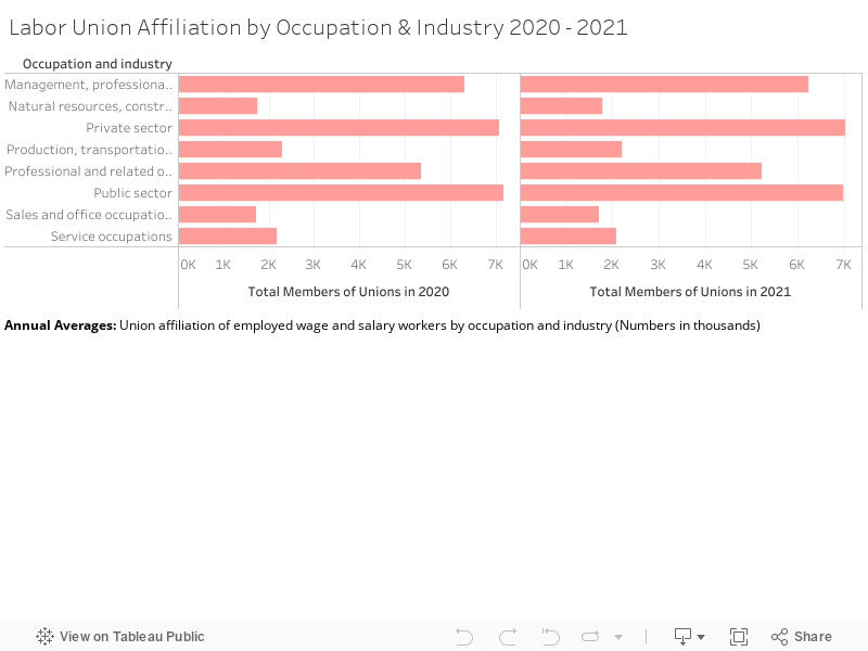
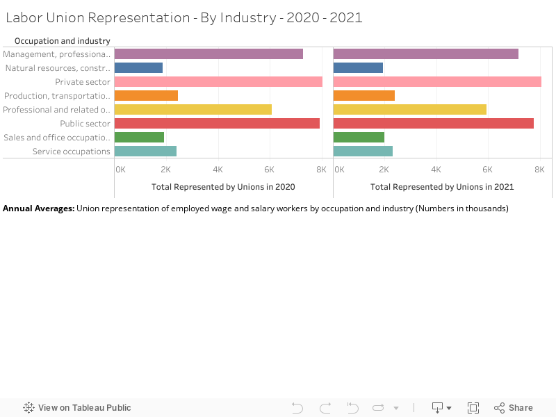
The following graphical displays elucidate both Labor Union Membership and Representation between 2020 and 2021. Though they follow extremely similar patterns of growth and decline, such that it almost seems unnecessary to provide both, I thought it was an interesting exercise primarily to distinguish the two categories. The number of workers represented by a labor union is generally higher than that of union membership due to instances of employees in a unionized workplace receiving union benefits despite not being official members of said workplace’s union (Shierholz, et al., 2022). Though I feel as if union representation is a more salient metric due to its inclusion of those who might want (and deserve) the protection and rights afforded to them through a labor union but might not be in a place to engage in legitimate union membership, it is interesting to include both primarily due to anomalies within the dataset (for example, instances of falling union membership with union representation rising within the same industry).
Though my experience with Tableau Public was ultimately limited by my amateur status as a data visualizer, my “findings,” as simple as they were to come across and to reproduce graphically, did challenge my assumption that union involvement has been steadily increasing as labor organizations become “cool again,” as labor expert and professor at CUNY Ruth Milkman stated earlier this year. Upon seeking inspiration for how my approach to displaying this information might have been improved, I came across predominantly geographically and temporally plotted presentations of the declension of labor organization over the last century (NPR’s 50 Years of Striking Union Membership in One Map, a “trends over time” map of global Trade Union Membership from 1880 to 2010 from Harvard Business School). However, both of these visualizations (and my own) neglect to comment on such pertinent factors as “the power relations of financial actors or the social construction of race” involved in the unmaking of worker power, as Tressie McMillan Cottom advocates visual inclusivity for in her work More Scale, More Questions: Observations from Sociology (2016). Such knowledge is invaluable in the advancement of worker organization and, though some relevant information can be found through resources such as the U.S. Bureau of Labor Statistics’ Union Membership Annual News Release, opportunities for successful integration and visualization of this information’s complex components, such as Black workers continuing to have the highest unionization rates in 2021 at 12.9% or the standardization of corporations to hire “avoidance consultants to coordinate intense anti-union campaigns” at the whisper of organization, are lost amidst reductive recreations of complicated corporeal power struggles as easily understood graphs and maps (Shierholz, et al., 2022).
More than anything, in attempting my own data visualization, the calls of authors such as Bonilla and Hantel for representations that reveal the complexities of structures of power while simultaneously challenging normative understandings of one’s sovereignty within such systems became increasingly relevant (2016). Upon realizing that union activity is decreasing despite the vocal desire for unionization amidst non-union workers growing (48% of non-union workers said they desired to create a union within their workplace in 2017, years before the semi-shift of consciousness brought about through trends such as “The Great Resignation”), I found it tremendously difficult to conceive of how to communicate this effectively through the tools provided (Shierholz, H. (2022). If anything, I think my experience attempting to do so has shed further light on the necessity of projects found in our coursework and effectively conveyed the essentiality of critical and creative approaches to data visualization in order to produce the “slow, thoughtful, inclusive, and collaborative” work fundamental to the flourishing of an effectual and equitable Digital Humanities (Guiliano & Heitman, 2019).
Bonilla, Yarimar, and Max Hantel. 2016. “Visualizing Sovereignty.” Sx Archipelagos, no. 1 (May).
Cottom, Tressie McMillan. 2016. “More Scale, More Questions: Observations from Sociology.” In Debates in the Digital Humanities 2016, edited by Matthew K. Gold and Lauren F. Klein. University of Minnesota Press.
Drucker, Johanna. 2011. “Humanities Approaches to Graphical Display.” Digital Humanities Quarterly 5 (1).
Guiliano, Jennifer, and Carolyn Heitman. 2019. “Difficult Heritage and the Complexities of Indigenous Data” Journal of Cultural Analytics 1 (1).
Shierholz, H. (2022). Latest data release on unionization is a wake-up call to lawmakers: We must fix our broken system of labor law. Economic Policy Institute. Retrieved September 26, 2022, from https://www.epi.org/publication/latest-data-release-on-unionization-is-a-wake-up-call-to-lawmakers/
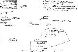
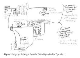
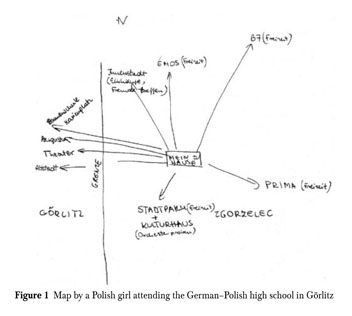
After last class I have thought more about the discussions surrounding questions about sovereignty and alternative ways of mapping to convey other ideas than traditionalist maps. The readings for the class all touched upon how regular maps both do not represent reality (if that is even possible) and are often centered around a western viewpoint.
We discussed the article “Visualizing Sovereignty: Cartographic Queries for the Digital Age” and how they in many ways did not succeed in creating an alternative map. That has since reminded me of specific ethnographic methods that I have worked with earlier. It is a method that works with informants creating their own alternative maps of a specific part of their everyday life, and I have come across it in regard to nation borders. It is also called methodological cartography, and the idea is that when you map out something, you also obtain knowledge of something. I have worked with it in the context of the border between Germany and Denmark which is an “open border” meaning no control of crossing. I got inspired by ethnologist Marie Sandbjerg who has done a larger study of the border between Poland and Germany where she asked high school students about their everyday experience with their border. She used mapping as a method and got the students to draw their everyday lives around borders. Some of her findings were about how the border had different meanings and were interacted with differently. It is a way of understanding the border in a performative gaze that helps the concept of explaining the formation of realities (such as objects, materials, artifacts and subjects), which is something that happens within practice in people’s lives (Sandbjerg, M. (2009) p. 114). Therefore the border can be enacted in different ways. I think it opens up to an interesting way of understanding maps, borders and sovereignty. I have included some of the drawings from her studies.
The specific method became relevant to me again talking about the way to visualize and theorize Caribbean sovereignty. In the reading by Yarimar Bonilla and Max Hantel they describe how a traditional understanding of sovereignty is different to the history and present of the Caribbean. They describe it as “This history of fractured, uneven, contested, and negotiated sovereignty continues to shape the region as a whole, and at present the majority of societies in the Caribbean are not independent nation-states but rather protectorates, territories, departments, and commonwealths personal”. By using the gaze of borders as performative it opens up to an understanding of the borders not as only drawings on a map but something people enact and interact with. A way to describe and visualize this understanding could be to use methodological cartography. It could be interesting to see if there exists studies of people in the Carribieans own experience of the borders and sovereignty in their everyday lives.
I just wanted to add a last note about even though the borders can be viewed as performative and fluid I still believe they have a big impact on many people’s lives and are meet more as frontier and boundary.
Sandberg, Marie (2009): “Performing the Border: Cartographic Enactments of the German–Polish Border among German and Polish High-school Pupils”, Anthropological Journal of European Cultures Volume 18, 2009: 107–128,
As I was experimenting with various mapping ideas on Tableau, I was glad to remember the sentence “failing is an option”.
I got caught in a Tableau-induced trial and error loop for several hours, until I finally understood what lay at the heart of my mapping troubles. And it wasn’t that had difficulty understanding the platform (which I would have anticipated). I produced dozens of very basic and uninteresting maps.
But: My choice of data was what made my experiment scattered and kept it from coalescing.
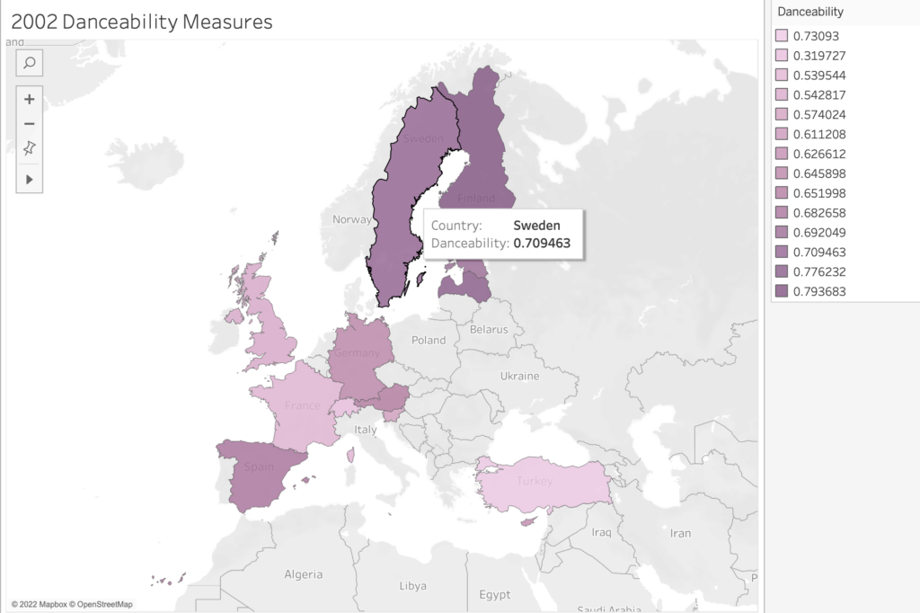
I had chosen a publicly available and rather expansive data set I didn’t fully understand (i.e., a breakdown of Eurovision songs from 1998-2012). Plus, I didn’t have a defined curiosity/question I wanted to pursue.
What seemed intriguing about the data was the effort to quantify aspects of art — in this case songs that are performed live as part of a highly emotional yearly competition, the Eurovision song contest. A brief explainer: Each country in Europe sends a musical act to compete for points at a grand live show. Juries from each country rate the acts, and the winning country gets to host the coming year’s context. The winning artists may be launched into stardom.
The collision of an art form (music) with a patriotic competition is fascinating in itself. But then to deconstruct the songs by applying metrics like “happiness” and “danceability” ratings (among others) struck me as particularly poignant. In its expansiveness and its quantitative focus, I felt this data collection might hold a promising cultural critique. (How do you measure a song’s danceability and happiness?)
However, other than having vague notions about the data’s potential for cultural critique, I didn’t have a strong guiding curiosity. So, I moved through various and random mapping assemblages that were visually fascinating (thanks to Tableau’s magic) but still remained random. None of the maps told a story. No obvious pattern emerged. And even if a visual pattern showed itself, I might not have been able to read it or give it meaning without an articulated research goal.
So, my plan is to either spend additional time with the data and try to contextualize it for myself a bit more (no background info was offered) in hopes that I’ll find something I want to make visible. Or, I’ll look for data that respond to a more specific curiosity (which is what I see all of you doing. You are working into an established curiosity you have, which makes so much sense and yields fascinating results.)
Anyway, I thought this particular roadblock was worth sharing, especially because our attention is (deservedly) focused on the mapping and not on the sometimes troubled/troublesome spreadsheet behind it.
I was particularly moved by Mayukh Sen’s “Dividing Lines,” as I remembered the years I spent on Google Earth trying to find my grandparent’s home in La Cumbre, Colombia. From 2007-2018, I was unable to see my grandparents in Colombia, and I often yearned for memories of them. To this day, the unpaved dirt road that leads to my family’s finca remains un-mapped on Google Earth or Maps. Entire areas of the globe continue to be marked as “unexplored,” allowing for colonialism disguised as “new development” to take place. In “Visualizing Sovereignty” by Yarimar Bonilla and Max Hantel, they mention the map as “a technology of possession… promising that those with the capacity to make such perfect representations must also have the right of territorial control.” The act of mapping is political because of the ways in which it puts forth an objective, incontestable truth by those already in power. Mapping is more about drawing the world the way it appears, and there is no denying that desires of that appearance are inevitably embedded. What powers and experiences are “necessary” to justify oneself (or a county, company, etc.) as capable of creating an “authoritative” map? When I think about maps, I think about travel – so who has the power to travel (as dictated by passports and visas, money, etc.), and by what means is this travel allowed (by air, sea, land)? A major mode of transportation for those in La Cumbre are the “brujitas” that utilize the otherwise abandoned railroad tracks. How are these experiences of travel not recognized by corporate maps? Why are maps created by local civilians not recognized with the same credibility when they more truthfully reflect people’s lived realities? I’m really intrigued by many of the questions raised by this week’s readings, and I hope to bring more critical thinking and questioning in my engagement with maps in many different capacities.
Since Python is such a useful programming language for data wrangling, how can I use it to map data without exporting data frames to a third-party tool like Tableau? This is the question I had back in 2020 while I was working with the London crime dataset. After googling for a while, I found folium, a python based library that uses Leaflet.js for mapping. The main concept behind folium is that one will manipulate the data in python and then visualize the map with Leaftlet.js through folium.
The project was firstly intended to find the safest boroughs in London based on the reported crime data. Then cluster the neighborhoods of the safest borough based on the crime data and amenities closer. This will help users to find the best place to live within the safest borough. I am writing this article to explain the workflow of the project in detail. Since this is a blog article I have limited time and space to achieve my objective. I will try to deliver the fundamentals. The development environment I have used for this project is google colab.
Dataset Description:
I pulled the London crime dataset from Kaggle which consists of 13M rows of criminal reports by month, London boroughs, and crime category from 2008 to 2016. The dataset was created by Jacob Boysen by pulling .txt files from the Google Cloud Platform and then converted to .csv.
Working Process:
Once a dataset has been acquired, the first thing I did loading it into a dataframe for pre-processing. I used pandas, a python library for data wrangling for this purpose. Pandas can be used with python script by importing with the following command.
import pandas as pd
A .csv file can be imported into dataframe with read_csv function. Loaded data can be viewed with df.head() command. This will return the first 5 rows of the dataframe.
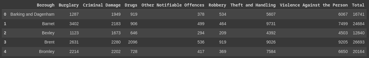
As you can see the original dataset contained null values, which required some preprocessing. I dropped the null values with dropna(), and added the total number of crimes per major_category per borough, and total crimes per borough. Finally dropped the rest of the columns to create a new dataframe. The processed dataframe I got is given below.
Next, I did some plotting to find out the safest district. Below were the 5 safest districts in terms of total crime. Kingston upon Thames was the safest borough according to the plot.
At this point, I required all the neighborhoods of Kingston upon Thames. I used Wikipedia for this. Then I used a geocoder to get the coordinates of the neighborhoods. The dataframe with coordinates is given below.
Then I used this dataframe to map the neighborhoods with folium.
To explore the neighborhoods, I used foursquare API to find out the most common venues around the neighborhoods. Below was the result.
Then I used the k-means clustering algorithm to cluster the neighborhoods into 5 clusters based on crime data and amenities around. Cluster 0 represents the best to live in Kingston upon Thames borough. After the clustering, I again mapped the results with folium.
I created a map (demo) based on a travelogue written by a Japanese courtier and poet Asukai Masaaki (1611–1679), about his journey to Yoshino, Nara, Japan, in the spring of 1654. The data of the map is taken from the text transcribed by me from a beautifully brushed and decorated manuscript, A Record of Yoshino (Yoshino ki, mid-17th c.). This manuscript is about twenty-two pages long, and thirty-seven poems are recorded in the version I use. I only chose two or three of them to do a demo for this assignment and hope that I can build a template/layout design for future use. I created a public account in ArcGIS Online for this assignment, so there are not many customizing capabilities available.
I chose ArcGIS Online and ArcGIS StoryMaps to create this demo.
As Olivia Ildefonso explains in “Finding the Right Tools for Mapping,” ArcGIS creates high-resolution maps but is very expensive if you want to buy the full version. I had experiences, though very limited, of using the student account (the full version ArcGIS) in the past and thus did some comparisons this time.
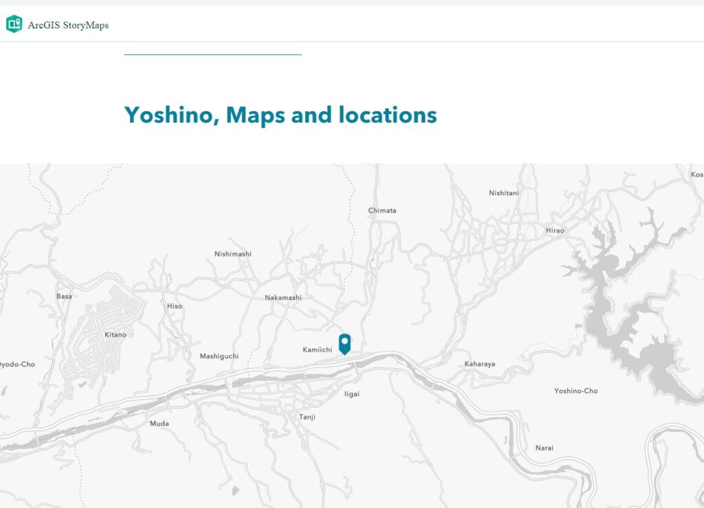
The locations in this travelogue are all local spots that are very difficult to search and identity using the searching function in ArcGIS Online. Then I tried the “Express map” feature in the StoryMap, but I could only find “Yoshino, Nara,” as shown in the image below (Figure 1).
Figure 1
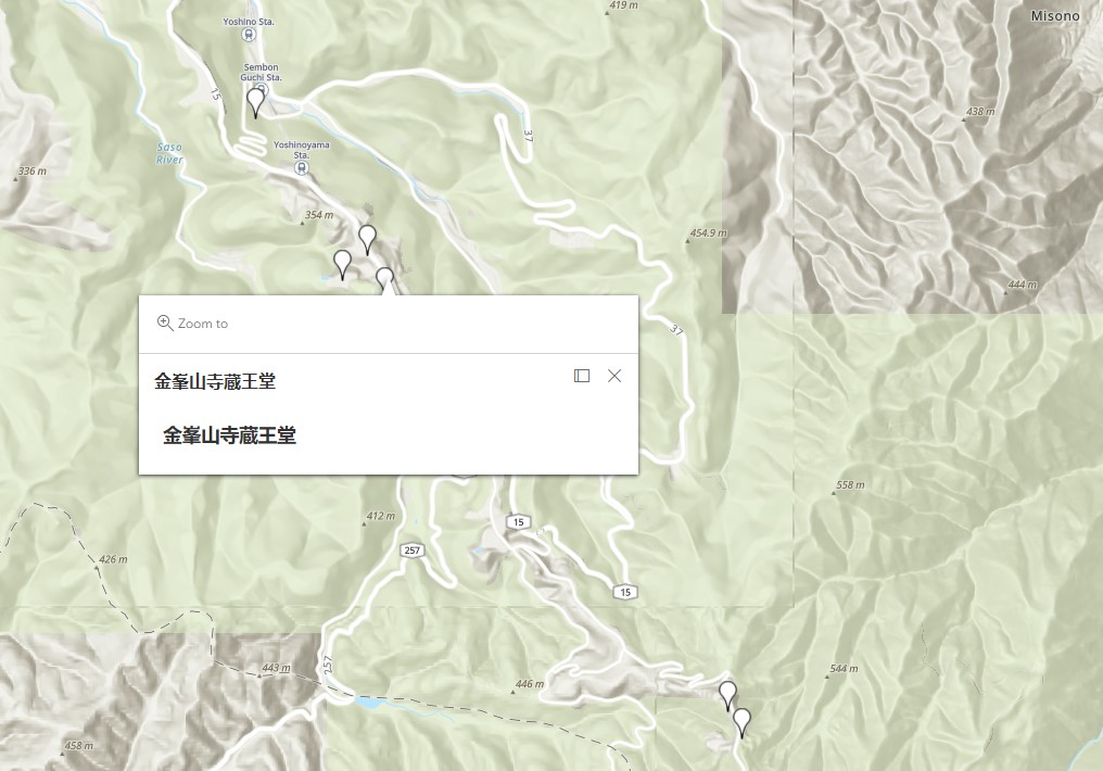
I was instead looking for another way to create a customized map that could show details of local sites. I made a map in Google Maps (location names in Japanese are available), downloaded its KML, and uploaded the KML file as content to my ArcGIS account. It works perfectly, as shown below (Figure 2).
Figure 2
I didn’t notice the limitations of adding non-Western spots in ArcGIS maps before trying it. As Sen writes in “Dividing Lines,” “for those of us whose corners of the world are considered ‘remote’ or ‘uncharted’ from an essentialist white, Western perspective, the interface is far from seamless.”
We do not know whether the 37 poems in the manuscript are in chronological order. It is possible that the poet wrote poems one by one during his journey, but it is also possible that he took notes and went back home to finish the work. So, I did not mark a direction on the map but only provided spots he visited. In the StoryMaps where I can add more interactive features (e.g. Map tour), I thought it would be easier for viewers to navigate if I have an order, so I just did a demo following the poem order. But it would be an excellent question to consider the sense of time and geographical distance presented by textual materials in premodern times when we design an interactive digital map in which modern readers could explore the locations via a historical figure’s mind (or maybe also via the designer’s mind). This question is an idea that I can relate to Monmonier’s book How to Lie with Maps. Besides scales and symbols, directions and order of locations could also lie to us. Or if we use new orders as an interpretation of the original text, would it be an issue?
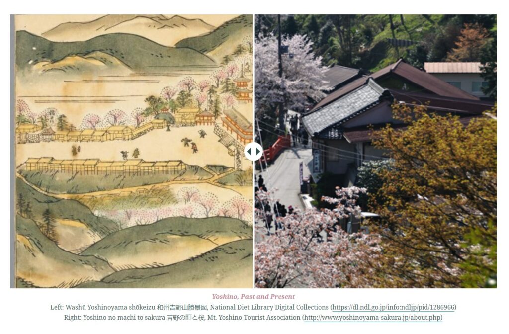
I played with features like “Express maps,” “Slide,” and “Sidecar” in StoryMaps and thought these are great tools to create past-present comparisons and literary maps (content + geographical info). “Slide” is very interesting in that it allows two images to be overlaid and one can swipe back and forth. (Figure 3)
Figure 3
However, since the account I used this time is public, many features are unavailable. For example, sometimes, I could not change the font/size of the text. Also, it was impossible to build a bilingual StoryMap in the past, but I successfully inserted Japanese text into my StoryMap this time. However, if I wanted to try further, I still couldn’t do the vertical direction for the Japanese poems. (Figure 4)
Figure 4
Last, both the map and StoryMap could be shared by URLs. But the group function (members in the group could collaboratively work on one project) in StoryMap is not very user friendly. If I use a school account, it seems easy to find partners in my school and share a work-in-progress privately. But I see obstacles in sharing your project with members outside your school. On YouTube, you could upload a video as “unlist (more sharable than private),” but I haven’t found a level between “private” and “public” in StoryMaps, which makes teaching using StoryMaps in the classroom a bit challenging due to copyright concerns.
Need help with the Commons?
Email us at [email protected] so we can respond to your questions and requests. Please email from your CUNY email address if possible. Or visit our help site for more information: