
https://public.tableau.com/app/profile/colin.geraghty/viz/HistoryofEugenicsOverTime/Dashboard1
https://public.tableau.com/app/profile/colin.geraghty
Eugenics.
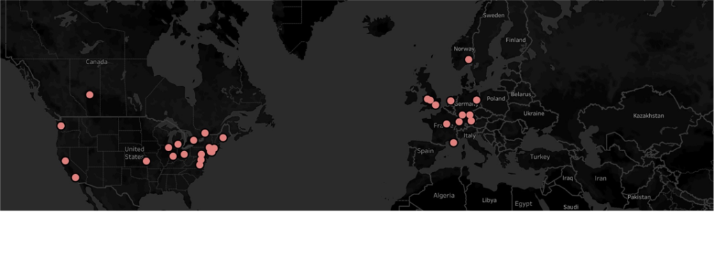
Back in the 1860s, when Sir Francis Galton first conceived Eugenics, it wasn’t rejected as the pseudoscience we know it as today. On the contrary, the idea spread as a form of humanitarian compassion. My mapping idea was to visualize how this ‘noble’ idea spread worldwide and ultimately set the foundation for justifying genocide in Nazi Germany.
I gathered data from https://eugenicsarchive.ca, which is a database of Eugenics-related information about its history and continued significance today. I picked what I considered some of the more significant developments in Eugenics over time for mapping. I gathered the coordinates of where these took place, put them into an Excel spreadsheet, and then imported them to Tableau. My first visualization (History of Eugenics on the Tableau page above) mapped the locations, and if you click on any red dots, you get a description of what happened there.
What this map didn’t show was how eugenics spread over time so I set myself the goal of animating this evolution. I spent way too much time trying to figure this out, but the little victories of accomplishments made it worth while.
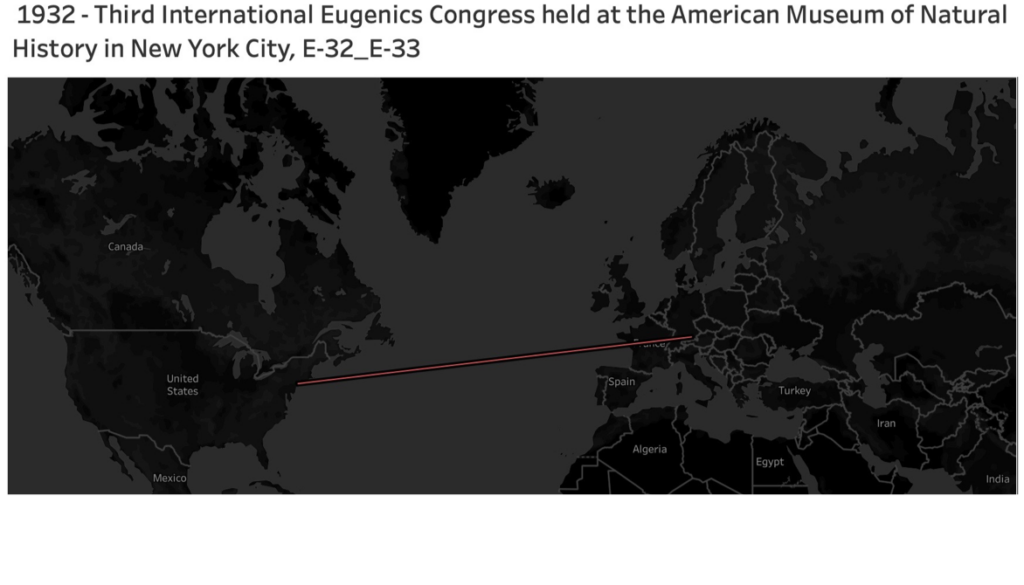
If you go to my Tableau public page and view the ‘History of Eugenics Over Time’ visualization and hit the small play button above ‘Show History’ in the top right corner, it should play the animation I made. You can view a video of it below, but it’s better played on Tableau, if it works!
I chose the dark background and laser-like red lines to convey a sense of danger and how these ideas were sooner or later going to reach an inevitable conclusion in a place like Nazi Germany. Overall, I’m happy enough with the results, but I’d prefer it visualized more powerfully.

This entry is licensed under a Creative Commons Attribution-NonCommercial-ShareAlike 4.0 International license.