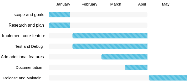
Python is a great programming language and one of the fastest-growing programming languages in the world due to its versatility. Python can be used for mobile app development, web development, and data analytics because of supporting a vast number of modules and packages. Although Python is known for its user-friendliness and readability, it inherits all the hardships that involves in learning any programming language. This is especially true for people from various backgrounds, such as Digital Humanities scholars. The goal of this project proposal is to change that. We propose PyNLPVIS which is a low-code library for Natural language processing and data visualization. PyNLPVIS will be a series of cohesive, reusable functions that will streamline text analysis and data visualization. The library will be hosted as a PyPi project so that, it can be easily accessible not only to humanists but also to the masses.
Methods
The project will be written in python as a module and will be shared as a PyPi project to enhance accessibility. Below is the simplest code for parts of speech tagging with NLTK barring that the textual data is already clean.
import nltk
nltk.download('punkt')
nltk.download('averaged_perceptron_tagger')
from collections import Counter

text = "It is necessary for any Data Scientist to understand Natural Language Processing"
text = text.lower()
tokens = nltk.word_tokenize(text)
pos = nltk.pos_tag(tokens)
the_count = Counter(tag for _, tag in pos)
print(the_count)
PyNLPVis will create an abstraction by taking care of data processing from Line of Code(loc) text = text.lower() till the end in the background. To accomplish this the library will be equipped with a sample function like the following.
def pos_tagger(text):
 text = text.lower()
 tokens = nltk.word_tokenize(text)
 pos = nltk.pos_tag(tokens)
 the_count = Counter(tag for _, tag in pos)
 print(the_count)
Once we set up the library as a PyPi project, the user will simply integrate the library in their python script with the following loc.
import pos_tagger from PyNLPVis
Then the user needs to simply pass the text data using the following command to get a result from POS tagging.
pos_tagger(/*User defined text*/)
The low code nature of PyNLPVis has reduced the necessity of writing several locs to just a couple of locs for this instance.
Also visualizing the output of the pos_tagger for instance as a Word Cloud, the user has to simply do the following
import word_cloud from PyNLPVis
pos = pos_tagger(/*User defined text*/)
word_cloud(pos)
If making programming more accessible is the name of the game, in that sense most python workshops do an excellent job to pull learners with beginner-friendly design.
In-detail learning, in the beginning, is extremely useful for avid learners.
Since by design most of the workshops are low stakes, learners never feel intimidated by the content.
Low-stakes nature ensures participants from diverse communities and backgrounds.
The bad:
Doesn’t address the different learning rates of the learners.
For programming workshops, motivation is often proportionate to the challenge presented. Because of the low stake nature and lack of challenge, motivation curbs down significantly after the initial session.
The Ugly:
Doesn’t teach real-world concepts like debugging and computational thinking. Who writes raw codes nowadays? More often than not, Developers go to stack overflow to seek solutions and ended up debugging thousands of lines of code suggested by the others developer communities.
Utopia or the Future of Programming?
Since the inception of artificial intelligence, it has been just a moment away when some genius computer scientist will come up with the idea of teaching an inherently dumb machine how to speak its language. Yes, I am referring to training an artificial neural network (ANN) with codes that community-like stake overflow has built over time. What an ingenious idea to make programmers obsolete! I call it the next evolution. Hey, if the machine running GitHub Copilot can generate code to generate solutions that are meant to help us rather than extinguish us. Programmers will always be involved in guiding the machines and evaluating what they have produced. However, the role will change. I assume the programmers will have to debug more codes in the future rather than write raw codes. The future is not far away when entry-level programming jobs are replaced by bots and neural networks.
Before assessing the capability and dissecting the structure of CUNY commons, let me express my appreciation for CUNY common. The concept is perfect. I appreciate the thought behind it and how it makes knowledge produced in various CUNY institutions accessible to all CUNY students.
CUNY Commons is built on the concept of multisite. BuddyPress, a community-building plugin that allows having forums and groups on top of WordPress has been used. The lead developer of the project is Boone B. Gorges who is also the lead developer of the BuddyPress plugin and a former student of the Graduate Center.
Disclaimer!! All the assumptions I have made from here on are based on poking around CUNY Academic Commons on GitHub and the website’s source code. I could be mistaken, after all, I am human.
The folder of the theme for CUNY academic common(CAC) is bp-nelo. I assume this is a modified theme of the bp-default theme. The website is running on the latest BuddyPress plugin 10.6. This is great because it shows that CAC has been getting regular updates. CAC is open source and all the development is available on GitHub.
I assume CAC is using Reclaim Hosting, an educator-friendly hosting service. CAC provides users the ability to host their own site, this is a feature of the BuddyPress plugin. The users can set up their site with the shared hosting of CAC. This provides users limited access to the WP dashboard through abstraction. Users can add pages, change themes(themes that are available within Commons, the number of themes is growing!!), manage users just like hosting their own website with a hosting service. All these features are free for all CUNY students!! This makes CAC a great place to showcase coursework, and academic projects, or even make a portfolio.
Now comes the criticism! Throughout the semester, I faced problems receiving notifications from the common groups. This is most likely to do with the notification management system of the BuddyPress plugin. I assume this is a BuddyPress bug. Also, how about those distorted emails forwarded from the Commons? CAC uses wired URL masking, which does not play well within the forwarded message. Occasionally, the hyperlink embedded within the email turned out to be broken. I assume the WP Better Emails plugin has been integrated with BuddyPress for formatting HTML emails so that they can be forwarded to the users. Furthermore, I believe the issue with email formatting is not site-wide. It probably has something to do with group settings, maybe? The developer knows better! Anyway, it is high time that CAC fixes this issue.
The development progress and logs for CAC are available at
This week, the class provided the opportunity to see social annotation in action. Here is my effort toward social annotation.
social media by design is in the fourth dimension
How much to share
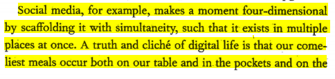
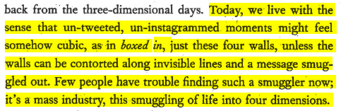
I want the student to focus on the rationale behind the existence of the fourth dimension in social media where we create our picture-perfect world to escape reality. The author mentioned in the text, nowadays, untweeted, uninstagrammed moments might feel somehow cubic perhaps trapped within the perfect four-sided wall box and just about to sneak out if and only if the walls are contorted. I want the students to justify the psychological motivation behind sharing each and every moment on social media. What is it like to be trapped in a fictitious self-made reality full of expectations? Contextualize and address the tension to figure out just the perfect balance.
Psychological Changes
Are we skipping reality?
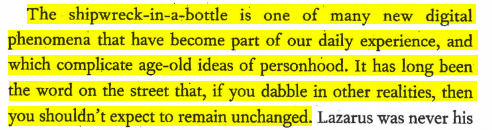
The author mentioned you dabble in other realities, then you should not expect to remain unchanged. I want the student to figure out What’s the effect of the four dimensions that inherently change human psychology and what is its impact on the community and society? Trapped within Doll House, how does it impact the ability to recognize real problems like climate change? Contextualize real-world problems and how can you utilize social media and the fourth dimension to bring positive change to the shipwrecked world.
“What is Distant Reading?”, the title of a NY Times article by Kathryn Schulz has provided one of the simplest ways to understand the topic, “understanding literature not by studying particular texts, but by aggregating and analyzing massive amounts of data.” One might be wondering how to utilize distant reading. In this praxis assignment, I have used Topic modeling, a distant reading approach to analyze historical newspapers.
Newspapers that have survived the course of time are among the most valuable sources of information accessible to academics for researching civilizations and cultures of the past, especially in the context of historical research. Virtually all significant dialogues and disputes in society and culture throughout history were brought to light in newspapers. This is due to the fact that, as early as the mid-nineteenth century, almost every town regardless of its size saw the establishment of a minimum of one newspaper. Within the newspaper, every facet of the social and daily life of the people is covered with articles such as regarding political debate, promotion of goods and services, and so on and so forth. To this date, no other repository was found with scholarly editorials from history covering controversial topics like political issues, marketing promotion for fashionable clothing, news on major sporting events, and poetry by a local poet all in one place. In a nutshell, for contemporary historians, newspapers record the entire spectrum of human experience better than any other source, giving them access to the past, unlike any other medium.
However, despite their importance, newspapers have remained one of the most underused historical resources for a long time. Historians have found it a daunting task and not to mention sometimes impossible to study historical newspapers page by page for a specific research topic due to the enormous amount and range of material they provide. For instance, just to address one research topic, a historian might have to go through hundreds of thousands of newspaper articles. Ironically, after all these efforts there is still no guarantee of finding the required information.
In this praxis, an attempt will be made to uncover the most interesting and potentially important topics from a period of time using topic modeling on the Paper Past database from DIgitalNZ. As opposed to utilizing the knowledge of historians at the very beginning to find out relevant topics by going through an abundance of newspapers, this praxis relies on a reverse approach. A computational approach will be used for clustering data into topics which will then be evaluated from a historian’s point of view to identify specific patterns in the dataset.
The Experiment
Dataset
Paper Past DigitalNZ is comprised of the following four sections:
Newspapers
This section contains digitized newspaper issues from the eighteenth, nineteenth, and twentieth centuries from the New Zealand and Pacific regions. Each newspaper has a page dedicated to providing details about the publication, such as the period range in which it was accessible online. Also, there is an Explore all newspapers page in which one can discover the URL of all the newspapers. Papers Past contains only a small sample of New Zealand’s total newspaper output during the period covered by the site. But it is more than sufficient for the intended term paper.
During the year 2015, the National Library of New Zealand incorporated a compilation of historical newspapers into their collection that was predominantly targeted at a Mori audience during 1842 and 1935. For this task to be carried out, the University of Waikato’s Computer Science Department used the digital Niupepa Archive, which was created and made accessible by the New Zealand Digital Library Project in 2000.
Magazines and Journals
Letters and Diaries
Parliamentary Papers
Newspaper articles are the particular topic of interest for this praxis. More specifically, the praxis will build a topic model with newspaper articles ranging from 1830-1845. This timeframe is selected because New Zealand announced its declaration of independence in 1835 and this praxis is particularly targeted to find out the topics that emerged in the society during the pre-independence and post-independence declaration period. Paper past provides an excellent API that is open to all. I have gathered 12596 newspaper articles available in the paper past database using the API. The data was migrated into the pandas data frame for further processing and building a topic model on top of it.
I will not be going to discuss the nitty gritty of model building and technical stuff in this article. Instead, I will focus on evaluation and discussion.
Topic Visualization
The visualization is interactive. If you want to check out the visualization, please follow the URL below.
The evaluation of the topic model results in this praxis has been done through online browsing and looking for the history of New Zealand during the time period of 1830-1845 along with using general intuition. A historian with special knowledge of New Zealand’s history might have judged better. Some of the topic groups emerged from the topic model results along explanation provided in table 1 for gensim LDA model and table 2 for gensim mallet model.
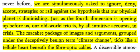
Franco Moretti’s call for abandoning close reading caused a stir in literary scholarship. Moretti’s intention was to leverage big data to find hidden patterns. This is extremely controversial for assessing a complex state like emotions. What is an emotion? Emotions are psychological states that are unique to each person. “Emotions are defined in various ways depending on who you ask.” – Gendron, 2010. Then how to quantify emotion or is it even possible to quantify emotion? In the world of AI, chatbots, and metrics, how do machine understands emotion? Is it even ethical to use machines for quantifying emotions?
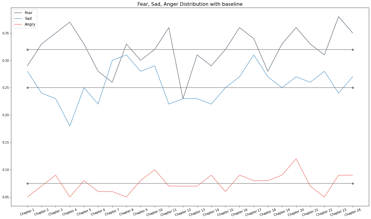
Nevertheless, I have chosen “Frankenstein” by Mary Shelly for this visualization to explore distant reading and analyze emotion to show the masterpiece through the lens of computational analysis. A dictionary-based approach has been used for this purpose. A dictionary is equipped with words and their classified emotion. Texts are prepared, preprocessed, and cleaned using python libraries. The Texts are parsed into word tokens and classified based on the dictionary to generate emotion scores.
Since Python is such a useful programming language for data wrangling, how can I use it to map data without exporting data frames to a third-party tool like Tableau? This is the question I had back in 2020 while I was working with the London crime dataset. After googling for a while, I found folium, a python based library that uses Leaflet.js for mapping. The main concept behind folium is that one will manipulate the data in python and then visualize the map with Leaftlet.js through folium.
The project was firstly intended to find the safest boroughs in London based on the reported crime data. Then cluster the neighborhoods of the safest borough based on the crime data and amenities closer. This will help users to find the best place to live within the safest borough. I am writing this article to explain the workflow of the project in detail. Since this is a blog article I have limited time and space to achieve my objective. I will try to deliver the fundamentals. The development environment I have used for this project is google colab.
Dataset Description:
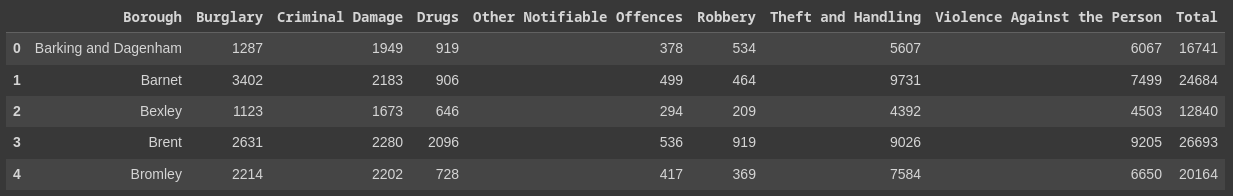
I pulled the London crime dataset from Kaggle which consists of 13M rows of criminal reports by month, London boroughs, and crime category from 2008 to 2016. The dataset was created by Jacob Boysen by pulling .txt files from the Google Cloud Platform and then converted to .csv.
Working Process:
Once a dataset has been acquired, the first thing I did loading it into a dataframe for pre-processing. I used pandas, a python library for data wrangling for this purpose. Pandas can be used with python script by importing with the following command.
import pandas as pd
A .csv file can be imported into dataframe with read_csv function. Loaded data can be viewed with df.head() command. This will return the first 5 rows of the dataframe.
As you can see the original dataset contained null values, which required some preprocessing. I dropped the null values with dropna(), and added the total number of crimes per major_category per borough, and total crimes per borough. Finally dropped the rest of the columns to create a new dataframe. The processed dataframe I got is given below.
Next, I did some plotting to find out the safest district. Below were the 5 safest districts in terms of total crime. Kingston upon Thames was the safest borough according to the plot.
At this point, I required all the neighborhoods of Kingston upon Thames. I used Wikipedia for this. Then I used a geocoder to get the coordinates of the neighborhoods. The dataframe with coordinates is given below.
Then I used this dataframe to map the neighborhoods with folium.
To explore the neighborhoods, I used foursquare API to find out the most common venues around the neighborhoods. Below was the result.
Then I used the k-means clustering algorithm to cluster the neighborhoods into 5 clusters based on crime data and amenities around. Cluster 0 represents the best to live in Kingston upon Thames borough. After the clustering, I again mapped the results with folium.
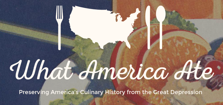
Cover of What America Ate Project. Source: https://whatamericaate.org/
Launched in the spring of 2017, What America Ate, is an interactive website and online food recipe archive created by the collaboration among Digital Humanities professors and students from the University of Michigan. The project was funded by National Endowment for the Humanities with the mission to discover the everchanging diet and food habits of the American people in different historical phenomena during the Great Depression in the 1930s and 1940s.
The project contains a vast amount of Digitized content including 200 rare community cookbooks, rare promotional materials, flyers, and recipe booklets. When I was browsing through the project, I could not exactly find how long did it take to complete such a mammoth project. However, It is fair to assume that it takes years because of the sheer amount of content it has. Although, the data in the What America Ate project came from multiple sources, the majority of it comes from American Eat, a Depression Era project. In essence, What America Ate can be considered as an extended effort to understand different aspects of American Life during the era. The primary objective of the project is to make the historical record of food culture available to the masses using digital tools.
The interface of the project contains content in multiple formats to attract diverse users. There is a Browse section on the website with filters like Regions, Format, and Years to narrow down the browsing result to specific research interests. Also, a Basic and Advance Search functionality is available in the interface that facilitates searching from a few phrases, and keywords to perform complex field-specific searches with multi-select dropdown menus. A detailed recipe section is available to categorize Dishes based on time, course, and ingredients to attract foodies who are just browsing the project to find out what Americans used to eat in breakfast or as soup. Each recipe also contains a number of associated metadata such as description, date range, language, sources, citations, and many more! Furthermore, there is a map visualization to categorize recipes by different regions of America. The project also invites volunteers to transcribe the scanned images.
Although the What America Ate project is populated with thousands of materials, it does not contain all the contents that were available at that period. Instead, the project utilizes sampling to find out the representatives that epitomize different food traditions from different regions of America. One criticism that I have about the project is regarding sampling bias that is visible in the number of selected recipes by region. For instance, most of the recipes are from the far west and south which is more than any other region.
In conclusion, What America Ate is a captivating project that offers a great overview of America’s culinary history. Like many other DH projects, what I liked most is the inclusive characteristics of What we ate that serve and appeal to a broad range of audiences.
The transition from the tag “the next big thing”(Chronicle, 2009) to “the thing”(Pannapacker, 2011) requires some justification. Also, actions speak louder than words. Let’s examine some of the projects to justify the importance of DH.
The Torn Apart / Separados, a collaborative project launched in June 2018 centered around the United States immigration policy of separating families at the Mexico-U.S. border. This project is under the “big tent” of social justice and interventions against government policy to avert humanitarian crises. The most important aspect of this project is giving voice to the unheard, revealing the untold stories, and focusing on those who require to be uplifted. In a broader way, DH scholars have drawn an overall landscape of immigrant detention. The project demonstrates the collaborative power to execute a mammoth project at a greater speed with a distributed network and the ability of storytelling with data to alert people regarding a crisis.
The Colored Conventions Project is a free publicly accessible digital archive and information resource. The collection contains a series of important national meetings of Black leaders with the goal to enhance the living standard of Black communities across the United States and Canada. The project not only emphasizes the meetings but also sheds light on the crucial work performed by the Black women to make them successful that required representation. The project brings historic collaborative effort to life with digital tools and transforms pedagogy for students, activists, and scholars.
The Early Caribbean Digital Archive, is a publicly accessible collection of Caribbean texts (diaries, novels, poetries, travel records, and history), maps, and images of the early twentieth century of the Caribbean. The collection brings the two most critical aspects to light that are at the core of modern capitalism which also existed in the early Caribbean i.e. Plantation slavery and settler colonialism. Also, the phenomenal storytelling of European imperial domination and enslavement of African and indigenous American people is at the center of the project. The project demonstrates the ability to archive history using digital tools which is an objective of DH.
The aforementioned projects demonstrate the significance of DH in different aspects. In its own way, DH has transformed these projects to serve a greater cause rather than only using digital tools. The question that was raised in the article “The Digital Humanities Moment” is, “Can DH save humanity?” I want to inspect it from the opposite direction of “Does humanity requires saving?” In essence, none of the projects are possible with pure humanities methodology. In my opinion, where traditional humanity stops, DH begins. DH not only fulfills these projects but also set a new standard for Digital projects that truly justify the title “the thing”(Pannapacker, 2011).
Need help with the Commons?
Email us at [email protected] so we can respond to your questions and requests. Please email from your CUNY email address if possible. Or visit our help site for more information: