Author Archives: Benjamin Moerch

Connected Pedagogy Assignment 

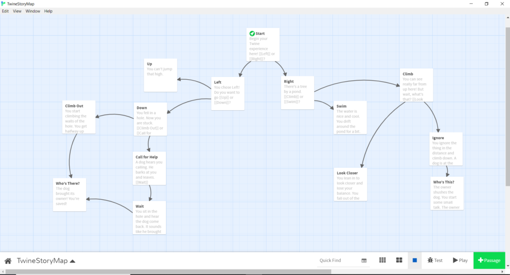
I found this assignment of combining theory and praxis interesting but unfortunately this post is coming a bit delayed because of sickness in my home.

I think it is a relevant discussion to have within DH of how social annotation can be a part of facilitating learning experience for students. My own experience with social annotation only comes from my time at the graduate center, and it was interesting to dig deeper into a more theoretical perspective. The reading points to different interesting aspects of annotations that are relevant to reflect upon. One annotation will not change the whole learning outcome for the students, but I have chosen to focus with my annotation on trying to create collaborative, co-construction of knowledge and at least try to address some of the power issues raised by Brown, M and Croft, B. They described how critical social annotation can undermines norms around knowledge authority. To put some of the theory into practice my annotation asks the students to find out together how to approach one of the claims of the readings. I found it relevant how Roopika Risam points to how immersing students in knowledge production gives experience with deconstruction the political formations of knowledge. It would take more than one annotation but it is a relevant goal to work towards.

I have picked to annotate this part of the reading:But an arguably more interesting phenomenon is the voluntary reversal, for now we endorse and facilitate all sorts of peepholes into our domestic interiors. It is perhaps during our drowsy meanders of the deep night, alone in the glowing dark, that we most often find ourselves, through social media’s chain of associations, in a kitchen full of strangers, caught in a moment of togetherness. One could rightly argue that these views are stage-managed, a show to be enjoyed, the opposite of an ambush. And yet there’s always an excess that can’t be controlled, knowledge that slips around the sides of the spotlight. This is a new vision of our homes, with windows opening onto faraway rooms, and lights shining out into remote darknesses.

Annotation:“This is a new vision of our homes, with windows opening onto faraway rooms, and lights shining out into remote darknesses.” What does this sentence mean to you? I’m personally not an expert on social media and I have only used it limited within the last few years, but I understand it as the author claims we show more of ourselves today than earlier. How can we address this claim? What question can we ask to explore this? I suggest that it can be helpful to ask what our own experiences with social media both as sharing, viewing and interacting. What parts did you find interesting in the reading and what do you wish to know more about?

Reflections about Workshop in interactive storytelling

I attended a workshop about interactive storytelling with the program Twine and I wanna share some of my takeaways.  

Twine is a free and open-source tool for making interactive fiction in the form of web pages. You don’t need to write any code to create a story with Twine, but you can extend your stories with variables, conditional logic, images, CSS, and JavaScript. The goal of the workshop was to get familiar with the program and try to create your own interactive storytelling. The setup was that each person participated online from their own computer and was connected to an online program that took you through the different steps of using twine. Twine works as a grid of paths where at each step you will have to pick your next step.

This is an example of a storyline. 

The workshop started with a video that explained the basic tools followed by time for each person to start creating their own stories. Every 15 min. you would then be matched up with another participant to try their game, give feedback and resume again to your own story. I think the idea of the setup was great. Unfortunately the workshop encountered many technical issues which resulted in I never got to try another participant’s game. Nevertheless I still learned the basics of the program and had some takeaways. 

  • It is an easy program to get started with and uses very simple coding tools. I got a good idea of the program and fast I learned to use very simple tools and started creating a story. It can both be used as a program to do a fast mockup of an idea to an interactive game and can also be created with many different focuses both ethical dilemmas, informative questions etc. I could see myself using it both to create content for teaching students, but also for students themselves to create stories.
  • I started creating my story without any specific idea, but I was surprised how the program sparked creativity and how fast it was to create a story by very simple means. 
  • Besides the setup did not work because of technical issuesI found the format interesting. To be online and get partnered up with somebody, give them feedback but actually never “meeting” them seemed to work for other people in the workshop.

Beside creating my own story I have afterwards also explored the many different interactive stories created by other users. If you want to explore yourself is there here a list of games made with Twine: https://itch.io/games/made-with-twine

Can archival praxis be an act of resistance? Blogpost

I found the readings and projects for this week interesting. They show a potential for making new ways for doing archival work. These approaches are inspiring and in this blogpost I will reflect upon the readings and highlight the project DocNow for providing tools for archivists, activists, researchers to gather social media data.

As described in the reading “Towards Slow Archival” by Kimberly Christen and Jane Anderson the history of collection is the history of colonialism. They reading raises the question about “how do we recognize and rebuild archival practices, structures, procedures, and workflows that allow for relational, reciprocal , respectful , and restorative connections to knowledge, kin, and community within their frame?” Their specific method is slow archiving and by doing collaborative archiving. I find the work of Michel-Rolph Trouillot relevant to this call for a new decolonizing praxis. Trouillot was a Haitian American Professor of Anthropology and Social Sciences at the University of Chicago and he contributed with many books to the field of anthropology. He is best known for exploring themes of origins and application of social science in academia and its consequences in the world. He discusses the study of the “other” in anthropology and how this has led to theories of inherent distinctions between Westerners and non-westerners. He argues we need to look upon the categories and concepts we think with as something that shapes our experience but that very experience also shapes in turn the categories and concepts. It gives space for reflection and for questioning some of our fundamental assumptions when doing research, and I see this as another way to try to decolonize knowledge production. For example, Trouillot uses this approach to work with these ideas to reimagine the Caribbean peasants as agents of their own history instead of as victims. In a similar way Christen and Anderson call to move archival works away from preservation and towards “processes of opposing imperial and ongoing forms of collecting and classifying which isolate the relational, deeply embodied, practiced, and dynamic processes between people, belongings, land, and communities that make, remake, and unmake cultural heritage, knowledge, and traditions.” (page 100) How does digital humanities create new ways of archival work towards as an act of care and resistance?


One of the selected projects for this week DocNow, tries to deal with this struggle. The Documenting the Now (DocNow) project’s primary aim is to help preserve and chronicalize historically significant events and other digitally relevant content found on social media sites. It focuses on providing a variety of digital tools, as well as acts as an appraisal of content, to help analyze social media content. A strong focus on ethical collection and preservation of social media data adheres to Twitter’s notion of honoring the user intent as well as preserving the rights of content creators. In many ways the site offers a large range of tools and additional resources to create a way for archivists, activists, researchers to gather social media data. The website consists of six different tools created by the DocNow project which are all accessible via GitHub, a software development platform. Utilizing GitHub allows the organization to create a more open and accessible participatory environment, which agrees with their community-based approach. I see the project as trying to be a way for not only collaboration between cultural institutions and people, but trying to give the tools to the people to conduct their own research. As the report “Beyond the hashtags: #Ferguson, #Blacklivesmatter, and the online struggle for offline justice” partly concludes the primary goals of social media use among their interviewees were education, amplification of marginalized voices, and structural police reform. The report shows how movements can learn valuable knowledge from analyzing their “own” data. I believe it highlights the relevans of making the tools of archival work more accessible. This example might be a less traditional approach to archival praxis, but I think it manages to go beyond the idea of preservation and instead deals with the concepts of ownership of history and data. I’m curious if we are gonna see more similar research in the future and how it might affect the power relationships and knowledge production within archival works.

Blog post – Visualization Assignment

I chose for this assignment to work with visualization to explore the opportunities of the program “Tableau”. I only have little experience from last semester where I worked with a large datasets of information from NYC about community gardens. I wanted to find out more about what data is publicly available, but to push it in another direction than geospatial. Therefore I went into this assignment hoping to learn more about graphs or similar. With that in mind I set out to explore the database “NYC Open Data”. Coming from a background in teaching and a very different school system from Denmark I have an interest in the school system in NYC. I wanted to find out what I could tell about education in New York from a digital humanist point of view by exploring datasets. 

At NYC Open Data there exists a lot of dataset, but some of them are hard to understand without context and others are hard to work with. It is for example possible to find information about different initiatives and specific programs at each specific school in New York, but those datasets would be hard to visualize. I ended up looking at general enrollment in schools in New York over the last couple of years. A dataset called “Demographic snapshot citywide” with different information about who enrolls in schools in New York. 

Without going too deep into the dataset I still wanted to give a bit of context to situated the dataset more. From the website it tells the user that the data is collected using multiple data sources, including DOE’s Audited Register, biographic data from Automate The Schools (ATS) system and the Location Code Generation and Management System (LCGMS). Data can be used to view citywide demographic and enrollment trends over time. Enrollment counts are based on the October 31 Audited Register for each school year. 

I tried different things to create connections between the data for the reader but not everything went as I hoped. I looked at the development over time but had troubles putting the visuals together in a more cohesive graph. I wanted to tell one narrative to make it more clear what I wanted to communicate with this visualization, but also encountered that I need to have a better knowledge of the field and the data to present one narrative. In the end I focused upon the data showing a growth in students enrolled under the category “poverty” over the last couples of years.

As argued by visual theorist and author, Johanna Drucker in “Humanities Approaches to Graphical Display” (2011), data often comes across as mere descriptive and therefore lacks the acknowledgement of the interpretation process behind the final graphical expressions. It is part of a discussion within digital humanities of how to use bigger datasets and still be rooted in the humanistic knowledge production it is based on. Looking at my process and work it is clear to me that a lot of questions are unanswered but they have furthermore evoked my curiosity. Is poverty on the rise in New York? Or has New York become better at collecting data about students today? Or are more low income families kids attending school than earlier? It has raised more questions than these, and some important perspectives to look into in order to understand and interpret the data more fully. Matthew K. Gold and Lauren F. Klein describes in their piece “A DH That Matters” (2019) another relevant perspective to reflect upon: how social and cultural biases pervade technologies, platforms and devices. How is tableau created and what values and ways of thinking does it convey? How does it structure data and what does the program consider data? I don’t have the answers to these questions but I hope they will be explored more during this semester.

Here follows a few screenshots from my process working with tableau.

  • First screenshot shows the development in three different parts of the dataset “Enrollment”, “% poverty” and “Students with disabilities”.
  • Second shows a tried in combining different datasets
  • Third shows part of the process in creating the graphs.

Blog post – Reflections about in-class discussions and mapping

After last class I have thought more about the discussions surrounding questions about sovereignty and alternative ways of mapping to convey other ideas than traditionalist maps. The readings for the class all touched upon how regular maps both do not represent reality (if that is even possible) and are often centered around a western viewpoint. 

We discussed the article “Visualizing Sovereignty: Cartographic Queries for the Digital Age” and how they in many ways did not succeed in creating an alternative map. That has since reminded me of specific ethnographic methods that I have worked with earlier. It is a method that works with informants creating their own alternative maps of a specific part of their everyday life, and I have come across it in regard to nation borders. It is also called methodological cartography, and the idea is that when you map out something, you also obtain knowledge of something. I have worked with it in the context of the border between Germany and Denmark which is an “open border” meaning no control of crossing. I got inspired by ethnologist Marie Sandbjerg who has done a larger study of the border between Poland and Germany where she asked high school students about their everyday experience with their border. She used mapping as a method and got the students to draw their everyday lives around borders. Some of her findings were about how the border had different meanings and were interacted with differently. It is a way of understanding the border in a performative gaze that helps the concept of explaining the formation of realities (such as objects, materials, artifacts and subjects), which is something that happens within practice in people’s lives (Sandbjerg, M. (2009) p. 114). Therefore the border can be enacted in different ways. I think it opens up to an interesting way of understanding maps, borders and sovereignty. I have included some of the drawings from her studies.

The specific method became relevant to me again talking about the way to visualize and theorize Caribbean sovereignty. In the reading by Yarimar Bonilla and Max Hantel they describe how a traditional understanding of sovereignty is different to the history and present of the Caribbean. They describe it as “This history of fractured, uneven, contested, and negotiated sovereignty continues to shape the region as a whole, and at present the majority of societies in the Caribbean are not independent nation-states but rather protectorates, territories, departments, and commonwealths personal”. By using the gaze of borders as performative it opens up to an understanding of the borders not as only drawings on a map but something  people enact and interact with. A way to describe and visualize this understanding could be to use methodological cartography. It could be interesting to see if there exists studies of people in the Carribieans own experience of the borders and sovereignty in their everyday lives. 

I just wanted to add a last note about even though the borders can be viewed as performative and fluid I still believe they have a big impact on many people’s lives and are meet more as frontier and boundary.

Sandberg, Marie (2009): “Performing the Border: Cartographic Enactments of the German–Polish Border among German and Polish High-school Pupils”, Anthropological Journal of European Cultures Volume 18, 2009: 107–128,

Mapping task – a journey into the big amounts of data

With this praxis assignment I wanted to explore mapping in the context of Denmark, and I thought it was a good opportunity to get more familiar with tableau as a program for mapping. In the following text I will reflect upon the process and some of my reflections.

I started by asking what is traditionally not mapped and found it interesting to explore the themes of borders in this case Denmark. On a map of Denmark borders are thick lines and come across as more permanent than they are both historically and for the people living around them. I became interested in a map showing the movement of people across borders, and tried to open up the understanding of borders as not necessarily only around a nation but a broader understanding. How can a map show both the big consequences and impact borders have on people’s lives and at the same time the fluidity of them? Are borders made by nations not people? Since I set out to work in Tableau I needed to find a dataset large enough to work to map out. With my experience in Tableau the data needs to be readable for the program and fit into how it is built. I started searching for already collected datasets which is something I have not done before since it has not been relevant for my work or studies. My search led me to realize there exists a lot of free datasets online both from New York and from Copenhagen. An exciting discovery as I found data sets about a wide range of topics. From datasets with different kinds of trees, air quality in New York and to how many new bike lanes are made in 2021 in Copenhagen. I actually found the dataset of three interesting and tried to incorporate it in tableau but unfortunately I found out that tableau doesn’t work with European cities in the same way as it does with cities within the USA. I could not just use zip codes and it did not recognize my multi poly location. It reminded me of one of our readings “Dividing Lines. Mapping platforms like Google Earth have the legacies of colonialism programmed into them” by Mayukh Sen. I realized that Tableau is not that easy to use outside Western countries. It made me reflect upon the tools we are using within digital humanities and if they are helpful in decolonization knowledge production or works in opposite ways? Mayukh Sen presents an argument of how Google Earth has the legacies of colonialism programmed into them. He further explains on Google Earth a lot of photos in Indias are blurry and not sharp and creates a link between colonialism and the way Google earth’s hireaky in selected countries. It makes me wonder if DH used tools have a colonialism programmed into them maybe without realizing? It suddenly makes the quote from Audre Lorde very literally: “The master’s tools will never dismantle the master’s house”.

As I search for a solution to my problem with locations in Denmark I come across a larger database from Denmark called “Danmark statistic bank” (the danish bank of statistics). There exist many different kinds of datasets from Copenhagen, some similar to what I have found from New York and others very different. One of the interesting things about both the differences and similarities in themes was the way it was framed. An example is the overall categories. NYC open data focuses on business, city government, education, environment and health while Copenhagen open data focus also on health and environment but also transportation, culture and sports. It does not surprise me that there are cultural differences, but it becomes relevant when these differences are the basis for mapping and data collection.

While I could not make the data work from Copenhagen with Tableau I ended up finding out that the Danish open data source has its own mapping program for visualizing the data. I have attached these because I found them interesting. They show what the city has categories people into as data: danish, western immigrants and other immigrants. I could continue talking about this matter and the way they divided people, but I will save that for another post. Luckily I did not find a similar division in the datasets from NYC but instead I found a list of locations if you as an immigrant are searching for assistance. Which I made a little map about. Not my intended idea but I got to work with Tableau and learn more about the program.

Blog post 1

After some technical issue I have access to the site and therefore posts my blog a bit delayed.

I enjoyed this week’s readings because they gave me an insight into the changes of the field of digital humanities over time. They showed different aspects of digital humanities, and at the same time more or less all of them acknowledge that digital humanities can’t not easily be defined and should not be defined. It is a field that is changing and evolving over time which can also be seen as a strength. I find this aspect relevant when looking at the two projects “Colored Conventions Project ” and “The early Caribbean Digital Archive”, since both projects work with archival material but gives the opportunity for the user to explore and understand the material in different ways. In ways the projects reflect ideas from the readings about not narrowing down and putting the projects in a specific box. 

Both projects look at archival material and historical periods with new approaches than the traditional way. The project Colored Conventions uses historical images and documents to expand our understanding of early Black organizing, and The Early Caribbean Digital Archive wished to expand how we discuss and think about history, colonialism, and the experiences of enslaved. When looking at the projects with the gaze of digital humanities their use of history and wish to create a change stands out. Something that the reading “A DH that Matter” touches upon with the potential for DH to be a technically and historically informed resistance. Both these projects reflect these ideas as they both present a push back to traditional storytelling of their fields, and ask the user to reflect on a new way to approach the specific historical context. Both are created with the idea of representing parts of history that are often forgotten or not given space. In many ways both projects can be defined as digital humanities projects today even though the discussion of digital humanities as a field is still changing and probably will continue to be debated.