
I chose for this assignment to work with visualization to explore the opportunities of the program “Tableau”. I only have little experience from last semester where I worked with a large datasets of information from NYC about community gardens. I wanted to find out more about what data is publicly available, but to push it in another direction than geospatial. Therefore I went into this assignment hoping to learn more about graphs or similar. With that in mind I set out to explore the database “NYC Open Data”. Coming from a background in teaching and a very different school system from Denmark I have an interest in the school system in NYC. I wanted to find out what I could tell about education in New York from a digital humanist point of view by exploring datasets.
At NYC Open Data there exists a lot of dataset, but some of them are hard to understand without context and others are hard to work with. It is for example possible to find information about different initiatives and specific programs at each specific school in New York, but those datasets would be hard to visualize. I ended up looking at general enrollment in schools in New York over the last couple of years. A dataset called “Demographic snapshot citywide” with different information about who enrolls in schools in New York.
Without going too deep into the dataset I still wanted to give a bit of context to situated the dataset more. From the website it tells the user that the data is collected using multiple data sources, including DOE’s Audited Register, biographic data from Automate The Schools (ATS) system and the Location Code Generation and Management System (LCGMS). Data can be used to view citywide demographic and enrollment trends over time. Enrollment counts are based on the October 31 Audited Register for each school year.
I tried different things to create connections between the data for the reader but not everything went as I hoped. I looked at the development over time but had troubles putting the visuals together in a more cohesive graph. I wanted to tell one narrative to make it more clear what I wanted to communicate with this visualization, but also encountered that I need to have a better knowledge of the field and the data to present one narrative. In the end I focused upon the data showing a growth in students enrolled under the category “poverty” over the last couples of years.
As argued by visual theorist and author, Johanna Drucker in “Humanities Approaches to Graphical Display” (2011), data often comes across as mere descriptive and therefore lacks the acknowledgement of the interpretation process behind the final graphical expressions. It is part of a discussion within digital humanities of how to use bigger datasets and still be rooted in the humanistic knowledge production it is based on. Looking at my process and work it is clear to me that a lot of questions are unanswered but they have furthermore evoked my curiosity. Is poverty on the rise in New York? Or has New York become better at collecting data about students today? Or are more low income families kids attending school than earlier? It has raised more questions than these, and some important perspectives to look into in order to understand and interpret the data more fully. Matthew K. Gold and Lauren F. Klein describes in their piece “A DH That Matters” (2019) another relevant perspective to reflect upon: how social and cultural biases pervade technologies, platforms and devices. How is tableau created and what values and ways of thinking does it convey? How does it structure data and what does the program consider data? I don’t have the answers to these questions but I hope they will be explored more during this semester.
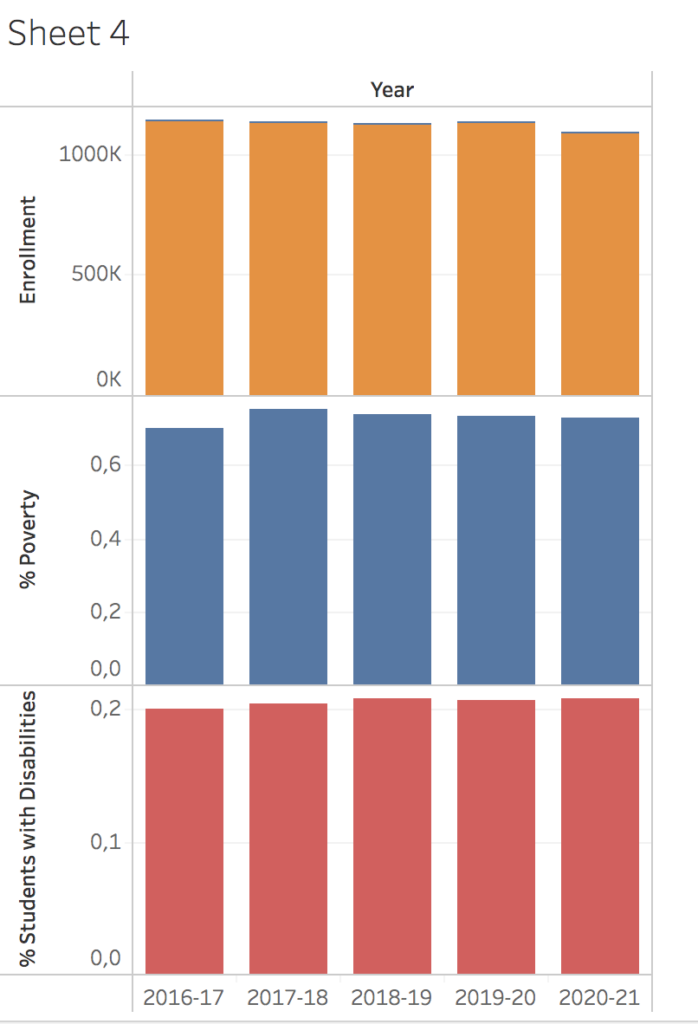
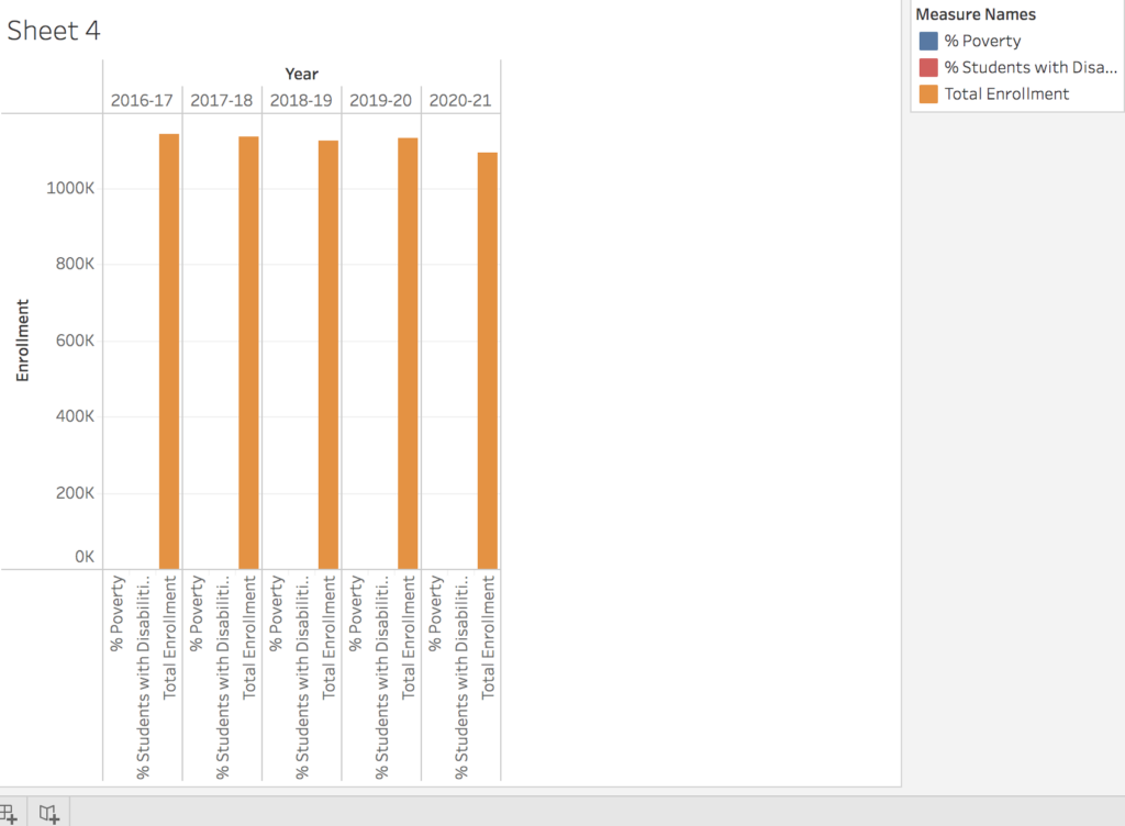
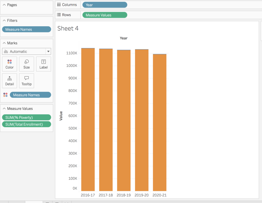
Here follows a few screenshots from my process working with tableau.
- First screenshot shows the development in three different parts of the dataset “Enrollment”, “% poverty” and “Students with disabilities”.
- Second shows a tried in combining different datasets
- Third shows part of the process in creating the graphs.

This entry is licensed under a Creative Commons Attribution-NonCommercial-ShareAlike 4.0 International license.
Hey Ben, this is great, and agreed on the fact that some of the NYC Open Data datasets lack contexts! I’m learning Tableau myself and incurred in an issue where it’s difficult for the eye to see/easily quantify the differences between bars, I came to the conclusion (or workaround) that a potential solution could be to either rescale the y-axis or set your origin say at x=0; y=1100k (for the charts with orange bars for example); it’s not particularly orthodox, but I personally found it beneficial when working on my charts.
Thanks for the tip Gemma! I will try that next time.