Overview: My final project delineates the proposal details of More Than Surviving, focused on Wampanoag social and political activities in the antebellum era (specifically 1830-50). Seeking to counteract the disappearing of Wampanoag from the retelling of the nation’s history and rectify the impact of the black/white racial binary, this project is will highlight the powerful acts of survival and social/political collaboration of the Wampanoag.
Northeastern Indigenous history is often limited to the colonial period. Historians have often focused enquiries and discussion to this time frame as it relates heavily to the founding of the nation, while Indigenous activists often highlight the misconceptions and the trauma and Indigenous perspectives of this period which historians often only approach via the European perspectives available in historical documents. More Than Surviving seeks to shift this perspective to focus on Wampanoag acts of self preservation and agency as well as showcase Indigenous presence in the Northeast beyond the colonial period.
Product
As a means to raise public awareness, the final project will both populate the timeline of Wampanoag political and social activism and activists between 1830-1850, a particularly active political timeframe nationwide, and map the activity to showcase ancestral ties. The online hub will be geared towards the general public, and in addition to the timeline and mapping, it will offer filters related to social/political issues (ex. Native Rights, Racial equality, etc.) and offer information about key individual actors where available. The issues chosen will overlap with national issues of interest to showcase the local and national implications of Wampanoag activism.
First Phase of Many
This project marks the beginning of a potentially long term investigation and sharing of political and social activity between the colonial period and today. Showcasing Indigenous activities decenters the colonial perspective and provides a valuable resource for building mechanisms to ensure cultural and community survival.
Institutional Critiques with Student Collaborators
On November 13 I attended an online lecture hosted by DefCon featuring Dr. Anelise Shrout. Dr. Shrout discussed her pedagogical approach to her DH class focused on investigating the history of Bates college. She provided an overall framework and design of the course as well as specific examples of class activities that supporter her goals.
Dr. Shrout channelled her expertise in the 19th century origins of philanthropy to design a course that investigates Bates’s namesake whose donations enabled the founding of the institution. Bate’s has traditionally offered an origin story that centers on the abolitionist roots of its founders, yet no one had investigated the origins of the wealth that Bates used to fund the school. Through a variety of hands-on activities related to research, data capture, coding, and collaboration, Dr. Shrout empowers her students to investigate their own institution while gaining valuable insight and skills. Her ultimate goal is that students walk away from the class with a deeper understanding of the strengths and weaknesses of data and refined collaboration skills which can be used in any work they pursue. Specific tactical skills she bakes into the course include: ;
Her course included the following activities and pedagogical approaches:
Transcription of 19th Century Records (Skills Research and Critical Understanding of Data (how data is constructed, the implications of how they are structured and how this can hinder and help analyses)
Lessons in reading and writing 19th century handwriting, including practicing with fountain pens. In this case, students capture data as recorded in 18th century donation rosters of Bates College as well as purchase orders of Bates textile mill which fabricated cloth using cotton purchased from Southern slave plantations. Students are able to engage with the original data sources before it is scrubbed and tidy, helping them understand the complexity and imperfection of the resulting data. When digitally capturing historical data many educated guesses are baked into what might eventually appear as “clean data.” The fountain pen exercise helped students to connected in a more visceral way to the period the data originated from, and made their own educated guesses…more educated.
Maneuvering the Data (Skills: coding, collaboration, data visualization and analysis with an awareness of the subjectivity of the data)
This phase in the course includes learning basic coding through exercises developed in Saturn Notebook, watching videos, and discussing in groups. Pairs then apply the specific functions learned to the data that was collected earlier in the semester—enabling students to put it into practice what they had just learned. Professor Shrout seeks feedback in each pairing session to understand if there are any snags, and invite students to consciously consider what is working, not working, or they could do better to ensure successful collaborations. Professor Shrout emphasizes trying and failing over perfection to remove any barriers to familiarizing ones self to the coding environment.
Asking Questions of the Data (Skills: Critical Thinking (Data and History), understanding different approaches to the study of data)
Students are asked to consider what questions can be asked related to the data and beyond and then propose their own personal projects related to their inquiries and findings. In this case students learned that cotton is sold in bales which is equal to 500#—they may then ask why that means in relation to the actual physical labor needed to produce that much cotton. They may ask who else shows up in the data besides Bates (turns out many donors had ties to cotton, some of whom have streets on campus named after them)
Final Projects (Skills: Collaboration, Critical thinking, aiming work at informed civic action in pursuit of social justice)
Students then design projects that encapsulate their findings and bring them to life in ways that they deem appropriate. Some amazing examples were infographics related to the founding donors posted around the campus; a student survey investigating if knowing the ties to southern cotton if students would’ve still applied (they would’ve, and in fact claim they would be more eager if the institution was forthcoming with that information—these findings were shared with the schools leadership). Shrout also shared that a student approached her a year after they had taken the course to voice interest in using the skills she had developed in the class to investigate a sensation of feeling less are on campus. This included discussing with a critical lens what types of data could be used to this end and its shortcomings (eg. Campus police records).
Shrout also generously offered her class outline which she adapts to her specific intentions as the class evolves. She emphasized that she at times had skeptics in the classes—students initially more interested in coding and computer science and those who were intimidated by it. She is careful to emphasize critical thinking skills as the hero of the course to appeal to both coders who think they won’t learn much and allay the fears of the coding-shy.
The lecture was inspiring and inspired, and I fully regret not broadcasting it to our cohort as it aligned perfectly with our current readings and class discussion. Professor Shrout really brings DH to life for her students by putting it to work on a subject that directly impacts them and in a way that empowers them to find their own critical and creative voices within it.
We know that new technology always causes a stir—with champions and detractors rightly debating its implications. The internet is a newer technology, prompting heated discussion as we witness its effect real time. Being more connected and therefore able to share our observations, we also have an opportunity to investigate other institutions and the philosophies behind them to consider how they have also shaped us. We have been born into many longstanding institutions, (ex. public policy, cultural and social hierarchies, family, religions etc.) and have not felt the shock or dissonance of their arrival or evolution so we are not always conscious of their impact on our intellectual and emotional development. I wanted to invite students to look at other places in their lives where they may have been influence in highly impactful but “invisible” ways.
“I was being freshly coded with certain expectations of the world, one of which seemed to be an unflagging belief in the responsiveness of others and which never seemed to learn from its disappointments. Digital technology was reshaping my responses, collaborating with my instincts acts, creating in me, its subject, all kinds of new sensitivities. In that sideways glance at the postcard, I could feel my place in history by the peculiar register of my uneasiness.”
Possible annotations:
What other structures and institutions shape our “expectations of the world?”
How much control over our experience within these spaces do we have?
What other sensations or experiences beyond the dissonance the author describes have made you aware of your “place in history.”
An interesting extension of this reading could be to write a similarly toned exploration imagining the arrival of technologies and modes of communication of the past (telegraph, phone, tv, novel, printing press etc.).
ANNOTATION 2:
The author uses most of the text to discuss the emotional and intellectual changes induced by interaction with the internet, only suggesting its physical impact. There’s a feeling of awe, inevitability, and distress all wrapped up in his witnessing the internets draw and impact. Building on his realization of his impossible expectation that the unsent postcard should garner a response, I am curious what other ways the rewiring of our expectations impact our relationship with the “analogue” world.
“Going online can feel like a step on a homeward journey, where it is the abstract promise of home, rather than any real sense of the home itself, which matters”
Possible annotations:
How do you think an intellectual and emotional construct of “home” compares to the experience of “home” rooted in physical time and place? Is one more desirable than the other?
What implications, if any, do you think the internet’s emphasis on mental engagement says about the future of our relationships to our physical selves and others?
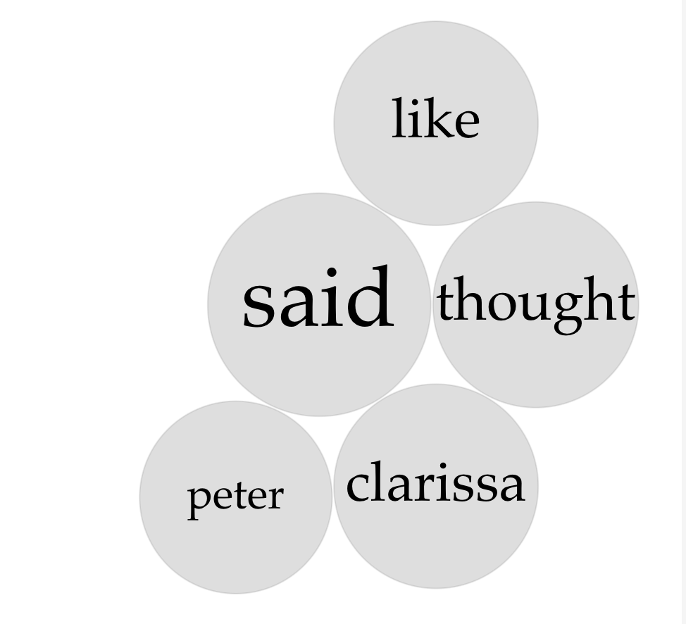
Comparing Close and Distant reading outcomes of Virginia Woolf’s Mrs. Dalloway.
For the text analysis praxis, I chose to test out an observation made while close reading Virginia Woolf’s Mrs. Dalloway. For another DH class, I’ve been working on a group project investigating annotation methods using the Mrs. Dalloway as the basis. Despite Woolf suggesting that she simply let the novel flow through her with no great structure in mind, when reading it’s hard to not feel the seemingly concrete structure on top of which flows the seemingly meandering stream of consciousness dance. Of course that stream of consciousness surfaces themes again and again via the minds of various characters until it becomes plain that Woolf wants us to explore certain aspects of our humanity—youth and age, spontaneity and duty among them.
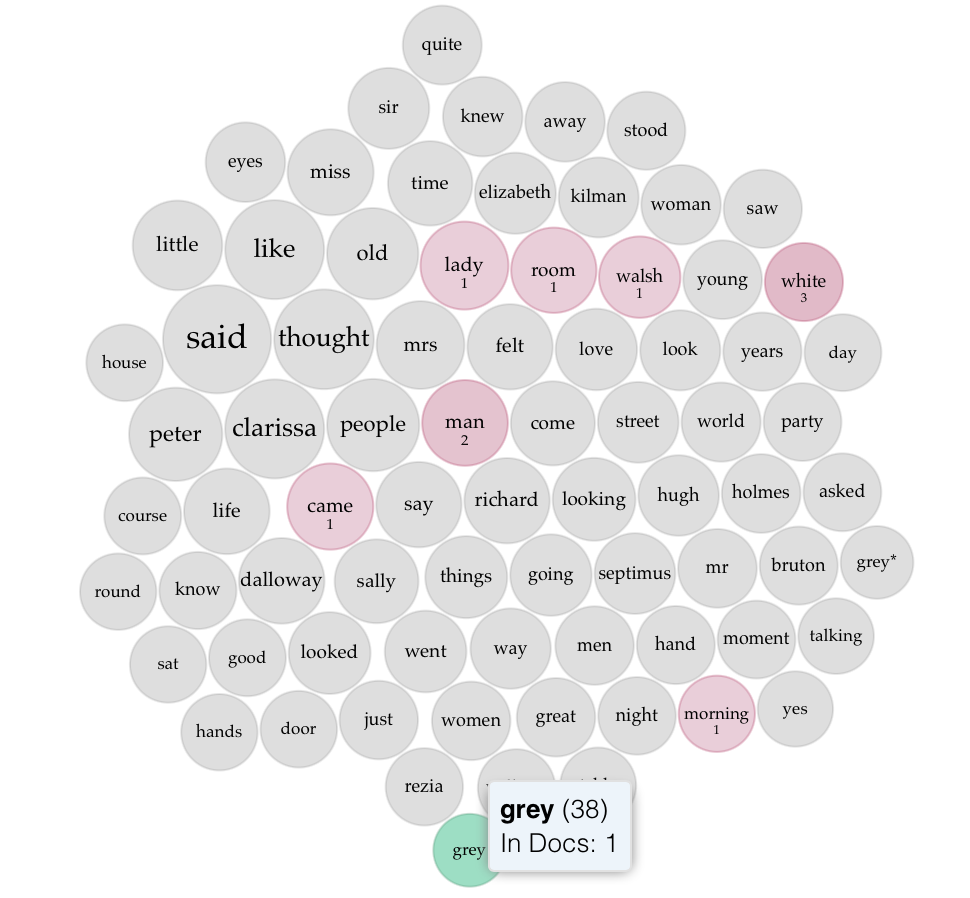
When close reading I felt and remarked that the color grey turned out repeatedly. At first I suspected that the London setting and widely accepted stereotypical assumptions of English weather made me more attuned it (ahh yes, confirmation of that stereotype, I’m picturing the right thing) —maybe even made me overestimate its prevelance. But then I began to notice it being applied to all manner of things—but most often in a manner to denote stature, wisdom, age, and respectability. I also began to nice the mention of roses—a kind of sprinkling evenly throughout the text in relationship to various characters. These flowers were derided, gifted, and displayed—even used by Septimus, a character with a tenuous connection to this Earth, to ground himself in the moment and counteract his tendency lose himself to incoherent thought. I decided that Voyant would be a great way to see what the algorithm’s had to say about my observations. Would the reinforced or minimized—would it help suss out a pattern I didn’t observe?
Looking at the frequency of grey (38 mentions), which appears more than any other color in the text after white (58 mentions), I did see a continued usage throughout the text, and the context revealed what I had suspected. It is often used to denote age (grey hair)—and suggest a more regular and fixed time of life. It is, also, used to signal a more refined air—standing in the world. In relation to the text, I’d even go so far as to say it showcased the kind of fixed and respectable striving of 1923 London. Weather does come in, for sure (grey-blue sky), but more often it describes the appearance of understated and refined clothing, vehicles, and homes of established ladies and gentlemen.
Indeed it was—Sir William Bradshaw’s motor car; low, powerful, grey with plain initials’ interlocked on the panel, as if the pomps of heraldry were incongruous, this man beingthe ghostly helper, the priest of science; and, as the motor car was grey, so to matchits sober suavity, grey furs, silver grey rugs were heaped in it, to keep her ladyshipwarm while she waited.
He had worked very hard; he had won his position by sheer ability (being the son of a shopkeeper); loved his profession; made a fine figurehead at ceremonies and spoke well—all of which had by the time he was knighted given him a heavy look, a weary look (the stream of patients being so incessant, the responsibilities and privileges of his profession so onerous), which weariness, together with his grey hairs, increased the extraordinary distinction of his presence and gave him the reputation (of the utmost importance in dealing with nerve cases) not merely of lightning skill, and almost infallible accuracy in diagnosis but of sympathy; tact; understanding of the human soul.
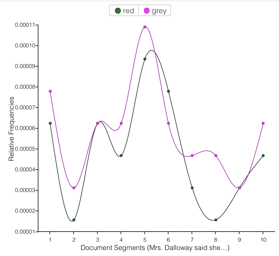
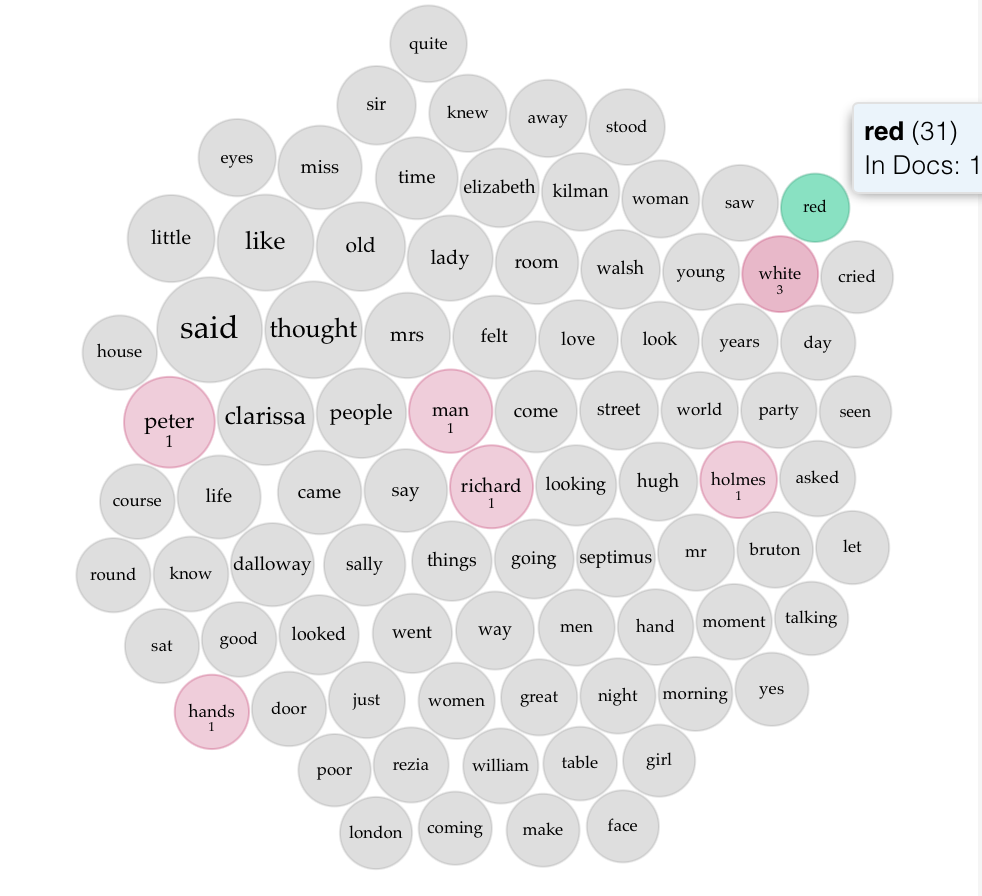
In considering roses, I wondered if it might not be more congruous, given my investigation of the color grey, to shift to investigating the color red. The roses mentioned throughout the book are red—that classic color of love, emotion, youth and intensity. When I made this adjustment something very striking was revealed. The frequency of the mention of red mirrored that of grey—almost as though they went hand in hand. Instead of black and white, Woolf seemed to have leaned into a contrast of grey and red—old vs young, passion vs resignation.
Red and Grey going hand in hand
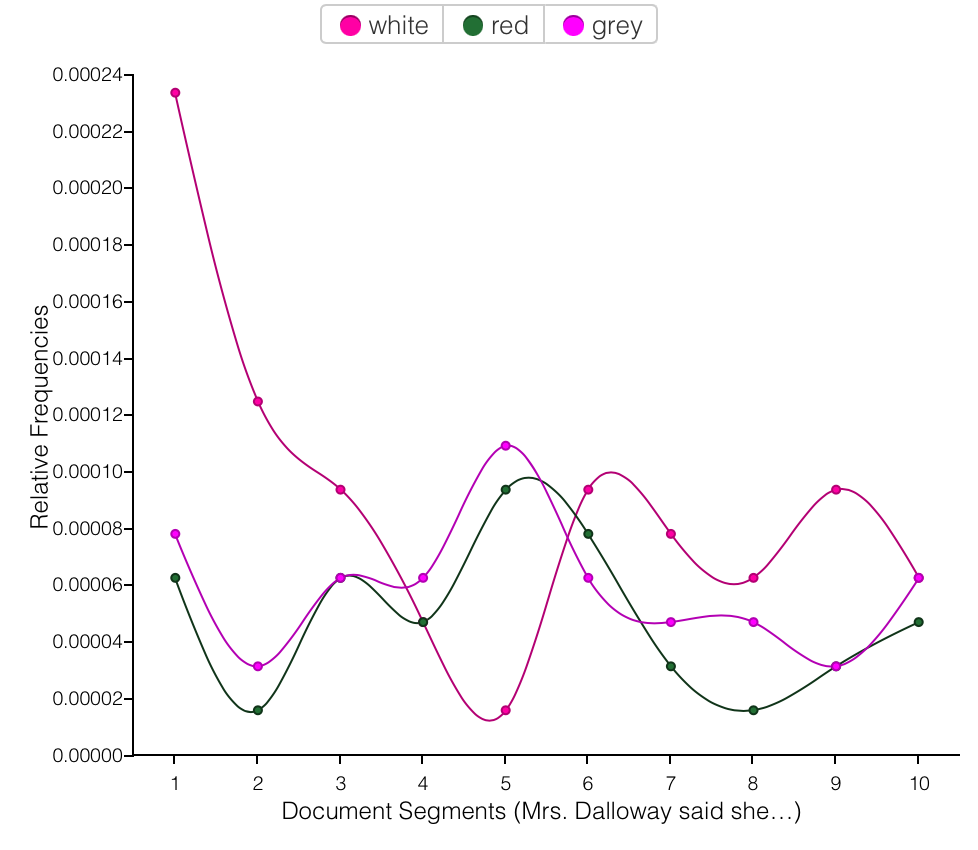
The striking overlap is even more apparent when contrasted with the color most mentioned in the book— white. There is a clear correlation between grey and red.
Red and Grey— best buddiesPeter and Richard chase and try to harness the power of red
Investigating red’s term berry doesn’t give too much away, but digging into the context gives everything away. It’s often mentioned in descriptions with almost riotous abundance of color (in stark contrast to drab and monotonous grey) and often paired with descriptions of flowers and bodily features (again with hair and clothing, but also nostrils, lips, and cheeks). Red is seemingly used to the character experience in the present moment of the novel in contrast to the experience of reminiscence that makes up much of the novel.
… and it was the moment between six and seven when every flower—roses, carnations, irises, lilac—glows; white, violet, red, deep orange; every flower seems toburn by itself, softly, purely in the misty beds; and how she loved the grey-white mothsspinning in and out, over the cherry pie, over the evening primroses!
But she’s not married; she’s young; quite young, thought Peter, the red carnation he had seen her wear as she came across Trafalgar Square burning again in his eyes and making her lips red.
…through all the commodities of the world, perishable and permanent, hams, drugs, flowers, stationery, variously smelling, now sweet, now sour she lurched; saw herself thus lurching with her hat askew, very red in the face, full length in a looking-glass; and at last came out into the street.
And that very handsome, very self-possessed young woman was Elizabeth,over there, by the curtains, in red.
Over all this investigation made me curious about mapping and investigating the many many overlapping patterns and structures in the novel. In fact, this exercise and that in my other class has pushed me into a peculiar space of looking at the novel as a specimen to be poked, prodded, and labeled, graphed and displayed. In this way I might possess and express my own experience of it. The idea of thinking one could “master” a novel in this way feels a bit like a delusion. It’s like trying to create a bot of Woolf’s thought process, but when you press go she doesn’t pass the Turing test. I know that there is value to this work—and as I become more comfortable and perhaps apply these tools to non-fiction work as well I can better manage the dissonance that flutters about this exercise.
BONUS:
If you haven’t read Mrs. Dalloway, setting the Voyant Terms Berry to the smallest word sample gives a pretty good summary:
“Towards Slow Archival” by Kimberly Christen and Jane Anderson, which discussed ways to name and address the colonial and harmful approach to digitizing and documenting Native cultures, was a fascinating discussion of the digital intersection with holding Native cultural expression. Given the authors’ attention to cultural preservation, I was surprised that there was no mention of The Native American Graves Protection Act of 1990 (NAGPRA) or The American Indian Religious Freedom Act of 1978 (AIRFA). The former necessitating that museums and other institutions repatriate to tribes the items stolen from their burial sites, including bones and sacred burial items and the latter protecting Native American religious and cultural practices as defined by practitioners (Yes, it is shocking that these were just passed in 1978 and 1990). Both of these acts necessarily modified the relationship between tribes and institutions focused on their documentation through a colonial lens. In many cases, the colonial mindset of the institutions required to repatriate items was undeniably exposed through their response to Native peoples empowered by the new legal landscape these acts created.
For many years, my mother was the Director of The Department of Tribal Preservation and tribal historian of my own tribe, the Mashpee Wampanoag. As part of her work, empowered by NAGPRA, she worked directly with museums, archeologists, and universities, including Harvard University and the Peabody Essex Museum, to repatriate artifacts, including the bones and burial items of our ancestors. Some of these institutions created struggles that took years. They simply would not give the items back, using every technique they could to stall or thwart the repatriation process, preferring that items remain in storage, tagged and hidden away. Most upsetting for them, I believe, was our practice of reinterment—returning the items to the Earth where our ancestors placed them. Much like Fewkes’s insistence on cataloging what he believed to be disappearing cultural practices, these museums felt that somehow simply possessing the bones and items of our ancestors, equated a kind of possession or acquisition of knowledge that provided them some true insight to our culture. The most fascinating irony of this situation is that the very stealing of the items and cutting off or gatekeeping access to them represented the exact negation of the knowledge they sought. To Christen and Anderson’s point, often times Native peoples understand history to be a living knowledge with which we interact and evolve within. This freezing in time, this pinning of our customs on a board like butterflies negates our cosmology and our expression of what it means to be human. We are living beings carrying and sharing the part of the story we hold, and our culture is a living expression of that.
Non-indigenous digital archives, even while claiming to promos access, often just reinforce the gatekeeping of informative moments in time. Locked behind inscrutable interfaces, in unfamiliar and potentially unwelcoming settings, described through a non-indigenous lens, the true inheritors of this information are cut off from receiving the full message of the captured and cataloged moments. Packaged for the non-indigenous reception, our culture performs but it doesn’t breathe. We, by extension, become artifact not being. The conscious effort to free this knowledge from the constraints of perspectives and tools that don’t serve our customs creates added labor and struggle.
This behavior of freezing and naming our culture discussed in the essay has contributed to so many old and tired stereotypes — specifically images of the Noble Savage both revered and infantalized as naive and childlike—and gone. Most people don’t realize there are still Native peoples in New England and across the Nation outside of reservations. The assumption is that we are gone, and that referencing the original inhabitants is enough to signal some awareness of these long lost disenfranchised peoples. Unfortunately, Federal Recognition is often the substantiating badge of existence, among Native peoples as well. T
This drive to pinpoint a culture in a linear way—to create equations of understanding—in my view—stems from fear of the unknowable. When you strip down the complex and and try to neatly organize what you do not understand into units that can be dressed in familiar terms, you remove the threat of looking at truths beyond your worldview and the smallness of your place in the world at large.
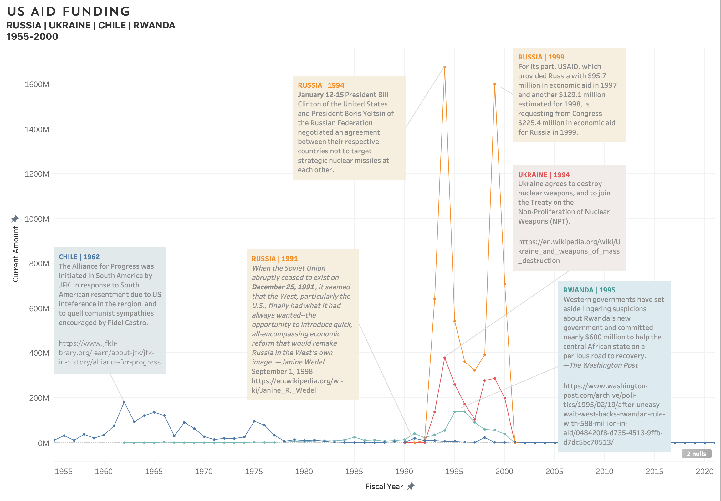
For my Data Visualization Praxis my primary goal was to gain awareness of the Tableau platform. Below is an outline of my process including the challenges and understandings that emerged.
WHAT TO VISUALIZE
Given that I went in primarily concerned with the technology not the content, it was a bit difficult to narrow down or understand what kind of data would be best to visualize. I found myself ambivalent about most of the data sets I ran across and even tested out a few to see if they might sing to me once loaded in the program. They did not. Without a personal connection or familiarity with the questions the data inherently touched on, I couldn’t formulate a need to visualize it. I am studying race and politics in antebellum US at the Grad Center this semester as well, and my first thought was to visualize key events in the evolution of the various iterations of the anti-slavery movement or the birth and evolution of the Republican Party. In the end, I didn’t feel I had enough data to map the central ideas properly. As a bit of a quirky middle ground, I chose to parse US AID* funding between 1945 and 2021, available on the US Aid website. The data set inherently incorporates US and world history which I find very engaging.
HOW TO VISUALIZE
The data set is quite large (funding from 1945-2020 to almost every nation in the world), and I knew that including all aid over that vast period of time would be overwhelming I knew I wanted to compare and contrast a few nations, but which ones? Ukraine and Russia came to mind because of current news. I included Rwanda, because I assumed there’d be data around the civil war. And Chile. Why Chile? I wanted to hop over to another part of the world, I knew the US had interfered quite heavily in the region, and, well, my husband’s family is from Chile. I chose a color coded line graph, because I wanted to compare and contrast the rise and fall of aid to these. US Aid lists its funding in both current currency values and set as a constant value. I chose to show dollar amounts in current values to make it more relatable, but ideally I would be able to use Tableau well enough to allow for a reveal of the secondary amount for any given data point.
When I noticed that not much money was given to any of these nations until the 50’s, I shorted the displayed timeframe. Unfortunately, the data between 2000-2020 will not load, despite it being included in the data set. This has been particularly frustrating, because the data during that period is sure to reveal heightened activities by the department and reflect global conflicts and major shifts in US foreign policy.
NOW WHAT
After plotting the points it was interesting to the emergence of peak years of funding —making me curious about what events, political environments, and policies impacted the amount of aid. This, for me, is where the fun really started. I researched each nation and was able to determine various events that may have impacted the time and amount of funding. I do recognize the limitations somewhat cursory research, and don’t present it in itself as any form of deep scholarship well rounded theory. In fact, more questions about policy, US and International geopolitical strategies before and after the graphed points, and the impact of the aid quickly arose. The sources I used to look into each point included the JFK presidential memos housed at the presidential Library, government websites, political science think tanks, and even wikipedia—all presenting information in their own formats and from various points of view. From reading the notes taken when JFK spoke with the Rodríguez, then president of Chile, to dry government reports and summaries of aid and newspaper articles adding flavor—they all gave different impressions of the events at hand.
RAISE FROM THE DEAD
Being inside of a Data set is a charged experience. There are many perspectives and stories that are hidden in the points, and I found a strong desire to reanimate the numbers with the information about the events and motivations behind them— to add water to the dehydrated goods. With this in mind, I decided to annotate all of the peaks with a quick note regarding what I had found in my research. I did this knowing that what I chose to include in the annotations would be incomplete—but I viewed this step as an invitation to the audience to question, amend, and correct the theories I posit related to the peak funding years.
“On behalf of the American people, we promote and demonstrate democratic values abroad, and advance a free, peaceful, and prosperous world. In support of America’s foreign policy, the U.S. Agency for International Development leads the U.S. Government’s international development and disaster assistance through partnerships and investments that save lives, reduce poverty, strengthen democratic governance, and help people emerge from humanitarian crises and progress beyond assistance.”
Each of us processes the stimuli of our experience differently. Our senses pull in raw data that is translated by our brains into some sense of order, providing us with the ability to navigate the onslaught of external input. Our brains want order, they want to find a path through. The trick is that we all experience and translate these stimuli a little differently. Whether it is in how our brain perceives it or how we emotionally or intellectually process and react. This week’s readings, so focused on the inherent shortcomings of curating, standardizing and relaying information, all point to an overall takeaway that there is no such thing as objective truth because the complexity of the many interwoven phenomena that comprise both our experience and understanding of it is not fixed.
With that understanding, it is easier to understand maps as limited tools that allow us to capture a specific thesis relevant to a specific world view held at a specific point in time. When we map histories, for example, not only is the map relying on a specific depiction of a physical location that in itself makes assumptions, it is overlaying data that is relevant to a specific moment(s) in time as marked by the map’s creator. Time as a necessary data point in relationship to a map makes them multidimensional, yet maps are almost one dimensional as a concept in that they are instruments to convey a premise developed by its creator. The map’s creator is documenting their correlations and understanding of what is important at the expense or in relief of all other possible observations. Because of this, it becomes imperative to ask—what was left out? What values are on display and what is the motivation driving this depiction?
Considering these limitations, it would seem that maps incorporating multiple expressions of collaboration would be the most relevant and successful to Digital Humanities. There should be collaboration and discussion on the authoring side—rich input to help decide, in particular, the appropriate final form and content of the project. As the field moves more into active public discourse, often attempting to bridge the academic and public worlds, targeting a large audience AND engaging them in the functionality, content, and development of the end product would invite the most robust outcomes.
Richly layered maps, a benefit of digital expression, with filters that provide various lenses, although still curated, offer more potential for user interpretation, inspiration, and interaction. The excellent Evictions Lab map shared in class last week, rich with data, includes an easy to engage with interface that gives users multiple ways to view statistical data to arrive at their own understanding of the story that emerges from the map. The creator(s), having chosen what data to include in the map, remain the curator, but the user becomes a collaborator invited to engage and therefore challenge, expand, and synthesize the data for emerging concepts and perspectives. We are inviting the public to “read” the findings not just witness, where reading implies deep engagement and processing of what is taken in.
A visualization that could benefit from more interaction is the one featured in Bonilla and Hantel’s In Visualizing Sovereignty: Cartographic Queries for the Digital Age. Revealing an understanding of the world that is not accounted for in traditional tools is an extraordinary challenge. Admirably, the author’s were able to step away from step away from the traditional depictions of land mass in a geospatial context— for a more linear understanding of time as well as collaborate with colleagues outside of their immediate circle (animator). However, the end result leaves out a core aspect of the authors’ perspective. Rather than depict nations in relationship to their colonizer and traditional achievements of “sovereignty,” it might have served the creators to consider the notion of sovereignty itself within their depiction as deeply as they do in their writing. Variations of sovereignty as the underlying framework over which the nations are placed would help center one of their primary ideas. In the current depiction, we are told that the dates of achieving “sovereignty” are important, but all other nuance is stripped away— the violence and continued paternalistic relationships inspired by political gain the authors mention in writing are absent. The Renewing Inequalityvisualizations may have applicable learnings to offer. By providing multiple views (map, cartogram, chart) the project not only accommodates multiple users’ preferences and needs, but creates the potential for the relationships between the data points to reveal varied insights. I have to wonder if the chart view in this project might not inform a possible solution for the issues arising with the Visualizing Sovereignty project. Updated to a quadrant based chart, it might allow the mapping of Caribbean nations in relationship to various concepts of sovereignty over time. Interaction in the form of a sliding bar could dynamically visualize the shifting of each nation over time, emphasizing the dynamic nature of these shifts in a more palpable way. This treatment may also more readily reveal the lack of complete political and social sovereignty in nations that were previously considered “sovereign” in the traditional Western sense as discussed by the authors, thereby engaging users in discussion of the very concept of sovereignty. Overlays could be toggled to provide additional context, including colorization to account for colonial relationships, demographics, cultural traditions and more.
As the readings make clear, it’s critical that we question every tool we are offered—ensuring that we understand its origin and implications when conveying our perspectives and findings through them. In addition, I believe it’s important that we consider the tool of our own mind in the same way. Through collaboration we gain outside perspective on what our own minds may have presented to us as truth. Not only does collaboration help illuminate our own biases and assumptions, it also creates the opportunity for dramatically new configurations and perspectives.
In reviewing the dhq website, “an open-access, peer-reviewed, digital journal covering all aspects of digital media in the humanities,” it is apparent that a rich resource of current and diverse thinking is tethered to a traditionalist and outdated expression of academic online publishing. From the information hierarchy to the interface, this website does not take advantage of best practices in facilitating the easy access to the rich collection it houses.
Although this type of website may feel familiar and comfortable to academics who began their careers in an earlier wave of online expression, newer scholars, digital natives, are accustom to sites that take advantage of UX/UI learnings over the past decades to address user needs and behaviors and apply design principles that signify relevance, active participation in the larger online world, and promote engagement.
Navigation
Main Navigation: This tool serves as the primary framework that users engage with to understand the contents of the site, and it also communicates what the creators have decided merits attention based on what they understand their objects and user needs to be. Typically when landing on a site, users need to gain understanding of where it is they have landed—what is the purpose of the site? Who is shaping this site? The order of options on the main navigation of dhq suggests that before knowing about the publication itself or who is involved in it, users should be concerned with guidelines to submit. From an outside observer this can suggest that the publication is lacking in sufficient submissions and soliciting new work is imperative or, alternatively, assumes that academics are most concerned with having work published, considering it is seen as a legitimizing activity. Either way, this prominent placement on the navigation feels unseemly. In contrast, non-profits typically don’t place the donate button before the who and why of their organizations. That is not to say it does not have prominence, and following non-profit convention of creating an alternative treatment that both draws attention to the action of submitting, but maintains the prominence of the publications existing content and underlying philosophies may serve the dhq site well.
Issue Navigation: Presumably, this navigation should provide entry points into the evolving conversation, and provide insight into the overarching themes that the editors chosen to showcase. This would provide users with a layer of understanding to help navigate the many areas of inquiry in the field. However, on the dhq site the issues are simply arranged by date—giving indication of the themes revealed only after arbitrarily clicking into a dated link. If you are not a user arriving with a specific inquiry in mind, the search tool is rendered useless, and the lengthly scroll of dates becomes overwhelming and obtuse. It’s akin to offering someone an anthology where each chapter is simply a page number, requiring you to flip to that page to know what the chapter covered. Using only dates to indicate each issue is also a missed opportunity to cross-pollinate thinking—to invite users, many of whom may have come to the site with a specific understanding or area of knowledge, to explore new perspectives.
Orienting The User
Issues: Each issue has a theme only revealed when you click on its issue date. Once on the issue landing page, however, you are required to click again into the “front matter” to better understand the intention and process behind the issue. Some issues do not have a theme, and simply list an “articles” section—negating the convention of the others. In both cases, the issue landing page would benefit from a quick (2-4 sentence) summary from the editor(s) to both humanize the issue theme and set the stage for deeper understanding. In a sense, the issue landing page is the quarterly cover— which even in the more traditional publishing world typically include some kind of indication of what’s to come.
About DHQ: This page should help orient the user to the overarching perspective and structure of the publication. It does include key information, but it might benefit the creators to reconsider the order in which they present it. Technical and contextual information about the publication seem to be intermingled in a way that doesn’t suggest a progression to build up the users understanding. For example, it might benefit the user to read through “DHQ on Digital Humanities” before getting information on public indexes and source code. It’s also confusing that the technical overview section does not also encompass the sub-topic related to “getting DHQ Data” vs. having that section stand alone. The current hierarchy raises questions about the definitions of the term “technical” as seen by the creators. There also seems to be a missed opportunity to cross promote other portions of the site. Having learned more about the structure and purpose of the publication, it would make sense to be invited, as a user, to find out more about submitting, or have a carousel promoting recent articles that exemplify the purpose delineated on the page.
DHQ People: This page is meant to give insight into the folks who bring the publication to life. It’s worth noting that the publication’s statement on BLM and Structural Racism does not appear on the page where it’s actual personnel structure is listed, and there are no images of the people behind the publication to give a preliminary indication of the diversity of the staff. In addition, providing images of staff and contributors would act as an encouraging signal to those entering the space if they were to see images of people who may resemble them. Simply stripping away any human representation (ironic in the humanities), creates a faceless cold index driven experience and misses opportunities for greater community building and collaboration.
Aesthetics
Overall, the dhq website is aesthetically uninviting and feels like a missed opportunity to collaborate with design professionals who would bring their own expertise to help create a more compelling and engaging experience. The site as a whole could benefit from more modern and thought out branding elements including an updated logo, typography, palette, and images. A more sophisticated typographic treatment would help reinforce hierarchy, while an updated palette and imagery would better set the tone and indicate cultural awareness. Increased usage of images, in particular, would help infuse energy and a sense of vitality into the presentation of these deeply engaging conversations. Each issue with a theme, for example, could benefit from images that help bring the area of exploration into relief.
In Conclusion
It is true, simple mastery of basic coding skills does create enormous potential and opportunity for sharing information quickly and easily. The dhq site does an extraordinary job of gathering and presenting the writings of a wide range of DH scholars and thinkers and serves as an impressive resource. However, the site also exemplifies a common occurance on many academic pages. These sites are often set up with an uneven emphasis on their underlying indexes and neglect the needs of the user and front end design conventions to facilitate efficient and frictionless access to information. Everything from the site architecture and mapping, including the hierarchy on each page, to the fonts and colors impact the user’s experience. Done well, these elements can create a welcoming hub that users choose to return to, and even make into a “third space,” done badly and it can render a site a chore to navigate and only accessed in times of immediate research based need. In considering the building of DH tools, creators must invest in the user’s experience. Perhaps the strict formats and conventions of earlier scholarly publishing has influenced the current online expressions, but in order to take full advantage of the internet’s potential a new approach is required. As a tool, the internet provides incredible opportunity to positively impact both academic and public engagement—leading to richer and more varied outcomes. Besides, scholars like easily navigable and aesthetically pleasing things too!
It’s possible that lack of funding for a front end design collaborator limited this site’s front end outcomes, but hopefully it was not a case of these skills being deemed unnecessary. UX/UI and front end design funding should be included in grant proposals and presented as imperative, because the resulting digital expressions will better reflect the energy and sense of possibility inherent to Digital Humanities.
Extra: Some sample resources that successfully use front end design and structuring to impart varied and rich long for content:
In looking at Digital Humanities, one can acutely feel the struggle to avoid the pitfalls of the restrictive dynamics (gender, racial, economic) seen in earlier established fields and academic institutions. This is expected—as Digital Humanities is trying to define and validate itself within the structures of these very institutions and in contrast to established fields that came up through these institutions. One could argue that it will be impossible to shake the limitations (seen and unseen) without changing the venue and baseline assumptions of what validates and defines the field as a whole.
In considering the evolving conversation surrounding the definition and validation of Digital Humanities and its standing in the academic and public spaces, I can’t help but consider the breadth, depth, and human-centric knowledge evident in the design field, and how Digital Humanities would benefit from a deeper relationship with this sister discipline.
Digital Humanities, to me, operates in a similar space as Design as an expansive field encompassing a myriad of possible human behaviors and endeavors which ladder up to perhaps a porous definition. Porous in that it allows for many things so seep in and interlock with existing expressions of the field—not limited to new practices that arise as society and technology develop (internet gave us evolved expressions of UX/UI, interactive design, a new field in web design etc.). At its core design deals with the devising and development of an artifact that serves a purpose or use. As a discipline it seemingly mimics the nature of a fractal—forever iterating off of new branches and with increased nuances. It is not limited by the medium and does not define the challenge to be solved, only that it can be used to solve challenges. From architecture, systems design, service design, fashion design, or graphic design etc.— each field requires specialized knowledge and skill paired with awareness of the intended final user and use. As in any mature discipline, within each field is a dissection of actions performed—roles required—to realize the final outcome.
This idea of collaboration— of practitioners working under a similar expectation and school of thought—but with very different access points to how design comes to life—speaks to what could be the most impactful work Digital Humanities has to offer—community building. In looking at each of the sites offered this week, it is clear that multiple instances of collaboration—between skilled practitioners, the creators and their audience, and paralleled practitioners and institutions— were necessary to build and share these projects. From the foundational research gathered and indexed on the back end and the front end layouts providing navigable access to the user—many skills, expertise, and collaborative efforts are on display. In publishing the work, community building moves from simply strengthening academic understanding and partnerships, to creating a wider community encompassing the interested public who choose to engage.
These sites specifically feel aligned with the early academic uses of the internet—used to quickly share learning with colleagues. Issues do arise, however, in the continued academic design expressions and signifiers. This “gives away” the extremely academic environment that these projects were birthed in. In side stepping modern advances in design — specifically current expressions of UX/UI the project creators ensure a limited reach with audiences beyond the academic space. In exploring the various sites, it’s unclear, in fact, who the target audience is for each. There is a lot of vacillation between focused scholars (links to published papers, wordy introductions, and academic vocabulary) and the general public (anecdotes, quick summaries, and photography). Online behaviors of the average user do not mimic that of scholars used to reading lengthy texts structured in institutional traditions of scholarship.
Moving forward, if I were to consider in my evolving understanding that DH’s core includes collaborative sharing and expression of knowledge and experience related to the human experience via digital spaces and specifically beyond the walls of academia — it should be asked what can the field benefit from absorbing from design, an established field that has advanced and dedicated knowledge of the practical and physical human experience, including how to impactfully share knowledge so it is effectively received.
Need help with the Commons?
Email us at [email protected] so we can respond to your questions and requests. Please email from your CUNY email address if possible. Or visit our help site for more information: