
For this assignment I chose Tableau not only because it’s one of the recommended tools for beginners in the syllabus, but also because it’s one I keep hearing about, including at work, for a meaningful visual representation of data to tell a story. I downloaded the student version then discovered the public online version which is limited but more convenient so I created an account and used the latter. Then I headed over the YouTube for a quick tutorial and found Tableau in Two Minutes – Tableau Basics for Beginners which turned out to be 23 minutes long of which I logged around 9 minutes. Then I spent way too much time figuring out what topic I wanted to cover and where to find a manageable dataset. It would have been nice for this to be included in the syllabus.
I settled on Twitter and searched for related datasets. I came across the following list: Top 25 Twitter Datasets for Natural Language Processing and Machine Learning, chose SMILE Twitter Emotion – “Ideal for sentiment analysis, this Twitter dataset contains over 3,000 tweets across a range of emotions including happiness, anger, outrage, sadness, and more,” and was taken to figshare to download the dataset. Here we were given more information on the dataset: “tweets mentioning 13 Twitter handles associated with British museums was gathered between May 2013 and June 2015. It was created for the purpose of classifying emotions, expressed on Twitter towards arts and cultural experiences in museums. It contains 3,085 tweets, with 5 emotions namely anger, disgust, happiness, surprise and sadness.” This is not what I imagined the dataset to be about but I’m all in at this point since the goal is to familiarize myself with the tool.
I never download info from unfamiliar sites, but did some research on figshare and they seem legit so I downloaded the csv file and dragged in into a new Tableau workbook and the fields did not populate as indicated in the YouTube tutorial. Again, adding vetted tutorials to the tools in the syllabus would have been helpful.
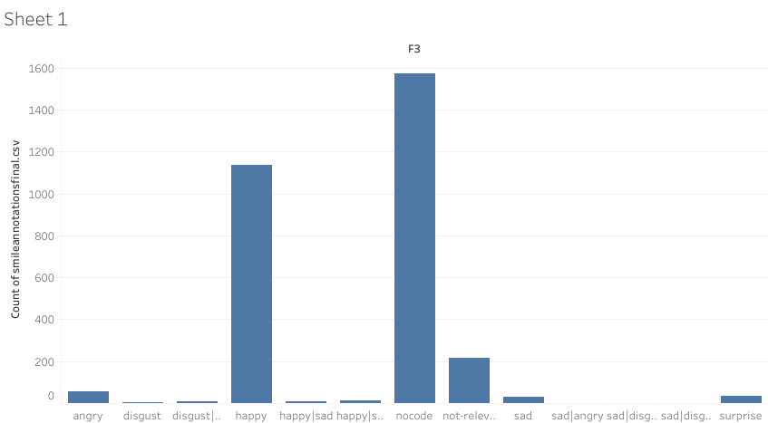
I played around and moved one item into a row and another into a column field and came up with graph. Not a riveting imagine which means I needed to do some data cleanup, like removing the “nocode” and other irrelevant columns which resulted in the more meaningful graph below where we can clearly see that the emotions expressed were overwhelmingly positive:
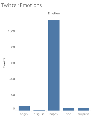
The data visualization is available on public Tableau.This assignment has whetted my appetite for exploring Tableau further.

This entry is licensed under a Creative Commons Attribution-NonCommercial-ShareAlike 4.0 International license.
Nice. I appreciate you sharing the tutorial link and what hiccups your ran into. Your post saved me a few headaches. Cheers.