Author Archives: T. Baran

Thought Experiment: Fashioning a DH Course as a Program-Product-Project

This is a short thought experiment I’m cross-posting from my Digital Pedagogy class for consideration. Context: assessment/evaluation of digital products in the humanities.

Within nonprofit and other sectors, an organization generally has a set of programs based on their mission and for which they’re funded. Within each of these programs are products to be delivered. Each of these products involve one or more projects. These program, products, and projects, are based on meeting the needs of the people they serve. Identifying products to build include data analysis and engaging a range of research methods such as a needs assessment or a human-centered design outreach effort, which are then evaluated later on using outcome and impact metrics. How about if we fashion Digital Humanities curriculum similarly? The course is the program, the product(s) to be delivered are identified in the syllabus, and each week represents a project to achieve the goal of delivering the product(s). This ensures that every class serves as a milestone in the development of a stated goal: building a product. So, instead of seemingly disparate readings and topics from class to class, there’s a roadmap with transparency into the process and learning critical project management skills along the way. The final project could be the evaluation of the program, product, and/or projects.

Minimal Computing

Every sector publishes information on websites and online portals to inform their particular audience about problems they may encounter and present pathways to potential solutions. For instance, in the medical/health sector there are sites like WebMD and Mayo Clinic, and in the legal/justice sector there are sites like LawHelpNY and Crime Victims Legal Help. These sites speak to a range of individuals, from advocates who use it to help their clients to people in need who have vastly different reading levels and internet access. This brings me to the article, Introduction: The Questions of Minimal Computing where we’re warned that “defining minimal computing is as quixotic a task as defining digital humanities itself,” but can generally be considered to mean “a mode of thinking about digital humanities praxis that resists the idea that “innovation” is defined by newness, scale, or scope,” in response to, or consideration of, constraints such as the “lack of access to hardware or software, network capacity, technical education, or even a reliable power grid.” 

I’m considering the possibility of exploring this topic more broadly for my final paper, but will focus my notes for this post on minimal computing as it relates to digital humanities projects. First, the authors recommend that considering the constraints when developing a digital humanities project we should ask 4 constituent questions:  1) “what do we need?”; 2) “what do we have”; 3) “what must we prioritize?”; and 4) “what are we willing to give up?” As someone who has project-managed product development in the nonprofit sector over the past few years, this is a good framework for projects beyond the confines of digital humanities projects. A north star which the author’s point to and which resonates is “sometimes — perhaps often — when we pause to consider what we actually need to complete a project, the answer isn’t access to the latest and greatest but the tried and true.”

To implement minimal computing in digital humanities projects, we must sit with the following tensions: the impulse towards larger, faster, always-on forms of computing, the consideration of the range of computer literacy of the intended audience, and the tension between choice and necessity driven by the dearth of funding and resources.

Workshop: Finding Data for Research Projects

Early in the semester we had an assignment that involved finding a data set and offering analysis. There are several ways to go about doing this including a simple internet search for “data sets for research projects” or identifying an area of interest and looking for related data. Another great option I discovered is the Graduate Center Mina Rees Library’s Finding Data portal. The following is a brief overview.

The home page of the portal offers general information along with pathways for 5 categories of data:

  1. Demography & Populations
  2. Education & Housing
  3. Labor & Economics
  4. Health & Environment
  5. Law, Politics & Conflict

There are also guides for analyzing and visualizing data and mapping data. If it all seems a bit overwhelming, a “where to start” section on the home page offers examples of local data such as NYC OpenData and Neighborhood Data Portal, national data such as American FactFinder, and international data such as UNdata. 

There are some limitations, however. I was interested in the Law, Politics & Conflict data sets, and specifically about data related to 2 areas: access to civil justice and American democracy. There were a few data sets related to criminal justice but none for civil justice which is admittedly not as widely studied, and there were no data sets for American democracy. Still, if you don’t have a specific area of interest and looking for a place to discover data sets that you can use for projects, the Mina Rees Library’s Finding Data portal is a great resource.

Praxis: Visualizing Twitter Emotions using Tableau

For this assignment I chose Tableau not only because it’s one of the recommended tools for beginners in the syllabus, but also because it’s one I keep hearing about, including at work, for a meaningful visual representation of data to tell a story. I downloaded the student version then discovered the public online version which is limited but more convenient so I created an account and used the latter. Then I headed over the YouTube for a quick tutorial and found Tableau in Two Minutes – Tableau Basics for Beginners which turned out to be 23 minutes long of which I logged around 9 minutes. Then I spent way too much time figuring out what topic I wanted to cover and where to find a manageable dataset. It would have been nice for this to be included in the syllabus. 

I settled on Twitter and searched for related datasets. I came across the following list: Top 25 Twitter Datasets for Natural Language Processing and Machine Learning, chose SMILE Twitter Emotion – “Ideal for sentiment analysis, this Twitter dataset contains over 3,000 tweets across a range of emotions including happiness, anger, outrage, sadness, and more,” and was taken to figshare to download the dataset. Here we were given more information on the dataset: “tweets mentioning 13 Twitter handles associated with British museums was gathered between May 2013 and June 2015. It was created for the purpose of classifying emotions, expressed on Twitter towards arts and cultural experiences in museums. It contains 3,085 tweets, with 5 emotions namely anger, disgust, happiness, surprise and sadness.” This is not what I imagined the dataset to be about but I’m all in at this point since the goal is to familiarize myself with the tool. 

I never download info from unfamiliar sites, but did some research on figshare and they seem legit so I downloaded the csv file and dragged in into a new Tableau workbook and the fields did not populate as indicated in the YouTube tutorial. Again, adding vetted tutorials to the tools in the syllabus would have been helpful.

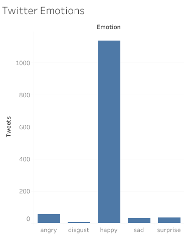
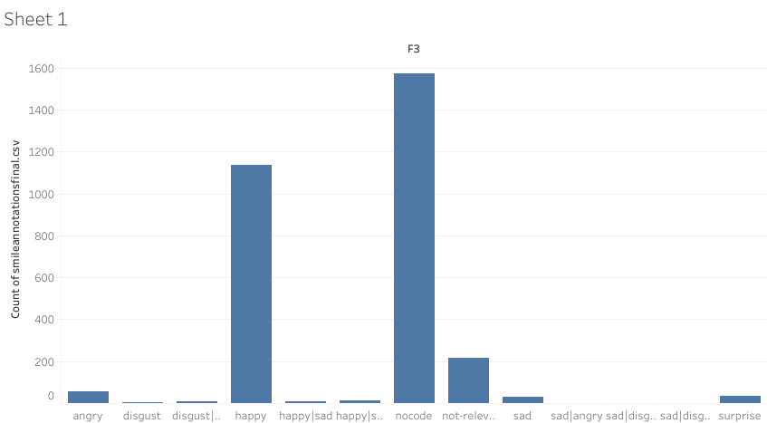
I played around and moved one item into a row and another into a column field and came up with graph. Not a riveting imagine which means I needed to do some data cleanup, like removing the “nocode” and other irrelevant columns which resulted in the more meaningful graph below where we can clearly see that the emotions expressed were overwhelmingly positive:

The data visualization is available on public Tableau.This assignment has whetted my appetite for exploring Tableau further.

Praxis: The Eviction Map

Re: Analysis of a Digital Humanities Project and Lightning Talk

The first thing I noticed when researching digital humanities projects to write and talk about is how esoteric and historical in nature most of them are like Maria Popova’s list of project that included “Salem Witch Trials of 1692” and “London Lives from 1690 to 1800” or Alan Liu’s list that included “Geoparsing 19th-Century Travel Narratives.” 

I was looking for something more contemporary and relatable and immediately useful. A Google search returned more of the same from institutions across the world, including a project called “Creating immersive, interactive environments for engaging with ancient Egyptian coffins.” This is not a topic I want to spend any of my time exploring. 

Although in my last blog post I embraced the “big tent” of digital humanities, in practice, writing about digital humanities projects or anything related to the field is challenging when there’s no clear definition. I went outside of the course recommendations to an area I’m familiar with: the law & justice sector. There were a few options I could explore and chose the National Eviction Map project from the Eviction Lab program. I figured this relates to one of the focuses of our curriculum: Data Visualization and Mapping and thus would qualify as a digital humanities project.

The majority of poor renting families in America spend over half of their income on housing costs, and eviction is transforming their lives. Yet little is known about the prevalence, causes, and consequences of housing insecurity.

Enter the Eviction Lab – a team of researchers, students, and website architects who believe that a stable, affordable home is central to human flourishing and economic mobility. 

Drawing on tens of millions of records, the Eviction Lab at Princeton University published the first ever dataset of evictions in America, going back to 2000. Their goal is for the data to be used by policymakers, community organizers, journalists, educators, non-profit organizations, students, and citizens interested in understanding more about housing, eviction, and poverty in their own backyards.

Now about the DH project that is the National Eviction Map : Eviction cases are civil lawsuits filed by landlords to remove tenants from rental properties or collect past-due rent. Records of eviction cases are typically held in electronic case management systems or paper files in the local court where the case was filed. The mapping project used three strategies to collect eviction case data: bulk requests for electronic records from all state courts, requests for aggregated counts of eviction filings at the county level, and the purchase of proprietary individual records data from LexisNexis Risk Solutions. Researchers can use the data to help document the prevalence, causes, and consequences of eviction and to evaluate laws and policies designed to promote residential security and reduce poverty.

Eviction Lab has a Twitter account @evictionlab with over 12K followers with the tagline: The Eviction Lab is helping neighbors and policymakers understand the eviction crisis. In July 2022 they put out a Twitter thread about the new edition of the Map. News outlets regularly site the lab and the map when reporting on eviction-related issues.

Bring on the Digital Humanities Big Tent

In The Digital Humanities Moment, DH has an existential framing within the lens of the very purpose of the university system: “In a moment of crisis, the digital humanities contributes to the sustenance of academic life as we know it, even as (and perhaps because) it upends academic life as we know it.” And continues, “can DH provide meaningful opportunities to scholars seeking alternatives to tenure-track faculty employment? Can it save the humanities? The university?” These existential questions are still be considered.

One suggestion is that you have to know how to code to be a digital humanist but was softened later to simply building and making things. Of course, one can be a technologist and not a coder and I would suggest that a DH scholar needs to be at least the former, but not necessarily the latter which can be prohibitive and exclusionary.  

I’m interested in digital pedagogy, which the Graduate Center’s course description captures as “digital methodologies that enhance the classroom experience for both students and instructors,” and this class, Intro to the Digital Humanities showcases this. It’s a hybrid class – meeting sometimes in person and other times, online; using the Academic Commons and a public WordPress blog – a more streamlined and recognizable and intuitive platform than Blackboard, with dynamic online syllabi instead of PDF or Word downloads. 

In Digital Humanities: The Expanded Field, the expansion or “big tent” of DH is exhaustive and what I’m discovering from this and other readings – and starting to accept and even embrace – is that DH doesn’t have to fit into a neat box. Innovations happen at warp speed in the digital space and DH, as a living, breathing discipline – or perhaps more accurately, interdisciplinary field –  has to be malleable enough to accommodate and embrace those changes. And if it upends traditional academic and pedagogical norms that are desperately in need of innovation, bring it on. For instance, instead of the three areas of study currently offered by the DH program at the Graduate Center, I’d like to see 10 or more fields of study that speaks to range of interests DH students have and would like to pursue. The “big tent” indeed.

Northeastern University’s early Caribbean Classroom embodies some of what is covered in the articles, particularly the possibilities of collaborative curriculum. The Early Caribbean Digital Archive is online and publicly available. It includes materials for students, teachers, and researchers. It solicits materials from the community along with suggestions for syllabi, class activities, and assignments. In other words, it’s crowdsourcing curriculum and pedagogical innovations from a “variety of  levels, places, and backgrounds.”