This recap of the Mina Rees Library’s Fair Use workshop is a little belated; Tomiko already reviewed the follow-up workshop on Creative Commons. However, I’ve been reflecting on it as I work on my final project, and I thought some of the takeaways might be helpful for others as they gather materials, now or in the future. The workshop was led by Jill Cirasella, an Associate Professor and Associate Librarian for Scholarly Communication; I’m happy to email any of you some follow-up resources she shared after.
The main thing that stuck with me is that Fair Use (like so much we deal with in the humanities!) is nebulous and open to interpretation. If you follow music industry news and controversy, you probably already know that the line between sampling or inspiration and copyright infringement is a thin one, and reasonable people (and their lawyers) can disagree on where exactly it is.
Professor Cirasella took us through the historical and legal basis for Fair Use in the United States, starting with the Constitution, which provides a foundation for the concept of copyright:
“The Congress shall have power… to promote the progress of science and useful arts, by securing for limited times to authors and inventors the exclusive right to their respective writings and discoveries.”
United States Constitution, Article 1, Section 8
The reasoning behind this right — “to promote the progress of science and useful arts” — is key to understanding Fair Use and how it provides a small loophole * (not a legal term! Please research this for yourself!) to allow for use of copyrighted work while the copyright is still in effect. (Which, by the way, is a long time.)
Here’s how Fair Use is defined in U.S. law:
“[T]he fair use of a copyrighted work, including such use by reproduction in copies … for purposes such as criticism, comment, news reporting, teaching (including multiple copies for classroom use), scholarship, or research, is not an infringement of copyright. In determining whether the use made of a work in any particular case is a fair use the factors to be considered shall include—
(1) The purpose and character of the use, including whether such use is of a commercial nature or is for nonprofit educational purposes;
(2) The nature of the copyrighted work;
(3) The amount and substantiality of the portion used in relation to the copyrighted work as a whole; and
(4) The effect of the use upon the potential market for or value of the copyrighted work.
17 U.S. Code § 107, via Cornell Law’s Legal Information Institute
The four factors listed can help you determine whether something is Fair Use. (This page from Columbia University Libraries goes into more detail about these factors, including how the courts have ruled based on each.) The history of case law related to Fair Use can also help you determine whether a potential use qualifies — although it’s complicated, the good news is that the rulings in these cases have generally expanded the scope of Fair Use has over time. As we learned in the workshop, Fair Use grew to cover home recording of televised events (Sony v. Universal, 1984), parody (Campbell v. Acuff-Rose/2 Live Crew, 1994), and transformative use, as in the case of Google Books, which has digitized books in order to make them searchable without sharing the full text (Authors Guild v. Google, 2015).
The takeaway? Using material for teaching is usually Fair Use, especially if you’re mindful about how much of a copyrighted work you use. For creative projects, it often depends on what you’re doing with it — how transformative it is, how much you’re using, and whether your use makes the original worth less. For example, it would be hard to argue that a parody, like Weird Al’s “Amish Paradise,” makes people less likely to listen to or pay for Coolio’s “Gangsta’s Paradise” — which in turn, heavily samples (with permission) Stevie Wonder’s “Pastime Paradise,” which didn’t necessarily lose value either.
Coolio, LV, and Stevie Wonder performing together at the 1995 Billboard Music Awards – an example of how great things happen when artists are able to sample and build off of each others’ work.
I’m no expert on Fair Use, but the library workshop has given me a better sense of what it covers and why, as well as some tools to help determine whether a potential use is or isn’t fair. I’ll leave you with one I’ve found particularly helpful: this Fair Use checklist from Columbia University Libraries.
Finally, if you didn’t make it to a library workshop this semester, I’d highly recommend it. The full calendar is here.
In our discussion of Alan Liu’s essay, Where is Cultural Criticism in the Digital Humanities? last week, my group circled around the other topics that were raised in this week’s readings — professional roles in the academy, the economics of the university, and of course, the metaverse and its role in education.
This passage from Liu’s essay speaks to what I’ve found missing in most discussion of the metaverse, including this week’s readings (emphasis mine):
While digital humanists develop tools, data, and metadata critically, therefore (e.g., debating the “ordered hierarchy of content objects” principle; disputing whether computation is best used for truth finding or, as Lisa Samuels and Jerome McGann put it, “deformance”; and so on) rarely do they extend their critique to the full register of society, economics, politics, or culture. How the digital humanities advances, channels, or resists today’s great postindustrial, neoliberal, corporate, and global flows of information-cum-capital is thus a question rarely heard in the digital humanities associations, conferences, journals, and projects with which I am familiar.
This introduction to learning in the metaverse acknowledges that immersive “technologies remain more expensive than other learning resources such as computers and books” and “content is more expensive to create” but doesn’t proceed further to ask how mediating not-for-profit learning through a technology that requires extensive financial resources might affect which ideas and arguments are and aren’t taught (unsurprising, since despite the academic bona fides of some of the authors, this text is published by a “storytelling and experiential agency” that touts its partnerships with Meta and Lenovo). It also raises a question that’s troubled me for a long time. With the rise of corporate educational technology, who controls learning outcomes and practices: educators or corporations?
For instance, take this ad from Meta, Facebook’s parent company. It’s worth watching if you haven’t seen it, because it illustrates what I see as the dangers of the metaverse:
The possibilities are endless! Except… each of the possibilities depicted here contains and creates its own limitations and barriers. The field trip to ancient Rome sounds amazing! But…
Even without the need to purchase headsets, the creation of such a thing would be fantastically expensive: actors, subject matter expertise, scripting, computer-generated settings, and QA all cost money. Who would pay to create it, and what might they privilege because of their own bias or cut to save money?
If AI were used to generate some of the simulation and cut costs, whose work would be used to “train” the AI, and would that person be compensated? And would the final project hold up to academic and historical scrutiny?
Would schools pay to access this type of simulation? If so, what would be cut from the budget in exchange? If not, what would students be “paying” to get such a simulation for free? It’s easy to imagine a conservative think tank funding curriculum on the Classical world — what biases would that introduce?
What would be the educational opportunity cost in terms of time and focus? What might be cut (either from the curriculum as a whole or the discussion of this specific topic) based on pressure to make the most out of an expensive, shiny new tool?
How can the educational value of such an experience be measured, and if it’s found lacking, will there still be pressure to use a metaverse field trip because of sunk cost? This article we read on the educational benefits of immersive virtual reality found better outcomes for students who accompanied Al Gore on a VR trip to Greenland than for those who just watched a video, but do these outcomes translate to situations where students are expected to apply deeper critical thinking skills or synthesize information to make an argument?
Similar questions could be raised about every example mentioned in the video. For instance, it seems like a neat trick to let a farmer visualize the spots in his field that need more water, until you remember:
Agricultural knowledge and experience allows farmers to do just that on their own, and
That knowledge is disseminated in a variety of ways, both informally/traditionally, and through public universities with agricultural programs, which have their own traditions of scholarship, political and humanistic thought, and engagement with the wider agricultural community, and
Once a farmer has that knowledge, they don’t have to pay a subscription fee to use it or share it with others.
In this way, metaverse education can be seen as furthering the 20th-and-21st century corporate project of taking something that once belonged to no one and everyone and making it into a source of profit (see: Disney’s transformation of folk fairy tale plots and characters into copyrighted IP). The farmer no longer owns the ability to evaluate their fields. Teaching about ancient civilization means one thing — a glossy VR field trip — rather than a multitude of possibilities depending on student interest, teacher knowledge, and pedagogical goals.
Let’s go back to Liu and his argument that digital humanists who don’t “extend their critique to the full register of society, economics, politics, or culture” aren’t truly engaging in humanities work. Any effort toward an “educational metaverse” is inherently political, as the technical and logistical requirements of creating highly complex edTech mean that power, resources, and cultural hierarchy will always play a role in determining what’s taught and how. Any discussion of the metaverse that isn’t grounded in that reality is uncritical technopositivism — and not truly based in the humanities.
I know that many educators at the K12 level have been rethinking the idea of a literary canon and changing their reading lists to correct the gaps, omissions, and biases in the traditional high school curriculum. It’s an exciting development; that said, I’ve wondered if first-year students of the new canon/non-canon might have trouble (at least at first) recognizing references that authors educated on the traditional canon would expect most readers to understand. In just this introduction, for example, Scott references a number of books, historical figures, and characters with little or no explanation:
Don Quixote (1605)
Rene Descartes (1596–1650)
La Princesse de Clèves (1678)
Robinson Crusoe (1719)
The Odyssey
The Lion, the Witch, and the Wardrobe (1950)
The Biblical story of Lazarus
Poe’s “The Telltale Heart”
This is in addition to the allusions he does explain. If you know what these works are generally understood to signify (e.g, what it means to “tilt at windmills”), references like these are almost invisible; if you don’t, they can be distracting or confusing, and leave readers with the choice of pausing repeatedly to look up minor details, guessing at what the comparison might mean, or just ignoring the parts they don’t understand (and hoping they’re not meaningful).
In truth, you don’t need to read the books Scott references to get his allusions; you just need to have heard them referenced enough, gotten a good summary, or (if you grew up in the 90s like I did) watched an educational TV show about a jack russell terrier reenacting the classics. I didn’t think providing Wishbone links for all Scott’s references would be appropriate or very helpful, so I chose to write a brief gloss for two of the references that seem to be doing some heavy lifting.
Here are my annotations:
Original Text
Work Referenced
My annotation
At the same time, the various and non-stop opportunities for communication are notable for highlighting our isolation, and it’s perhaps this intensity of digital communicability that brings mythic proportions to mind. When the Olympian postman Hermes goes in search· of Odysseus during the latter’s long confinement on Calypso’s island, he looks for him in a cave, but ‘Of Odysseus there was no sign, since he sat wretched as ever on the shore, troubling his heart with tears and sighs and grief. There he could gaze out over the rolling waves, with streaming eyes.’ I think of this weeping Odysseus sometimes, when I’m waiting with indecorous zeal for an email or a text, or when I catch myself peering into the rolling blue of Facebook, unable to remember for whom or what I’m looking. I see his yearning in miniature, in the five seconds it takes for someone to bring a phone from their pocket and put it back again.
These are ship-in-a-bottle feelings, which life can accommodate. The otherwise cheerful and productive of us have cheerful, productive lives amid digital longings and desolations: But it is certainly true that invoking the messenger god is one of the constitutive practices of our times.
The Odyssey
In Homer’s “Odyssey,” various gods interfere with and aid the warrior Odysseus in his journey home from the Trojan War. The journey takes him ten years; for seven of those, he’s held captive by the nymph Calypso. In the passage Scott refers to, Hermes has actually come to persuade Calypso to free Odysseus, who is mourning and longing for his wife and son at home.
Scott compares Odysseus’ “tears and sighs and grief” for his home to a feeling of yearning for digital contact. He juxtaposes two situations with very different stakes: a father and husband longing to return home vs. a Facebook user waiting for a notification.
Is this comparison overly dramatic, and if so, why do you think Scott chose to make it? What effect does this comparison have on the tone of the essay, and on the arguments the author is making? For example, how does this passage change your overall understanding of this introduction if Scott is being self-deprecating and ironic? Or what if his comparison of these situations is serious and earnest?
It has long been the word on the street that, if you dabble in other realities, then you shouldn’t expect to remain unchanged. Lazarus was never his old self again.
The Bible
Like the reference above to the Odyssey, this is another brief reference to a very old text. In the Bible, Lazarus has been dead for four days when Jesus brings him back to life. Like the earlier comparison of Odysseus’ grief to the social media user’s FOMO, this comparison is dramatic: literally being brought back to life vs. “dabbl[ing] in the “other realities” of the internet and the digital world. Arguably, Scott is using Lazarus as a metaphor for just how transformative our experience in the digital world can be; even if we aren’t reborn as individuals, the changes to the experience of being human might qualify as a rebirth of sorts.
Besides for this reference and the one to the Odyssey, there are several other old literary references in this reading, including the one that gives “The Fourth Dimension” its title. Why might the author choose to build his argument about new ways of being using references to such old works? Does it have an effect on how accessible his argument is? If so, what?
In addition to clarifying the context of the allusions, I wanted to bring up two questions that these passages raised for me:
First, how does Scott want us to read his extravagant comparisons between extreme situations (Odysseus stranded for years on an island, far from those he loves) and the everyday experience of using the internet and existing in a digitally-mediated world? My first impulse was to think he’s being arch, maybe a little self-deprecating — of course waiting for a new email (probably spam!) is not the same as longing to sail home. But the more I reflected, the more I wondered if I was missing his argument based on my own biases. I’m curious about what other readers (especially younger ones who might have a different relationship to technology) might think.
Second, what’s the rhetorical effect of making so many allusions to such old works, anyway? Again, is this a bit of irony? An attempt to show the profundity of the digital world and our relationship to it? A response to an anticipated argument that new and old media can’t coexist in our understanding of what it means to be human? Or maybe it’s just Scott’s attempt to prop up his own intellectual bona fides? I’d like to read the entire book to get a clearer answer — but again, I’m curious about what the students will think.
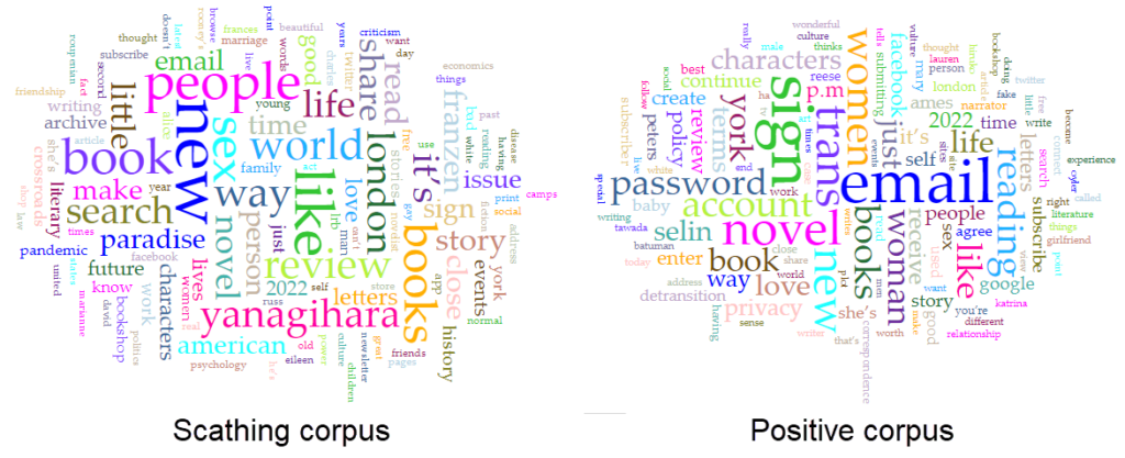
For my first foray into Voyant, I decided to take a look at a guilty pleasure of mine: the scathing book review. I know I’m not the only one who likes reading a sharp, uncompromising take on a book. Reviews along the lines of Lauren Oyler’s excoriation of Jia Tolentino’s debut essay collection go viral semi-regularly; indeed, when Oyler herself wrote a novel, some critics were ready to add to the genre. (“It’s a book I’d expect her to flambé, had she not written it.”)
I was curious if these reviews differed from less passionate (and less negative) reviews in any way that would show up in text mining.
Initial Process
To investigate, I assembled two corpora: a small set of scathing reviews, and a small set of mildly positive ones. The parameters:
Each corpus included 5 reviews.
I drew the reviews from Literary Hub’s Bookmarks site, which aggregates book reviews from notable publications. Bookmarks categorizes reviews as “pan,” “mixed,” “positive,” and “rave.” I drew the “scathing” corpus from reviews tagged as pans, and the control set from positive reviews.
I used the same 5 reviewers for both sets. (This was tricky, since some of the reviewers I initially chose tended to only review books that they either truly hated or — more rarely — unequivocally loved. Call this “the hater factor.”)
I only selected books I haven’t read yet — unintentional at first, but I decided to keep with it once I noticed the pattern.
I tried to select only reviews of books that fell under the umbrella of “literary fiction,” (though what that means, if anything, is a debate in itself) though American Dirt is arguably not a great fit there (but was reviewed so scathingly in so many places, I couldn’t bear to leave it out — maybe call this “the hater’s compromise”).
I specifically stayed away from memoir/essays/nonfiction, since those are so often critiqued on political, moral, or fact-based grounds, which I didn’t want to mix with literary reviews (but if this post has made you hungry for some takedowns along these lines, the Bookmarks Most Scathing Book Reviews of 2020 list contains memoirs by Michael Cohen, John Bolton, and Woody Allen — you’re welcome).
Voyant was pretty easy to get started with — but I quickly realized how much more I’ll need to know in order to really get something out of it.
I created my corpora by pasting the review URLs into two Voyant tabs. My first observation: an out-of-the-box word cloud or word frequency list, perhaps especially for a small corpus of short texts like mine, is going to contain a lot of words that tell you nothing about the content or sentiment.
I read Voyant’s guide to stopwords, then attempted to eliminate the most obvious unhelpful words, including:
Author names (Yanagihara, Franzen) and parts of book or review titles (Paradise, Detransition) – these would have been way less significant if I’d started with a large corpus
Words scraped from the host websites, rather than review text (email, share, review, account)
Words with no sentiment attached to them (it’s, book, read)
If I were doing this as part of a bigger project, I’d look for lists of stopwords, or do more investigation into tools (within or beyond Voyant) related to sentiment analysis, which would fit better with what I was hoping to learn.
Even with my stopword lists, I didn’t see much difference between the two corpora. However, when I compared the two corpora by adding the Comparison column to my Terms grid on one of them, I did start to see some small but interesting differences — more on that below.
What I learned
Frankly, not much about these reviews — I’ll get to that in a second — but a little more about Voyant and the amount of effort it takes to learn something significant from text mining.
Some things I would do differently again next time:
Add much more data to each corpus. I knew five article-length items wasn’t much text, but I hadn’t fully realized how little I’d be able to get from corpora this small.
Set aside more time to research Voyant’s options or tools, both before and after uploading my corpora.
Create stopword lists and save them separately. Who would have guessed that my stopwords would vanish on later visits to my corpus? Not me, until now.
Use what I’ve learned to refine my goals/questions, and pose questions within each corpus (rather than just comparing them). Even with this brief foray into Voyant, I was able to come up with more specific questions, like: Are scathing reviews more alike or unlike each other than other types of reviews? (i.e., could Tolstoy’s aphorism about happy and unhappy families be applied to positive and negative reviews?) I think having a better understanding the scathing corpus on its own would help me come up with more thoughtful ways to compare it against other reviews.
Very minor takeaways about scathing book reviews
As I mentioned, I did gain some insight into the book reviews I chose to analyze. However, I want to point out that none of what I noticed is particularly novel. It was helpful to have read Maria Sachiko Cecire’s essay in the Data Sitters Club project, “The Truth About Digital Humanities Collaborations (and Textual Variants).” When Cecire’s colleagues are excited to “discover” an aspect of kid lit publishing that all scholars (and most observers) of the field already know, she points out that their discovery isn’t a discovery at all, and notes:
“To me, presenting these differences as a major finding seemed like we’d be recreating exactly the kind of blind spot that people have criticized digital humanities projects for: claiming something that’s already known in the field as exciting new knowledge just because it’s been found digitally.”
So here’s my caveat: nothing that I found was revelatory. Even as a non-expert in popular literary criticism, the insights I gained seemed like something I could have gotten from a close read just as easily as from a distant one.
The main thing I really found interesting — and potentially a thread to tug on — came from comparing word frequency in the two corpora. There weren’t any huge differences, but a few caught my eye.
The word “bad” appeared with a comparative frequency of +0.0060 in the “scathing” corpus, compared to the “positive” corpus. When I used the contexts tool to see how they occurred, I saw that all but one of the “scathing” uses of bad came from Christian Lorentzen and Lauren Oyler’s reviews. Neither reviewer used the word to refer to the quality of the text they’re reviewing (e.g., “bad writing”). Instead, “bad” was used as a way to paraphrase the authors’ moral framing of their characters’ actions. For Lorentzen, Salley Rooney’s Beautiful World, Where Are You includes “…a relentless keeping score… not only of who is a ‘normal’ person, but of who is a ‘good’ or ‘bad’ or ‘nice’ or ‘evil’ person.” Oyler uses the word to discuss Kristen Roupenian’s focus on stories that feature “bad sex” and “bad” endings. That literary reviewers pan something for being didactic, or moralistic, or too obvious is nothing surprising, but it’s interesting to see it lightly quantified. I’d be interested to see if this trend would carry out with a larger corpus, as well as how it would change over time with literary trends toward or against “morals” in literature.
I found something similar, but weaker, with “power” — both Oyler and Ryan Ruby (panning a Jonathan Franzen novel) characterize their authors’ attempts to capture power dynamics as a bit of shallow didacticism, but the word doesn’t show up at all in the positive corpus.
Words like “personality” and “motivation” only show up in the negative critiques. It’s also unsurprising that a pan might focus more on how well or poorly an author deals with the mechanics of storytelling and character than a positive review, where it’s a given that the author knows how to handle those things.
Even “character” shows up more often in the scathing corpus, which surprised me a bit, since it’s a presumably neutral and useful way to discuss the principals in a novel. To add further (weak!) evidence to the idea that mechanics are less important in a positive review, even when “character” does turn up in an otherwise positive review, it was more likely to be mentioned in a critical context. For example, in Oyler’s overall positive review of Torrey Peters’ Detransition, Baby, she notes that “the situation Peters has constructed depends on the characters having a lot of tedious conversations, carefully explaining their perspectives to one another.” As with everything else, I would want to see if this still held in a larger corpus before making much of it. It’s very possible that the reviewers I chose are most concerned with what they find dull. From my other reading of her work, that certainly seems true of Oyler.
To test these observations further, I’d need to build a bigger corpus, and maybe even a more diverse set of copora. For example, if I were to scrape scathing reviews from Goodreads — which is much more democratic than, say, the London Review of Books — what would I find? My initial suspicion is that Goodreads reviewers have somewhat different concerns than professional reviewers. A glance at the one-star reviews of Beautiful World, Where Are You seems to bear this out, though it’s interesting to note that discussion of character and other mechanics shows up here, too:
This would be a fun project to explore further, and I could see doing it with professional vs. popular reviews on other subjects, like restaurant reviews. Fellow review lovers (or maybe “review-loving haters”?), let me know if you’re interested in poking into this a bit more.
Since our last class discussion, I’ve been reflecting on what makes a visualization “work” — and whether evaluating a visualization that way is even possible. Any critique of a visualization has to include considerations like:
Who is the intended audience, and how much does that overlap with the actual audience? For example, if a humanities-related data visualization in an academic paper is clear/legible to scholars with a deep knowledge of the subject matter, but inscrutable to undergraduate students assigned to read the paper, is it successful?
How much should we expect a humanities data visualization to convey, and how authoritatively? As Krysia pointed out in our discussion, using data to “close down questions” may run counter to the aims of the humanities. Trying to seek definitive answers from a visualization also ignores Drucker’s distinction between capta and data.
What is the affective/emotional impact of the visualization — and how much does that dimension of a visualization matter? I keep coming back to this image from Teddy’s blog post on Sefaria in Gephi, a visualization of meaningful Jewish texts. The visualization shows Biblical texts and commentaries in blue, the Gemara in pink, and other sources in red, green and orange, with the nodes appearing larger based on the number of connections to that text — the largest blue node is Genesis 1:1. The author of the visualization compares it to a “cell under a microscope,” but it reminds me of a supernova, as well — and both images feel fitting and emotionally resonant with the subject matter.
What effect might the toolkit used to create the visualization have on the scope and perceived meaning of the visualization? The features and constraints of any platform can shape the way data is presented, and even the type of data that’s collected. It’s easy to imagine how an individual’s reliance on a specific platform could limit the types of data would collect, and by extension, the types of questions they would research.
Is it possible (or valuable) to evaluate the visualization author’s skill/success as part of (but still somewhat separate from) our overall critique? With a written text, the author’s skill (or faults) as a writer can determine how effectively they convey their argument. Visualization might have the potential to obscure an author’s limitations — something glossy and visually intriguing might draw weak conclusions or be a mess “under the hood.” On the other hand, an author who is able to create their own visualization tools has a lot of power to convey their point exactly as they intend. To call back to the old DH debate about the importance of being able to “make,” is the author’s control of the visualization something we should consider to evaluate the visualization, or would any weaknesses/errors on the author’s part be evident in the final product, as might be the case in a written work? The question might be purely theoretical, anyway — if we can’t see behind the curtain of a visualization, this may be impossible to know.
Along with all of these considerations, I’ve also been thinking about complexity vs. legibility. Per Drucker, a humanist approach to visualization allows us to capture subjective experience and analysis:
The challenge is to design graphical expressions suited to the display of interpreted phenomena: information about subjective user-dependent metrics, subjective displays of information, and subjective methods of graphical expression. The term subjective is used as shorthand for interpretative construction, for the registration of point of view, position, the place from which and agenda according to which parameterization occurs. Subjectivity is not the same as individual inflection or mere idiosyncracy, but is meant to put codependent relations of observer and phenomena (in contrast to presumptions of objectivity, or observer-independent phenomena).
Joanna Drucker, “Humanities Approaches to Graphical Display,” 2011
I would argue that the challenge lies equally in designing visualizations that are “suited to the display of interpreted phenomena” and in making sure those visualizations are legible in a way that allows for subjective but at-least-somewhat consistent readings.
For example, this visualization from Drucker’s article is complex and reflects interpretive construction, but is also easily legible, in that it’s possible to quickly understand how the visualization was constructed and use it as a jumping off point for further discussion. When I interpret it, I can assume that other good-faith readers can gain similar insights to my own:
Joanna Drucker, “Humanities Approaches to Graphical Display,” 2011
However, I’m not sure if the same could be said for visualizations like the one below — though I admit that me not understanding it doesn’t necessarily mean it’s illegible:
Joanna Drucker, “Humanities Approaches to Graphical Display,” 2011
(I had a lot of questions here that might be answered with greater context, with a major one being: “What on earth does the hole mean?”)
Of course, to some extent, all visualizations necessarily depend on context to be legible and useful — as Drucker points out, even “straightforward” datasets and visualizations involve choice and decision-making from their creators. But I do wonder about the utility of a visualization that’s difficult or impossible to interpret without already understanding the data, the author’s intent, the unprecedented visual metaphor, the degree of attempted precision, etc.
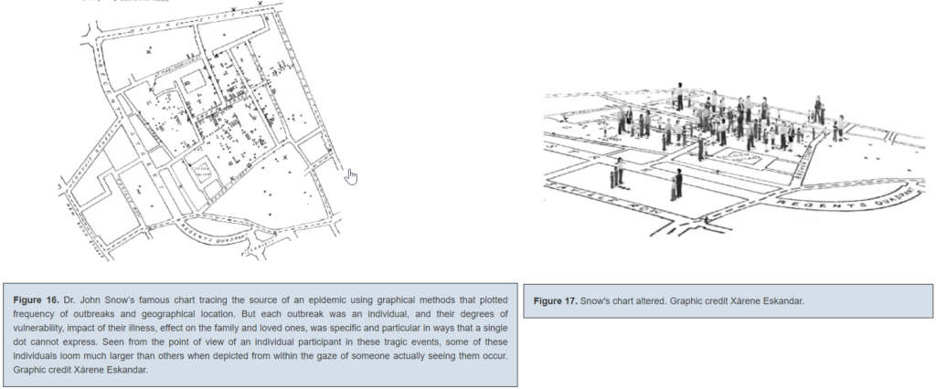
Finally — what do we make of a visualization that approaches the complexity and level of detail of the original data/capta-set it’s trying to illustrate? I’m thinking of this alternative to John Snow’s famous cholera spread chart that Drucker offered:
Joanna Drucker, “Humanities Approaches to Graphical Display,” 2011
This is such an interesting choice to me, since altered chart still tells us not much about the individuals who died of cholera — and the original is one of the most famously effective and influential visualizations in history. While supposedly more interpretive, the new one seems to be something closer to a recreation of situation — it reminds me a bit of Borges’ country-sized map of the country from “In Exactitude in Science.”
I hope we get more of a chance to discuss this as the class goes on — I’m curious as to what others think, and if maybe my approach (thinking about effectiveness/utility) means I’m not quite taking these visualizations as they’re intended to be taken.
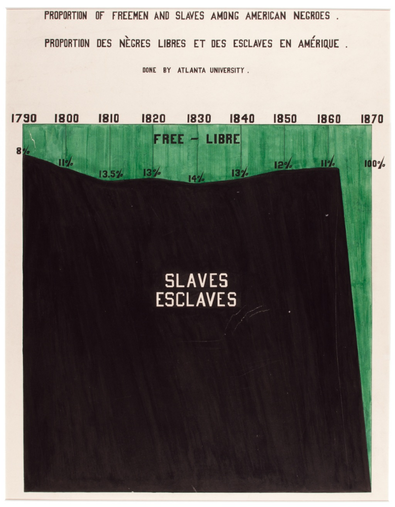
Finally, I want to leave off with a visualization I’ve always found particularly striking, though it’s pre-Digital Humanities:
W.E.B Du Bois, presented in 1900 at the Exposition Universelle — this article from Smithsonian gives more detail about the circumstances and the team who made it.
This is a visualization created by W.E.B. Du Bois and a team of students and alumni from Atlanta University as part of an exhibition at the 1900 Paris Exposition Universelle. (You can read more about it here.) While some of his other visualizations are more abstract and, for me, edge on that zone where expressiveness outweighs easy legibility (for example, a historian I know confessed that he still “[doesn’t] really understand” this beautiful one), this one depicts data precisely while still conveying an affective impact. The choice to fill in the enslaved population as a large black block creates the image of an enormous mountain-like mass — of humanity, of suffering, of injustice. It foregrounds the scale and endurance of American slavery in a way that a simple line or bar graph couldn’t. I think even if you were to extend the chart to the present, with the mountain of slavery further in the past, it would still be a powerful reminder of just how many generations of individuals were enslaved in this country.
I’d be curious to see other examples of pre-digital visualizations that push past the conventional limits of what a visualization can do — and how they might conform to or challenge Drucker’s ideas about humanities visualizations.
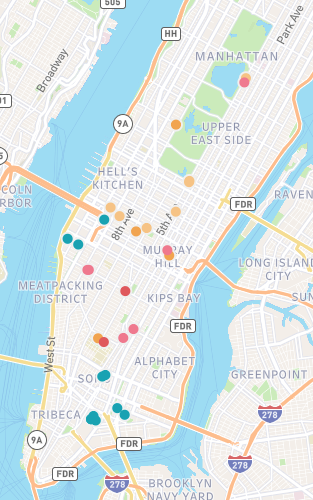
This week, I attempted to map the works of two chroniclers of Gilded Age New York: Edith Wharton and Jacob Riis. Both offered clear-eyed critiques of the city and its people, and together they represent the duality inherent to the idea of a Gilded Age. Wharton’s novels describe the thin ornamental gilding that conceals the truth about a society; Riis’ journalism and photography deal with with what’s rotten underneath. Wharton’s critique is cultural and relatively narrow: the shallowness of the rich and the rigidity and provincialism of their customs and mores. By contrast, Riis’ critique is material, and his focus on the indigent is an indictment of the wider social and economic structures of late 19th century New York.
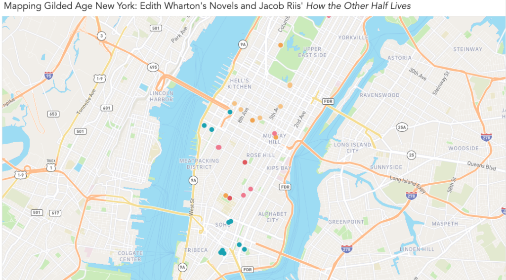
To create my map, I chose to use Tableau. You can see a draft of it here, on Tableau Public, as well as in the screenshots below.
View of the entire map. Locations from Riis’ How the Other Half Lives are in teal, while Wharton’s novels are represented by various warm shades.Each marker expands into a note that contains information about the author, source, and location, as well as an excerpt from the relevant text and interpretive notes. In the notes, I attempted to give context about the source material and explain my methodology for determining the location.
Goals and Inspiration
I chose to map Wharton and Riis after a visit to the Tenement Museum last month. I’ve read three novels by Wharton in the past year, and while I’ve always been moved by the photography of Jacob Riis, I hadn’t consciously connected their work until paging through a copy of How the Other Half Lives while waiting for my tour.
The title alone is pointed, and I couldn’t help but think of Riis directing it toward New Yorkers who resemble Wharton’s characters. They possess such precise, detailed knowledge about the rules of their own limited world, yet show so little curiosity about what exists just out of sight. By mapping sites from Wharton’s novels and Riis’ journalism, I hoped to see just how closely these worlds were situated.
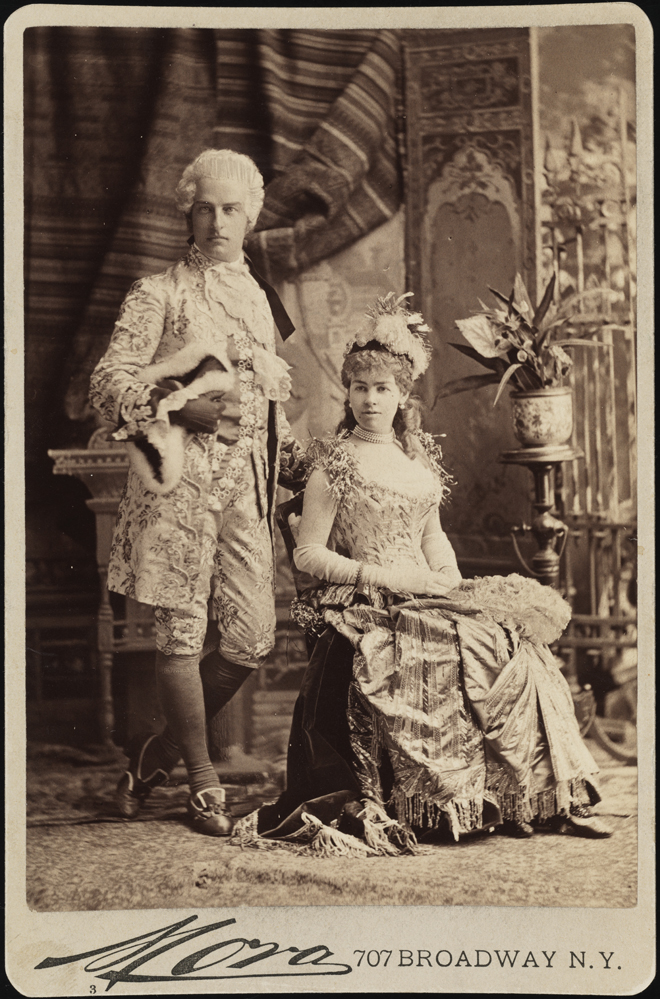
Mora (b. 1849). Mr. and Mrs. Cornelius Vanderbilt II (neé Alice Claypoole Gwynne). 1883. Museum of the City of New York. F2012.58.1341. https://www.mcny.org/story/vanderbilt-ball
I was particularly interested in spatially distinguishing the “genteel” poverty experienced by some of Wharton’s characters from the desperate circumstances Riis documented. For example, Wharton’s The House of Mirth tells the story of Lily Bart’s gradual fall from “high society” to poverty and obscurity. When Lily, finally broke, moves to a boarding house and works in a small workshop making hats, just how far is she — economically, socially, and literally — from the immigrant garment makers in the tenements of the Lower East Side?
My initial plan was to overlay locations from Riis and Wharton with demographic information from the time, such as population density, income, family size, etc. I set out to see what had been already done — and quickly realized how ambitious my original goal was. A number of researchers have done great work with data from this era, including researchers at the time. (You can see my rough research notes, including links to sources, here.)
Through Village Preservation’s blog, I learned about the demographic maps created by the Tenement-House Committee in 1894. I’m including a small image below, but I encourage you to click through to the Library of Congress listing to see a full-sized image — these maps are incredible.
Pierce, F. E. The Tenement-House Committee maps. S.l.: Harper & Brothers, 1894 Map. https://www.loc.gov/item/2006629793/.
What strikes me is that these map-makers were doing something we were challenged to do this week — map something that isn’t normally considered mappable. While demographics maps are common today, the crazy-quilt appearance of the lower map (showing various immigrant populations in New York) shows how ambitious a task this was at the time. The map is difficult to read at first glance, at least to my eye — our mapping conventions have evolved over time, to the point where I have built-in expectations about how a map like this “should” look. The idiom of the upper map is more familiar to me; even before studying the key, I was able to make assumptions about what it shows.
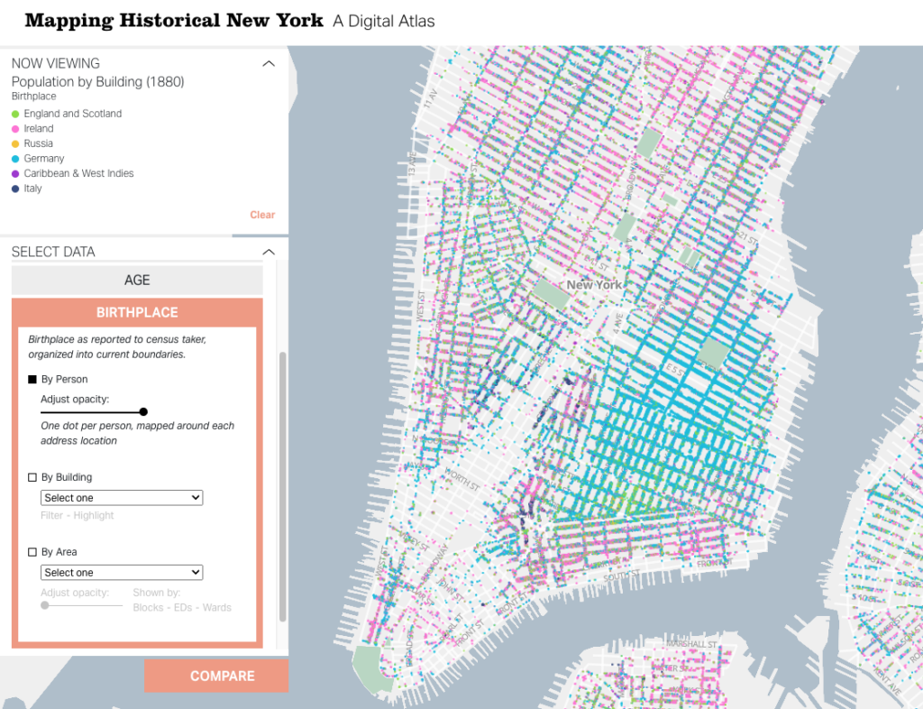
A more recent — and equally visionary — look at the same data is Columbia University’s “digital atlas,” Mapping Historical New York. The team behind this project used census records to map out demographic data at the individual and building level. So far, their data set includes records from 1850, 1880, and 1910. For each of these, you can view information related to nationality, gender, race, occupation, and age, as well as basic population density information. You can zoom out to view larger patterns, but since the map points represent individual records, you can zoom in on a block and see what types of jobs the people living there had, where they were born, and more.
Gergely Baics, Wright Kennedy, Rebecca Kobrin, Laura Kurgan, Leah Meisterlin, Dan Miller, Mae Ngai. Mapping Historical New York: A Digital Atlas. New York, NY: Columbia University. 2021.
The project includes case studies that use specific locations on the map to present a story — something I would eventually love to do with my data. However, given the complex work that’s already been done with demographics, I chose to limit my focus for this first draft to plotting locations from Wharton’s novels and Riis’ How the Other Half Lives.
Gathering Data: Challenges and Methodology
I started by reading everything I could find about locations in Wharton’s novels. Given her enduring popularity, as well as the prominence of real estate in her work, I thought that finding rough locations for many of her characters’ homes would take a Google search or two. I was wrong, of course. While you can book an Edith Wharton walking tour, these tours are mainly focused on the events of Wharton’s life and general Gilded Age sites, rather than locations in her novels. It was easy to find writing that touched on the significance of place in her work, from the hotel where Undine Spragg stays in an attempt to get “in” with high society, to Ellen Olenska’s idiosyncratic flat in a neighborhood her critics consider beneath them . But finding more detail about possible locations than is offered in the books themselves? Not easy. (Except in a few cases, which are noted in my map.)
This is where I felt my own limitations as a humanist. While I took a handful of courses in both, my undergraduate degree wasn’t in history or literature — they’re subjects I’ve continued to study in the decade and a half since I graduated, but not with academic rigor or backing. I didn’t find what I was looking for in academic databases, but I can’t say for certain that the information wasn’t there. With both the literary and historical aspects of this research, I couldn’t be certain I was asking the right questions, so I had to use a simple method of finding the answers I wanted: I went through each of my source books.
I worked with three of Wharton’s novels, each of which I’ve read within the past year:
I started by making a list of the specific locations I was hoping to find in each, as well as search terms within the novels that I thought might lead to other discoveries (e.g., “avenue,” “street,” “corner,” “house,” “home”). Since all three novels are in the public domain and available on Project Gutenberg, I was able to use ctrl+F to highlight the terms and scroll through the results. (This is a task I would like to explore again once I know more about text mining.) I started collecting my data in a spreadsheet, including:
A brief description of the locations I found
Textual evidence of the actual location. This ranged from:
Vague evidence, like “far west of Sixth Avenue” (Lily Bart’s boarding house in The House of Mirth), to
Highly specific details, like the ones that place Lawrence Selden’s bachelor apartment in the same book at 50th Between Fifth and Madison.
A relevant excerpt from the book
I did the same for Jacob Riis’s words and photos, using two sources:
Once I had my basic data, I started working to pinpoint precise locations for each place. This was fairly straightforward for Riis’ work, as he was a journalist by trade. For most of his photos and descriptions, I was able to use details in the text to easily estimate the location within a block or two.
Wharton presented a number of challenges. Most obviously, her work is fiction — so I didn’t expect an exact concurrence between her work and the New York City map. However, a few of her idiosyncrasies made my job harder:
Wharton only rarely used real places (the Academy of Music, the Metropolitan Museum of Art), but she often used buildings that are meant to be stand-ins for other, well-known buildings. For example, Undine Spragg’s hotel in The Custom of the Country is called the Stentorian. Since Wharton provides the cross streets, I know that it’s a stand-in for a real hotel called the Majestic — and her readers probably would have known that too, and understood that she was using that detail to further color Undine’s character. I have the strong suspicion that many of her other locations — especially the most ostentatious mansions — are nods at specific buildings, as well. Contemporary readers would be able to pick up these cues (and so might experts on the history of New York architecture), but it wasn’t something I could figure out in the ten hours or so I spent collecting this data.
While each of these novels is set in New York City, Wharton mainly wrote them while living in Lenox, Massachusetts. Even when she provides an exact address, it’s not clear that one should really expect that address to be accurate. For example, in The House of Mirth, Wharton provides us the exact cross streets for Lawrence Selden’s apartment building, “The Benedick.” (Another fictional but very likely-sounding location!) When Lily Bart visits, she notices every detail about her potential beau’s block — except for the fact that it contains St. Patrick’s Cathedral, if it is where Wharton says it is.
Wharton’s impressionistic mapping extended to relative locations, as well. For a while, I thought I could be clever and map the posh Fifth Avenue homes in The House of Mirth based on the movements of the characters who visit these homes. For example, characters are often described walking north or south from one house to another. I began to plot these home on a straight line — but eventually figured out Wharton had not done the same. My plan was foiled when I realized that a particular house was listed as both north and south of its neighbor.
When I reached the limits of what the text could offer, my next step was to consult other sources. The one I used the most was Mapping Historical New York. When Wharton’s text offered me a general area, I used the demographics maps, as well as other historical sources, to come up with a likely location.
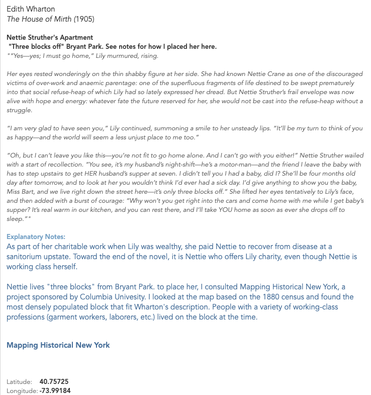
For example, one of the places I was most interested in locating was Lily Bart’s boarding housein The House of Mirth. This is a significant location because of what it represents: Lily’s fall into poverty after she accrues an overwhelming amount of debt and makes “bad” social choices. The boarding house is where Lily goes to live when she decides to stop accepting acquaintances’ charity; it’s also where she dies from an ambiguous overdose. When the other characters see Lily’s living situation, they are shocked and even disgusted. Here’s one reaction:
As she led the way westward past a long line of areas which, through the distortion of their paintless rails, revealed with increasing candour the disjecta membra of bygone dinners, Lily felt that Rosedale was taking contemptuous note of the neighbourhood; and before the doorstep at which she finally paused he looked up with an air of incredulous disgust.
“This isn’t the place? Some one told me you were living with Miss Farish.”
“No: I am boarding here. I have lived too long on my friends.” He continued to scan the blistered brown stone front, the windows draped with discoloured lace, and the Pompeian decoration of the muddy vestibule; then he looked back at her face and said with a visible effort: “You’ll let me come and see you some day?””
The House of Mirth, Chapter 10
Given the intensity of Rosedale’s reaction, I was extremely curious about where Lily might have lived — and how it would have compared to the living conditions of immigrants in the tenements. Fortunately, this same section of the novel offered key clues to the location. To put everything together, I consulted Mapping Historical New York, as well as information about the elevated rail line that existed at the time. I describe the process in a note on my map:
I was able to make an educated guess about the location of Lily’s apartment (as well as her chemist — see other note) based on the face that she walks there with Rosedale after meeting him as he descends from the 6th Avenue train. Based on other context, the only el stops that fit are 23rd St., 33rd St., 42nd St., or 50th St. (Others opened after the novel was written.)
Knowing that Wharton was born on 23rd and chooses to make far West 23rd the home of Madame Olenska’s artistic neighborhood in “The Age of Innocence,” I believe we can eliminate the possibility of Lily living on or near 23rd.
Demographics maps show that 50th was less densely populated further to the west, which makes it an unlikely location for a shabby boarding house. 42nd and 33rd were both dense — but given the landmarks near 42nd, and the fact that it’s closer to Bryant Park, which has been mentioned before as a place where Lily stops at this point in her life, I believe that 42nd is the most likely spot for her to run into Rosedale.
According to “Mapping Historical New York,” this block [W. 42nd between 9th and 10th] is the first one on 42nd west of 6th that has a significant number of garment workers living there in 1880; it and the blocks directly south are very densely populated, compared to the blocks to the east. 42nd St. has a large population of immigrants at that time, but from various backgrounds, whereas the streets to the south are predominantly German — something I think would have been noted if Wharton had intended it to be the case about Lily’s street.
(Interestingly, this location for Lily’s boarding house puts her only a few blocks north of one of the Jacob Riis locations in Hell’s Kitchen — but based on demographics at the time, that was a meaningful distance. The location suggests that while Lily was poor, she was still in not nearly as dire straits as the New Yorkers who lived in the tenements to the south.)
My process wasn’t quite as intense in each case, but I did try to reach this level of certainty for all my data. For this draft of the map, I eliminated locations that I couldn’t pin down within a few blocks. Once I had identified the locations that would make the final cut, I revisited the whole list on Google Maps to determine the latitude and longitude for each. You can view a copy of my dataset (as of 9/20/22) here.
Building the Map
Once I had my data, I chose to build my map in Tableau. As others have stated in their posts, it’s free for students and offers a robust toolset. I found it easy to learn, but I hit a few stumbling blocks that kept me from the vision I would ultimately like to execute.
Custom Map Image
I had originally planned to plot my coordinates on this 1879 map of New York, which I used to narrow down a few of my locations:
However, from a practical point of view, this map has a few problems. First, the perspective is skewed. The map doesn’t show a true bird’s-eye view, like we would expect from a modern map. When I attempted to overlay this image with Google Maps, I could get the contours of the Battery to match up, but Central Park wasn’t even close.
My second issue was that I didn’t trust the accuracy of the map beyond Manhattan, which would have been essential for providing the bounding latitude and longitude to map on Tableau.
I think both these issues can be resolved — but not in a couple of evenings.
Tooltip Images
I’d originally planned to include Riis’ images as part of the tooltips for my labels; each of the points I mapped has an image associated with it.
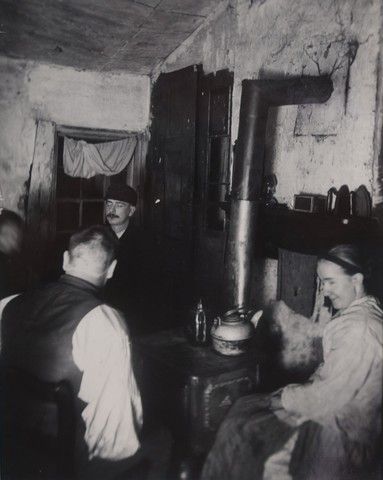
“Children’s Playground in Poverty Gap.” 1892. Located on W. 28th between 11th and 12th.
Tableau doesn’t currently offer a built-in way to do this. Many users employ an elaborate workaround — which I will attempt in my next draft — but this seems like a real gap, as well as a barrier for Digital Humanists, students, and others, especially if the workaround solution is not scalable or easy to keep updated with new data sources.
Reflections and Next Steps
My first attempt at this project was somewhat successful — I can see the limits of my own skills, both in the humanities and in the tools I used, but I also was able to answer some of the questions I started with.
My map, with nearly all points visible. The warm colors represent locations drawn from Wharton’s novels and life, while the teal markers represent locations documented by Riis. The locations in Wharton’s work that come closest to intersecting with “the other half” are Lily Bart’s shabby boarding house (westernmost yellow marker in Hell’s Kitchen) and Ellen Olenska’s apartment in a neighborhood that we could now refer to as “gentrifying.” (One of two pink markers nestled closely together north of the Meatpacking District.) Also note how spread out the world of Wharton’s characters is compared to the densely packed New York of Riis’ tenement dwellers.
Plotting out the locations in Wharton’s and Riis’ work did give me a better sense about how the worlds they described coexisted, with Riis’ workers providing so much of the labor that Wharton’s characters would choose not to see. I was especially interested in seeing the clear lines drawn between Wharton’s “genteel poor” and the real-life tenement dwellers; even when they approach each other on the map, they don’t quite overlap.
However, the most valuable aspect of the project was the chance it gave me to reflect on larger questions, including ones we’ve touched on in class.
Namely:
How might DH tools like mapping unintentionally obfuscate the uncertainty within some works of scholarship? I know that I’ll probably end up revising some of my locations as I learn more about Gilded Age New York, and I did my best to “show my work” and be honest about how tenuous some of my conclusions are. But if this lives publicly on the web, will my caveats get lost as other people find and use my work? For example, how many walking tours would have to include my educated guess about Lily Bart’s boarding house for the location to become an established fact? Our readings this week addressed the idea of maps seeming to create truth — when Digital Humanities projects use these tools, do we run the risk of being more convincing than we intend to?
Who and what am I leaving out by focusing on Riis and Wharton, and how does this reinforce existing narratives and gaps? The whiteness of the people (fictional and real) I highlighted in this project doesn’t reflect New York today — it doesn’t even reflect Gilded Age New York. I became especially conscious of how limited my data set is when I asked my husband, who’s a historian of the Great Migration and Black urban politics, to give me a gut check on some of my methodology as I checked for information on Mapping Historical New York. Instead of answering my question, he got caught up on looking at the demographics of an area just southeast of Columbus Circle and launched into a story about how Booker T. Washington nearly got beaten up there — and how of course that made sense, given the historical context of the area. That’s a story my map wouldn’t capture, along with many others. As I expand this project, I need to add additional sources, lest I give viewers the impression that the stories I’ve chosen are representative of that era of New York as a whole.
How do our tools limit what we choose to do as humanists? When I chose to leave certain elements, like Riis’ photos, out of this draft because it was too complicated to attempt in the moment, I compromised the integrity of my original goal. I have no doubt the project would be richer with the photos included. I believe I’ll be able to include them in my next draft, but this makes me reflect on some of the debate about defining Digital Humanities and Digital Humanists — namely the perceived distance between “thinkers” and “makers.” I have more sympathy for the argument that Digital Humanists must be makers than I did before this project, though I’m not fully convinced. If those who don’t have the skills to make projects choose to rely on out-of-the-box tools that impose limits on their projects, are they just restricting their own work? Or can we aggregate all of the DH work that doesn’t get made (or executed to the fullest extent) for want of a good tool and see it as detrimental to the field as a whole?
How might these tools limit the information available to the public? If data gets left out because it’s not easily displayed, can we expect people who engage with our work to know that data exists? What assumptions might be made based on a lack of data?
I’m curious to hear others’ thoughts and critiques as I continue working on this, especially as I continue grappling with these questions.
[Updated 9/21/22 ~ 10:00 AM to add additional sources, including my dataset, and make some edits for clarity and style.]
Taken together, this week’s readings lay out a few key dimensions to Digital Humanities work and thought. For example, “A DH that Matters,” expands on several ways in which Digital Humanities work might matter to people who aren’t already immersed in the field. Two are:
Social or ethical impact with outward-facing projects that speak to an issue, goal, condition, inequity, etc.
The impact on other fields — DH’s ability to engage with and embed itself within other areas of the humanities
Similarly, the other readings present modes of engagement that aren’t quite dichotomies but have the potential to be — let’s call them “and/or”s. As in:
Coding and building Digital Humanities projects
and/or
Using non-DH-specific tools as part of a related critique or engagement (“The Digital Humanities Moment”)
“Traditional” DH tasks, such as text analysis, curation, and preservation
and/or
Using DH to disrupt, dismantle, and remake
Traditionally-trained academics, perhaps with tenured positions
and/or
“Alt-academics” with disparate backgrounds and careers
“Or” may apply to individual projects, or more likely, the beliefs of individual scholars — but the projects we looked at this week offer a vision of and, from the Early Caribbean Digital Archive’s use of traditional digital humanities practices to tell history in a way that recenters the Black diasporic experience, to map- and visualization-based projects like Torn Apart/Separados that use mapping and other digital tools to assemble publicly accessible data into an unexpected format that drives users to engage with information they might otherwise ignore.
One last thought — in comparing the readings with the projects, I noticed another, unintentional and/or:
Writing that uses heavy jargon, “academese,” ponderous syntax, etc., and is legible primarily to an audience with traditional academic training
and/or
Clear, engaging writing that explores subjects with depth and precision but is legible to a curious layperson.
Compare nearly any sentence in Jacqueline Wernimont and Elizabeth Losh’s scholarly “Introduction” with the clear and inclusive framing of the Early Caribbean Digital Archive and the Colored Conventions Project, which are intended to be used by teachers, students, and the public, rather than just scholars. To fully realize the idea of Digital Humanities as a “big tent” and disruptive force, it’s worth interrogating if the ways in which DH scholars speak amongst ourselves keep that tent closed off to the very people we’d like to invite in.
Need help with the Commons?
Email us at [email protected] so we can respond to your questions and requests. Please email from your CUNY email address if possible. Or visit our help site for more information:


