Tag Archives: reading reflection

The Metaverse and the Perils of Technopositivism

In our discussion of Alan Liu’s essay, Where is Cultural Criticism in the Digital Humanities? last week, my group circled around the other topics that were raised in this week’s readings — professional roles in the academy, the economics of the university, and of course, the metaverse and its role in education.

This passage from Liu’s essay speaks to what I’ve found missing in most discussion of the metaverse, including this week’s readings (emphasis mine):

While digital humanists develop tools, data, and metadata critically, therefore (e.g., debating the “ordered hierarchy of content objects” principle; disputing whether computation is best used for truth finding or, as Lisa Samuels and Jerome McGann put it, “deformance”; and so on) rarely do they extend their critique to the full register of society, economics, politics, or culture. How the digital humanities advances, channels, or resists today’s great postindustrial, neoliberal, corporate, and global flows of information-cum-capital is thus a question rarely heard in the digital humanities associations, conferences, journals, and projects with which I am familiar. 

This introduction to learning in the metaverse acknowledges that immersive “technologies remain more expensive than other learning resources such as computers and books” and “content is more expensive to create” but doesn’t proceed further to ask how mediating not-for-profit learning through a technology that requires extensive financial resources might affect which ideas and arguments are and aren’t taught (unsurprising, since despite the academic bona fides of some of the authors, this text is published by a “storytelling and experiential agency” that touts its partnerships with Meta and Lenovo). It also raises a question that’s troubled me for a long time. With the rise of corporate educational technology, who controls learning outcomes and practices: educators or corporations?

For instance, take this ad from Meta, Facebook’s parent company. It’s worth watching if you haven’t seen it, because it illustrates what I see as the dangers of the metaverse:

The possibilities are endless! Except… each of the possibilities depicted here contains and creates its own limitations and barriers. The field trip to ancient Rome sounds amazing! But…

  • Even without the need to purchase headsets, the creation of such a thing would be fantastically expensive: actors, subject matter expertise, scripting, computer-generated settings, and QA all cost money. Who would pay to create it, and what might they privilege because of their own bias or cut to save money?
  • If AI were used to generate some of the simulation and cut costs, whose work would be used to “train” the AI, and would that person be compensated? And would the final project hold up to academic and historical scrutiny?
  • Would schools pay to access this type of simulation? If so, what would be cut from the budget in exchange? If not, what would students be “paying” to get such a simulation for free? It’s easy to imagine a conservative think tank funding curriculum on the Classical world — what biases would that introduce?
  • What would be the educational opportunity cost in terms of time and focus? What might be cut (either from the curriculum as a whole or the discussion of this specific topic) based on pressure to make the most out of an expensive, shiny new tool?
  • How can the educational value of such an experience be measured, and if it’s found lacking, will there still be pressure to use a metaverse field trip because of sunk cost? This article we read on the educational benefits of immersive virtual reality found better outcomes for students who accompanied Al Gore on a VR trip to Greenland than for those who just watched a video, but do these outcomes translate to situations where students are expected to apply deeper critical thinking skills or synthesize information to make an argument?

Similar questions could be raised about every example mentioned in the video. For instance, it seems like a neat trick to let a farmer visualize the spots in his field that need more water, until you remember:

  1. Agricultural knowledge and experience allows farmers to do just that on their own, and
  2. That knowledge is disseminated in a variety of ways, both informally/traditionally, and through public universities with agricultural programs, which have their own traditions of scholarship, political and humanistic thought, and engagement with the wider agricultural community, and
  3. Once a farmer has that knowledge, they don’t have to pay a subscription fee to use it or share it with others.

In this way, metaverse education can be seen as furthering the 20th-and-21st century corporate project of taking something that once belonged to no one and everyone and making it into a source of profit (see: Disney’s transformation of folk fairy tale plots and characters into copyrighted IP). The farmer no longer owns the ability to evaluate their fields. Teaching about ancient civilization means one thing — a glossy VR field trip — rather than a multitude of possibilities depending on student interest, teacher knowledge, and pedagogical goals.

Let’s go back to Liu and his argument that digital humanists who don’t “extend their critique to the full register of society, economics, politics, or culture” aren’t truly engaging in humanities work. Any effort toward an “educational metaverse” is inherently political, as the technical and logistical requirements of creating highly complex edTech mean that power, resources, and cultural hierarchy will always play a role in determining what’s taught and how. Any discussion of the metaverse that isn’t grounded in that reality is uncritical technopositivism — and not truly based in the humanities.

Creating Community Through Collaborative Projects | Pedagogy

The readings related to pedagogy allowed me to reflect and think about the work I do with students at LaGuardia Community College.

Context

First-Year Seminar and Student Success Mentors

At LaGuardia Community College, I oversee the Student Success Mentor (SSM) Program. We hire 15 -20 students each semester. The SSMs in the program facilitate the studio hour lab session that is part of a discipline-specific First Year Seminar Course taught by faculty in the discipline and mentored by one of our SSMs. For example, if a first-year student is majoring in business, they will take the Business and Technology First Year Seminar Course. Currently, we have 16 discipline-specific courses. Our program serves approximately 2000 students who are enrolled in the First Year Seminar.

Learning Digital Communication Ability

Before students graduate and or transfer from our institution, they should learn Digital communication, Written Communication, and Oral communication as part of the Core Compemntices and Abilities. Students begin their development in Digital Communication Ability by creating their first Core ePortfolio on Digication. This ePortfolio goes on a journey with the student from the first semester at LaGuardia until their capstone course.

The Student Success Mentors play an instrumental role in helping students develop their first ePortfolio. Therefore, new SSMs undergo 30 hours of training (5 weeks) before facilitating their First Studio Hour. We touch on several topics ranging from the following:

  • Mentorship
  • DEI
  • Digital Tools
  • Class management
  • Empathy
  • Facilitation
  • Digital Communication
  • College Resouce and etc.

New and Returning SSMs also participate in Professional Development every semester to go over any updates related to technology or topics that need to be addressed.

Community Building Through Collaborative Digital Blog Projects

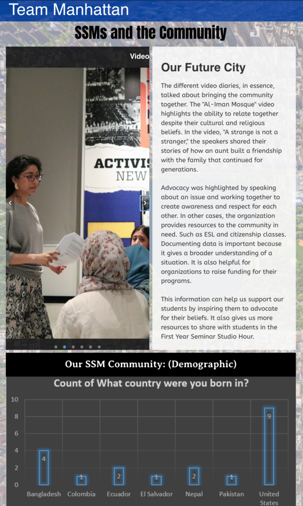
For the last eight years, the Student Success Mentor Community is very strong. They support each other. Therefore, it’s important for us to create opportunities for SSMs to work together on different projects beginning with the Blog they create with New SSMs and Returning SSMs.

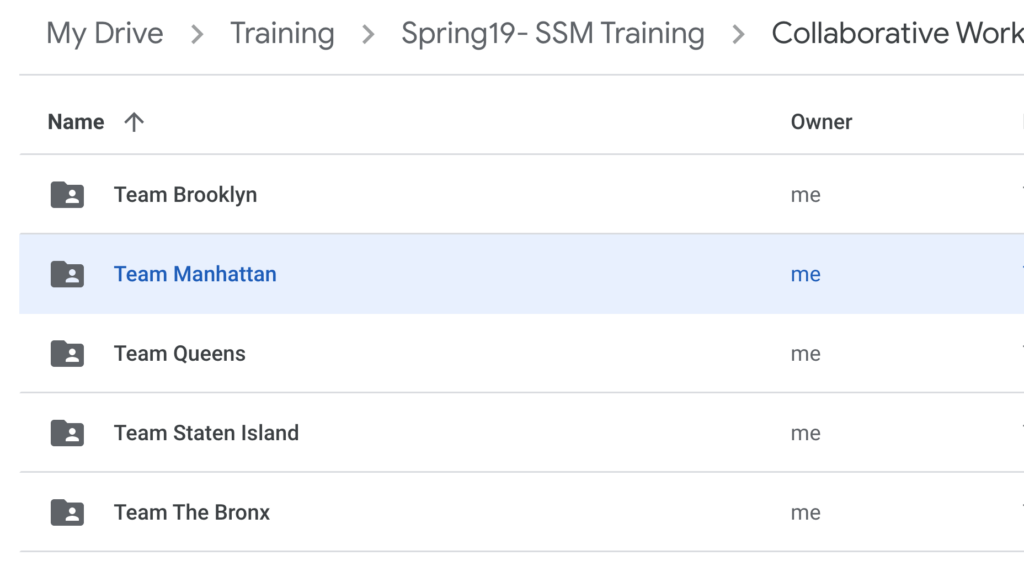
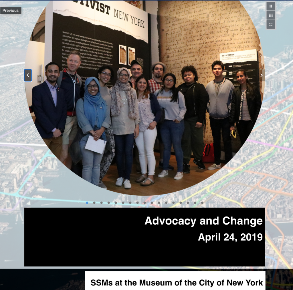
At the culmination of their New SSM Training, the program takes the New SSMs and returning SSMs on a trip to a cultural site. The aim of this trip is to help the New SSMs and Returning SSMs to connect with each other, but also connect the training topics to the artifacts they observe and analyzed at a cultural site. We have visited the MET, Ellis Island, Museum of the City of New York. We provide SSMs with prompts to help them think about what they learned during training and how it’s connected to the artifact. As a team, they come together to answer these questions. They are instructed to take videos, and pictures and take notes. One example is, at the MET, we asked teams to select one artifact they saw at an assigned exhibition and explain how this artifact represents one of the SSM Core Values and how it relates back to the work they will be doing with students once the semester begins.

What to do with media? Computer Literacy Skills

As a former student of graphic design and new media arts I know firsthand how important it is to organize, name, categorize, and backup media. One of the techniques I emphasize before we begin our exploration at the exhibit is to make sure that we have the media in one platform such as google drive to upload and share the media with team members along with any notes they are making as they are documenting their experience.

Putting it together!

In the following session, after they have gone to the cultural site, they meet in the lab. During this session, SSMs begin their work by creating a blog on ePortfolio with the information, videos, and photos they have gathered. As they are creating this blog in the lab, they are running from one computer to another. They are talking, laughing, and overall, helping each other build one blog. Once they have created their blog, they present the section of their blog. During the presentation, you can see the work that went behind creating this blog and how they all supported the work. They practice the digital communication skills they learned during training and also the different topics while creating a lasting community of mentors.

Connected Pedogoy Assignment: The Reverse Peephole

I made several annotations on the reading, as listed below. However, I would like to focus on three quotes. For each quote, I have provided a reason for annotation this quote. I aim to help students relate concepts or themes to their lives. Generally, when students relate the content to their experiences, I think they can better grasp and understand the concept.

  • Quote: ” Queen Victoria transformed into King Edward, ‘the fourth dimension’ became an everyday concept.”
  • Annotation: I am not familiar with this concept of ‘the fourth dimension that occurred a century ago. I need to research since I don’t know what transformation happened during this time.
  •  Quote: “The modem’s faithful churn made it seem as if it were tunneling through to somewhere else, opening up a space for us to inhabit.”
  • Annotation: What does “tunneling through to somewhere else” look like in the digital world? Does that tunnel still exist?
  • Quote:  “With the prospect of this fourth digital dimension, a moment can feel strangely flat if it exists solely in itself.”
  • Annotation: If you post an accomplishment on social media, does it feel “more real” than if you didn’t post it? Why?

1) Quote: “but our physical homes have also been digitized. We can identify a common fitting on a 4D house by traveling back in time to the unlikely world of Seinfeld‘s last season”

Annotation: Video Reference Youtube: https://youtu.be/jzAvEkbn3lA

Annotation Reason:

I am not sure what is the age group for this class, however, I am assuming that some might not understand the reference to Seinfeld. Therefore, I provided a short video that I found on YouTube related to this specific scene.

2)Quote: “physical homes have also been digitized.”

Annotation: During the pandemic, when work and school took place online, we were forced to digitally invite our colleagues, boss, classmates, interviews, and people we usually don’t invite to our homes. How did this make you feel? What did you learn more about this experience?

Annotation Reason:

This book was written in 2016, however, four years later, the whole world was forced to changes due to the pandemic. Therefore, these students can understand the impact it had on their lives. This question aims to help them reflect on their own experience, give them a moment to think about their feelings and give them the power to create their narrative, as this was a traumatic experience for many.

3) Quote: “What happens to the nervous system when it is exposed.to the delights and pressures and weird sorrows of networked life? “

Annotation: What happens to the development of children who are born into using mobile devices?

Annotation Reason:

This is a rhetorical question. I don’t have the answers. However, I’d like students to consider the digital world’s implications on children.

Doing Public Humanities: Open Access Publishing/ Minimal Computing / Digital Scholarship

The first time I came across the topic of public humanities was by reading the book Doing Public Humanities edited by Susan Smulyan. I learn that public humanities happens in collaboration and engages diverse public audiences. But as put by Robyn Schroeder in “The Rise of the Public Humanists,” digital technologies could be seen as disruptions that “have undermined the traditional source of authority for researchers and archivists.” (20) Fitzpatrick’s proposed ideas in “Working in Public” encourages me to think further how to engage openly and explore widely together to create, support, and promote projects/works toward the public good, particularly in a digital age.

The most complex challenge in doing generous thinking I learned from her writing is understanding and balancing the interests of diverse and sometimes even competing stakeholders within and outside of your fields/organizations and facilitating good conversations. Coping with uncertainty and unfamiliarity in conversations and collaborations is undoubtedly not easy. In the session on public access, she mentions the advantages of OA journals (which I read further explanation in Suber’s piece “What Is Open Access?”). She uses OA journals in science as good examples that help sciences progress. And systematically speaking, publishing costs are also said to be included in grants in the sciences, which aims to promote knowledge transmission and public engagement. However, I also see difficulties in balancing interests in the OA publishing in science. There is an article titled “Why I think ending article-processing charges will save open access,” published last week in Nature written by Juan Pablo Alperin.

Alperin explains how difficult it is for Latin American scholars to publish in well-funded top journals in Europe and North America due to increasing APC (Article processing charges) payments. I learned from scientists I follow on SNS that they currently need to pay around $4,000-5,000 for the APC per article. Scientists could pay the APC from their grants, and as Fitzpatrick writes, “those tenured, and tenure-track faculty and other fully employed members of our professions who can and should contribute to the world the products of the labor that they have already been supported in undertaking.” (157) But there is also the issue of geographical inequalities, even among tenured faculty and schools. Thereby, I am excited to find out that Fitzpatrick also addresses “the dominance of standard English” (164) in this chapter. Echoing her, I also think translation works are not valued enough as scholarly contributions. And ultimately, I ask for a critical reflection on how the world beyond the US’s boundaries is taught and learned and how we could combine the DH and regional studies to help the students/the public understand the rapidly changing world. Geographical inequalities, as well as inequalities in race, gender, and age, requires us to consider general questions like the role of public intellectuals but also look into some invisible questions regarding capabilities in utilizing technologies during the development of technologies, as addressed by Risam and Gil in “The Questions of Minimal Computing.”

And lastly, let us revisit the idea of public intellectual and public scholarship. Speaking and writing to the public is not enough to become a public intellectual. I notice some scholars do public scholarship by formulating their beliefs and arguments on fighting against what they oppose. However, some fail to discover what they inherently support and give good guidance in questions outside their disciplines but relate to global social and cultural issues. I would argue for consciousness and self-awareness in the process of producing public goods

Open Educational Resouces: Pressbooks

Access to knowledge and technology was a common theme in the readings. It sparked a curiosity about Open Access and Open Educational Resources. Currently, at LaGuardia Community College, my colleagues are working on an OER project (Open Educational Resource). In a short interaction while at work, I briefly mentioned that I was learning about Open Access in my weekly readings. My colleague invited me to see a current OER project they are working on. Without really getting into details about my readings, the first thing they said was that they needed to figure out what platform they were going to use. Some factors to consider were cost, accessibility, and user experience. I immediately thought about the four heuristic questions in Introduction: The Questions of Minimal Computing. I especially thought about this question. “What do we have?”

“what do we have.” – CUNY Pressbooks.

Based on my conversation with my colleague, they used Pressbooks as the OER platform to create this project. Based on my understanding, I learned that CUNY has a subscription to this platform. I also learned that a team is behind this project, from professors to students. A grant is funding this work. Therefore, they can compensate students for their time creating content for this OER project.

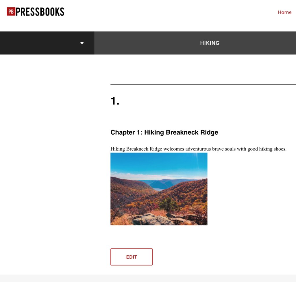
I decided to create an account on Pressbooks and play around with the platform. I decided to “create” my first book titled hiking. It’s similar to word press. It has some book themes to choose from. I needed more time to learn about the features and tools on this platform, but it seemed straightforward and user-friendly. For practice, I decided to create a book called “Hiking.” I love hiking and spending my weekends year-round (weather and time permitting) in the mountains of the Hudson Valley and surrounding areas. I created a chapter called Hiking Breakneck Ridge, one of NYS’s most challenging hikes.

Who can afford $100+ Textbooks?

While playing around with the platform, I was thinking about textbooks in the sciences that are constantly being updated. Therefore, the content in the textbook in one year can be different the following year due to new scientific discoveries.

I think it’s ridiculous that students have to pay $100+ for a textbook, especially if they are going only to use it one time. However, I think we now have a solution for that. These platforms and OER projects allow for sharing knowledge with students and the public interested in a subject/topic.

How can OER textbooks and learning material support student success?

I think that OER textbooks and learning materials can support student success by alleviating this cost burden to students. Students shouldn’t be stressed by deciding to buy a textbook or paying for rent or their living expenses. They can instead use the money for their living expenses. It’s already expensive to live in the states. If OER can alleviate that stress, I think we need to move towards an educational system that will support all students to succeed by providing the materials necessary to achieve their goals and success.

Belated Thoughts on Visualization

Since our last class discussion, I’ve been reflecting on what makes a visualization “work” — and whether evaluating a visualization that way is even possible. Any critique of a visualization has to include considerations like:

  • Who is the intended audience, and how much does that overlap with the actual audience? For example, if a humanities-related data visualization in an academic paper is clear/legible to scholars with a deep knowledge of the subject matter, but inscrutable to undergraduate students assigned to read the paper, is it successful?
  • How much should we expect a humanities data visualization to convey, and how authoritatively? As Krysia pointed out in our discussion, using data to “close down questions” may run counter to the aims of the humanities. Trying to seek definitive answers from a visualization also ignores Drucker’s distinction between capta and data.
  • What is the affective/emotional impact of the visualization — and how much does that dimension of a visualization matter? I keep coming back to this image from Teddy’s blog post on Sefaria in Gephi, a visualization of meaningful Jewish texts. The visualization shows Biblical texts and commentaries in blue, the Gemara in pink, and other sources in red, green and orange, with the nodes appearing larger based on the number of connections to that text — the largest blue node is Genesis 1:1. The author of the visualization compares it to a “cell under a microscope,” but it reminds me of a supernova, as well — and both images feel fitting and emotionally resonant with the subject matter.
  • What effect might the toolkit used to create the visualization have on the scope and perceived meaning of the visualization? The features and constraints of any platform can shape the way data is presented, and even the type of data that’s collected. It’s easy to imagine how an individual’s reliance on a specific platform could limit the types of data would collect, and by extension, the types of questions they would research.
  • Is it possible (or valuable) to evaluate the visualization author’s skill/success as part of (but still somewhat separate from) our overall critique? With a written text, the author’s skill (or faults) as a writer can determine how effectively they convey their argument. Visualization might have the potential to obscure an author’s limitations — something glossy and visually intriguing might draw weak conclusions or be a mess “under the hood.” On the other hand, an author who is able to create their own visualization tools has a lot of power to convey their point exactly as they intend. To call back to the old DH debate about the importance of being able to “make,” is the author’s control of the visualization something we should consider to evaluate the visualization, or would any weaknesses/errors on the author’s part be evident in the final product, as might be the case in a written work? The question might be purely theoretical, anyway — if we can’t see behind the curtain of a visualization, this may be impossible to know.

Along with all of these considerations, I’ve also been thinking about complexity vs. legibility. Per Drucker, a humanist approach to visualization allows us to capture subjective experience and analysis:

The challenge is to design graphical expressions suited to the display of interpreted phenomena: information about subjective user-dependent metricssubjective displays of information, and subjective methods of graphical expression. The term subjective is used as shorthand for interpretative construction, for the registration of point of view, position, the place from which and agenda according to which parameterization occurs. Subjectivity is not the same as individual inflection or mere idiosyncracy, but is meant to put codependent relations of observer and phenomena (in contrast to presumptions of objectivity, or observer-independent phenomena).

Joanna Drucker, “Humanities Approaches to Graphical Display,” 2011

I would argue that the challenge lies equally in designing visualizations that are “suited to the display of interpreted phenomena” and in making sure those visualizations are legible in a way that allows for subjective but at-least-somewhat consistent readings.

For example, this visualization from Drucker’s article is complex and reflects interpretive construction, but is also easily legible, in that it’s possible to quickly understand how the visualization was constructed and use it as a jumping off point for further discussion. When I interpret it, I can assume that other good-faith readers can gain similar insights to my own:

Joanna Drucker, “Humanities Approaches to Graphical Display,” 2011

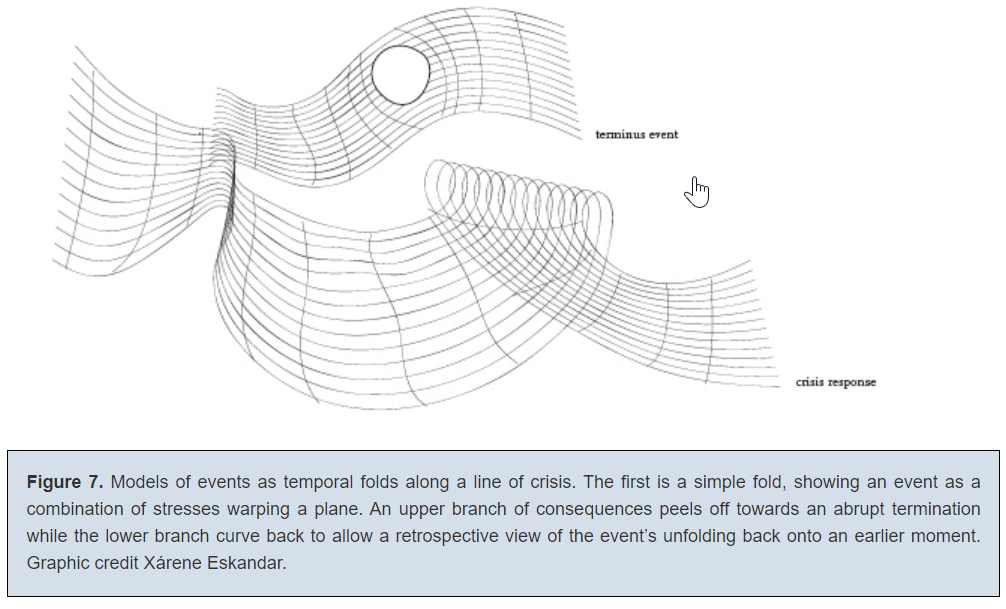
However, I’m not sure if the same could be said for visualizations like the one below — though I admit that me not understanding it doesn’t necessarily mean it’s illegible:

Joanna Drucker, “Humanities Approaches to Graphical Display,” 2011

(I had a lot of questions here that might be answered with greater context, with a major one being: “What on earth does the hole mean?”)

Of course, to some extent, all visualizations necessarily depend on context to be legible and useful — as Drucker points out, even “straightforward” datasets and visualizations involve choice and decision-making from their creators. But I do wonder about the utility of a visualization that’s difficult or impossible to interpret without already understanding the data, the author’s intent, the unprecedented visual metaphor, the degree of attempted precision, etc.

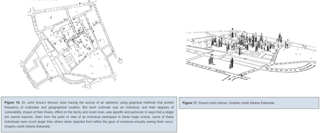
Finally — what do we make of a visualization that approaches the complexity and level of detail of the original data/capta-set it’s trying to illustrate? I’m thinking of this alternative to John Snow’s famous cholera spread chart that Drucker offered:

Joanna Drucker, “Humanities Approaches to Graphical Display,” 2011

This is such an interesting choice to me, since altered chart still tells us not much about the individuals who died of cholera — and the original is one of the most famously effective and influential visualizations in history. While supposedly more interpretive, the new one seems to be something closer to a recreation of situation — it reminds me a bit of Borges’ country-sized map of the country from “In Exactitude in Science.”

I hope we get more of a chance to discuss this as the class goes on — I’m curious as to what others think, and if maybe my approach (thinking about effectiveness/utility) means I’m not quite taking these visualizations as they’re intended to be taken.

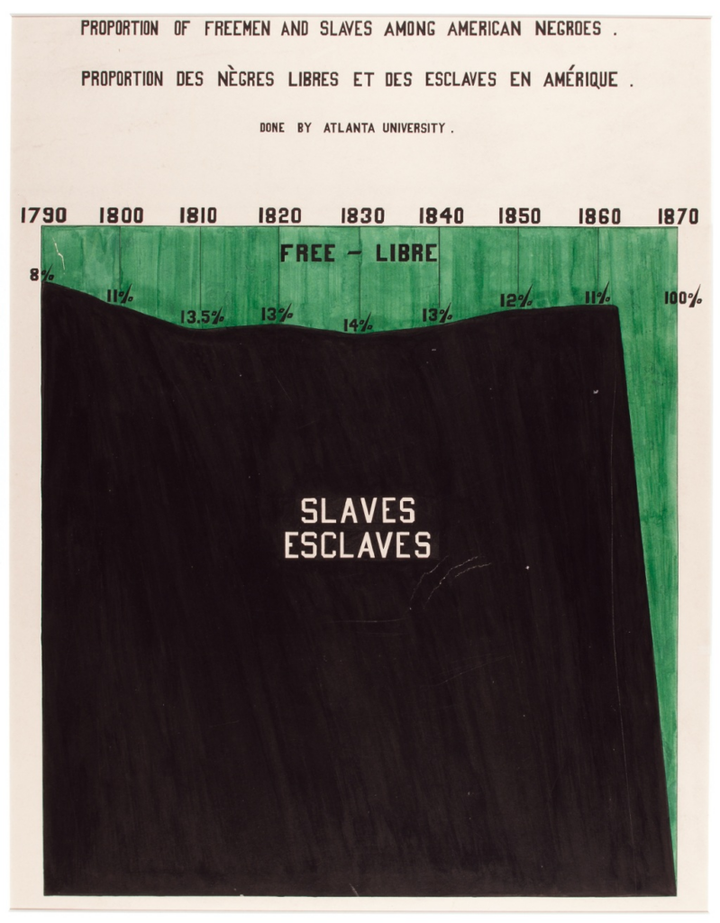
Finally, I want to leave off with a visualization I’ve always found particularly striking, though it’s pre-Digital Humanities:

W.E.B Du Bois, presented in 1900 at the Exposition Universellethis article from Smithsonian gives more detail about the circumstances and the team who made it.

This is a visualization created by W.E.B. Du Bois and a team of students and alumni from Atlanta University as part of an exhibition at the 1900 Paris Exposition Universelle. (You can read more about it here.) While some of his other visualizations are more abstract and, for me, edge on that zone where expressiveness outweighs easy legibility (for example, a historian I know confessed that he still “[doesn’t] really understand” this beautiful one), this one depicts data precisely while still conveying an affective impact. The choice to fill in the enslaved population as a large black block creates the image of an enormous mountain-like mass — of humanity, of suffering, of injustice. It foregrounds the scale and endurance of American slavery in a way that a simple line or bar graph couldn’t. I think even if you were to extend the chart to the present, with the mountain of slavery further in the past, it would still be a powerful reminder of just how many generations of individuals were enslaved in this country.

I’d be curious to see other examples of pre-digital visualizations that push past the conventional limits of what a visualization can do — and how they might conform to or challenge Drucker’s ideas about humanities visualizations.