
This week’s readings particularly moved me as I have come across questions of responsible archiving throughout the past few years. Jessica Marie Johnson’s “Markup Bodies” articulated a festering discomfort I have sometimes found myself feeling in archival spaces (ranging from curated museums to viral social media posts) with regards to the commodification and spectacle-making of trauma. “ The brutality of black codes, the rise of Atlantic slaving, and everyday violence in the lives of the enslaved created a devastating archive. Left unattended, these devastations reproduce themselves in digital architecture, even when and where digital humanists believe they advocate for social justice” – Johnson points to a lack of critical engagement that can occur under the guise of “archiving” that ultimately leads to a desensitized and disconnected consumption of trauma through media that continues to replicate and give power to it. As we engage with traumatic archives, it’s important to question and think critically about the desired impacts of archival engagement, potential unintended consequences, emotional labor of archivists, and imagine creative, responsible ways to archive in a way that does not make light of the deep brutality experienced by real people. I found two really interesting readings when looking for more about responsible trauma-informed archiving that I think might be good for folks interested in more: Love (and Loss) in the Time of COVID-19: Translating Trauma into an Archives of Embodied Immediacy and Safety, Collaboration, and Empowerment.
Monthly Archives: October 2022
Highlighting the Humane
Reflecting on the readings for this week, the point that kept coming up in my mind as I was reading the articles was how utterly humane the writers discussion was underlined. This was surprising by omission in the sense that it was something I had missed before their discussion. When thinking of an archive or a collection or a museum, the concept of humanness somehow didn’t cross my mind. Being aware of the horrors of slavery, I hadn’t thought of the point that an archive could perpetuate them. Reading Johnson’s Markup Bodies I became very aware of questions that need to be addressed while coming into contact with an archive. Questions of data stability, of data usage, and, of course, objectivity- something I was aware of previously. Data as Johnson states, ‘… has been central to the architecture of slavery studies and digital humanistic study.” Taking into account that data is not neutral allows me to have a critical take on what I’m looking at, very similar to the last set of readings which involved mapping. Neither can be taken as is. Even taking first hand experiential testimony can have a slanted point of view. Johnson notes, “ … an exploration of the world of the enslaved from their own perspective- served to further obscure the social and political realities of black diasporic life under slavery.” The tradition of data as ‘given’ or neutral has continued for quite a long time. Even up until recently, the concept of humanizing- I think of Drucker here- data is still resisted as Johnson mentions regarding the conference at the College of William and Mary. Her aim is to contextualize the data and to bring it home so to speak. To open up the database and allow it to be used by the community for the community’s well-being whether to remember, to pass on, or to help heal. It is this idea of it being a tool to heal that resonated with me and where I saw the archive being used by people, normal people rather than academics. Real world application to help real world hurts. Rather than just having numbers which can take away a sliver of humanity and obfuscate reality, we have a tool to do the converse of that.
The September 11 Digital Archive also showed healing as a component of its purpose. Brier and Brown showed tremendous insight in their approach towards the archive when they had an epiphany of being archivist-historians, the updated version of a historian- historian 2.0. Working very rapidly to collect as much input from as many sources as possible was an excellent idea to record things which were fresh in people’s minds. Creating webs by reaching out to other communities, whether ones with different languages, different locations, different geographies, was an enlightened approach. Giving ordinary people an input into the archive and allowing them to be represented gives people the opening to view/use the archive to remember, to heal. This is a major reason it’s one of the most visited sites.
Christen and Anderson articulate the view of an archive being a place to ‘decolonize processes’ as a ‘slow archive’ where data is preserved but more importantly where ‘we have to keep pushing forward to save the culture.’ By ‘pushing forward’ we can find solace in the wrongs of the past and, again, heal. A slow archive is, as others have noted, a place to pick up life experiences, oral stories, and in view of the Mukurtu CMS to have real healing whether recognizing tribal traditions or respecting tribal customs or allowing ‘temporal sovereignty.’ A slow archive is a recognition of the relationship between the archive and what the community needs.
This enlightened view of an archive is seen in different places. One such place is Pan Dulce: Breaking Bread with the Past. In creating the archive, Cotera not only created an archive but a template for others to use to tailor the archive to their unique purpose. For her, creating a feminist Chicana archive and the basic template for others to use consisted of 5 principles:
- Research grounded in a specific topic. For her own, it was Feminist Chicana History.
- Participants are co-creators and retain intellectual rights to their input.
- Relies on relationships of reciprocity, vulnerability and researcher reflexivity.
- Places lived experience at the center.
- Provides a potential space for healing.
Healing, again. So, from the readings, the insight that I come back to over and over again is of use, of use to heal. How powerful is that?! They are not places to only be academic, nor are they places to be dissected and analyzed, but places to learn and to heal, an active place to be pro-active. A place where one can ‘keep pushing forward.”
In essence, an archive must not just record data, but bear witness, and be a place to help heal.
Digital Archive
I really enjoyed this unit and how digital archives can create connections. Recording, sharing, evaluating, and archiving past and present history digitally allows for an accelerated and vast reach. The readings, video and sites from this week demonstrated how important it is to ensure not only that the history be correct and representative of the people it tells the story of and how imperative it is to collaborate with the history makers. I found the TK knowledge site eye opening and after reading about the different labels, it made me really think about how important it is to share the stories digitally with permission and accuracy. Reading the CUNY Distance Learning Archive allowed me to step into the shoes of the students and faculty during the recent pandemic. I was working during that time, and I wish we recorded and digitally archived the experience to have the history but to also allow others to understand the impact of my company and coworkers. I was living in California during the time of Sept 11 and although I knew people that lived in NY and experienced that time, reading the articles and looking at the photos that I never saw gave me pause to what so many people in NYC and other areas went through.
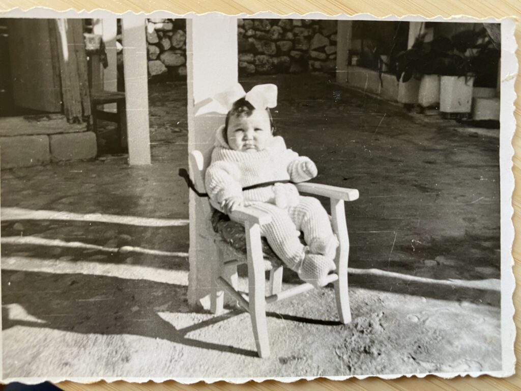
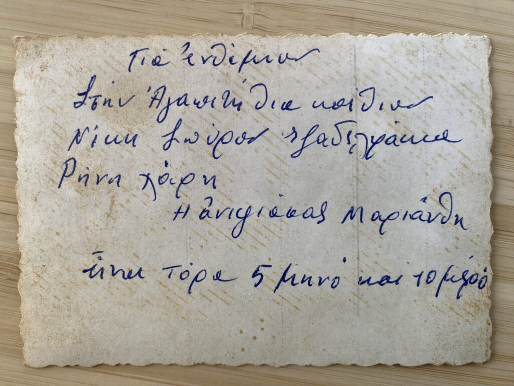
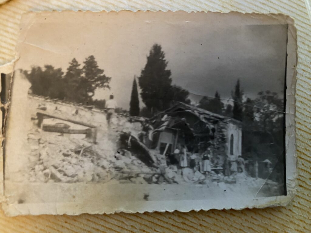
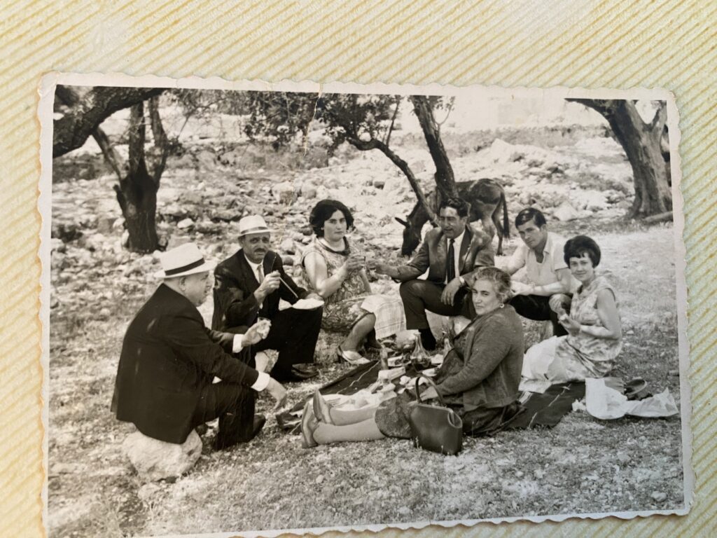
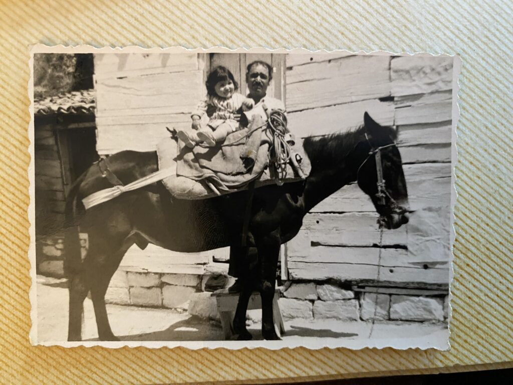
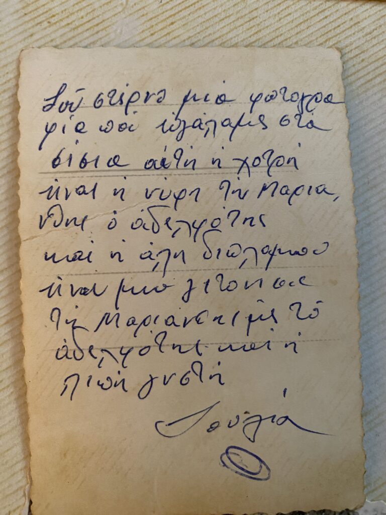
My husband’s family is from the island of Kefalonia in Greece and on a visit many years ago, he recorded conversations he had with his grandmother. He is trying to locate the recordings for me, and I hope to be able to translate and watch the videos and along with the old photographs put together a digital archive of his family’s history. During World War II, in 1941, the island was occupied by the Italian troops which were allied with the Germans. In 1943, Italy capitulated but its troupes refused to leave from Kefalonia. As a punishment, the German forces killed more than 5000 Italian soldiers, a historic fact described in the famous book Captain Corelli’s Mandolin, written by Louis de Bernieres. Then in August of 1953, a huge earthquake destroyed the largest part of Kefalonia and demolished most villages of the island. This past weekend, I spent some time looking through his family photo albums that his grandmother kept and thought it would be fun to share some with you all (photos are over 50 years old). Gotta love the creativity of parents back then!
By FY 2024, NARA will digitize 500 million pages of records and make them available online to the public through the National Archives Catalog.https://www.archives.gov/files/about/plans-reports/strategic-plan/2018/strategic-plan-2018-2022.pdf
Alive in the Archive
Response to “Toward a Slow Archival”
“Towards Slow Archival” by Kimberly Christen and Jane Anderson, which discussed ways to name and address the colonial and harmful approach to digitizing and documenting Native cultures, was a fascinating discussion of the digital intersection with holding Native cultural expression. Given the authors’ attention to cultural preservation, I was surprised that there was no mention of The Native American Graves Protection Act of 1990 (NAGPRA) or The American Indian Religious Freedom Act of 1978 (AIRFA). The former necessitating that museums and other institutions repatriate to tribes the items stolen from their burial sites, including bones and sacred burial items and the latter protecting Native American religious and cultural practices as defined by practitioners (Yes, it is shocking that these were just passed in 1978 and 1990). Both of these acts necessarily modified the relationship between tribes and institutions focused on their documentation through a colonial lens. In many cases, the colonial mindset of the institutions required to repatriate items was undeniably exposed through their response to Native peoples empowered by the new legal landscape these acts created.
For many years, my mother was the Director of The Department of Tribal Preservation and tribal historian of my own tribe, the Mashpee Wampanoag. As part of her work, empowered by NAGPRA, she worked directly with museums, archeologists, and universities, including Harvard University and the Peabody Essex Museum, to repatriate artifacts, including the bones and burial items of our ancestors. Some of these institutions created struggles that took years. They simply would not give the items back, using every technique they could to stall or thwart the repatriation process, preferring that items remain in storage, tagged and hidden away. Most upsetting for them, I believe, was our practice of reinterment—returning the items to the Earth where our ancestors placed them. Much like Fewkes’s insistence on cataloging what he believed to be disappearing cultural practices, these museums felt that somehow simply possessing the bones and items of our ancestors, equated a kind of possession or acquisition of knowledge that provided them some true insight to our culture. The most fascinating irony of this situation is that the very stealing of the items and cutting off or gatekeeping access to them represented the exact negation of the knowledge they sought. To Christen and Anderson’s point, often times Native peoples understand history to be a living knowledge with which we interact and evolve within. This freezing in time, this pinning of our customs on a board like butterflies negates our cosmology and our expression of what it means to be human. We are living beings carrying and sharing the part of the story we hold, and our culture is a living expression of that.
Non-indigenous digital archives, even while claiming to promos access, often just reinforce the gatekeeping of informative moments in time. Locked behind inscrutable interfaces, in unfamiliar and potentially unwelcoming settings, described through a non-indigenous lens, the true inheritors of this information are cut off from receiving the full message of the captured and cataloged moments. Packaged for the non-indigenous reception, our culture performs but it doesn’t breathe. We, by extension, become artifact not being. The conscious effort to free this knowledge from the constraints of perspectives and tools that don’t serve our customs creates added labor and struggle.
This behavior of freezing and naming our culture discussed in the essay has contributed to so many old and tired stereotypes — specifically images of the Noble Savage both revered and infantalized as naive and childlike—and gone. Most people don’t realize there are still Native peoples in New England and across the Nation outside of reservations. The assumption is that we are gone, and that referencing the original inhabitants is enough to signal some awareness of these long lost disenfranchised peoples. Unfortunately, Federal Recognition is often the substantiating badge of existence, among Native peoples as well. T
This drive to pinpoint a culture in a linear way—to create equations of understanding—in my view—stems from fear of the unknowable. When you strip down the complex and and try to neatly organize what you do not understand into units that can be dressed in familiar terms, you remove the threat of looking at truths beyond your worldview and the smallness of your place in the world at large.
Historical Queer Data (Or, the Lack Thereof)
I began my reading for this week with my post from our last meeting and my presentation from the Text as Data conference fresh in my mind, so naturally I was thinking about Queer data. My own project is currently archiving Queer, naturally occurring writing in a way that has never been done before. Now, in my last post I came to the conclusion that for queer data to be ethical, it must be collected by Queer people (or at the very least, close close close allies who deeply understand Queer Theory).
In Markup Bodies, Johnson writes: “Black digital practice is the revelation that black subjects have themselves taken up science, data, and coding, in other words, have commodified themselves and digitized and mediated their own black freedom dreams, in order to hack their way into systems (whether modernity, science, or the West), thus living where they were “never meant to survive.”’ It is in this exact way I believe Queer data currently exists. Unlike this historical legacy of Black people, Queer people do not have a history of data at all, even data that is incorrect and twisted, really.
Most of modernity has been spent trying to be rid of the idea of Queer people to begin with. Especially in recent years, as far as I understand it, due to a smear campaign in the 1950s and 60s, Queer people have been painted as pedophiles (as in ‘Watch Out for Homosexuals’ and ‘Boys Beware’, both of which are available on YouTube). Naturally, being the scum of the Earth, people would like to rid themselves of all records of pedophiles. That’s something you want to forget. And not to mention the fact that, as recently as the early 00s, articles in Evangelical publications were still asserting this as fact (and I’m sure they continue to do so). Prior to that, we have been subject to eugenics at such young ages that the records simply don’t exist. From the systematic killings of Gay people during the Holocaust, to the AIDs epidemic where our health was ignored to protect straight people from us. And so, there is no historical queer data.
But I pose that we must gather data, for we need to prove that we survive in the world that the cisgender heterosexual society wants us gone from. We must live where we are never meant to survive. For future generations to know that we were here. We have been systematically killed by plagues like the AIDs crisis, and lost many of our community elders. A lot of Queer stories are strictly oral stories, because often our lives are at stake if we dare put these tales to paper. So now, in our more free world (as much as it can be at present), we must take advantage of this and archive, archive, archive.
PS: I will henceforth be capitalizing the word Queer when in reference to the community, in an effort to divorce ourselves from the notion of queerness and establish ourselves as a distinct group. I highly encourage everyone else to do the same.
Workshop Overview: Impact Factor and Other Research Metrics
I attended this event about “Impact Factor and Other Research Metrics: What They Mean and What They Don’t” by Jill Cirasella (Associate Librarian for Scholarly Communication). While I have not written any formal article yet, I have always been curious about citation and their “importance” ever since one of my former work colleagues who had a Ph.D. once told me his paper finally got cited 100 times (which apparently was an exciting milestone).
This workshop gave a wonderful overview of the context of key citation metrics and how problematic they might be. The metrics discussed include:
- Article Metrics (aka how many times an article had been cited)
- h-index (largest number h for which the author has published h articles that have each been cited h or more times.)
- Journal Metrics (What is the journal’s Impact Factor?)
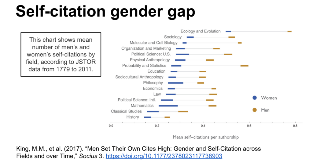
I also found the discussion around citation gender gaps interesting, here’s a quick summary:
- Men cite men over women.
- Mixed-gender co-authored papers cite men over women.
- Men self-cite more frequently than women do…even in fields with the majority of women authors.
- In fields that are trending toward more women authors, no corresponding trend toward citing more women.
Interesting Visual: It was discussed in the workshop how metrics could be “gamed” by a scholar. The following shows male scholars are way less shy about self-citing their own work (which will boost their metric), which contributed to the citation gender gaps.
If you are interested in the workshop but didn’t get to attend, you can check out their:
- Workshop recording (55 minutes, plus 18 minutes of Q&A): https://youtu.be/aqmqC_FgNjY
- Slides: https://docs.google.com/presentation/d/1AAdH3H_1UrCu_-DjgmnCxqa7oTdu9ew2G1FfNGNeBAk/edit#slide=id.g9a96ad921b_0_20
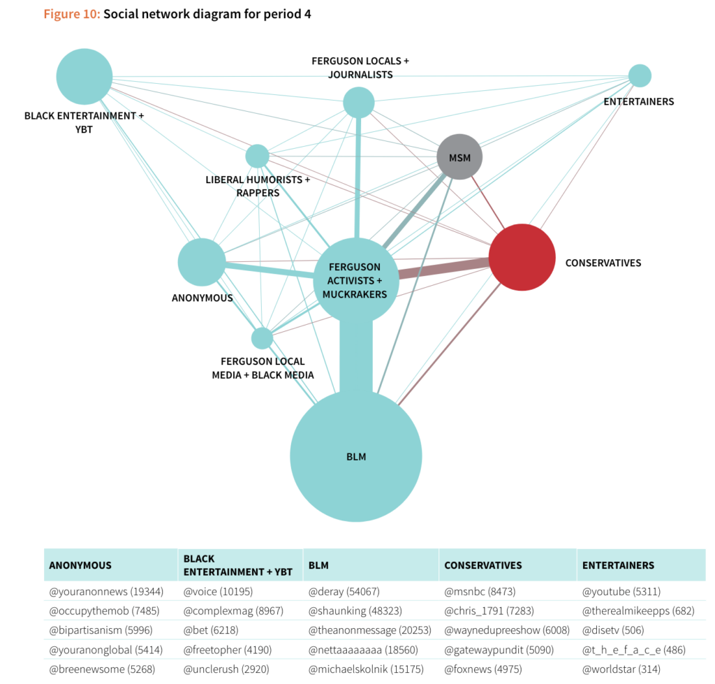
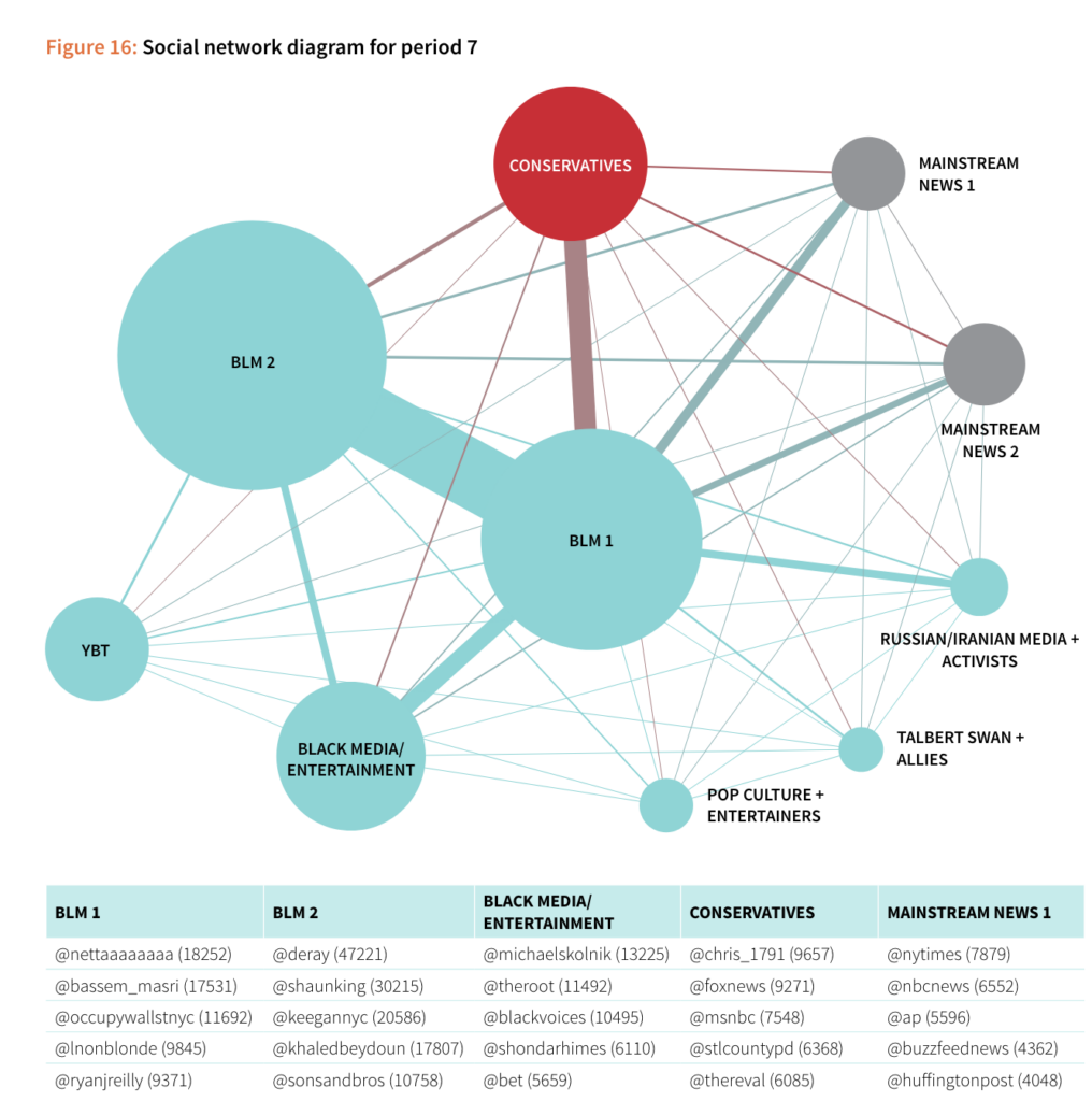
Weekly Readings Responses – Beyond the Hashtags
I have really enjoyed the “Beyond the Hashtags” reading this week:
- Freelon, Deen, Charlton D. McIlwain, and Meredith D. Clark. 2016. “Beyond the Hashtags: #Ferguson, #Blacklivesmatter, and the Online Struggle for Offline Justice.” Center for Media and Social Impact. February 29, 2016.
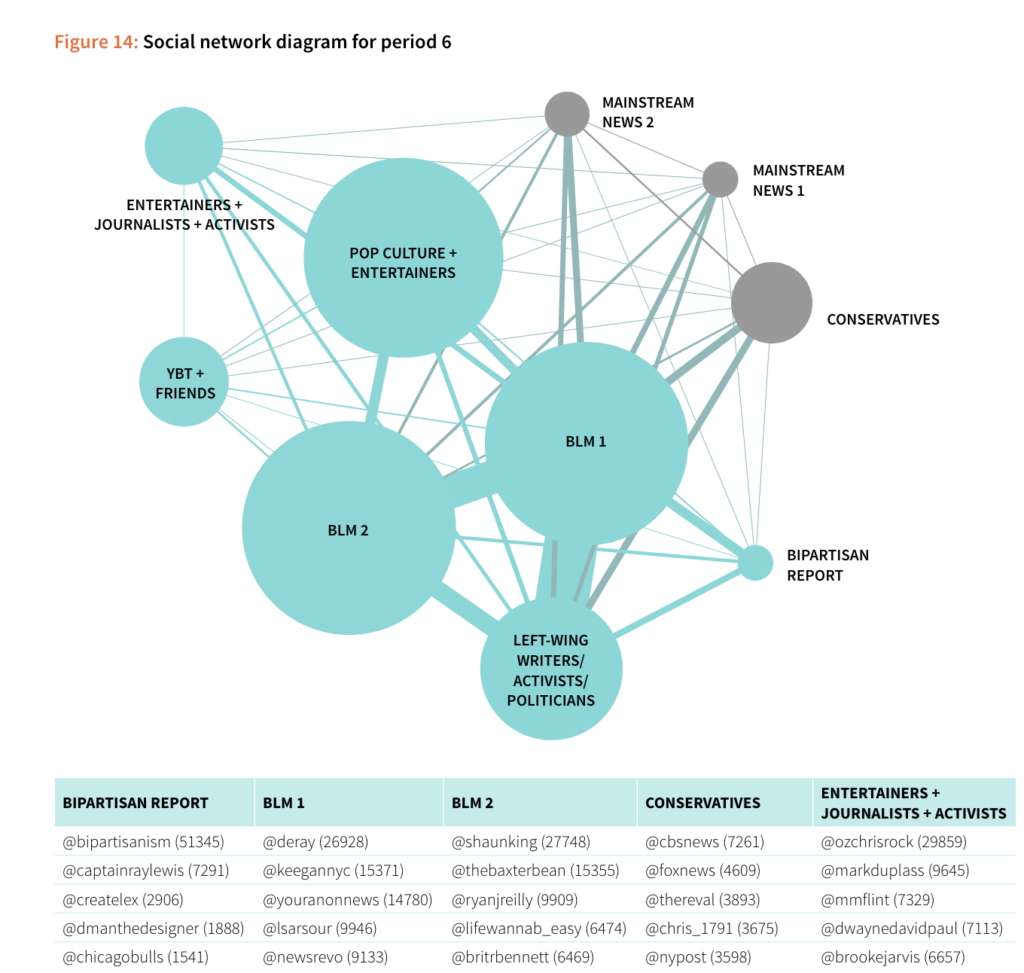
While I have enjoyed many readings this semester, I do find a lot of them written in the “academic style”. It is refreshing to find readings that express a similar amount of information and critical analysis but in a way more reader-friendly format. I took some time to think about what made this reading so much more digestible and engaging than other readings (in terms of format, not content-wise) and want to share my observations below:
- The chapter outline gave me an overview of what I should expect, as opposed to much academic writing, I have re-read the writings a few times and “do the work” to figure them out.
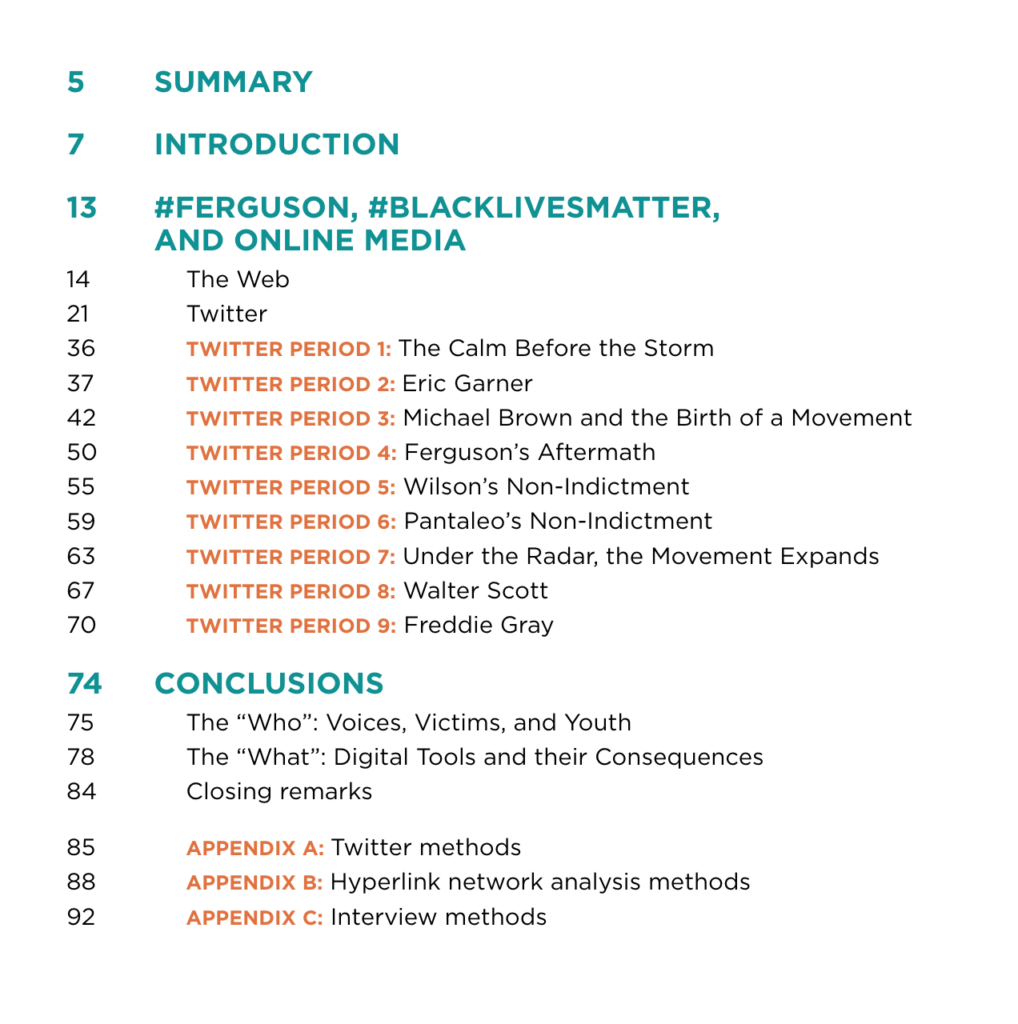
2. The information hierarchy is extremely clear with the use of font size and font color
3. I find the visualization very easy to interpret and done “just right” (in terms of size, color, design, information density, etc.). All charts are clearly titled, annotated, and explained. Note: I have very familiar with these chart types, to begin with, so I already know how to “read/ interpret” them.
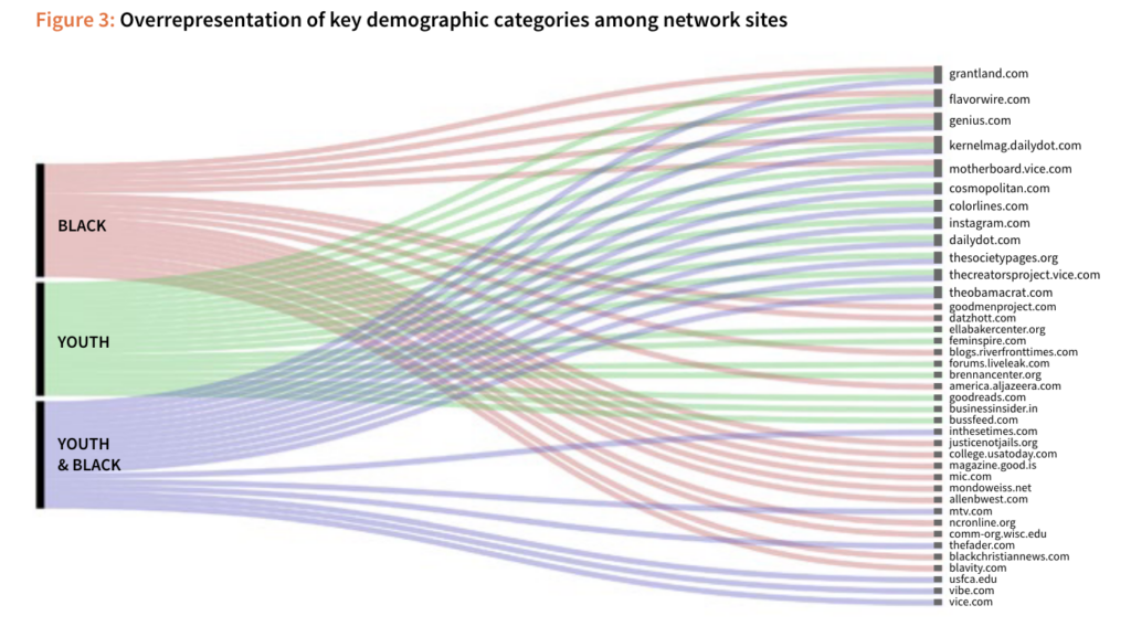
4. Tables are utilized to express the right amount of information, sorted logically and stylized in a way that’s easy for the eyes.
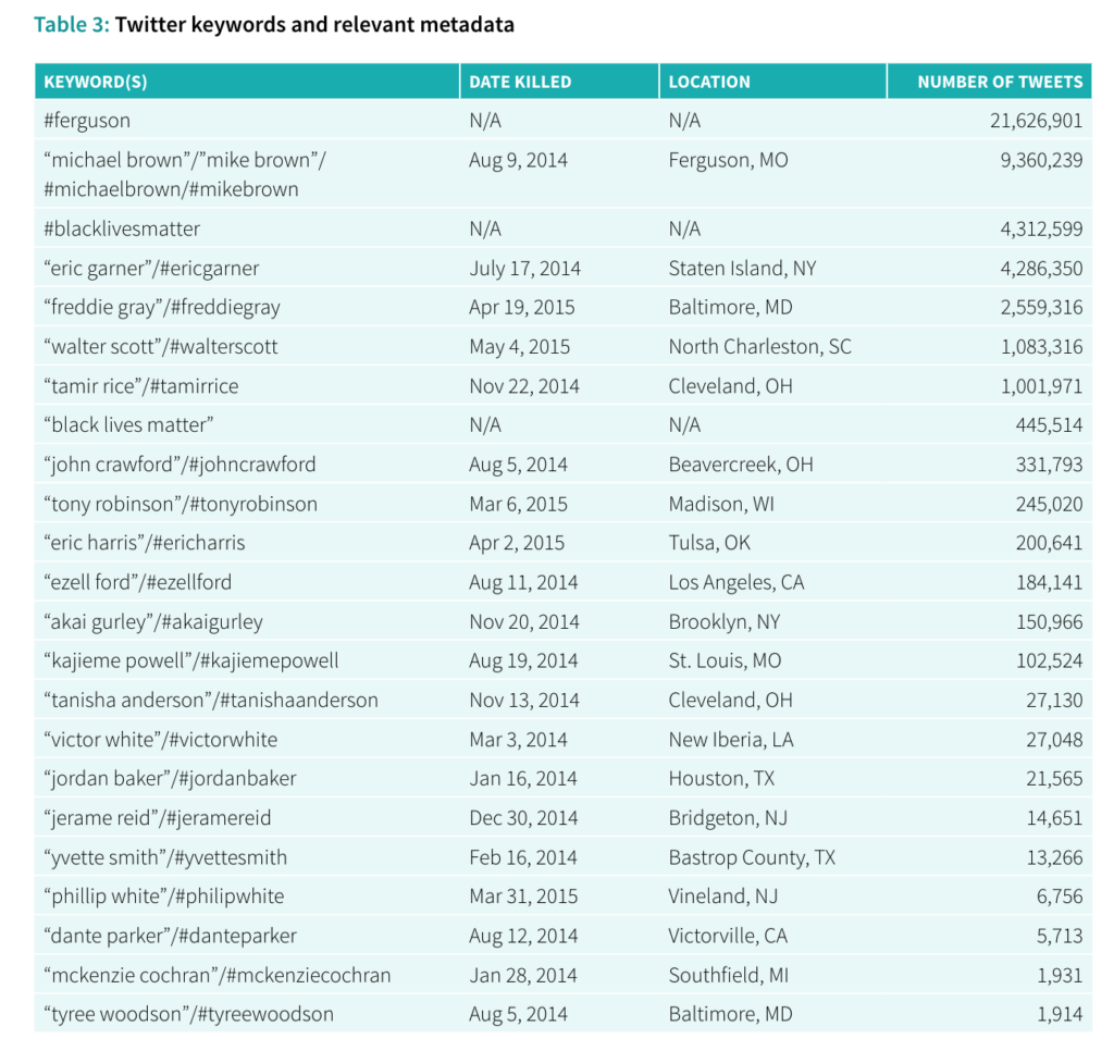
5. Chapters on Social diagrams leveraged a consistent form, making it easy to follow without doing a lot of brainwork to digest.
Can archival praxis be an act of resistance? Blogpost
I found the readings and projects for this week interesting. They show a potential for making new ways for doing archival work. These approaches are inspiring and in this blogpost I will reflect upon the readings and highlight the project DocNow for providing tools for archivists, activists, researchers to gather social media data.
As described in the reading “Towards Slow Archival” by Kimberly Christen and Jane Anderson the history of collection is the history of colonialism. They reading raises the question about “how do we recognize and rebuild archival practices, structures, procedures, and workflows that allow for relational, reciprocal , respectful , and restorative connections to knowledge, kin, and community within their frame?” Their specific method is slow archiving and by doing collaborative archiving. I find the work of Michel-Rolph Trouillot relevant to this call for a new decolonizing praxis. Trouillot was a Haitian American Professor of Anthropology and Social Sciences at the University of Chicago and he contributed with many books to the field of anthropology. He is best known for exploring themes of origins and application of social science in academia and its consequences in the world. He discusses the study of the “other” in anthropology and how this has led to theories of inherent distinctions between Westerners and non-westerners. He argues we need to look upon the categories and concepts we think with as something that shapes our experience but that very experience also shapes in turn the categories and concepts. It gives space for reflection and for questioning some of our fundamental assumptions when doing research, and I see this as another way to try to decolonize knowledge production. For example, Trouillot uses this approach to work with these ideas to reimagine the Caribbean peasants as agents of their own history instead of as victims. In a similar way Christen and Anderson call to move archival works away from preservation and towards “processes of opposing imperial and ongoing forms of collecting and classifying which isolate the relational, deeply embodied, practiced, and dynamic processes between people, belongings, land, and communities that make, remake, and unmake cultural heritage, knowledge, and traditions.” (page 100) How does digital humanities create new ways of archival work towards as an act of care and resistance?
One of the selected projects for this week DocNow, tries to deal with this struggle. The Documenting the Now (DocNow) project’s primary aim is to help preserve and chronicalize historically significant events and other digitally relevant content found on social media sites. It focuses on providing a variety of digital tools, as well as acts as an appraisal of content, to help analyze social media content. A strong focus on ethical collection and preservation of social media data adheres to Twitter’s notion of honoring the user intent as well as preserving the rights of content creators. In many ways the site offers a large range of tools and additional resources to create a way for archivists, activists, researchers to gather social media data. The website consists of six different tools created by the DocNow project which are all accessible via GitHub, a software development platform. Utilizing GitHub allows the organization to create a more open and accessible participatory environment, which agrees with their community-based approach. I see the project as trying to be a way for not only collaboration between cultural institutions and people, but trying to give the tools to the people to conduct their own research. As the report “Beyond the hashtags: #Ferguson, #Blacklivesmatter, and the online struggle for offline justice” partly concludes the primary goals of social media use among their interviewees were education, amplification of marginalized voices, and structural police reform. The report shows how movements can learn valuable knowledge from analyzing their “own” data. I believe it highlights the relevans of making the tools of archival work more accessible. This example might be a less traditional approach to archival praxis, but I think it manages to go beyond the idea of preservation and instead deals with the concepts of ownership of history and data. I’m curious if we are gonna see more similar research in the future and how it might affect the power relationships and knowledge production within archival works.
PRAXIS Visualization: Problems with Reduction and Null Meanderings
I currently work as a documentation and UX writer for a team of data analysts and software engineers. In this job, the word “Tableau” is something I either read about, write about, or edit something about on a near-daily clip. However, until starting this assignment, I had never actually opened the GUI of the software and had only written about what Tableau spits out: usually beautiful and straightforward visualizations for which I need to provide captions. As it turns out, I’m lucky (so far) my role hasn’t involved interfacing with the platform since it seems that I’m quite terrible with the software. It took me several hours of tweaking to try and make something that looks remotely cool (beautiful is already out the window). But, I think that’s the purpose of these assignments — I’m happy that I now have the basics down to eventually make something closer to beautiful after further practice (and maybe an ad-hoc sesh with Felipa).
During one of our early weeks of class, I mentioned how I had worked on a translation project for New York City a few years ago, which entailed managing the translations of digital assessment material into the “nine official” non-English languages of the New York City Department of Education (NYCDOE). For certain assessments in NYC, students are allowed to request translated materials into their “home” language. The assessments that allow this are normally measuring subject-matter constructs like math, science, history, and health. I’ve found it impossible to name these languages off the top of my head whenever I’m asked, so here they are after Googling: Arabic, Bengali, Chinese (modern), French, Haitian Creole (also referred to as French Creole), Korean, Russian, Spanish, and Urdu. Since this topic usually gathers interest when I bring it up, I figured it was a good data topic to explore with my visualizations.
The first thing I tried to do was find some numbers for how many student learners spoke each of the nine respective languages. This proved difficult and I wasn’t able to find very valuable data. I did stumble onto a NYC.gov page that breaks down the most commonly spoken languages at home in the city, which interestingly did not wholly align with the nine languages the DOE uses. You can view the pdf breakdown here: https://www1.nyc.gov/assets/planning/download/pdf/data-maps/nyc-population/acs/top_lang_2015pums5yr_nyc.pdf. I’ve also pasted a screengrab of the data below.
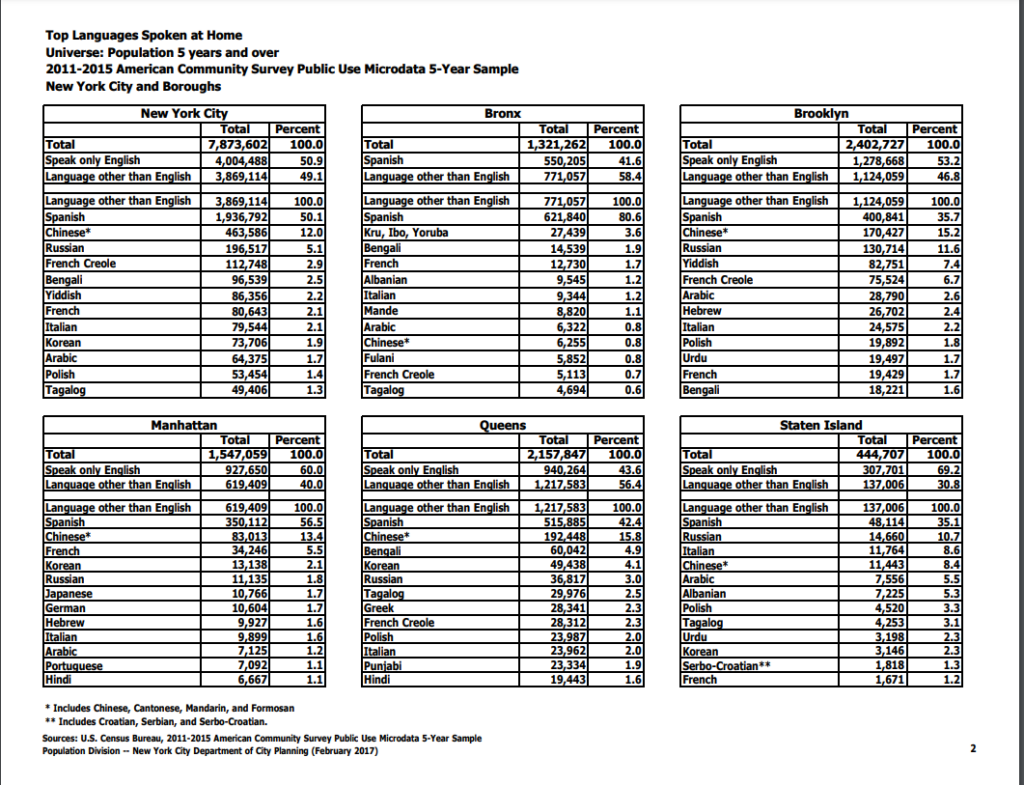
I decided to migrate these data into a spreadsheet, which was fairly time consuming in that of itself. As you may notice from the data (or from my caption), the languages are broken down by the top 12 languages in the city as a whole and then by each borough. It didn’t resonate with me at the time, but this presents some fairly confounding sorting obstacles for creating visually appealing data visualizations. As we learned from Manovich, the first principle of data viz is reduction. I’m sad to say that my first attempt at a visualization of these data points actually adds more noise than the (very dense) table I pasted above.
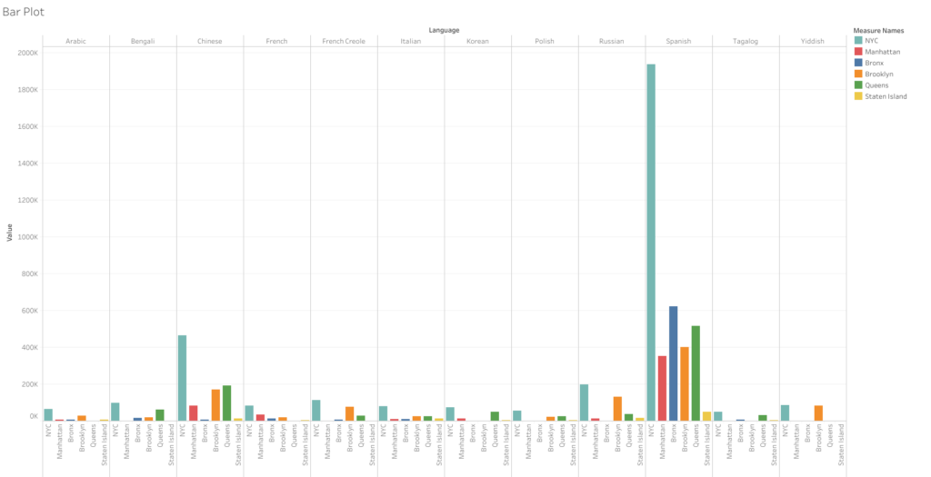
This bar graph takes all the languages and runs them along the top axis and then stacks the amount of speakers by all of NYC and then each borough. However, since each borough has a different set of top-12 speakers, they don’t align with the city’s overall numbers. Thus, even though Yiddish is one of the top 12 languages spoken in the city — it received null values within Manhattan, Bronx, Queens, and Staten Island as it falls out of the top 12 in those particular areas. This was the case with nearly a dozen other languages that are more prominent to certain boroughs. These null values ended up causing me a huge headache as I couldn’t figure out how to remove them from a single borough without removing them from the data sets where they are relevant. I think the only valuable thing one can take away from this first attempt is that Spanish is spoken at a significantly higher rate than any other language in the city. Chinese is the only other language that stands out, and it’s not even close to the sky-scraper bars shown for Spanish. But overall, as I said, this visualization certainly fails the reduction test. I can grasp the data better looking at the text tables.
For my next attempt, I decided forget the other boroughs and focus on the All NYC data to try and make something a little more simplified and helpful to a viewer trying to take away a snapshot of these data. I again ran into some issues with Tableau — as whenever I tried to use some of the nicer looking viz options, I was told I needed to add at least one “dimension” to use this or that visualization option. I couldn’t figure out what that meant as I seemed to have several data points labeled as “dimensions,” but many of the visualization options remained greyed out. I went with one of the more classic visualizations: the packed bubbles, which expand based on the volume contained in each data point.
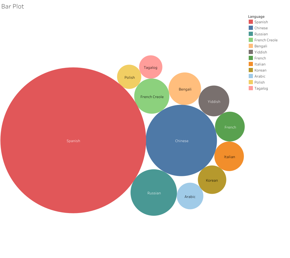
Now, this visualization I think properly reduces the noise from the text tables. It’s only regarding a single set of data: the top 12 non-English languages spoken at home in NYC. The user can clearly see which languages scale well above the others and can quickly make sense of the top 12 by looking at the order provided in the legend — and then can compare the numbers by hovering over the bubbles. I’m not sure if this is a cool visualization, but it’s at least somewhat effective.
In the context of my blog post, this visualization does pose an immediate question: why do the nine languages of the NYCDOE include Urdu when it isn’t in the top 12 across the city? I don’t know the answer, but we can see that Tagalog, Polish, Yiddish, and Italian all have more speakers yet aren’t provided as options for translation. This could be due to the amount of learners in the public schools representing each language. Yiddish speaking students my be more likely to attend Jewish religious schools, which could dwindle their numbers in the public school system. Likewise, Tagalog (Filipino), Polish, and Italian speakers may be more likely to attend Catholic schools. Whatever the reasons, I like how the reduction attempt made it easier to find some data points to discuss. Whereas my first attempt just created a vomit of bars that provided no discernable information to glean any insights from.
History and the Archive – Is there a golden source?
This week’s readings cement a concept that is not as obvious as it might sound: facts are a matter of perspective. Similarly, history is a matter of perspective.
An event, any event, can be subjected to a myriad of different narrations, which could be considered veritable if accounting for the storyteller’s background and their angle. Acknowledging this without attempting to arrogate the right of divulging a universal truth is no easy task though. In this sense, the 911 Digital Archive project plays a key role in preserving history as collected from its sources. And with a great sense of acceptance in doing so, which translates into the ability of understanding, and consequently embracing, how everyone lived the same tragic day in different ways.
In this sense, Brier and Brown, in their publication The September 11 Digital Archive, stress the speed at which a system aimed at gathering as many testimonies as possible, both in digital and analog formats, had to be brought to life within days from the attack.
The authors try to go beyond what mainstream media institutions present and ask themselves the question of what consequences the 9/11 attacks generated in everyone’s life including, if not especially, the one of “ordinary” people who were either at work or going to work, those who were floating around the area of the impact, maybe spending the day somewhere in New York City or perhaps somewhere else farther, and others, who were not necessarily on site, but happened to receive a message from someone somehow directly involved.
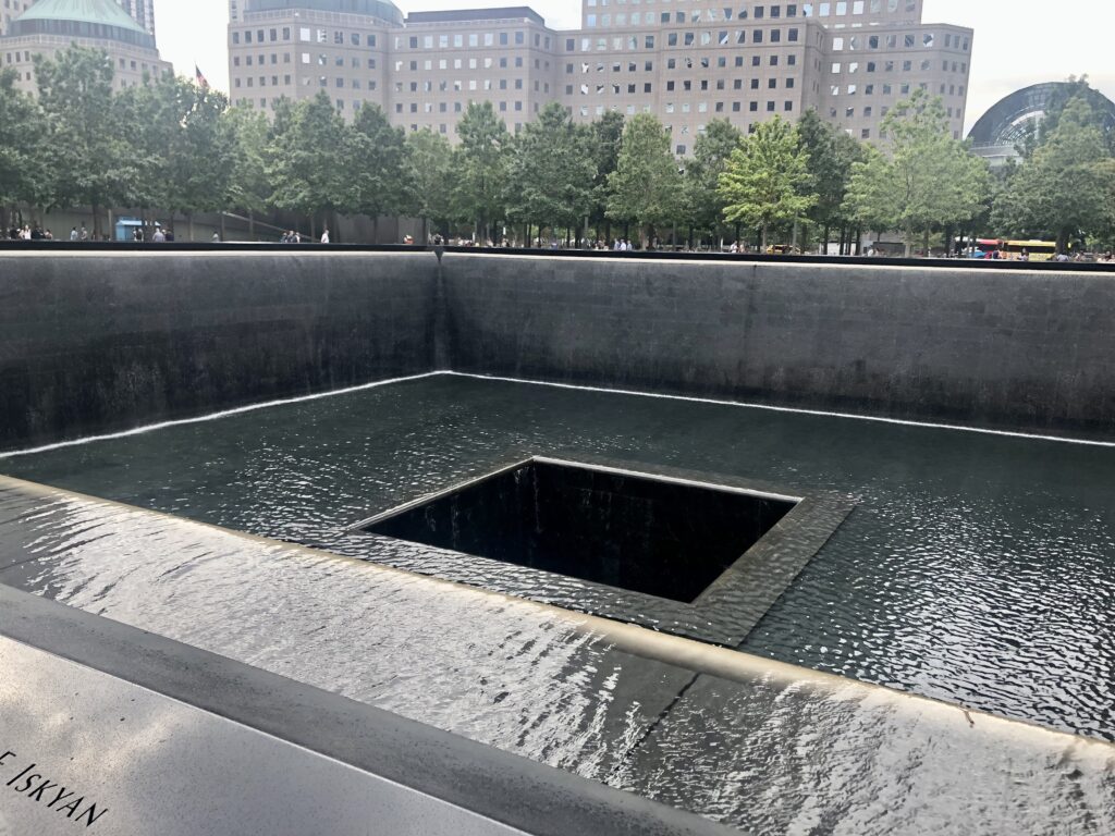
Their idea of collecting materials, in any form or shape, and from everyone, directly and indirectly, is remarkable, and, in a sense, avant-garde. The concept revolves around the action of gathering testimonies and evidence when facts happen as opposed to wait for them to be brought together by the media or through ‘post-mortem’ research. In this light, the introduction of the role of the archivist-historian is revolutionary, and orbits around the notion of perspective and the creation of a 360-degree viewpoint, or collective history, where everybody has the right, and the channels, to actively contribute.
A similar project is carried out by the curators of Our Marathon, an online accessible archive of photos, stories, and videos of the 15th of April 2013 Boston attack. Once again, the ‘game changer’ is the authors’ modus operandi whose goal is to ensure that the contributions to the platform are crowdsourced and free from potential media manipulation.
Using this approach, new tools to accurately build a collective and democratic history have become progressively available. Platforms like Omeka, CUNY Digital History Archive, and Home – Mukurtu CMS allow everyone to share their experience and perspective. The value of this relatively new way of operating when building archives is immense and, undoubtedly, grows over time. Personally, I feely lucky to live in an era where I am given the opportunity, and the means, to contribute to history with my own experiences and angle. Unlike my grandparents, who were both sent abroad to fight during WWII and witnessed the war’s atrocities, I know I have the luxury of crystallising (and sharing) my day-to-day life and views through the internet and its endless devices, whereas their legacy, and their days in Greece, Germany and Russia, only live in my memory and might soon get lost.