
I currently work as a documentation and UX writer for a team of data analysts and software engineers. In this job, the word “Tableau” is something I either read about, write about, or edit something about on a near-daily clip. However, until starting this assignment, I had never actually opened the GUI of the software and had only written about what Tableau spits out: usually beautiful and straightforward visualizations for which I need to provide captions. As it turns out, I’m lucky (so far) my role hasn’t involved interfacing with the platform since it seems that I’m quite terrible with the software. It took me several hours of tweaking to try and make something that looks remotely cool (beautiful is already out the window). But, I think that’s the purpose of these assignments — I’m happy that I now have the basics down to eventually make something closer to beautiful after further practice (and maybe an ad-hoc sesh with Felipa).
During one of our early weeks of class, I mentioned how I had worked on a translation project for New York City a few years ago, which entailed managing the translations of digital assessment material into the “nine official” non-English languages of the New York City Department of Education (NYCDOE). For certain assessments in NYC, students are allowed to request translated materials into their “home” language. The assessments that allow this are normally measuring subject-matter constructs like math, science, history, and health. I’ve found it impossible to name these languages off the top of my head whenever I’m asked, so here they are after Googling: Arabic, Bengali, Chinese (modern), French, Haitian Creole (also referred to as French Creole), Korean, Russian, Spanish, and Urdu. Since this topic usually gathers interest when I bring it up, I figured it was a good data topic to explore with my visualizations.
The first thing I tried to do was find some numbers for how many student learners spoke each of the nine respective languages. This proved difficult and I wasn’t able to find very valuable data. I did stumble onto a NYC.gov page that breaks down the most commonly spoken languages at home in the city, which interestingly did not wholly align with the nine languages the DOE uses. You can view the pdf breakdown here: https://www1.nyc.gov/assets/planning/download/pdf/data-maps/nyc-population/acs/top_lang_2015pums5yr_nyc.pdf. I’ve also pasted a screengrab of the data below.
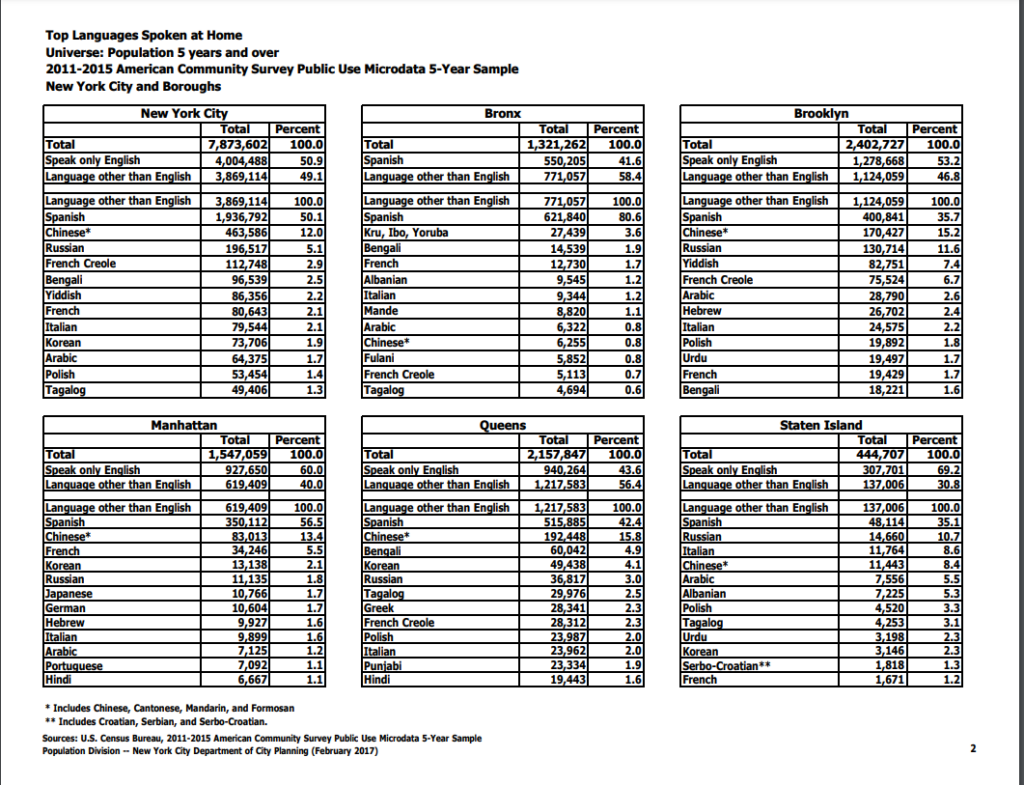
I decided to migrate these data into a spreadsheet, which was fairly time consuming in that of itself. As you may notice from the data (or from my caption), the languages are broken down by the top 12 languages in the city as a whole and then by each borough. It didn’t resonate with me at the time, but this presents some fairly confounding sorting obstacles for creating visually appealing data visualizations. As we learned from Manovich, the first principle of data viz is reduction. I’m sad to say that my first attempt at a visualization of these data points actually adds more noise than the (very dense) table I pasted above.
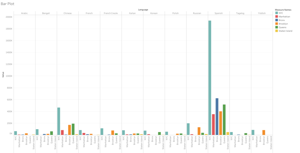
This bar graph takes all the languages and runs them along the top axis and then stacks the amount of speakers by all of NYC and then each borough. However, since each borough has a different set of top-12 speakers, they don’t align with the city’s overall numbers. Thus, even though Yiddish is one of the top 12 languages spoken in the city — it received null values within Manhattan, Bronx, Queens, and Staten Island as it falls out of the top 12 in those particular areas. This was the case with nearly a dozen other languages that are more prominent to certain boroughs. These null values ended up causing me a huge headache as I couldn’t figure out how to remove them from a single borough without removing them from the data sets where they are relevant. I think the only valuable thing one can take away from this first attempt is that Spanish is spoken at a significantly higher rate than any other language in the city. Chinese is the only other language that stands out, and it’s not even close to the sky-scraper bars shown for Spanish. But overall, as I said, this visualization certainly fails the reduction test. I can grasp the data better looking at the text tables.
For my next attempt, I decided forget the other boroughs and focus on the All NYC data to try and make something a little more simplified and helpful to a viewer trying to take away a snapshot of these data. I again ran into some issues with Tableau — as whenever I tried to use some of the nicer looking viz options, I was told I needed to add at least one “dimension” to use this or that visualization option. I couldn’t figure out what that meant as I seemed to have several data points labeled as “dimensions,” but many of the visualization options remained greyed out. I went with one of the more classic visualizations: the packed bubbles, which expand based on the volume contained in each data point.
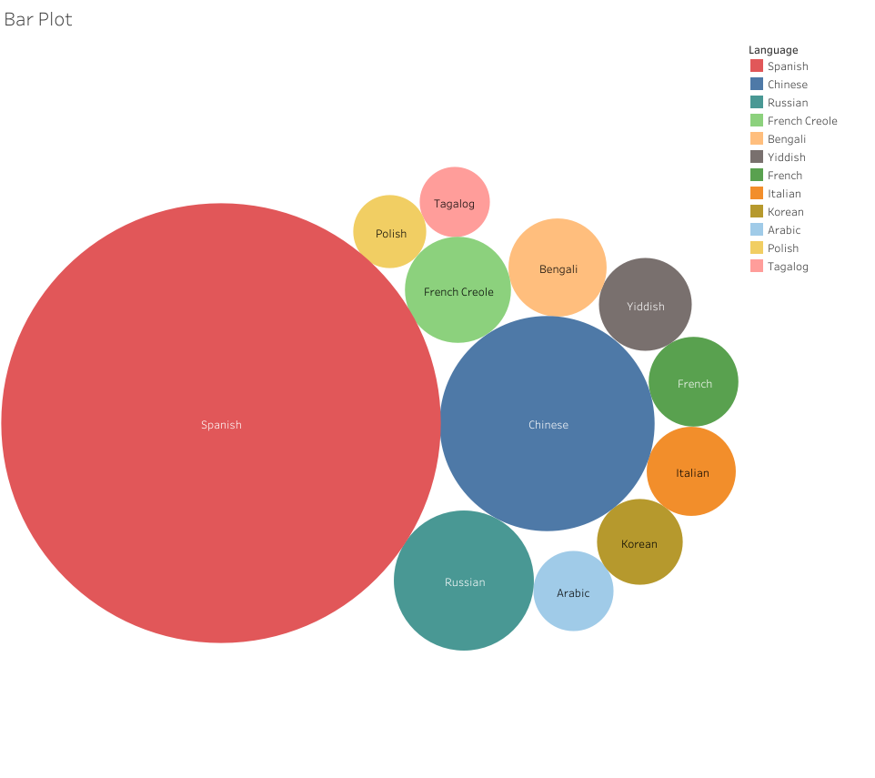
Now, this visualization I think properly reduces the noise from the text tables. It’s only regarding a single set of data: the top 12 non-English languages spoken at home in NYC. The user can clearly see which languages scale well above the others and can quickly make sense of the top 12 by looking at the order provided in the legend — and then can compare the numbers by hovering over the bubbles. I’m not sure if this is a cool visualization, but it’s at least somewhat effective.
In the context of my blog post, this visualization does pose an immediate question: why do the nine languages of the NYCDOE include Urdu when it isn’t in the top 12 across the city? I don’t know the answer, but we can see that Tagalog, Polish, Yiddish, and Italian all have more speakers yet aren’t provided as options for translation. This could be due to the amount of learners in the public schools representing each language. Yiddish speaking students my be more likely to attend Jewish religious schools, which could dwindle their numbers in the public school system. Likewise, Tagalog (Filipino), Polish, and Italian speakers may be more likely to attend Catholic schools. Whatever the reasons, I like how the reduction attempt made it easier to find some data points to discuss. Whereas my first attempt just created a vomit of bars that provided no discernable information to glean any insights from.

This entry is licensed under a Creative Commons Attribution-NonCommercial-ShareAlike 4.0 International license.