For my final project I chose to submit a project proposal for the Spring semester course. I’m proposing a project called The Queer & Now: Archiving Queer Internet Discourse in Contemporary Russia.
As it stands, there is no archive or otherwise research being done on the state of Queer discourse in Russia. Russia, as a nation which is in socio-political-economic turmoil at present, also has a history of being homophobic at the government level, which has only worsened in the wake of the war on Ukraine. Queer Russians are fearing for their lives, and due to the internet bans and other sanctions, many Queer Russians aren’t able to talk to the outside world to say what’s going on or ask for help. This project seeks to repair that.
The Queer & Now will utilize ARCH (Archives Research Compute Hub), a new platform by the Internet Archive currently in beta, allows users to create collections of websites, scrape and archive the data from them, analyze the data, visualize it, and download/disseminate the data all within ARCH. Luckily for us, I’m in the pilot test group and have early (and FREE) access to ARCH.
I intend on working with a small group of people to archive contemporary Queer discourse that occurs primarily on Russian websites, although we will likely also collect data from primarily English-speaking or international websites as long as the discourse is in Russian. Archival materials on Queer discourse post-AIDs Crisis, especially from non-English, is incredibly rare, and I’d like to change that.
This project will likely be ongoing after the Spring semester, as ARCH lends itself to repeating data scrapes, however this will take a lot of hard-drive space to store all the data and that is my most limiting factor.
Results will be published on GitHub and Quarto for public use. This data would be incredibly useful not just for social media dissemination to spread awareness, and not just for historical documentation purposes, but also for linguistic analysis and, of course, sociological and gender studies papers galore.
I recently had the opportunity to attend the Internet Archive’s workshop on web archiving in Los Angeles. Firstly, before I get into a rundown of what we learned, I just wanna say it was AWESOME. I met some great people there, including fellow DHers! This was their first workshop, and there will be more forthcoming, so don’t be sad if you missed this one! Please feel free to ask me questions in the comments or in an email if you want more information or clarification on any of these points. I’d recommend reading this post chronologically, as it goes in order from basics to advanced topics. Now onto the good stuff…
What is the Internet Archive?
Contains primarily, though not exclusively, 20th-21st century records of human interaction across all possible mediums (newspapers to fiction to gov. info to art etc).
Constant change and capture.
Every country in the world included.
Fit for both macro and micro level research questions.
Fit to archive both hundreds or millions of documents.
Known for the Wayback Machine, which takes snapshots of websites at different points in time, shows you those snapshots, as well as information about when snapshots are taken.
What is a web archive?
Web archives are a collection of archived URLs that contains as much original web content as possible while documenting the change over time and attempting to preserve the same experience a user would’ve had of the site on the day it was archived.
Challenges of web archiving
Trying to hit the balance between access to billions of bits of information and actual usability of that information.
Content is relational and self-describing.
Difficult to subset relevant collections, storing and computing all of it.
So many methods and tools to choose from.
Glossary
Crawler – software that collects data from the web.
Seed – a unique item within the archive.
Seed URL – the starting point/access point for the crawler.
Document, here meaning any file with a unique URL.
Scope – how much stuff the crawler will collect.
WARC—file type for downloaded archived websites.
Examples of steps to archive from a project on COVID response in the Niagara Falls region
Close reading with Solrwayback – searchable, individual items examinable in the collection.
Distant reading with Google Colab – sentiment analysis, summary statistics, data visualization.
Data subsetting with ARCH – full-text dataset extraction from the Internet Archive’s collections.
As an outcome, helped the City of Niagara Falls formulate a better FAQ for common questions they weren’t answering.
Other methods
Web scraping – creating a program that takes data from websites directly.
Topic modeling – assess recurring concepts at scale (understanding word strings together to create a topic).
Network analysis – computationally assessing URL linking patterns to determine relationships between websites.
Image visualization – extracting thousands of images and grouping them by features.
Web archiving tools
Conifer (Rhizome)
Webrecorder
DocNow
Web Curator Tool
NetArchive suite
HTTrack
Wayback Machine – access tool for viewing pages, surf web as it was.
Archive-It
WARC – ISO standard for storing web archives.
Heritrix – web crawler to capture web pages and creates WARC files.
Brozzler – web crawler plus browser-based recording technology.
The average web page only lasts ~90-100 days before changing, moving, or disappearing.
Often used to document subject areas or events; capture and preserve web history as mandated; taking one-time snapshots; and supporting research use.
Particular challenges
Social media is always changing policies, UI, and content.
Dynamic content, stuff that changes a lot.
Databases and forms that requires user interaction, alternatives include sitemaps or direct links to content.
Password protected and paywalled content.
Archive-it can only crawl the public web, unless you have your own credentials.
Some sites, like Facebook, explicitly block crawlers. Instagram blocks them but has workarounds.
How to Use the Internet Archive (It’s SO EASY)
Browse to web.archive.org/save – enter URL of the site you want to archive, creates an instance. Boom!
You can also go to: archive-it.org – create a collection (of sites), add seeds (URLs).
Two types of seeds: with the end / (backslash) and without the end backslash. Without adds all subdomains- eg, if I did my Commons blog noveldrawl.commons.gc.cuny.edu, it’ll give me ALL the commons blogs- everything before the ‘.commons’. If I do noveldrawl.commons.gc.cuny.edu/, it’ll give me just all the stuff on my blog AFTER the slash, like noveldrawl.commons.gc.cuny.edu/coursework.
I archived the website data… now what do I do with it?!… Some Tools to use with your WARC files:
Palladio – create virtual galleries
Voyant – explore text links
RawGraphs – create graphs
ARCH (Archives Research Compute Hub)
ARCH is not publicly available until Q1 2023; workshop participants are being given beta access and can publish experiment results using it.
Currently can only use existing Archive-It collections, however after release user-uploaded collections will be supported.
It uses existing collections in Archive-It, which you do need a membership to use.
Non-profit owned, and the internet archive is decentralized and not limited to a government or corporate tool.
Supports computational analysis of collections, eliminating the need for the technical knowledge to analyze sites, and allows for analysis of complex collections on a large scale.
Integrates with the Internet Archive, and has the same interface as Archive-It.
Can extract domain frequency (relationship between websites), plain text, text file info, audio files, images, pdfs, ppts. It can also create graphs of these relationships in browser. There’s even more it can do than this, if you need it, it can probably do it. All data is downloadable, which can be previewed before download.
Observations
I noticed the majority of everyone present had faced some sort of cultural erasure, threatened or realized, modern or archaic, that has brought them to their interest in archiving.
From experience using these tools, I’d say Wayback is great if you need to just archive one site, perhaps for personal use, whereas Archive-It is great if you have many sites in a particular research area that you’re trying to archive and keep all in one place.
Links of interest
https://archive-it.org/collections/11913 – Schomburg Center for Research in Black Culture, Black Collecting, and Literary Initiatives (67 GB, 23+ websites since March 2019; contains blog posts, articles, bookstore lists, etc)
https://archive-it.org/collections/19848 – Ivy Plus Libraries Confederation, LGBTQ+ Communities of the Former Soviet Union & Eastern Europe (30 GB, 70+ websites, since Aug ’22; contains news, events, issues, etc)
“In retrospect it seemed as though, in that deranged moment, I had wakened to a process that had been quietly rewiring my life for- a decade, more or less since I chose my first, cryptic email address (imagine broadcasting my real name on ‘the internet’).”
Here we see the author’s tone shift. How does it shift? What purpose does this serve for either the narrative or the reader? Explain.
How do you think this tone shift changes how you read this passage if you were to read it a second time?
How would you characterize the author based on this? Describe them using both literary terms and personal descriptors (for example, “unreliable narrator” and “pleasant”, respectively).
The second idea I had wasn’t a full annotation per se:
How is The Reverse Peephole related to The Fourth Dimension? How is this introduction related to the primary text? Why are they juxtaposed? How does this change how you view either section of the work? Discuss.
The purpose of these annotations is to have students think more about how texts relate to not only other texts but also to their readers and authors. It was something that I really enjoyed (and still enjoy) observing!
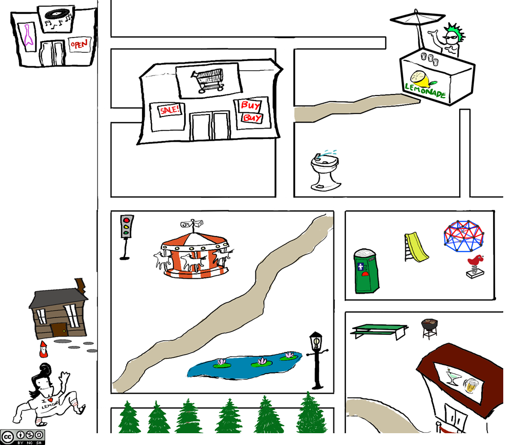
A/N: This post contains a lot of information about my project, Map Lemon. If you don’t want to be deeply confused about what Map Lemon is and why it is, you can head on over to my blog at https://noveldrawl.commons.gc.cuny.edu/research/, as I’m not explaining it for the sake of brevity in this post. The corpus itself is not yet publicly available, so you’ll just have to trust me on the docs I’m using for now.
I’ll start this post with a bit of introduction on my background with text mining. I’m a Linguist. I’m a Computational Linguist. And more importantly than either of those two really nebulous phrases that I’m still convinced don’t mean much, I made a corpus. I am making a corpus, rather (everything is constantly moving changing and growing). It happened by accident, out of necessity—it wasn’t my original research interest but now that I’m deep in it I love it.
My corpus, Map Lemon, is #NotLikeOtherCorpuses (I’m sorry for that joke). It’s not text mined. A LOT of linguistic corpuses are text mined these days and that gets on my nerves in a real bad way. Here’s why:
Let’s use the example that you’re text mining on Twitter to get a better idea of jargon used within a niche community, since this use-case is quite common.
Text mining often takes phrases out of their contexts because of the way platforms like Twitter are structured.
These aren’t phrases that, generally speaking, are used in natural speech or writing. While cataloging internet speak is important, especially to understand how it affects natural S&W, we’re not cataloging as much natural S&W as a result, and I don’t think I need to explain why that’s important.
It’s not situational. You’re not going to find recipes for lemonade, or directions to a lemonade stand yes I’m making a joke about my own research here on Twitter.
You’re often missing demographics that are unknown that can affect the content of the corpus.
I chose to do this praxis assignment to debunk, or at least attempt to, all of those things. I want text mining to work for me. It probably won’t for my use-case, but I should at least be versed in doing it!
Now let’s get into it.
I decided to text mine my own corpus. Yup. I’m at a stand-still with the results I’ve been getting and need material for an abstract submission. Here we go.
So, since my data has already been cleaned before, I went ahead and just plopped it into Voyant. The following ensued:
Oh, rats I forgot I can’t just do that with all the demographics and stuff in there and confuse Voyant.
Okay, copy the file. Take out all the not responses. Might as well separate them into their respective experiments while I’m at it.
So, the final version of what I’m analyzing is: 1) Just the directions to the lemonade stand 2) Just the recipes for lemonade. I’m not analyzing the entire corpus together since it wouldn’t yield coherent results for this specific purpose due to the difference in terminology used for these two tasks and lack of context for that terminology.
The results from the directions were really neat in that you can follow the correlations and word counts as directions given, basically. Here’s the map from Experiment I so you can follow along:
Here are the most common phrases in the directions given, according to analysis with Voyant:
“before the water fountain”; count: 4
“take the first left”; count: 4
“a carousel on your left”; count: 3
Some other phrases that are all count 3 and not as interesting until…
“at the water fountain”; count: 3
“between the carousel and the pond”; count: 3
Now, okay, these numbers aren’t impressive at first glance. Map Lemon only has 185 responses at present, so numbers like this maybe aren’t all that significant, but they sure are interesting. Map Lemon contains exclusively responses from North Americans, so from this we could postulate that North Americans tend to call “that thing over yonder” a water fountain or a carousel. But also from this we can see the directions Chad gets most commonly: people often send him down the first left on the street; of the group that does not, and has him cut through the park, they let him know that he should pass the carousel on the left; and the lemonade stand is just before the water fountain. All these directions are reiterated in two different ways, so it seems. That sure is neat! Not particularly helpful, but neat.
So let’s look at those cool correlations I mentioned.
‘gym’ and ‘jungle’ – correlation: 1 (strongest)
‘clearing’ and ‘paved’ – correlation: 1
This one I’m unsure what is really meant by it, if that makes sense, but it was ‘enter’ and ‘fork’ corr. 1
‘home’ and ‘passed’ – correlation: 1
These look like directions alright! Okay, of course there’s the phrase ‘jungle gym’, but we do see, okay, there’s a paved clearing. I’m sure at some point Chad has to enter a fork, although I’m a bit confused by that result, and yes, many people did have Chad pass the house. Neat!
I’m a bit skeptical of some of these correlations as well, because it’s correlating words strongly that only appear once, and that’s just not a helpful strong correlation. But that’s just how the tool works.
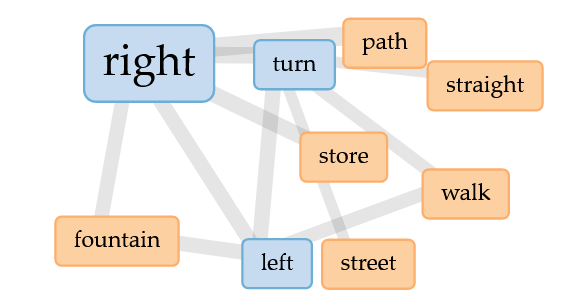
Looking at contexts wasn’t particularly helpful for the directions, as lot of the contexts were for the words ‘right’ and ‘left’.
Now, here’s what was really freakin’ cool: the links. Voyant made this cool lil graphic where I can see all the most common words and their links. And it actually shows… directions! The 2/3 most common paths, all right there, distilled down. Try giving Chad directions for yourself and see what I mean, ‘cause it’ll probably look something like this:
Voyant’s link map for Map Lemon Experiment I
Okay, so the directions didn’t show anything revolutionary, but it was pretty darn cool. Let’s move onto the recipe analysis.
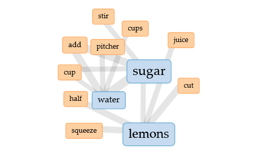
NOW THIS IS FREAKIN’ COOL!!! According to the phrase count tool, everybody makes lemonade about the same! Including using a lot of the same amounts of ingredients and even the same filler phrases!
Ingredients:
1 cup sugar; count: 3 (the semantics of this compared to the other two is really interesting!)
3 cups of water; count: 3
4 lemons; count: 3
Filler phrases:
“a lot of”; count: 5
“make sure you have”; count: 5
“kind of”; count: 4 (context for this one is tricky)
Perhaps that’s a recipe I could try!
Now, okay. If we’re skinning cats, there’s not a lot of ways to skin this one, actually. We specifically chose lemonade for this experiment because it’s ubiquitous in North America and really easy. And the correlations feature wasn’t really helpful this time around for that exact reason (lack of distinguishing words). But look at this cool link map thingy!!
Voyant’s link map for Experiment II
Very helpful! You either squeeze, cut, juice, or halve your lemons—not all four (and two of those are only different out of semantics). Add several cups of water to a pitcher, and stir in (or add—again, semantics) at least a cup of sugar. Boom! There’s our lemonade recipe. This was so cool to synthesize!
At the end of this little project, I am still as annoyed with the inability to use demographics with text mining as I was before. This means that demographics for text mining for my purposes would have to be very carefully limited to control for individual linguistic variants. However, I also see the benefit in this tech; although, I definitely think it’d be better for either larger datasets or datasets that have a very controlled demographic (so that small numbers like 3 and 4 are actually statistically significant). Mostly, for now, it seems that the results just make me say “cool!”. I love the visual links a lot; it’s a really good example of graphics that are both informative and useful. I think it would be a fun side project to try and synthesize a true “All-American Man” using text mining like this. (Side note, that exact sentence reminds me that in my Computational Linguistics class in undergrad, for our final project about half the class teamed up and scraped our professor’s Twitter account and made a bot that wrote Tweets like he did. It actually wasn’t all that bad!)
I think this could potentially be valuable in future applications of my research, but again, I think I need to really narrow down the demographics and amount of data I feed Voyant. I’m going to keep working with this, and maybe also try Google Ngram Viewer.
I began my reading for this week with my post from our last meeting and my presentation from the Text as Data conference fresh in my mind, so naturally I was thinking about Queer data. My own project is currently archiving Queer, naturally occurring writing in a way that has never been done before. Now, in my last post I came to the conclusion that for queer data to be ethical, it must be collected by Queer people (or at the very least, close close close allies who deeply understand Queer Theory).
In Markup Bodies, Johnson writes: “Black digital practice is the revelation that black subjects have themselves taken up science, data, and coding, in other words, have commodified themselves and digitized and mediated their own black freedom dreams, in order to hack their way into systems (whether modernity, science, or the West), thus living where they were “never meant to survive.”’ It is in this exact way I believe Queer data currently exists. Unlike this historical legacy of Black people, Queer people do not have a history of data at all, even data that is incorrect and twisted, really.
Most of modernity has been spent trying to be rid of the idea of Queer people to begin with. Especially in recent years, as far as I understand it, due to a smear campaign in the 1950s and 60s, Queer people have been painted as pedophiles (as in ‘Watch Out for Homosexuals’ and ‘Boys Beware’, both of which are available on YouTube). Naturally, being the scum of the Earth, people would like to rid themselves of all records of pedophiles. That’s something you want to forget. And not to mention the fact that, as recently as the early 00s, articles in Evangelical publications were still asserting this as fact (and I’m sure they continue to do so). Prior to that, we have been subject to eugenics at such young ages that the records simply don’t exist. From the systematic killings of Gay people during the Holocaust, to the AIDs epidemic where our health was ignored to protect straight people from us. And so, there is no historical queer data.
But I pose that we must gather data, for we need to prove that we survive in the world that the cisgender heterosexual society wants us gone from. We must live where we are never meant to survive. For future generations to know that we were here. We have been systematically killed by plagues like the AIDs crisis, and lost many of our community elders. A lot of Queer stories are strictly oral stories, because often our lives are at stake if we dare put these tales to paper. So now, in our more free world (as much as it can be at present), we must take advantage of this and archive, archive, archive.
PS: I will henceforth be capitalizing the word Queer when in reference to the community, in an effort to divorce ourselves from the notion of queerness and establish ourselves as a distinct group. I highly encourage everyone else to do the same.
In regards to data, it seems that the Native American epistemologies align with that of the queer community.
I’m someone who is deeply involved with minority data. My project, Map Lemon, specifically has found itself gathering data on trans people. And immediately, we faced backlash just for gathering the data to begin with. A lot of these come out of fear from the queer community: “this could be misused”, “could this ‘out’ trans people?”, “you can’t try to box non-binary people in for data”. While, as a queer person myself, I understand these fears and they have a real basis, I must continue to gather and analyze this data simply because it exists. I didn’t start Map Lemon intending to find stylometric differences between transgender people and cis people, but the data spoke by itself simply by gathering standard gender demographics. I cannot ignore incidental findings once they’ve been discovered. And with that, the data has actually come out in favor of the current LGBT+ political climate. With that said, I also believe that queer people must collect our own data, as a form of rewriting the history of those who have attempted to erase our existence through academia. Perhaps some of the initial backlash to this data I hold was because I was assumed to not be queer?
I’m pleased the tide is changing as my data proves to support the current philosophies of the queer community, and I’m conscious of the need to respect these fears existent within this community, however what I want is this fear to produce tools or methods that can adequately represent, say, non-binary identities, rather than shying away from data collection entirely. I also understand that I’m in a position of privilege as a queer person who has made it this far into academia to gather and present this data in a helpful way, and want to create a body of work that accurately represents as many of us as I can fit in!
A/N: This is less a critique and more praise, frankly, and you know what? I’m okay with that, this project is awesome.
Sefaria is a massive and widely-used online repository for Jewish texts, from Torah to Talmud. It contains all of our texts in several languages, and also includes user-generated commentaries and collections. It is often called a “living library” of Judaism. Gephi is a software that allows for data visualization. So when I came across Sefaria in Gephi, I said “oh my gosh, I’d been wondering about this exact thing!”
Sefaria in Gephi is a project by the folks at Ludic Analytics, a small group of colleagues who all work on literature visualization as a both a research and pedagogical tool. It’s a little dated at this point, finishing the posts themselves in 2014 when Sefaria was only a year old, but there is still a massive amount of value in these graphs. The main author, Dr. Liz Shayne, says she started this project mostly out of curiosity for “how do the formal attributes of digital adaptations affect the positions we take towards texts? And how do they reorganize the way we perceive, think about and feel for/with/about texts?”. This is, in my opinion, a very DH question to ask- how does the way we visualize data change the way we perceive the results and how we feel about them? It is truly DH in being at the intersection of math and literature, as well; it hits a very necessary cross-section.
Quick sidebar about Dr. Shayne- since this series was published on WordPress she actually ended up working with Sefaria, and is now a director at Yeshivat Maharat, a women’s university for Jewish studies (in goyim terms), which is actually part of my little niche community of Open Orthodoxy! Very proud to have her as one of us.
So about Sefaria: Sefaria creates literal links between texts that all reference the same thing. If you highlight Genesis 1:1, it’ll show you all the other texts that mention Gen. 1:1. It makes it very easy to see the (not so literal) links between the texts.
Over 87k connections were made over 100k nodes, which Dr. Shayne notes it’s important to realize that these connections are less an indication of over 2000 years of texts, but rather an indication of the incredible crowdsourcing Sefaria has been able to accomplish.
Here is the first example she gives of what Gephi did with Sefaria, using the plugin OpenOrd graphing, which visualizes large datasets.
The figure above represents the following:
“Blue – Biblical texts and commentaries on them (with the exception of Rashi). Each node is a verse or the commentary by one author on that verse.
Green – Rashi’s commentaries. Each node is a single comment on a section
Pink – The Gemara. Each node is a single section of a page.
(Note – these first 3 make up 87% of the nodes in this graph. Rashi actually has the highest number of nodes, but none of them have very many connections)
Red – Codes of Law. Each node is a single sub-section.
Purple – The Mishnah. Each node is a single Mishnah.
Orange – Other (Mysticism, Mussar, etc.)”
Don’t worry if you’re not Jewish/don’t know what these things mean, just know that they’re all Jewish texts. “Size also corresponds to degree”, says Shayne. “the more connections a single node has, the larger it is”. The largest blue node is just the first verse of Genesis. From this graph we can also see that most connections are made by the Gemara referencing the Torah and the Gemara referencing itself. Shayne notes, however, that this graph is just very hard to read, and misses a lot of important information like proximity- there’s nothing linear or otherwise sequential in this graph.
Dr. Shayne experiments with several different methods of visualizing this data, and is quite good at self-critiquing the methods based on the way they change the way you think about a text. The second article she writes in the series actually talks entirely about the limits of the project and of the medium, and specifically how to make limits work in your favor, which is something I think a lot of DH projects could use and are trying to learn. She also experiments with what data she’s trying to visualize, going from small concepts like connections between individual statements to much broader ones like visualizing connections between entire books. Due to her own project, as Sefaria gets bigger, it adds more links, and what she’s able to do with this data changes—like tracking allusions to other texts rather than tracking the texts themselves. There’s a point where she actually graphs Sefaria getting larger, which accidentally gave her insight into how Sefaria was built up.
Overall, I think this project has a lot to offer in terms of what it allows us to see about Jewish commentary from different lenses. However, this project is ultimately much less about Judaism and more about reliable and creative graphing. We learn that what is helpful visually may not always be what is helpful statistically. We also owe this project some credit to Sefaria’s popularity, as it was written about in Wired which gave it some traction. Unrelatedly, she is also quite witty: in potentially the funniest line I’ve ever read in an academic article, she writes “statistically speaking, Genesis 1:1 is the Kevin Bacon of Sefaria. You are more likely to be within 6 degrees of it than anything else.”
Dr. Shayne is, according to her WordPress, still working on this project, however I can’t find much online as to in what capacity (perhaps that was her work with Sefaria directly). You can access the data from her project here on GitHub (like any good DH project), but be warned that it is extremely hefty. She ends this exploration with two questions:
“1. How does this kind of work – making visualizations and thinking about networked Jewish text – enhance the traditional experience of studying Jewish texts in a Jewish environment? 2. How can an academic researcher make use of these visualizations and to what degree does she need to become an expert in network theory to do so?”
And to these I say:
Making these sorts of connections is innate to Jewish study- it is why we study the commentaries in addition to the Tanach. These images don’t take the legwork out of making those connections, but rather serve as a memory aid.
This question I can answer less, but I can say that you definitely don’t need to be an expert to use these- this is the Digital Humanities at work in serving the public knowledge base; these illustrations are incredibly accessible in their formatting.
A/N: This post was originally much better, but between my myriad tech issues this past week some of my data was erased. Apologies for any lateness on that same note.
In our first lecture, we asked ourselves to define Digital Humanities. Ultimately, the best agreed-upon decisions seemed to be those that had the most potentially opposed concepts, like ‘academia’ and ‘public’. As DH becomes larger as a field, it becomes subject to further privatization- not due to any fault of the field but simply as a product of the time in which we live. There is becoming a difference between Digital Humanities and digital humanities. The specifically corporate privatization of not only data but of knowledge, period, is a vicious cycle in academia in 2022. The barrier to entry for any academic field is so high, adding to that the pressures of securing funding, and you have Google awarding grants and SciHub being sued by the most major scientific journals out there. These monopolies are not only a problem for the market or even the private sector- it is affecting all of us. Google can have its digital humanities, but we must not let corporate ownership of our scholarship take hold in Digital Humanities. It is an ironic twist of fate that these monopolies allow us to simultaneously bring our scholarship more to the public, while also furthering this privatization epidemic. And with the idea that these two exist at the same time, there is a realization that Digital Humanities exists in an almost overtly liberal space. Knowledge for public good is an innately liberal idea, I’d argue. And that also unfortunately means Digital Humanists must do battle with many of our most prevalent political issues right now and must position ourselves as activists.
So how does the physical work shown via the websites provided showcase the scholarship associated with it? Museums are the perfect representation of Digital Humanities as a field. Public knowledge curated with an angle to show as much complex truth as possible (generalizing here), all the while it’s enmired in this battle with private collectors and institutions who don’t want to repatriate old artifacts. However, what’s digital about that? In walks the digital collection. While these collections exists, frankly they’re seldom used by the public. We must consider how we can fix that, make digital collections engaging outside of aca- or pan-demic necessity. Something about these collections that makes them very DH is the classroom sections of both sites (I unfortunately wasn’t able to access one)- the ability to further disseminate this information. I also want to say that there’s something innately Digital Humanities about African American, Latin American, and Caribbean historical scholarship due to the way information was taken from being privately held from people like slave holders and that information is now public by donation from families and diaries etc. That’s something beautiful!
With that, I think one of the final things I took away is that there’s the literal Digital Humanities, and there’s the mentality of Digital Humanities. The more things that have the mentality of DH, the better! However, with the rapid privatization of the internet, we have to actively fight for the digital component of DH to become public again as it was in the good ol’ days (snicker).
Ultimately I believe that what Digital Humanists are trying to fight is the age-old classic: power. Ownership of knowledge is the ownership of power, and in the most proletariat possible sense Digital Humanists are attempting to take back the knowledge that is ours– whether taken from us by corporations, wars, or slave holders. We are on the precipice of discussions that are ultimately about classism, power, and what it means to make us human.
Need help with the Commons?
Email us at [email protected] so we can respond to your questions and requests. Please email from your CUNY email address if possible. Or visit our help site for more information:

