
Since our last class discussion, I’ve been reflecting on what makes a visualization “work” — and whether evaluating a visualization that way is even possible. Any critique of a visualization has to include considerations like:
- Who is the intended audience, and how much does that overlap with the actual audience? For example, if a humanities-related data visualization in an academic paper is clear/legible to scholars with a deep knowledge of the subject matter, but inscrutable to undergraduate students assigned to read the paper, is it successful?
- How much should we expect a humanities data visualization to convey, and how authoritatively? As Krysia pointed out in our discussion, using data to “close down questions” may run counter to the aims of the humanities. Trying to seek definitive answers from a visualization also ignores Drucker’s distinction between capta and data.
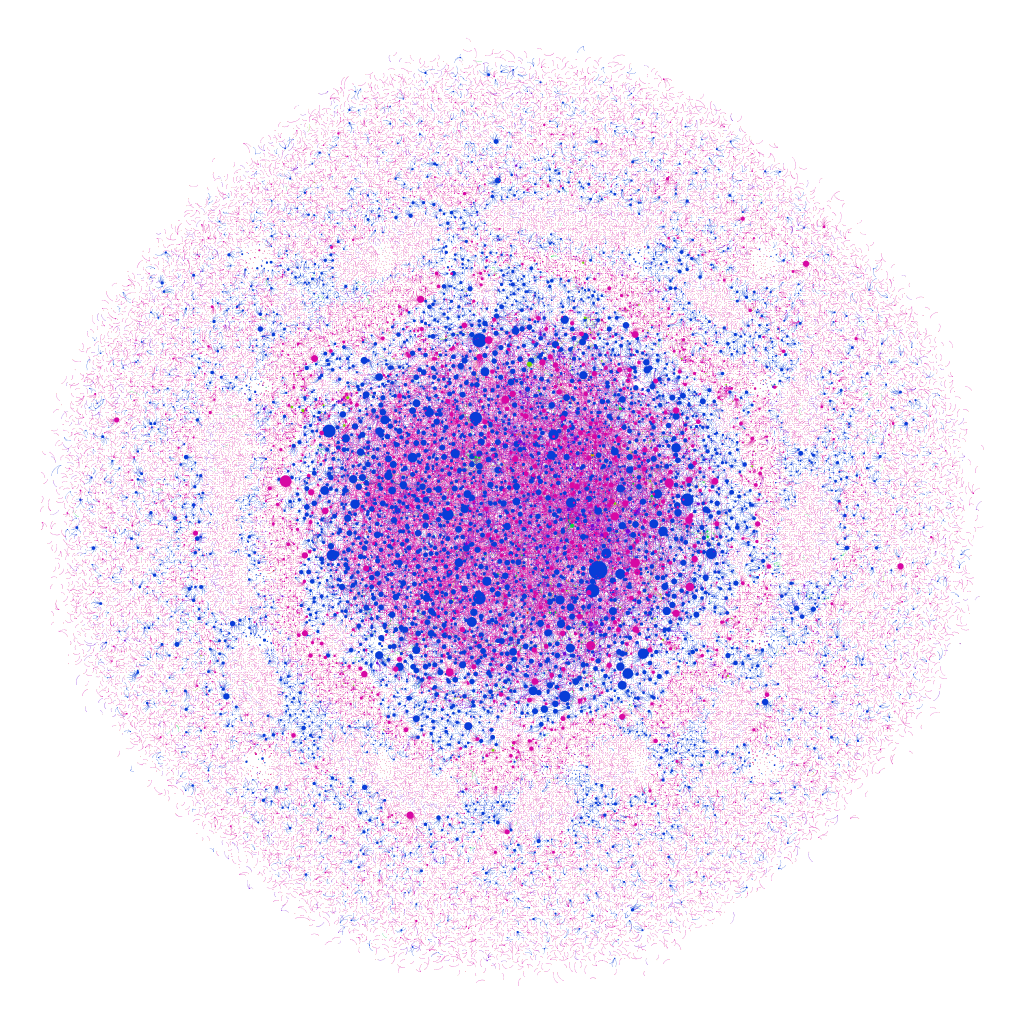
- What is the affective/emotional impact of the visualization — and how much does that dimension of a visualization matter? I keep coming back to this image from Teddy’s blog post on Sefaria in Gephi, a visualization of meaningful Jewish texts. The visualization shows Biblical texts and commentaries in blue, the Gemara in pink, and other sources in red, green and orange, with the nodes appearing larger based on the number of connections to that text — the largest blue node is Genesis 1:1. The author of the visualization compares it to a “cell under a microscope,” but it reminds me of a supernova, as well — and both images feel fitting and emotionally resonant with the subject matter.
- What effect might the toolkit used to create the visualization have on the scope and perceived meaning of the visualization? The features and constraints of any platform can shape the way data is presented, and even the type of data that’s collected. It’s easy to imagine how an individual’s reliance on a specific platform could limit the types of data would collect, and by extension, the types of questions they would research.
- Is it possible (or valuable) to evaluate the visualization author’s skill/success as part of (but still somewhat separate from) our overall critique? With a written text, the author’s skill (or faults) as a writer can determine how effectively they convey their argument. Visualization might have the potential to obscure an author’s limitations — something glossy and visually intriguing might draw weak conclusions or be a mess “under the hood.” On the other hand, an author who is able to create their own visualization tools has a lot of power to convey their point exactly as they intend. To call back to the old DH debate about the importance of being able to “make,” is the author’s control of the visualization something we should consider to evaluate the visualization, or would any weaknesses/errors on the author’s part be evident in the final product, as might be the case in a written work? The question might be purely theoretical, anyway — if we can’t see behind the curtain of a visualization, this may be impossible to know.
Along with all of these considerations, I’ve also been thinking about complexity vs. legibility. Per Drucker, a humanist approach to visualization allows us to capture subjective experience and analysis:
The challenge is to design graphical expressions suited to the display of interpreted phenomena: information about subjective user-dependent metrics, subjective displays of information, and subjective methods of graphical expression. The term subjective is used as shorthand for interpretative construction, for the registration of point of view, position, the place from which and agenda according to which parameterization occurs. Subjectivity is not the same as individual inflection or mere idiosyncracy, but is meant to put codependent relations of observer and phenomena (in contrast to presumptions of objectivity, or observer-independent phenomena).
Joanna Drucker, “Humanities Approaches to Graphical Display,” 2011
I would argue that the challenge lies equally in designing visualizations that are “suited to the display of interpreted phenomena” and in making sure those visualizations are legible in a way that allows for subjective but at-least-somewhat consistent readings.
For example, this visualization from Drucker’s article is complex and reflects interpretive construction, but is also easily legible, in that it’s possible to quickly understand how the visualization was constructed and use it as a jumping off point for further discussion. When I interpret it, I can assume that other good-faith readers can gain similar insights to my own:
However, I’m not sure if the same could be said for visualizations like the one below — though I admit that me not understanding it doesn’t necessarily mean it’s illegible:
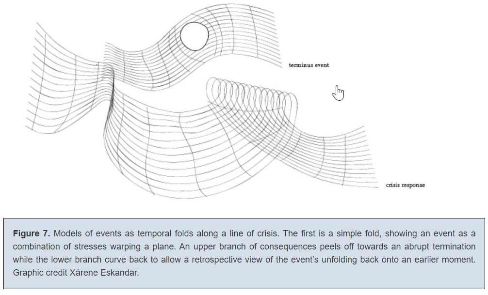
(I had a lot of questions here that might be answered with greater context, with a major one being: “What on earth does the hole mean?”)
Of course, to some extent, all visualizations necessarily depend on context to be legible and useful — as Drucker points out, even “straightforward” datasets and visualizations involve choice and decision-making from their creators. But I do wonder about the utility of a visualization that’s difficult or impossible to interpret without already understanding the data, the author’s intent, the unprecedented visual metaphor, the degree of attempted precision, etc.
Finally — what do we make of a visualization that approaches the complexity and level of detail of the original data/capta-set it’s trying to illustrate? I’m thinking of this alternative to John Snow’s famous cholera spread chart that Drucker offered:
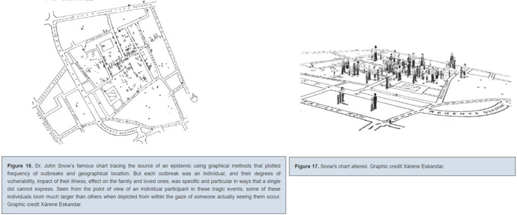
This is such an interesting choice to me, since altered chart still tells us not much about the individuals who died of cholera — and the original is one of the most famously effective and influential visualizations in history. While supposedly more interpretive, the new one seems to be something closer to a recreation of situation — it reminds me a bit of Borges’ country-sized map of the country from “In Exactitude in Science.”
I hope we get more of a chance to discuss this as the class goes on — I’m curious as to what others think, and if maybe my approach (thinking about effectiveness/utility) means I’m not quite taking these visualizations as they’re intended to be taken.
Finally, I want to leave off with a visualization I’ve always found particularly striking, though it’s pre-Digital Humanities:
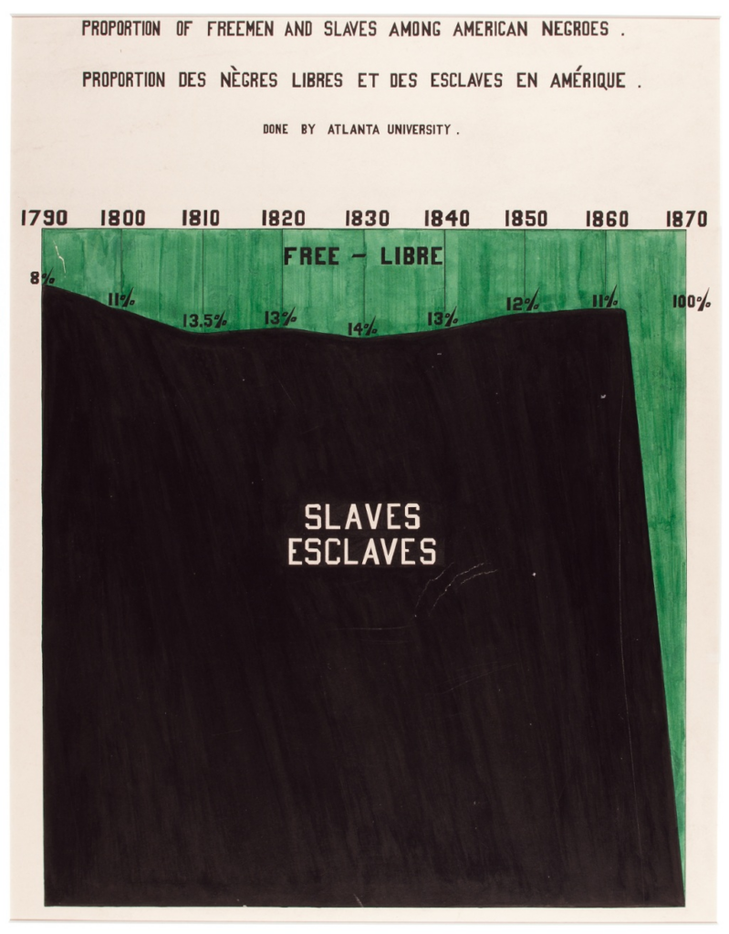
This is a visualization created by W.E.B. Du Bois and a team of students and alumni from Atlanta University as part of an exhibition at the 1900 Paris Exposition Universelle. (You can read more about it here.) While some of his other visualizations are more abstract and, for me, edge on that zone where expressiveness outweighs easy legibility (for example, a historian I know confessed that he still “[doesn’t] really understand” this beautiful one), this one depicts data precisely while still conveying an affective impact. The choice to fill in the enslaved population as a large black block creates the image of an enormous mountain-like mass — of humanity, of suffering, of injustice. It foregrounds the scale and endurance of American slavery in a way that a simple line or bar graph couldn’t. I think even if you were to extend the chart to the present, with the mountain of slavery further in the past, it would still be a powerful reminder of just how many generations of individuals were enslaved in this country.
I’d be curious to see other examples of pre-digital visualizations that push past the conventional limits of what a visualization can do — and how they might conform to or challenge Drucker’s ideas about humanities visualizations.