Author Archives: J Conor Sullivan.

Fourth Dimensional Annotations

For this assignment, I chose to annotate two similar but somewhat oppositional concepts presented in The Fourth Dimensional Human‘s “Introduction” chapter. My first annotation tackles the following excerpt from the text.

…our daily lives are a series of nets, any of which could be scored and bent at the perpendicular, and thus extended into this other dimension. Increasingly, the moments of our lives audition for digitisation [sic]. A view from the window, a meeting with friends, a thought, an instance of leisure or exasperation — they are all candidates, contestants, even for a dimensional upgrade.

xv

My annotation is somewhat of an instructional design prompt aiming to create discussion.

  • Thinking about our analog existence (i.e., the hobbies, chores, routines, and activities in our lives that are not part of the digital existence), what are experiences that could be effectively improved by digitization that have not yet transcended to the “fourth dimension”? Conversely, what aspects of our current analog existence could never be digitized for improvement?

I chose this annotation because I think this is a somewhat crucial part of the text. As readers, we leave the situational narrative and are introduced into the concept of our current-day lives being upended by this concept of the fourth dimension through digitization. The quote I chose to remark on orients the reader and provides examples of how digitization can enter any slice of life. I felt this was a proper point to provide some context into what the author is driving at and to allow the reader to ponder the questions asked in the annotation.

The next part of the text that I annotated was somewhat necessary as a huge Seinfeld fan. The reference to the reverse peephole and that analogy of how it aligns with our current “fourth dimension” living situations was extremely on point to me. So I wanted to orient the student readers to this concept.

The reverse peephole is, in this sense, visionary in its anticipation of the digital revolution, a definitive anxiety of which is that our peepholes have been reversed without our knowing.

xvii
  • In today’s world, there are fourth dimensional peepholes spread out across the modern home. In a sense, our homes are reversed much like Kramer’s. What are some examples of a way modern homes have been “reversed” from their analog past? What are the pros and cons to these reversals?

I wanted to get the student reader thinking about the benefits and downfalls of the digital invasion with homes. I want them to think about the benefits of having cameras on devices, “always on” audio assistants (e.g., Siri, Google Assistant, and Alexa) and to tackle whether these are overall assets versus intrusions into our lives. I think this plays off my other annotation well. First, students will consider what they can and cannot digitize effectively. Then, they are asked to consider whether the already-digitized aspects of their lives are mostly positive or negative. This, I think, promotes some of the concepts the author is tackling.

PRAXIS: Tinkering and Text Mining

Since starting my academic journey in DH over two years ago, I’ve been awaiting the moment when I’ll get to learn about text mining/analysis tools. I’ve worked in the “content” space my entire career and I’ve always been interested in the myriad tools out there that allow for new ways to look at the written word. I spent nearly a decade as an editor in the publishing world, and I never leveraged an actual text analysis tool, but I jerry-rigged my own approach for scouring the web for proper usage when I found myself confused on how to best render a phrase. My go-to text analysis “hack” has always been to search google for a phrase I’m unsure of in quotes, and then to add “nytimes.com” to my search query. This is based on my trust that the copyeditors at NYT are top notch and whatever usage they use most often is likely the correct usage. For instance, if I encounter the usage of “effect change” in some copy I’m editing and I’m not sure whether it should be “affect change,” I would do two separate searches in Google.

  1. “affect change” nytimes.com
  2. “effect change” nytimes.com

The first search result comes up with 72,000 results. The second result comes up with 412,000 results. Thus, after combing through the way the term is used in some of the top results, I can confidently STET the use of effect change and move on without worrying that I’ve let an error fly in the text. I’ve used this trick for years and it’s served me well, and it’s really as far as my experiments in text mining have gone until this Praxis assignment.

Diving into this Praxis assignment, I was immediately excited to see the Google NGram Viewer. I had never heard of this tool despite working in a fairly adjacent space for years. Obviously, the most exciting aspect of this tool is its absolute ease of use. It runs on simple Boolean logic and spits out digestible data visualizations immediately. I decided to test it out by using some “new” words to see how they’ve gained in published usage over the years. I follow the OED on Twitter and recall their annual new words list announcement, which for 2022 was produced as a blog post doing its best to leverage the newest additions in its text. You can read the post here: https://public.oed.com/blog/oed-september-2022-release-notes-new-words/

The NGram has a maximum number of terms you can input, so I chose the words and phrases that jumped out at me as most interesting.

The words I chose from the post were (in order of their recent frequency as spit out by NGram): jabbed, influencer, energy poverty, side hustle, top banana, Damfino, mandem, and medical indigency. As you can see, most of these terms are all quite new to the published lexicon — all but “jabbed.” However, jabbed in the early 20th century likely had more to do with boxing literature than vaccinations.

Moving along in this vein, I then looked up the “word of the year” winners dating back the last decade. These words were: omnishambles, selfie, vape, post-truth, youthquake, toxic, climate emergency, and vax. 2020 did not have a word of the year for reasons I suspect have to do with the global pandemic. Looking at the prominence of these words in published literature over the years showed a fairly similar result as the “new” words list.

What I found surprising is that these words and phrases are actually “newer” than the ones I pulled from the new words list. There’s barely a ripple for all these words outside of “toxic,” which has held populat usage for over a century now according to NGram.

Despite to say, as a person who routinely looks up usages for professional purposes, I’m elated to discover this tool. It will not only help me in my DH studies, but will also assist me in editorial work as I look for the more popular usage of terms. Instead of having to us Google’s own search engine and discern the results myself, I can now see simple visualizations that will prove one usage’s prominence over another.

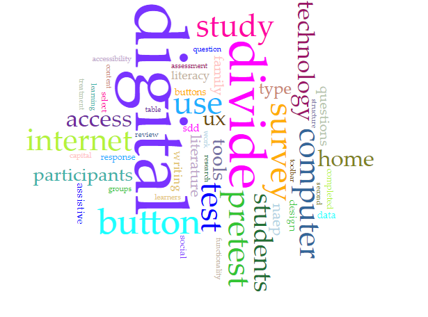
NGram is well and good, but I could tell this was a bit of a cop out when it came to learning the ins and outs of text mining. So I decided to test out Voyant Tools to see if I could get a handle on that. As was noted in the documentation, it is best to use a text I am familiar with so I can make some qualitative observations on the data this is spit out. I decided to use my recently submitted thesis in educational psychology, as there’s likely not much else I’m more familiar with. My thesis is titled, “User Experience Content Strategies for Mitigating the Digital Divide on Digitally Based Assessments.” Voyant spat out a word cloud that basically spelled out my title in via word vomit in a pretty gratifying manner.

This honestly would have been a wonderful tool to leverage for the thesis itself. As I tested 200 students on their ability to identify what certain accessibility tools offered on digital exams do, I had a ton of written data from these students and I could have created some highly interesting visualizations of all the different descriptive words the students used when trying to describe what a screen reader button does.

I’ve always known that text analysis tools existed and were somewhat at my disposal, yet I’ve never even ventured to read about them until this assignment. I’m surprised by how easy they are to get started with and am excited about leveraging more throughout my DH studies.

Minimal Computing and Cyclical Guilt in DH

This week’s reading, more so than other weeks, has been well aligned with many of the interests that brought me to study the digital humanities. I have been a long-time proponent of open access journals — as well as open access media in general. I thought Peter Suber did a wonderful job in outlining all the benefits to open access research articles and tackled all the tough questions that often go along with it. One of the many critiques I’ve stumbled across when it comes to OA is how it removes labor from the process of publishing academic articles. That is, by eliminating the process of sales, you eliminate the job of selling the literature. By eliminating the publisher as middleman, you eliminate the copyeditor, the proofreader, the production team, etc. from being involved in the process of creating a published work. That is, OA can be deemed “anti-labor” inherently by its removal of roles from the publishing process. I learned many retorts to this line of thinking from Suber — mainly that OA works can still live in published journals. They can still be refined and sold as parts of collections. It’s just that the written piece, in isolation, can be accessed by anyone. Much like public domain works of literature (those that predate 1923) are available to be published in anthologies or critical editions of books — which produce many jobs and are certainly pro labor — OA works can be included in their own anthologies and classroom “readers” to create new labor opportunities. I found this uplifting as a lot of what we read in DH is riddled with guilt — guilt about who DH doesn’t serve, whose voices are omitted from the field, and who cannot access the digital tools that are prerequisite to making a DH project. That brings me to my thoughts on the Risam and Gil piece on minimal computing.

I titled this post “Minimal Computing and Cyclical Guilt in DH” because after reading the Risam and Gil piece, I felt like I was taken on a whirligig tour of all the ways that digital tools can exclude different populations. SaaS GUIs require an internet connection and thus are only available to users who live in well connected areas of the world. User-friendly tools often are hosted on databases, which presents security problems as these databases are often owned by capitalistic corporate entities. I felt from reading the piece that the authors were advocating for minimal computing as a solution to these problems — but even in their writing, you could sense there was more guilt underpinning the concept of minimal computing.

To truly leverage the benefits for minimal computing, they make clear that a strong grasp of coding language is required. Making a Jekyll site is often achieved through the command line. This is a large learning curve for many. I’ve been working adjacent to computer science for over a decade and anytime I want to learn a new skillset, I have to take advantage of one of several pillars of privilege. I can take a class at an institution, which costs money and often requires being accepted into a program and having an expensive undergraduate degree. Alternatively, I can attend a bootcamp, which costs even more money per hour. If I want to save money, I can watch tutorials on YouTube, yet they require all the same connectivity as using a SaaS GUI does, which defeats the supposed altruistic purpose of learning the code if I can just use a GUI. I can purchase a textbook, which is probably the cheapest route, but it’s still expensive and I will have to rely solely on my ability to self-learn. There are dozens of other ways to gain these skills, but all of them require some form of privilege — not excluding the privilege of being smarter than I am and being able to learn complex syntax very easily — as many lucky software engineers are able to do with their computationally savvy minds.

I feel like it’s impossible to learn about any aspect of DH without going down the rabbit hole of guilting ourselves about how any approach to scholarship inherently leaves out a large chunk of the population. Studying advanced mathematics leaves out people who aren’t inherently skilled at math. But I don’t think that’s much of a topic in the introduction to linear regression. To me, minimal computing is dope. It’s cool to make lo-fi digital projects using simple forms of technology. I don’t think the reason to promote this approach to scholarship requires us to go over how WordPress is a product of neocolonialism. I feel like there’s no need to justify minimal computing — it’s justified in the fact that practitioners are able to create interesting humanities projects without relying on the hand-holding GUIs available to the greater public. That in that of itself is interesting.

PRAXIS Visualization: Problems with Reduction and Null Meanderings

I currently work as a documentation and UX writer for a team of data analysts and software engineers. In this job, the word “Tableau” is something I either read about, write about, or edit something about on a near-daily clip. However, until starting this assignment, I had never actually opened the GUI of the software and had only written about what Tableau spits out: usually beautiful and straightforward visualizations for which I need to provide captions. As it turns out, I’m lucky (so far) my role hasn’t involved interfacing with the platform since it seems that I’m quite terrible with the software. It took me several hours of tweaking to try and make something that looks remotely cool (beautiful is already out the window). But, I think that’s the purpose of these assignments — I’m happy that I now have the basics down to eventually make something closer to beautiful after further practice (and maybe an ad-hoc sesh with Felipa).

During one of our early weeks of class, I mentioned how I had worked on a translation project for New York City a few years ago, which entailed managing the translations of digital assessment material into the “nine official” non-English languages of the New York City Department of Education (NYCDOE). For certain assessments in NYC, students are allowed to request translated materials into their “home” language. The assessments that allow this are normally measuring subject-matter constructs like math, science, history, and health. I’ve found it impossible to name these languages off the top of my head whenever I’m asked, so here they are after Googling: Arabic, Bengali, Chinese (modern), French, Haitian Creole (also referred to as French Creole), Korean, Russian, Spanish, and Urdu. Since this topic usually gathers interest when I bring it up, I figured it was a good data topic to explore with my visualizations.

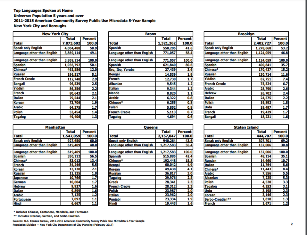
The first thing I tried to do was find some numbers for how many student learners spoke each of the nine respective languages. This proved difficult and I wasn’t able to find very valuable data. I did stumble onto a NYC.gov page that breaks down the most commonly spoken languages at home in the city, which interestingly did not wholly align with the nine languages the DOE uses. You can view the pdf breakdown here: https://www1.nyc.gov/assets/planning/download/pdf/data-maps/nyc-population/acs/top_lang_2015pums5yr_nyc.pdf. I’ve also pasted a screengrab of the data below.

The 12 most spoken home languages in the city and by borough

I decided to migrate these data into a spreadsheet, which was fairly time consuming in that of itself. As you may notice from the data (or from my caption), the languages are broken down by the top 12 languages in the city as a whole and then by each borough. It didn’t resonate with me at the time, but this presents some fairly confounding sorting obstacles for creating visually appealing data visualizations. As we learned from Manovich, the first principle of data viz is reduction. I’m sad to say that my first attempt at a visualization of these data points actually adds more noise than the (very dense) table I pasted above.

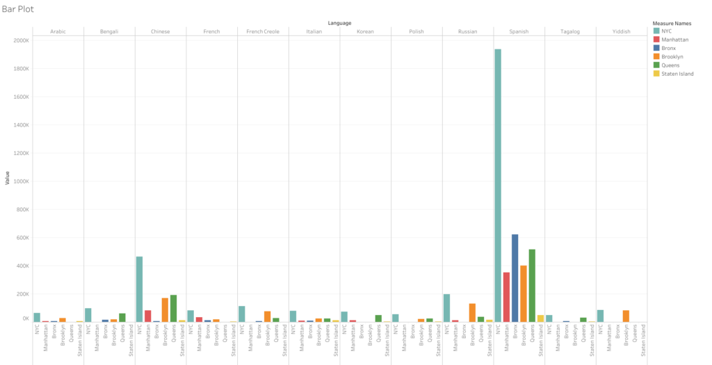
First noisy attempt at visualizing the languages (click link above for larger view)

This bar graph takes all the languages and runs them along the top axis and then stacks the amount of speakers by all of NYC and then each borough. However, since each borough has a different set of top-12 speakers, they don’t align with the city’s overall numbers. Thus, even though Yiddish is one of the top 12 languages spoken in the city — it received null values within Manhattan, Bronx, Queens, and Staten Island as it falls out of the top 12 in those particular areas. This was the case with nearly a dozen other languages that are more prominent to certain boroughs. These null values ended up causing me a huge headache as I couldn’t figure out how to remove them from a single borough without removing them from the data sets where they are relevant. I think the only valuable thing one can take away from this first attempt is that Spanish is spoken at a significantly higher rate than any other language in the city. Chinese is the only other language that stands out, and it’s not even close to the sky-scraper bars shown for Spanish. But overall, as I said, this visualization certainly fails the reduction test. I can grasp the data better looking at the text tables.

For my next attempt, I decided forget the other boroughs and focus on the All NYC data to try and make something a little more simplified and helpful to a viewer trying to take away a snapshot of these data. I again ran into some issues with Tableau — as whenever I tried to use some of the nicer looking viz options, I was told I needed to add at least one “dimension” to use this or that visualization option. I couldn’t figure out what that meant as I seemed to have several data points labeled as “dimensions,” but many of the visualization options remained greyed out. I went with one of the more classic visualizations: the packed bubbles, which expand based on the volume contained in each data point.

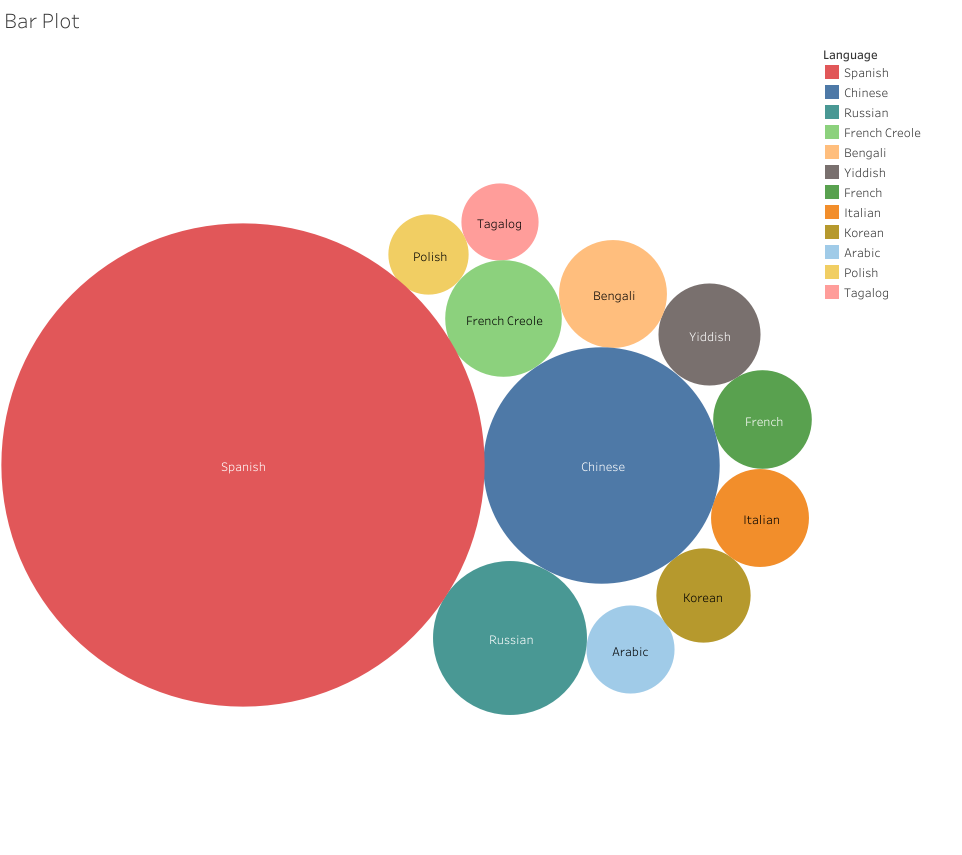
Packed Bubbles Visualization of Home Languages Across the City

Now, this visualization I think properly reduces the noise from the text tables. It’s only regarding a single set of data: the top 12 non-English languages spoken at home in NYC. The user can clearly see which languages scale well above the others and can quickly make sense of the top 12 by looking at the order provided in the legend — and then can compare the numbers by hovering over the bubbles. I’m not sure if this is a cool visualization, but it’s at least somewhat effective.

In the context of my blog post, this visualization does pose an immediate question: why do the nine languages of the NYCDOE include Urdu when it isn’t in the top 12 across the city? I don’t know the answer, but we can see that Tagalog, Polish, Yiddish, and Italian all have more speakers yet aren’t provided as options for translation. This could be due to the amount of learners in the public schools representing each language. Yiddish speaking students my be more likely to attend Jewish religious schools, which could dwindle their numbers in the public school system. Likewise, Tagalog (Filipino), Polish, and Italian speakers may be more likely to attend Catholic schools. Whatever the reasons, I like how the reduction attempt made it easier to find some data points to discuss. Whereas my first attempt just created a vomit of bars that provided no discernable information to glean any insights from.

Resurrecting Barthes’ Dead Authors

I want to write this week about the very interesting piece we were assigned by Tressie McMillan Cottom, “More Scale, More Question: Observations from Sociology.” There’s a lot to digest here and I understand the scope of this article is about sociology’s sway towards quantifiable research and how that parallels what DH is driving in the humanities. However, I found myself writing my largest annotation yet in this class when I encountered the quote about a TV show I’m well aware of but have never seen:

For example, is a character on Grey’s Anatomy “black” because I interpret him as black, or because the show’s writers write the character as black, or because the actor playing the character identifies as black?

Tressie McMillan Cottom, “More Scale, More Questions: Observations from Sociology”

This reminds me of a discussion I had probably 15 years ago during my undergraduate studies as an English student. A professor asked the class for their favorite female characters across the literary canon. After some minutes of discussion, the professor — very ready for what names were brought up — asked us why so many of these characters were written by men and whether that is problematic. Is Caddy Compson of The Sound and the Fury truly a great female character or is she the male ideal of a great female character? As a college kid trying to sound smart for reading a cool book the summer before, I had brought up Oedipa Maas of The Crying of Lot 49 because I thought she was a fantastic heroine — quirky, funny, descriptively beautiful, and driven to get to the bottom of a giant, strange, and highly interesting national mail conspiracy. However, was she really a great female heroine or was she a male author’s idea of what other males might find as a great female character? In some ways, I may have had a crush on this fictional character — as she more closely aligned with what I was seeking in a college girlfriend than what a true heroine in a real society might look like (i.e., she’s no Rosa Parks, Marie Curie, Ada Lovelace, etc). This concept has stuck with me since then, but the quote above really helped put it in new context when thinking about corporate “writer rooms” determining the characterization of a diverse cast of characters.

This concept reminds me of the famous concept of “Death of the Author” as presented by Roland Barthes — which posits the question as to whether the intent of the author matters. In Barthes opinion, as I recall, it does not. A text should be separated from the author’s intent to allow the reader to analyze the cultural phenomena that shaped the text. However, in the Grey’s Anatomy quote above, it is certainly pertinent to look at who the author is when analyzing the makeup of their characters. Can a white author write a great black character? That’s definitely a valid debate; and it’s hard to justify that it’s possible without knowing a lot about what research went into creating the character. And to complement the article in question, that research would hopefully entail a lot qualitative interviews with people similar to the character being shaped. Thus, come anywhere near a conclusion to that answer, I think we need to dig deeper into who the author is and what biases shaped the character in question. This, in some sense, digs up the many authors Barthes killed to see what biases and stereotypes they lived their lives by to see how “great” their characters truly are.

Effective Debates in the Digital Humanities

It was interesting to read the different introductions to the Debates in Digital Humanities series this week as they showcased the evolving definition(s) of the field itself. In “The Digital Humanities Moment” and “Digital Humanities: Expanded Field,” it is noted that the DH lexicon was originally (and often still is) grouped by the term “The Big Tent” of DH, which was how the initial 2011 Debates book framed its included essays. Aligning with the nature of a good debate, we learn in the “Expanded Field” piece that due to some effective debating about the use of that term, the “Big Tent” (despite its name) was limited in scope and did not capture the full essence of DH.

This led to the concept of expanding the field, which naturally opened up more debates about the nature of DH inclusion. Through further debating about the DH framework, the experts in the field move away from merely adding new scope to include in the tent and start identifying biases and problems with what already lives under in the tent. Due to the technological barriers to participate in DH, we encounter debates about social economic access to the subject matter. Due to the nature of what is traditionally studied in the humanities, we run into the bias of too many DH projects surrounding white male figures. Due to the stereotypes and cultural pressures of who should participate in digital fields, there’s clear gender and racial gaps in the cohorts of DH practitioners.

What I found of most interest when reading through the articles, which wrap with the Digital Black Atlantic primer, is how each piece presents dialectical issues with the DH subject matter, and how the following piece addresses those issues and presents new solutions. Those solutions open up more debates, which create more solutions. It’s almost an infinite loop of a subject matter evolving towards a static definition that it will never settle on. This dynamic nature of the field is simultaneously daunting and freeing, as it seems there are countless angles to build research on.