
In light of the recent influx of discussion regarding unionization along with efforts being made by Starbucks employees across the country and, more recently, by Trader Joe’s employees in New York City, I thought it might be particularly interesting to look into data regarding how this swelling conversation and viral push for the rights of workers might have manifested in increased national membership with and representation by labor unions. Utilizing the available databases provided by the U.S. Bureau of Labor Statistics, I initially intended on accumulating the four collections of data pertaining to union affiliation into an aggregate visualization to follow Johanna Drucker’s advocacy for a more nuanced approach to graphical expression and to show the ambiguities and complexities undeniably inherent in the labor discussion (Drucker, 2011). However, upon being confronted with the ambiguities and complexities of Tableau Public, I chose to focus on a reduced version of a single dataset. After finding it exceedingly tedious to format the “Union affiliation of employed wage and salary workers by occupation and industry” dataset to be Palladio-friendly, I reduced the data to its core components in order to make it more user-friendly as I clumsily explored the suggested data visualization tools.
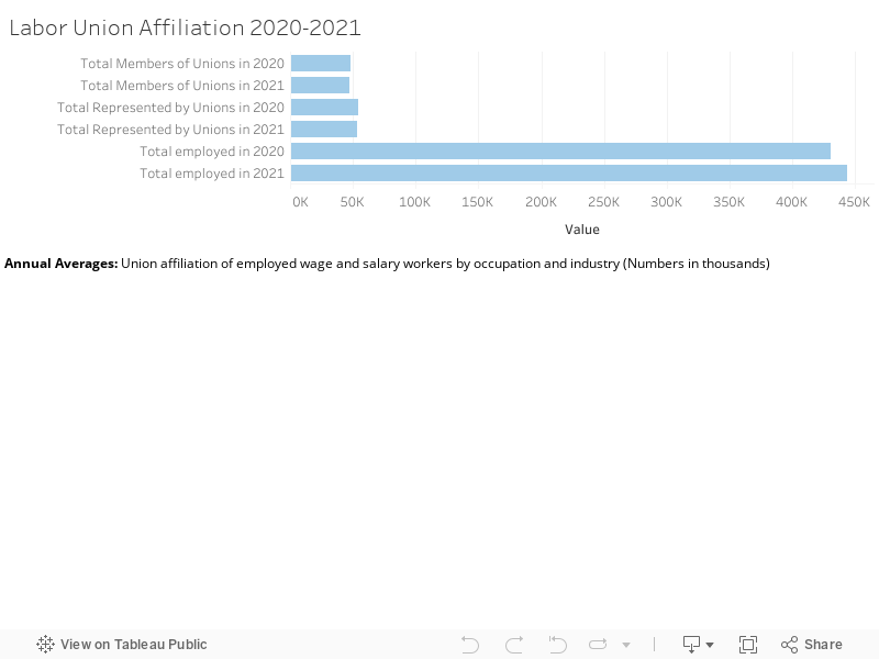
Upon finding Tableau Public more accessible, I proceeded to build four simple data visualizations illustrating different elements of the “Union affiliation of employed wage and salary workers…” dataset. The first visualization is a broad overview of the data, detailing the Total Members of Unions, Total Represented by Unions, and Total Employed in the United States in 2020 vs. 2021. From a glance, one can see that this almost embarrassingly straightforward graph counters my initial assumption that union involvement has experienced an uptick in recent years, instead illuminating a 1.79% decline in union representation even as the metric for “Total Employed” increased amidst the nation’s recovery from the COVID-19 pandemic.
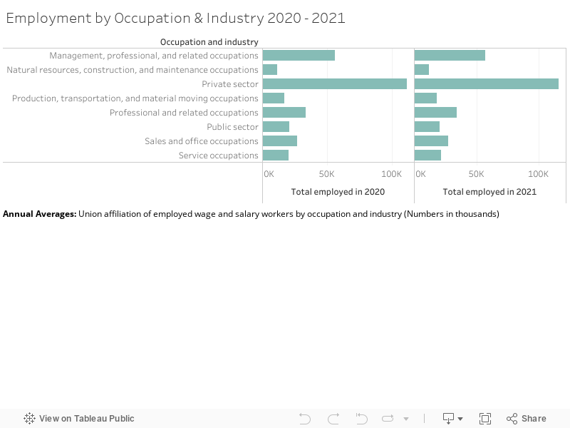
In order to explore the intricacies of this further, the following visualization breaks down Employment by Occupation & Industry in 2020 vs. 2021. While the original dataset includes subsets of each industry, with categories such as “Service Occupations” including a thorough account of the jobs that it encompasses (healthcare support occupations, food preparation related occupations, building and grounds cleaning and maintenance occupations, etc.), I couldn’t conceive of how to go about visually presenting this information in a comprehensible and digestible way. By reducing the data to exist within its broader (and vaguer) categories, users can certainly get a clear sense of the general growth of each sector in 2021 from the user-friendly visualization but are ultimately left without a thorough understanding of the complex occupational ebbs and flows at play within each industry during this period, mirroring Drucker’s warnings regarding the bureaucratic processing of “human activity through statistical means” and the violation of basic principles of critical thought produced through the crude reduction of data (Drucker, 2011). While I know this is not the precise point that Drucker was advancing, I couldn’t help but feel that my limited ability in creating data visualizations caused me to produce exactly that which her article had rightfully argued against.
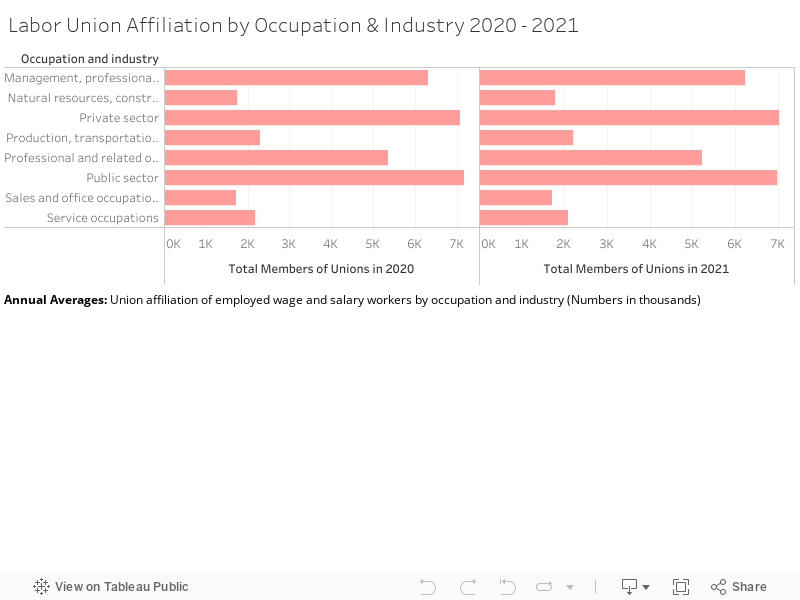
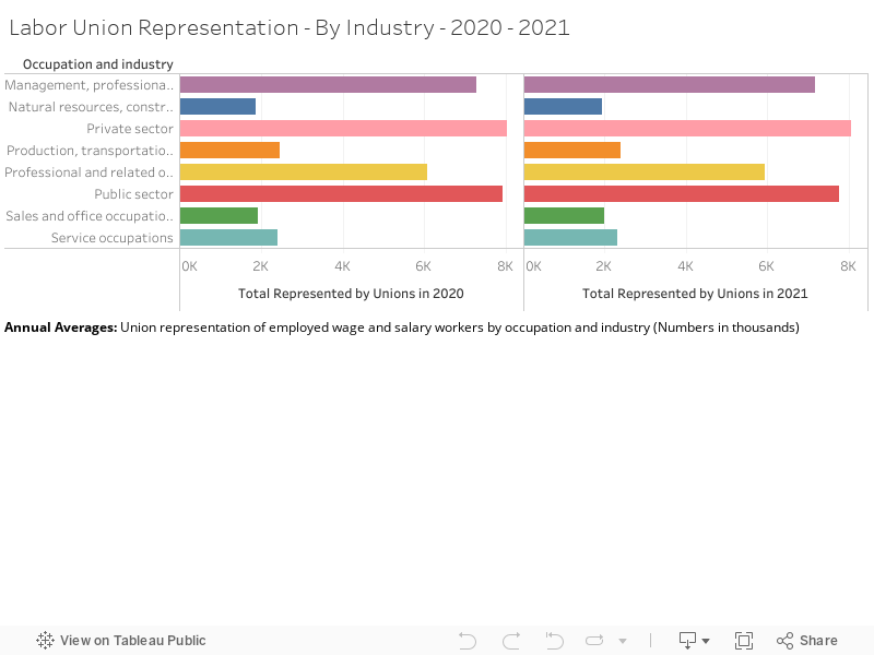
The following graphical displays elucidate both Labor Union Membership and Representation between 2020 and 2021. Though they follow extremely similar patterns of growth and decline, such that it almost seems unnecessary to provide both, I thought it was an interesting exercise primarily to distinguish the two categories. The number of workers represented by a labor union is generally higher than that of union membership due to instances of employees in a unionized workplace receiving union benefits despite not being official members of said workplace’s union (Shierholz, et al., 2022). Though I feel as if union representation is a more salient metric due to its inclusion of those who might want (and deserve) the protection and rights afforded to them through a labor union but might not be in a place to engage in legitimate union membership, it is interesting to include both primarily due to anomalies within the dataset (for example, instances of falling union membership with union representation rising within the same industry).
Though my experience with Tableau Public was ultimately limited by my amateur status as a data visualizer, my “findings,” as simple as they were to come across and to reproduce graphically, did challenge my assumption that union involvement has been steadily increasing as labor organizations become “cool again,” as labor expert and professor at CUNY Ruth Milkman stated earlier this year. Upon seeking inspiration for how my approach to displaying this information might have been improved, I came across predominantly geographically and temporally plotted presentations of the declension of labor organization over the last century (NPR’s 50 Years of Striking Union Membership in One Map, a “trends over time” map of global Trade Union Membership from 1880 to 2010 from Harvard Business School). However, both of these visualizations (and my own) neglect to comment on such pertinent factors as “the power relations of financial actors or the social construction of race” involved in the unmaking of worker power, as Tressie McMillan Cottom advocates visual inclusivity for in her work More Scale, More Questions: Observations from Sociology (2016). Such knowledge is invaluable in the advancement of worker organization and, though some relevant information can be found through resources such as the U.S. Bureau of Labor Statistics’ Union Membership Annual News Release, opportunities for successful integration and visualization of this information’s complex components, such as Black workers continuing to have the highest unionization rates in 2021 at 12.9% or the standardization of corporations to hire “avoidance consultants to coordinate intense anti-union campaigns” at the whisper of organization, are lost amidst reductive recreations of complicated corporeal power struggles as easily understood graphs and maps (Shierholz, et al., 2022).
More than anything, in attempting my own data visualization, the calls of authors such as Bonilla and Hantel for representations that reveal the complexities of structures of power while simultaneously challenging normative understandings of one’s sovereignty within such systems became increasingly relevant (2016). Upon realizing that union activity is decreasing despite the vocal desire for unionization amidst non-union workers growing (48% of non-union workers said they desired to create a union within their workplace in 2017, years before the semi-shift of consciousness brought about through trends such as “The Great Resignation”), I found it tremendously difficult to conceive of how to communicate this effectively through the tools provided (Shierholz, H. (2022). If anything, I think my experience attempting to do so has shed further light on the necessity of projects found in our coursework and effectively conveyed the essentiality of critical and creative approaches to data visualization in order to produce the “slow, thoughtful, inclusive, and collaborative” work fundamental to the flourishing of an effectual and equitable Digital Humanities (Guiliano & Heitman, 2019).
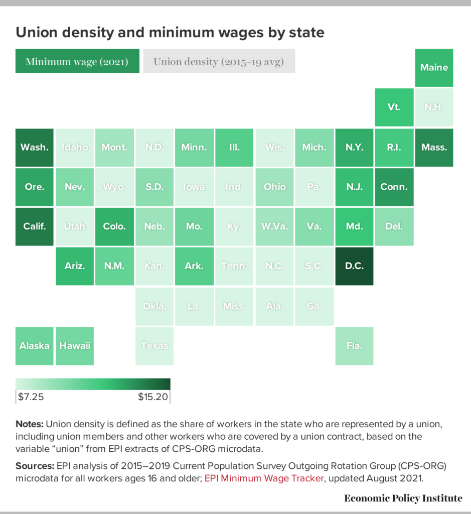
P.S. This data visualization of union density and minimum wages by state is fantastic and provides an example of something to aim for in the future.
Resources
Bonilla, Yarimar, and Max Hantel. 2016. “Visualizing Sovereignty.” Sx Archipelagos, no. 1 (May).
Cottom, Tressie McMillan. 2016. “More Scale, More Questions: Observations from Sociology.” In Debates in the Digital Humanities 2016, edited by Matthew K. Gold and Lauren F. Klein. University of Minnesota Press.
Drucker, Johanna. 2011. “Humanities Approaches to Graphical Display.” Digital Humanities Quarterly 5 (1).
Guiliano, Jennifer, and Carolyn Heitman. 2019. “Difficult Heritage and the Complexities of Indigenous Data” Journal of Cultural Analytics 1 (1).
Shierholz, H. (2022). Latest data release on unionization is a wake-up call to lawmakers: We must fix our broken system of labor law. Economic Policy Institute. Retrieved September 26, 2022, from https://www.epi.org/publication/latest-data-release-on-unionization-is-a-wake-up-call-to-lawmakers/

This entry is licensed under a Creative Commons Attribution-NonCommercial-ShareAlike 4.0 International license.