
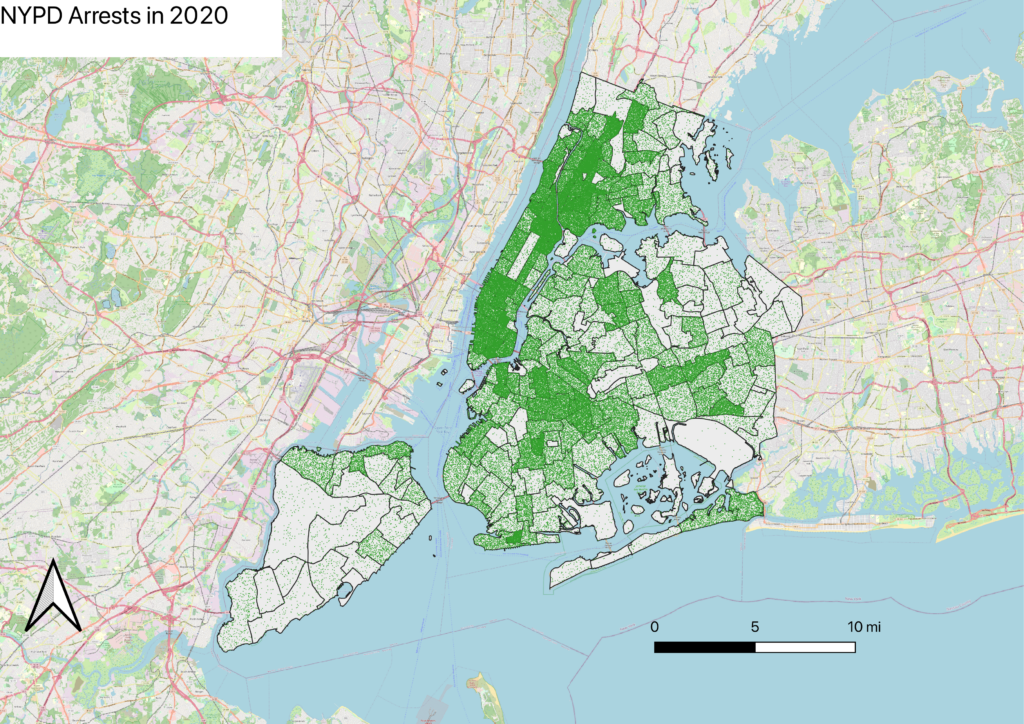
Crime and motor vehicle collisions have been hot topic issues nationwide, especially since lockdown restrictions were lifted. In light of this event, I wanted to map NYPD arrests in 2020 as well as motor vehicle collisions in October 2022. Based on the GC Digital Fellows’ Finding the Right Tools for Mapping article, I elected to use QGIS to create both maps.
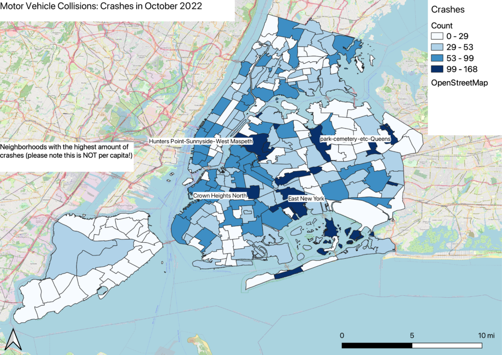
Both datasets were extracted from the NYC Open Data portal. For the NYPD arrests data, I chose to visualize 2020 arrests because I was curious to see if there was a change in the number of arrests prior to and post lockdown. As for the motor vehicle collisions, I elected to analyze the timeline of October 2022 because the dataset was too large to import into the program.
As stated in the article Finding the Right Tools for Mapping, some of the weaknesses of QGIS came to light while visualizing the data. I have a recent version of the program, and as a result, there were consistent bugs when applying multiple layers to the same map. In addition, without ArcGIS, I was unable to make the map interactive, and ultimately could not answer my initial question about the change of arrests pre and post lockdown. Lastly, I was fortunate to not have to geocode the addresses, but in the future I want to explore tools that give me that power.
Utilizing concepts from How to Lie with Maps, I chose a different map type for each dataset. For the NYPD arrests data, I chose a dot density format in order to visualize the distribution of arrests across NYC and to allow users to see which Census Tracts / neighborhoods contain the most arrests. Meanwhile, for the motor vehicle collisions data, I used a choropleth map because I wanted more control over the narrative of which neighborhoods had the most and least collisions. I quickly learned that an advantage of this technique is being able to distinguish the collisions among neighborhoods. However, since QGIS provides users with the ability to choose which scale to implement, I was able to use a scale that skewed the number of collisions — this is where Monmonier’s term of “lying with maps” comes into play.
In the future, I would like to incorporate ArcGIS to make both maps more interactive. In addition, I would like to import more of the motor vehicle collisions data and illustrate a timeline of how the number of crashes have changed over the past decade.

This entry is licensed under a Creative Commons Attribution-NonCommercial-ShareAlike 4.0 International license.